Benvenuto nelle Font Più Popolari — dove popolarità e qualità si incontrano. Qui trovi i font più scaricati e usati dell'anno. Se cerchi scelte sicure per logo, web o social, inizia da qui.
Ogni font top si distingue per equilibrio, leggibilità e versatilità. Troverai sans serif moderne, script eleganti, serif vintage e display minimalisti.
-
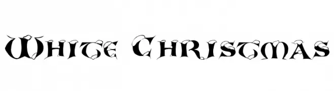
( Fonts by Daniel Gauthier )
A bold, decorative font with a distressed, vintage texture.
 Scaricare 803 Downloads@WebFont
 -
![White Christmas font caratteri gratis]() Scaricare 803 Downloads@WebFont
Scaricare 803 Downloads@WebFont -
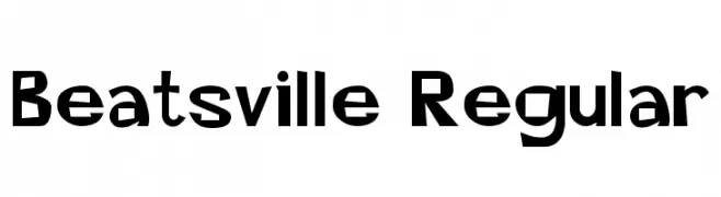
( Fonts by Altsys Metamorphosis )
A bold, retro-inspired font with playful, angular characters.
![Beatsville Regular font caratteri gratis]() Scaricare 803 Downloads@WebFont
Scaricare 803 Downloads@WebFont -
( Fonts by Gilang Ternadho )
A playful, bold font with rounded, hand-drawn characters.
![Begialo font caratteri gratis]() Scaricare 802 Downloads@WebFont
Scaricare 802 Downloads@WebFont -
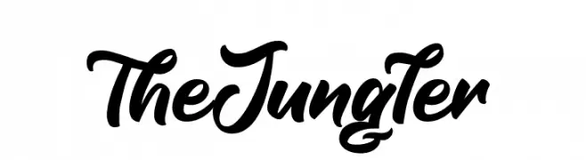
( Fonts by Octotype - www.foundmyfont.com - Personal-use only. For commercial use please contact owner. )
A bold, expressive script font with elegant, flowing cursive letters.
![TheJungler font caratteri gratis]() Scaricare 802 Downloads@WebFont
Scaricare 802 Downloads@WebFont -
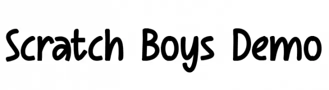
( Fonts by Figuree Studio )
A playful, bold handwritten font with rounded, consistent letterforms.
![Scratch Boys Demo font caratteri gratis]() Scaricare 802 Downloads@WebFont
Scaricare 802 Downloads@WebFont -
( Personal-use only. For commercial use please contact owner. )
A bold, italic serif font with a classic and elegant style.
![TGRoman Bold Italic font caratteri gratis]() Scaricare 802 Downloads@WebFont
Scaricare 802 Downloads@WebFont -
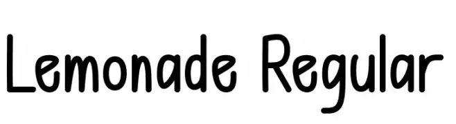
( Fonts by Bringtype Studio )
A playful, hand-drawn font with rounded edges and a whimsical style.
![Lemonade Regular font caratteri gratis]() Scaricare 802 Downloads@WebFont
Scaricare 802 Downloads@WebFont -
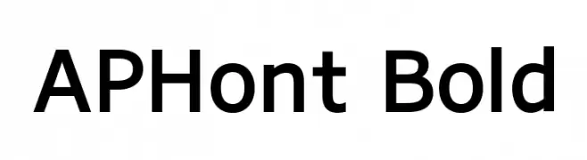
( APH Products - www.aph.org/products/aphont.html )
A bold, modern sans-serif font with excellent readability and balanced proportions.
![APHont Bold font caratteri gratis]() Scaricare 802 Downloads@WebFont
Scaricare 802 Downloads@WebFont -
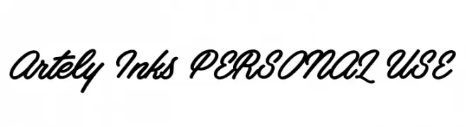
( Måns Grebäck - www.mansgreback.com )
A flowing, cursive font with a handwritten, elegant style.
![Artely Inks PERSONAL USE font caratteri gratis]() Scaricare 802 Downloads@WebFont
Scaricare 802 Downloads@WebFont -
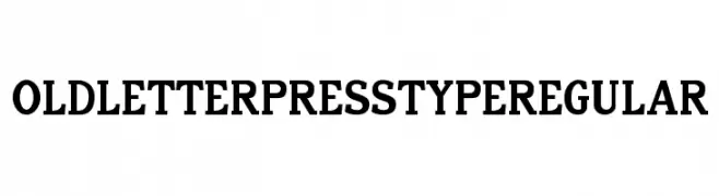
( Doug Sheets - dougsheets.com )
A bold, classic serif font with strong, impactful characters.
![Old Letterpress TypeRegular font caratteri gratis]() Scaricare 802 Downloads@WebFont
Scaricare 802 Downloads@WebFont -
![Crazy Dots font caratteri gratis]() Scaricare 802 Downloads@WebFont
Scaricare 802 Downloads@WebFont -
( Fonts by Freddie Line - www.freddieline.com - Personal-use only. For commercial use please contact owner. )
A modern, geometric font with clean lines and angular shapes, perfect for tech and creative projects.
![DissolveRegular font caratteri gratis]() Scaricare 802 Downloads@WebFont
Scaricare 802 Downloads@WebFont -
( Fonts by Daniel Zadorozny - www.iconian.com - Free for personal use )
A bold, italic font with a modern, angular design.
![Montroc Super-Italic font caratteri gratis]() Scaricare 802 Downloads@WebFont
Scaricare 802 Downloads@WebFont -
![Unholy Trade font caratteri gratis]() Scaricare 802 Downloads@WebFont
Scaricare 802 Downloads@WebFont -
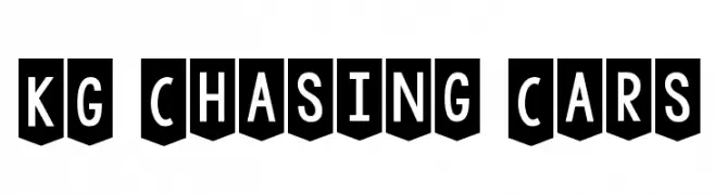
( Fonts by www.kimberlygeswein.com - Kimberly Geswein )
Bold, shield-encased font with a strong, structured appearance.
![KG Chasing Cars font caratteri gratis]() Scaricare 802 Downloads@WebFont
Scaricare 802 Downloads@WebFont -
( Fonts by Sam Wang )
An artistic and decorative font with elongated strokes and intricate details.
![AmbrosiaCap Cap:001.001 font caratteri gratis]() Scaricare 802 Downloads
Scaricare 802 Downloads -
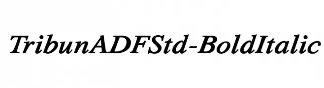
( Fonts by Arkandis Digital Foundry )
A bold, italic serif font with a classic and elegant style.
![TribunADFStd-BoldItalic font caratteri gratis]() Scaricare 802 Downloads@WebFont
Scaricare 802 Downloads@WebFont -
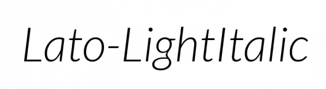
( Copyright (c) 2010-2011 by tyPoland Lukasz Dziedzic with Reserved Font Name "Lato". )
A modern, light, and italic sans-serif font with elegant slanted characters.
![Lato-LightItalic font caratteri gratis]() Scaricare 802 Downloads@WebFont
Scaricare 802 Downloads@WebFont -
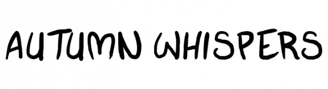
( Fonts by Press Gang Studios - Andeh Pinkard - www.pressgang-studios.com )
A playful, casual handwritten font with fluid, slightly irregular strokes.
![autumn whispers font caratteri gratis]() Scaricare 802 Downloads@WebFont
Scaricare 802 Downloads@WebFont -
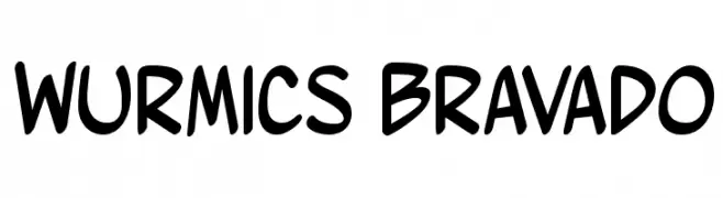
![Wurmics Bravado font caratteri gratis]() Scaricare 802 Downloads@WebFont
Scaricare 802 Downloads@WebFont -
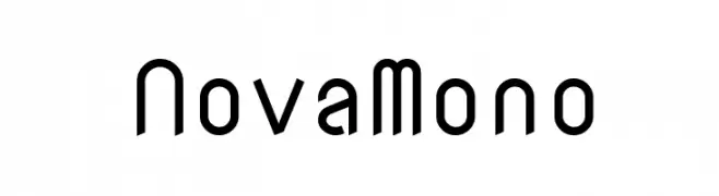
( Copyright (c) 2011, wmk69 (wmk69@o2.pl) )
A modern, monospaced font with a clean, geometric design.
![NovaMono font caratteri gratis]() Scaricare 802 Downloads@WebFont
Scaricare 802 Downloads@WebFont -
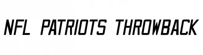
![NFL Patriots Throwback font caratteri gratis]() Scaricare 802 Downloads@WebFont
Scaricare 802 Downloads@WebFont -
( Fonts by Galdino Otten - galdinootten.com )
A bold, geometric font with a modern and strong presence.
![Insight Issue New font caratteri gratis]() Scaricare 802 Downloads@WebFont
Scaricare 802 Downloads@WebFont -
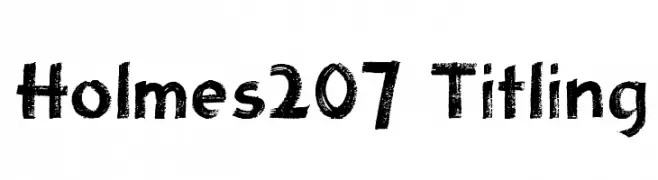
![Holmes207 Titling font caratteri gratis]() Scaricare 802 Downloads@WebFont
Scaricare 802 Downloads@WebFont -
![PersianLotosSSK font caratteri gratis]() Scaricare 802 Downloads@WebFont
Scaricare 802 Downloads@WebFont -
![VTC-KomikaHeadLinerTwo Wide font caratteri gratis]() Scaricare 802 Downloads@WebFont
Scaricare 802 Downloads@WebFont -
![DpQuake font caratteri gratis]() Scaricare 802 Downloads@WebFont
Scaricare 802 Downloads@WebFont -
![Pynkei_DIN font caratteri gratis]() Scaricare 802 Downloads@WebFont
Scaricare 802 Downloads@WebFont -
( Fonts by Jacob Fisher - www.pizzadude.dk )
A bold, playful font with a hand-drawn, whimsical style.
![Dream of me font caratteri gratis]() Scaricare 802 Downloads@WebFont
Scaricare 802 Downloads@WebFont -
![1:4 font caratteri gratis]() Scaricare 802 Downloads@WebFont
Scaricare 802 Downloads@WebFont -
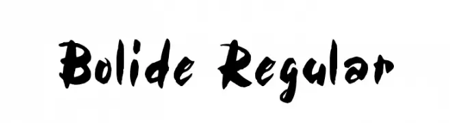
( Fonts by Rick Mueller )
A bold, hand-painted style font with dynamic and expressive characters.
![Bolide Regular font caratteri gratis]() Scaricare 802 Downloads@WebFont
Scaricare 802 Downloads@WebFont -
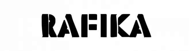
![Rafika font caratteri gratis]() Scaricare 802 Downloads@WebFont
Scaricare 802 Downloads@WebFont -
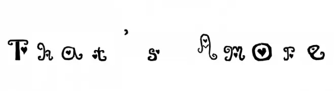
![That's Amore font caratteri gratis]() Scaricare 802 Downloads@WebFont
Scaricare 802 Downloads@WebFont -
( Fonts by Syaf Rizal - www.creativefabrica.com/ref/53/ - Personal-use only. For commercial use please contact owner. )
A fluid, cursive script font with elegant, handwritten strokes.
![Schagen font caratteri gratis]() Scaricare 801 Downloads@WebFont
Scaricare 801 Downloads@WebFont


Quali sono i font più popolari adesso?
Poppins, Roboto, Montserrat, Open Sans e Lato sono molto usati per le forme pulite e l'ampia applicabilità — dall'identità di marca alle landing page e ai poster.
Quali font si usano spesso nei loghi?
Le sans serif geometriche (es. Poppins, famiglie in stile Gotham) sono scelte comuni per un branding pulito e scalabile. Per un tocco personale restano valide script e stili manoscritti. Abbina un display deciso per i titoli a un corpo testo neutro per riconoscibilità ed equilibrio.
Ogni quanto si aggiorna la lista?
Con regolarità, in base ai download e all'attività reale. Torna spesso per scoprire in anticipo le nuove preferite.
💡 Consiglio: aggiungi ai preferiti — le tendenze cambiano in fretta e i font top di oggi possono ispirare il rebranding di domani.