Benvenuto nelle Font Più Popolari — dove popolarità e qualità si incontrano. Qui trovi i font più scaricati e usati dell'anno. Se cerchi scelte sicure per logo, web o social, inizia da qui.
Ogni font top si distingue per equilibrio, leggibilità e versatilità. Troverai sans serif moderne, script eleganti, serif vintage e display minimalisti.
-
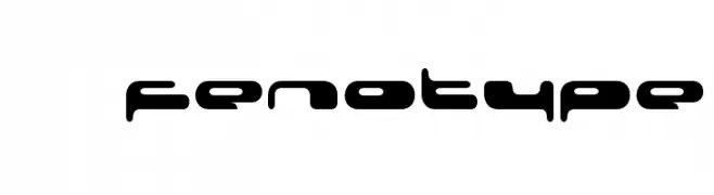
( Fonts by Fenotype - Personal-use only. For commercial use please contact owner. )
A futuristic, bold font with rounded, geometric letterforms and low contrast.
 Scaricare 183 Downloads@WebFont
 -
( Fonts by Andi Moz )
A playful, whimsical font with tall, narrow letters and decorative loops.
![Seafood font caratteri gratis]() Scaricare 183 Downloads@WebFont
Scaricare 183 Downloads@WebFont -
Caratteri di danny91194. For commercial use please contact the owner.
( July 16, 2004 – 2013 . Noger . Speed Stack )
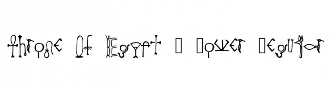
An artistic font inspired by ancient Egyptian hieroglyphs, featuring intricate and bold designs.
![Throne Of Egypt _ Lower Regular font caratteri gratis]() Scaricare 183 Downloads@WebFont
Scaricare 183 Downloads@WebFont -
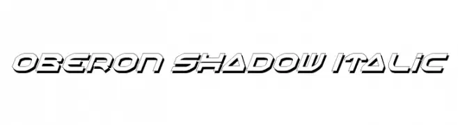
( Fonts by Daniel Zadorozny - www.iconian.com )
A bold, italicized font with a futuristic shadow effect.
![Oberon Shadow Italic font caratteri gratis]() Scaricare 183 Downloads@WebFont
Scaricare 183 Downloads@WebFont -
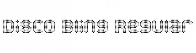
( Pixel Kitchen )
A decorative font composed of small dots, creating a retro and playful appearance.
![Disco Bling Regular font caratteri gratis]() Scaricare 183 Downloads@WebFont
Scaricare 183 Downloads@WebFont -
-
( Fonts by billyargel.blogspot.com - Billy Argel )
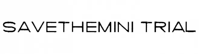
A modern, distressed font with a clean yet edgy appearance.
![SAVETHEMINI-TRIAL font caratteri gratis]() Scaricare 183 Downloads@WebFont
Scaricare 183 Downloads@WebFont -
( Fonts by Letterena Studios )
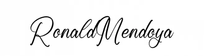
An elegant, flowing script font with smooth, cursive lines and graceful curves.
![Ronald Mendoya font caratteri gratis]() Scaricare 183 Downloads@WebFont
Scaricare 183 Downloads@WebFont -
( Fonts by Daniel Zadorozny - www.iconian.com )
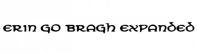
A bold, decorative font with Celtic-inspired letterforms and intricate serifs.
![Erin Go Bragh Expanded font caratteri gratis]() Scaricare 183 Downloads@WebFont
Scaricare 183 Downloads@WebFont -
( Fonts by Wino S Kadir - weknow - www.revolge.com/shop/weknow/ - Personal-use only. For commercial use please contact owner. )
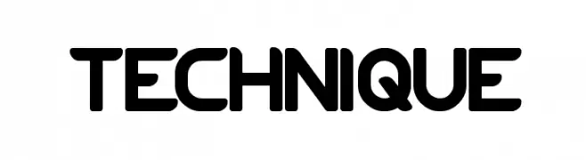
A bold, geometric font with a modern and futuristic style.
![TECHNIQUE font caratteri gratis]() Scaricare 183 Downloads@WebFont
Scaricare 183 Downloads@WebFont -
![Dreams Adventure DEMO font caratteri gratis]() Scaricare 183 Downloads@WebFont
Scaricare 183 Downloads@WebFont

Quali sono i font più popolari adesso?
Poppins, Roboto, Montserrat, Open Sans e Lato sono molto usati per le forme pulite e l'ampia applicabilità — dall'identità di marca alle landing page e ai poster.
Quali font si usano spesso nei loghi?
Le sans serif geometriche (es. Poppins, famiglie in stile Gotham) sono scelte comuni per un branding pulito e scalabile. Per un tocco personale restano valide script e stili manoscritti. Abbina un display deciso per i titoli a un corpo testo neutro per riconoscibilità ed equilibrio.
Ogni quanto si aggiorna la lista?
Con regolarità, in base ai download e all'attività reale. Torna spesso per scoprire in anticipo le nuove preferite.
💡 Consiglio: aggiungi ai preferiti — le tendenze cambiano in fretta e i font top di oggi possono ispirare il rebranding di domani.