Benvenuto nelle Font Più Popolari — dove popolarità e qualità si incontrano. Qui trovi i font più scaricati e usati dell'anno. Se cerchi scelte sicure per logo, web o social, inizia da qui.
Ogni font top si distingue per equilibrio, leggibilità e versatilità. Troverai sans serif moderne, script eleganti, serif vintage e display minimalisti.
-
( Fonts by Gerhard Helzel www.fraktur.biz )
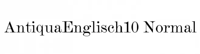
A classic serif font with high contrast and elegant serifs.
 Scaricare 792 Downloads@WebFont
 -
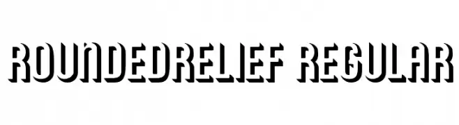
![RoundedRelief Regular font caratteri gratis]() Scaricare 792 Downloads@WebFont
Scaricare 792 Downloads@WebFont -
( Fonts by Dieter Steffmann )
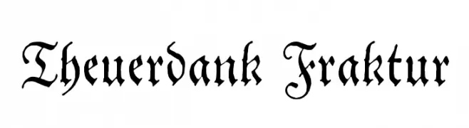
A decorative Gothic-style font with intricate, angular strokes and ornate details.
![Theuerdank Fraktur font caratteri gratis]() Scaricare 792 Downloads@WebFont
Scaricare 792 Downloads@WebFont -
( Fonts by joeBob graff-X )
A lively handwritten font with fluid, natural strokes and a playful aesthetic.
![VincHand font caratteri gratis]() Scaricare 792 Downloads@WebFont
Scaricare 792 Downloads@WebFont -
![Tia Marcia font caratteri gratis]() Scaricare 792 Downloads@WebFont
Scaricare 792 Downloads@WebFont -
( Fonts by Manfred Klein - manfred-klein.ina-mar.com )
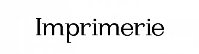
A classic serif font with elegant strokes and pronounced serifs.
![Imprimerie font caratteri gratis]() Scaricare 792 Downloads@WebFont
Scaricare 792 Downloads@WebFont -
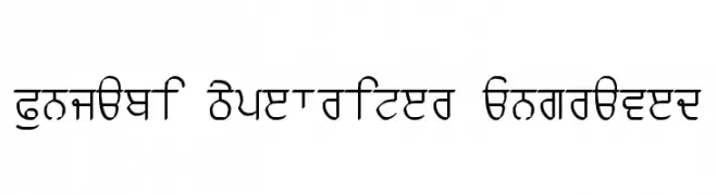
( Please check the owner website: http://www.billie.grosse.is-a-geek.com )
A bold, engraved Punjabi script with a typewriter aesthetic.
![Punjabi Typewriter Engraved font caratteri gratis]() Scaricare 792 Downloads@WebFont
Scaricare 792 Downloads@WebFont -
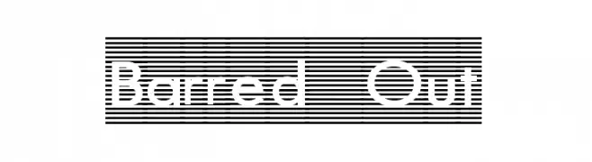
( Fonts by Graham Meade - GemFonts )
A modern, line-patterned font with geometric structure and dynamic appeal.
![Barred Out font caratteri gratis]() Scaricare 792 Downloads@WebFont
Scaricare 792 Downloads@WebFont -
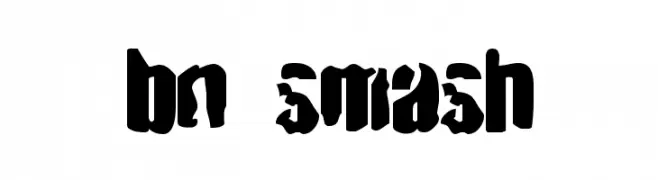
( Font by Ben Nathan - www.hafontia.com )
A bold, rugged font with a distressed, blocky design.
![BN Smash font caratteri gratis]() Scaricare 792 Downloads@WebFont
Scaricare 792 Downloads@WebFont -
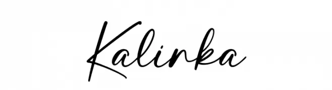
( Fonts by Ramli Setiadi - Personal-use only. For commercial use please contact owner. )
A cursive, handwritten-style font with elegant, flowing strokes.
![Kalinka font caratteri gratis]() Scaricare 791 Downloads@WebFont
Scaricare 791 Downloads@WebFont -
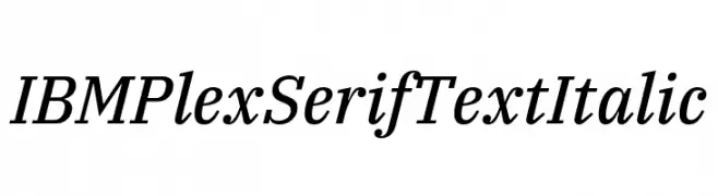
( Fonts by IBM )
A sophisticated serif font with an elegant italic style and moderate contrast.
![IBM Plex Serif Text Italic font caratteri gratis]() Scaricare 791 Downloads@WebFont
Scaricare 791 Downloads@WebFont -
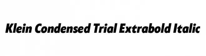
( Fonts by Zetafonts - Personal-use only. For commercial use please contact owner. )
A bold, condensed, and italic font with high contrast, ideal for impactful designs.
![Klein Condensed Trial Extrabold Italic font caratteri gratis]() Scaricare 791 Downloads@WebFont
Scaricare 791 Downloads@WebFont -
( Fonts by Alphabet&Type® - Paolo Arfelli Vannucci - Personal-use only. For commercial use please contact owner. )
A bold, geometric font with a military-inspired, authoritative style.
![TOP GUN font caratteri gratis]() Scaricare 791 Downloads@WebFont
Scaricare 791 Downloads@WebFont -
( Fonts by wep )
A bold, playful handwritten font with thick, rounded strokes.
![Decak font caratteri gratis]() Scaricare 791 Downloads@WebFont
Scaricare 791 Downloads@WebFont -
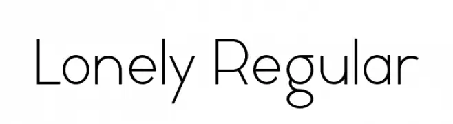
( Fonts by Vladimir Nikolic - www.creativefabrica.com/designer/vladimirnikolic/ - Personal-use only. For commercial use please contact owner. )
A modern, geometric sans-serif font with clean lines and balanced spacing.
![Lonely Regular font caratteri gratis]() Scaricare 791 Downloads@WebFont
Scaricare 791 Downloads@WebFont -
![IBSHagioGraphics font caratteri gratis]() Scaricare 791 Downloads@WebFont
Scaricare 791 Downloads@WebFont -
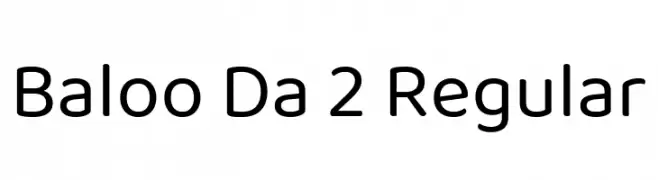
( Copyright (c) 2015 Ek Type (www.ektype.in) )
A friendly, rounded font with a playful and modern aesthetic.
![Baloo Da 2 Regular font caratteri gratis]() Scaricare 791 Downloads@WebFont
Scaricare 791 Downloads@WebFont -
( Southype - southype.com )
A playful, hand-drawn font with uneven strokes and a whimsical style.
![Afrika Safari Rebuild St font caratteri gratis]() Scaricare 791 Downloads@WebFont
Scaricare 791 Downloads@WebFont -
( Perry Mason )
A bold, stencil-style font with a vintage military aesthetic.
![AustralianFlyingCorpsStencilS font caratteri gratis]() Scaricare 791 Downloads@WebFont
Scaricare 791 Downloads@WebFont -
( Jef Triforce - Francisco Arellano - www.ixipcalli.com )
A modern, rounded sans-serif font with smooth edges and excellent readability.
![Copilme Light font caratteri gratis]() Scaricare 791 Downloads@WebFont
Scaricare 791 Downloads@WebFont -
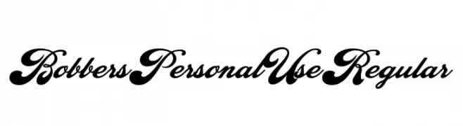
( Fonts by Billy Argel - www.billyargel.com - Personal-use only. For commercial use please contact owner. )
A bold, cursive script with high contrast and elegant flourishes.
![Bobbers Personal Use Regular font caratteri gratis]() Scaricare 791 Downloads@WebFont
Scaricare 791 Downloads@WebFont -
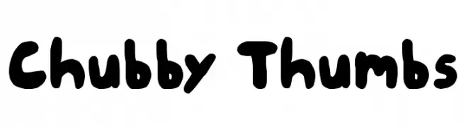
![Chubby Thumbs font caratteri gratis]() Scaricare 791 Downloads@WebFont
Scaricare 791 Downloads@WebFont -
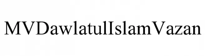
![MVDawlatulIslamVazan font caratteri gratis]() Scaricare 791 Downloads@WebFont
Scaricare 791 Downloads@WebFont -
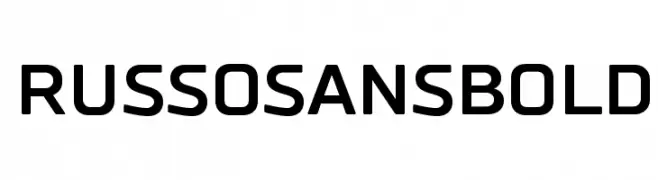
( Fonts by Jovanny Lemonad - typetype.ru - Personal-use only. For commercial use please contact owner. )
A bold, modern sans-serif font with a geometric structure.
![RussoSansBold font caratteri gratis]() Scaricare 791 Downloads@WebFont
Scaricare 791 Downloads@WebFont -
![Hussar Gothic Oblique font caratteri gratis]() Scaricare 791 Downloads@WebFont
Scaricare 791 Downloads@WebFont -
( Fonts by Goma Shin - Shintarou Nakayama www.geocities.jp/gomarice_font/ )
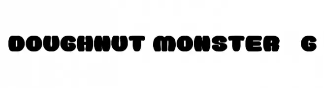
A bold, playful font with thick, rounded characters ideal for fun and whimsical designs.
![Doughnut Monster__G font caratteri gratis]() Scaricare 791 Downloads@WebFont
Scaricare 791 Downloads@WebFont -
( Free for personal use - new.myfonts.com/foundry/Intellecta_Design/?refby=paulow )
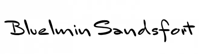
A playful, informal handwritten font with fluid, dynamic strokes.
![BluelminSandsfort font caratteri gratis]() Scaricare 791 Downloads@WebFont
Scaricare 791 Downloads@WebFont -
( Fonts by Arkandis Digital Foundry )
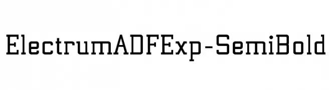
A bold, geometric font with a modern and structured design.
![ElectrumADFExp-SemiBold font caratteri gratis]() Scaricare 791 Downloads@WebFont
Scaricare 791 Downloads@WebFont -
( Fonts by Benoit Sjoholm - www.benoitsjoholm.com - All my fonts are for sale )
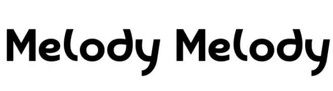
A bold, rounded font with a playful and modern aesthetic.
![Melody Melody font caratteri gratis]() Scaricare 791 Downloads@WebFont
Scaricare 791 Downloads@WebFont -
( These fonts are free to use in any private, recreational manner.For commercial go to www.flopdesign.com/fordesign/font.html )
A modern serif font with decorative elements and clean lines.
![ParismatchBright font caratteri gratis]() Scaricare 791 Downloads@WebFont
Scaricare 791 Downloads@WebFont -
![CaslonSSK Italic font caratteri gratis]() Scaricare 791 Downloads@WebFont
Scaricare 791 Downloads@WebFont -
![pastelRegular font caratteri gratis]() Scaricare 791 Downloads@WebFont
Scaricare 791 Downloads@WebFont -
![YY Uncial Most Irish font caratteri gratis]() Scaricare 791 Downloads@WebFont
Scaricare 791 Downloads@WebFont -
( Fonts by www.fontdiner.com )
A bold, distressed font with a static-like texture, perfect for impactful designs.
![Channel Tuning font caratteri gratis]() Scaricare 791 Downloads@WebFont
Scaricare 791 Downloads@WebFont -
![Console Relay font caratteri gratis]() Scaricare 791 Downloads@WebFont
Scaricare 791 Downloads@WebFont


Quali sono i font più popolari adesso?
Poppins, Roboto, Montserrat, Open Sans e Lato sono molto usati per le forme pulite e l'ampia applicabilità — dall'identità di marca alle landing page e ai poster.
Quali font si usano spesso nei loghi?
Le sans serif geometriche (es. Poppins, famiglie in stile Gotham) sono scelte comuni per un branding pulito e scalabile. Per un tocco personale restano valide script e stili manoscritti. Abbina un display deciso per i titoli a un corpo testo neutro per riconoscibilità ed equilibrio.
Ogni quanto si aggiorna la lista?
Con regolarità, in base ai download e all'attività reale. Torna spesso per scoprire in anticipo le nuove preferite.
💡 Consiglio: aggiungi ai preferiti — le tendenze cambiano in fretta e i font top di oggi possono ispirare il rebranding di domani.