Benvenuto nelle Font Più Popolari — dove popolarità e qualità si incontrano. Qui trovi i font più scaricati e usati dell'anno. Se cerchi scelte sicure per logo, web o social, inizia da qui.
Ogni font top si distingue per equilibrio, leggibilità e versatilità. Troverai sans serif moderne, script eleganti, serif vintage e display minimalisti.
-
 Scaricare 181 Downloads@WebFont
 -
![TypographerGotisch C Bold font caratteri gratis]() Scaricare 181 Downloads@WebFont
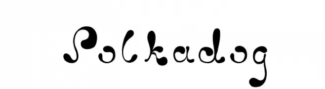
Scaricare 181 Downloads@WebFont -
![Polkadog font caratteri gratis]() Scaricare 181 Downloads@WebFont
Scaricare 181 Downloads@WebFont -
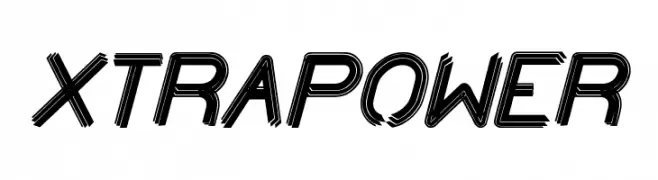
( Fonts by weknow - Wino S Kadir )
A bold, dynamic font with a three-dimensional effect and layered strokes.
![XTRAPOWER font caratteri gratis]() Scaricare 181 Downloads@WebFont
Scaricare 181 Downloads@WebFont -
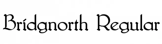
( Fonts by Typographer Mediengestaltung - Personal-use only. For commercial use please contact owner. )
A decorative font with ornate uppercase and elegant lowercase letters, blending traditional and modern styles.
![Bridgnorth Regular font caratteri gratis]() Scaricare 181 Downloads@WebFont
Scaricare 181 Downloads@WebFont -
-
( Fonts by Chequered Ink )
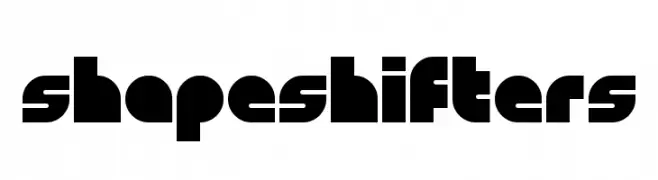
A bold, geometric font with a futuristic and modern style.
![Shapeshifters font caratteri gratis]() Scaricare 181 Downloads@WebFont
Scaricare 181 Downloads@WebFont -
( Fonts by Manfred Klein. Free for private and charity use. Free for commercial with donation to organizations )
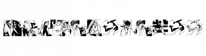
A narrative, illustrative display font featuring urban-themed sketches for each character.
![PabloInTownA font caratteri gratis]() Scaricare 181 Downloads@WebFont
Scaricare 181 Downloads@WebFont -
( Fonts by Daniel Zadorozny - www.iconian.com )
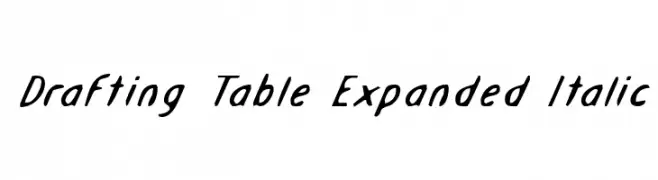
A dynamic, italicized font with expanded letterforms and smooth strokes.
![Drafting Table Expanded Italic font caratteri gratis]() Scaricare 181 Downloads@WebFont
Scaricare 181 Downloads@WebFont -
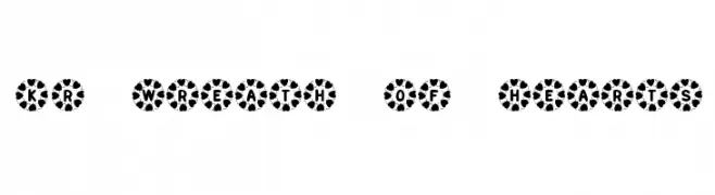
![KR Wreath Of Hearts font caratteri gratis]() Scaricare 181 Downloads@WebFont
Scaricare 181 Downloads@WebFont -
( Fonts by wepfont - Wahyu Eka Prasetya - Personal-use only. For commercial use please contact owner. )
A lively and flowing script font with elegant, cursive letterforms.
![Awake_Hearts` font caratteri gratis]() Scaricare 181 Downloads@WebFont
Scaricare 181 Downloads@WebFont


Quali sono i font più popolari adesso?
Poppins, Roboto, Montserrat, Open Sans e Lato sono molto usati per le forme pulite e l'ampia applicabilità — dall'identità di marca alle landing page e ai poster.
Quali font si usano spesso nei loghi?
Le sans serif geometriche (es. Poppins, famiglie in stile Gotham) sono scelte comuni per un branding pulito e scalabile. Per un tocco personale restano valide script e stili manoscritti. Abbina un display deciso per i titoli a un corpo testo neutro per riconoscibilità ed equilibrio.
Ogni quanto si aggiorna la lista?
Con regolarità, in base ai download e all'attività reale. Torna spesso per scoprire in anticipo le nuove preferite.
💡 Consiglio: aggiungi ai preferiti — le tendenze cambiano in fretta e i font top di oggi possono ispirare il rebranding di domani.