Benvenuto nelle Font Più Popolari — dove popolarità e qualità si incontrano. Qui trovi i font più scaricati e usati dell'anno. Se cerchi scelte sicure per logo, web o social, inizia da qui.
Ogni font top si distingue per equilibrio, leggibilità e versatilità. Troverai sans serif moderne, script eleganti, serif vintage e display minimalisti.
-
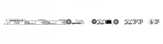
( Fonts by Jeff Levine. FREEWARE )
A playful collection of game-themed symbols for decorative use.
 Scaricare 180 Downloads@WebFont
 -
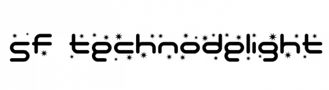
( Fonts by ShyFonts )
A futuristic, geometric font with decorative star-like accents.
![SF Technodelight font caratteri gratis]() Scaricare 180 Downloads@WebFont
Scaricare 180 Downloads@WebFont -
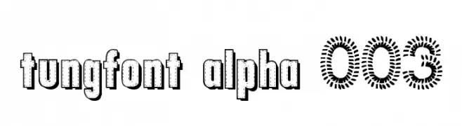
![tungfont alpha 003 font caratteri gratis]() Scaricare 180 Downloads@WebFont
Scaricare 180 Downloads@WebFont -
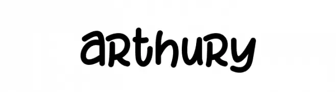
( Fonts by HandletterYean )
A playful, handwritten font with smooth, rounded edges and a casual style.
![arthury font caratteri gratis]() Scaricare 180 Downloads@WebFont
Scaricare 180 Downloads@WebFont -
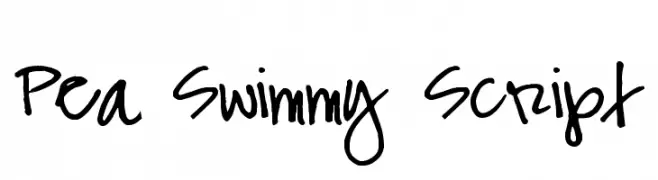
( Free for a personal use. For a commercial use please visit www.kevinandamanda.com )
A bold, handwritten script font with a playful and dynamic style.
![Pea Swimmy Script font caratteri gratis]() Scaricare 180 Downloads@WebFont
Scaricare 180 Downloads@WebFont -
-
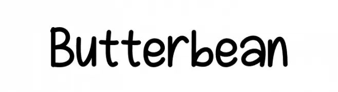
( Fonts by Sandylukee )
A playful, rounded handwritten font with smooth curves and a friendly appearance.
![Butterbean font caratteri gratis]() Scaricare 180 Downloads@WebFont
Scaricare 180 Downloads@WebFont -
![Lupanesque font caratteri gratis]() Scaricare 180 Downloads@WebFont
Scaricare 180 Downloads@WebFont -
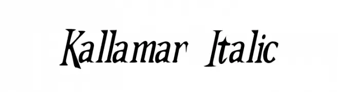
( Fonts by Omega Font Labs )
An elegant italic font with dynamic curves and sharp serifs.
![Kallamar Italic font caratteri gratis]() Scaricare 180 Downloads@WebFont
Scaricare 180 Downloads@WebFont -
( Fonts by Omnibus Type )
A modern, semi-condensed, bold italic font with high contrast and tight spacing.
![Saira SemiCondensed Bold Italic font caratteri gratis]() Scaricare 180 Downloads@WebFont
Scaricare 180 Downloads@WebFont -
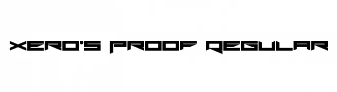
( Fonts by Andrew McCluskey - nalgames.com )
A futuristic, angular font with sharp edges and geometric shapes.
![Xero's Proof Regular font caratteri gratis]() Scaricare 180 Downloads@WebFont
Scaricare 180 Downloads@WebFont

Quali sono i font più popolari adesso?
Poppins, Roboto, Montserrat, Open Sans e Lato sono molto usati per le forme pulite e l'ampia applicabilità — dall'identità di marca alle landing page e ai poster.
Quali font si usano spesso nei loghi?
Le sans serif geometriche (es. Poppins, famiglie in stile Gotham) sono scelte comuni per un branding pulito e scalabile. Per un tocco personale restano valide script e stili manoscritti. Abbina un display deciso per i titoli a un corpo testo neutro per riconoscibilità ed equilibrio.
Ogni quanto si aggiorna la lista?
Con regolarità, in base ai download e all'attività reale. Torna spesso per scoprire in anticipo le nuove preferite.
💡 Consiglio: aggiungi ai preferiti — le tendenze cambiano in fretta e i font top di oggi possono ispirare il rebranding di domani.