Benvenuto nelle Font Più Popolari — dove popolarità e qualità si incontrano. Qui trovi i font più scaricati e usati dell'anno. Se cerchi scelte sicure per logo, web o social, inizia da qui.
Ogni font top si distingue per equilibrio, leggibilità e versatilità. Troverai sans serif moderne, script eleganti, serif vintage e display minimalisti.
-
 Scaricare 179 Downloads@WebFont
 -
( Fonts by www.fontalicious.com )
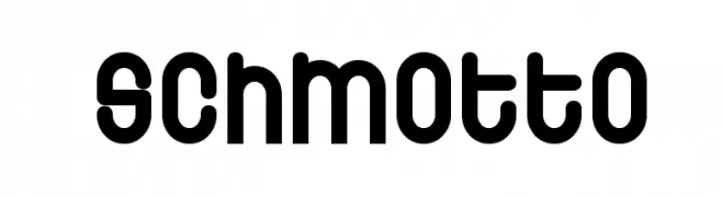
A bold, rounded font with a playful and modern aesthetic.
![Schmotto font caratteri gratis]() Scaricare 179 Downloads@WebFont
Scaricare 179 Downloads@WebFont -
( Fonts by Iconian Fonts )
A bold, condensed, and italic font with a dynamic and energetic style.
![Governor Condensed Italic font caratteri gratis]() Scaricare 179 Downloads@WebFont
Scaricare 179 Downloads@WebFont -
( Fonts by MCKL )
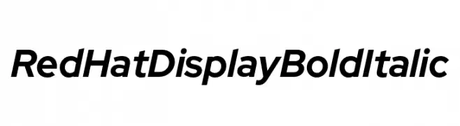
A bold, italicized font with a modern and dynamic style.
![Red Hat Display Bold Italic font caratteri gratis]() Scaricare 179 Downloads@WebFont
Scaricare 179 Downloads@WebFont -
Caratteri di Qbotype. For commercial use please contact the owner.
( Fonts by www.phuxerdesigns.com.ar - Non-commercial use of any typeface free version, only buying the full version )
A bold, textured brush-style font with an artistic, hand-drawn appearance.
![Oxin Brush font caratteri gratis]() Scaricare 179 Downloads@WebFont
Scaricare 179 Downloads@WebFont -
-
![Fedyral font caratteri gratis]() Scaricare 179 Downloads
Scaricare 179 Downloads -
( Fonts by Divide By Zero! - fonts.tom7.com )
A bold, decorative font with a unique outline style and high contrast.
![Technetium font caratteri gratis]() Scaricare 179 Downloads@WebFont
Scaricare 179 Downloads@WebFont -
( 7NTypes - Situjuh Nazara - 7ntypes.com )
A modern, bold, and italicized font with a sleek and dynamic appearance.
![LearnShareColaborate-BoldItalic font caratteri gratis]() Scaricare 179 Downloads@WebFont
Scaricare 179 Downloads@WebFont -
( Måns Grebäck - www.mansgreback.com )
A bold, modern sans-serif font with smooth, rounded edges and consistent character spacing.
![Kandira PERSONAL Bold font caratteri gratis]() Scaricare 179 Downloads@WebFont
Scaricare 179 Downloads@WebFont -
( Fonts by David Rakowski )
A classic serif font with high contrast and elegant, sharp serifs.
![Jumble Plain font caratteri gratis]() Scaricare 179 Downloads@WebFont
Scaricare 179 Downloads@WebFont


Quali sono i font più popolari adesso?
Poppins, Roboto, Montserrat, Open Sans e Lato sono molto usati per le forme pulite e l'ampia applicabilità — dall'identità di marca alle landing page e ai poster.
Quali font si usano spesso nei loghi?
Le sans serif geometriche (es. Poppins, famiglie in stile Gotham) sono scelte comuni per un branding pulito e scalabile. Per un tocco personale restano valide script e stili manoscritti. Abbina un display deciso per i titoli a un corpo testo neutro per riconoscibilità ed equilibrio.
Ogni quanto si aggiorna la lista?
Con regolarità, in base ai download e all'attività reale. Torna spesso per scoprire in anticipo le nuove preferite.
💡 Consiglio: aggiungi ai preferiti — le tendenze cambiano in fretta e i font top di oggi possono ispirare il rebranding di domani.