Benvenuto nelle Font Più Popolari — dove popolarità e qualità si incontrano. Qui trovi i font più scaricati e usati dell'anno. Se cerchi scelte sicure per logo, web o social, inizia da qui.
Ogni font top si distingue per equilibrio, leggibilità e versatilità. Troverai sans serif moderne, script eleganti, serif vintage e display minimalisti.
-
( Copyright (c) 2011, Cyreal (www.cyreal.org) )
A modern, sleek font with sharp angles and smooth curves.
 Scaricare 780 Downloads@WebFont
 -
( Fonts by www.DigitalDreamDesign.net )
A bold, geometric font with a futuristic, outlined style.
![D3 Cosmism Katakana font caratteri gratis]() Scaricare 780 Downloads@WebFont
Scaricare 780 Downloads@WebFont -
![Fuuka font caratteri gratis]() Scaricare 780 Downloads@WebFont
Scaricare 780 Downloads@WebFont -
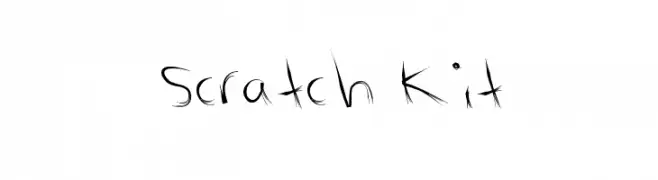
![Scratch Kit font caratteri gratis]() Scaricare 780 Downloads@WebFont
Scaricare 780 Downloads@WebFont -
![AI hellvertigo font caratteri gratis]() Scaricare 780 Downloads@WebFont
Scaricare 780 Downloads@WebFont -
( Fonts by Graham Meade - GemFonts )
A bold, decorative font with high contrast and intricate details.
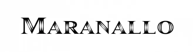
![Maranallo font caratteri gratis]() Scaricare 780 Downloads@WebFont
Scaricare 780 Downloads@WebFont -
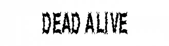
( Fonts by Spork Thug Typography - Josh Wilhelm - www.lifewithouttaffy.com/taffy/blog )
A decorative, horror-themed font with jagged, distressed characters.
![Dead Alive font caratteri gratis]() Scaricare 780 Downloads@WebFont
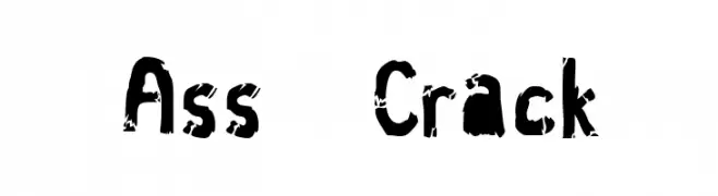
Scaricare 780 Downloads@WebFont -
![Ass Crack font caratteri gratis]() Scaricare 780 Downloads@WebFont
Scaricare 780 Downloads@WebFont -
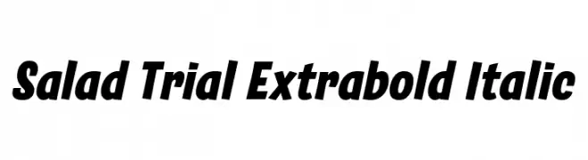
( Fonts by Zetafonts )
A bold, italic font with a dynamic and modern style.
![Salad Trial Extrabold Italic font caratteri gratis]() Scaricare 779 Downloads@WebFont
Scaricare 779 Downloads@WebFont -
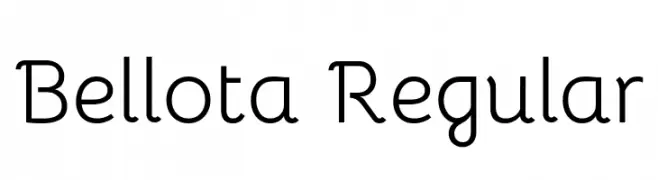
( Copyright 2019 The Bellota Project Authors (https://github.com/kemie/Bellota-Font) )
A playful and friendly font with rounded edges and smooth curves.
![Bellota Regular font caratteri gratis]() Scaricare 779 Downloads@WebFont
Scaricare 779 Downloads@WebFont -
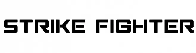
( Fonts by Iconian Fonts )
Bold, geometric font with a futuristic, industrial style.
![Strike Fighter font caratteri gratis]() Scaricare 779 Downloads@WebFont
Scaricare 779 Downloads@WebFont -
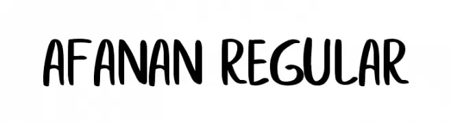
![afanan Regular font caratteri gratis]() Scaricare 779 Downloads@WebFont
Scaricare 779 Downloads@WebFont -
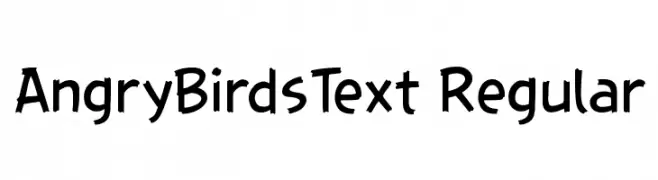
Caratteri di HeartBolt499. For commercial use please contact the owner.
![AngryBirdsText Regular font caratteri gratis]() Scaricare 779 Downloads@WebFont
Scaricare 779 Downloads@WebFont -
( Fonts by Antipixel )
A bold, textured sans-serif font with a stamped, vintage look.
![Austral Sans Stamp Regular font caratteri gratis]() Scaricare 779 Downloads@WebFont
Scaricare 779 Downloads@WebFont -
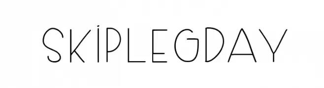
( www.dilemakiner.com )
A modern, geometric font with thin lines and a minimalist design.
![SkipLegDay font caratteri gratis]() Scaricare 779 Downloads@WebFont
Scaricare 779 Downloads@WebFont -
![Km Standard TT Bold font caratteri gratis]() Scaricare 779 Downloads@WebFont
Scaricare 779 Downloads@WebFont -
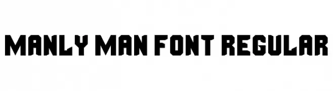
( Fonts by Andrew McCluskey - nalgames.com )
A bold, geometric font with a strong, masculine aesthetic.
![Manly Man Font Regular font caratteri gratis]() Scaricare 779 Downloads@WebFont
Scaricare 779 Downloads@WebFont -
![Hand of JJ font caratteri gratis]() Scaricare 779 Downloads@WebFont
Scaricare 779 Downloads@WebFont -
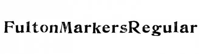
( Fonts by www.abecedarienne.com )
A bold, distressed font with a vintage, textured appearance.
![FultonMarkersRegular font caratteri gratis]() Scaricare 779 Downloads@WebFont
Scaricare 779 Downloads@WebFont -
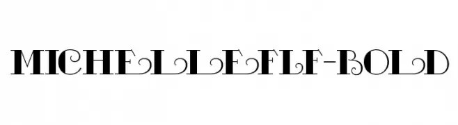
( Fonts by Casady & Greene )
A bold, decorative font with elegant swirls and flourishes.
![MichelleFLF-Bold font caratteri gratis]() Scaricare 779 Downloads@WebFont
Scaricare 779 Downloads@WebFont -
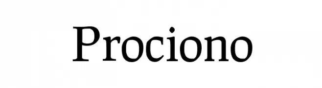
( Copyright (c) 2011, Barry Schwartz (chemoelectric@chemoelectric.org) )
A classic serif font with medium contrast and elegant, traditional elements.
![Prociono font caratteri gratis]() Scaricare 779 Downloads@WebFont
Scaricare 779 Downloads@WebFont -
( THESE ARE SHAREWARE FONTS ! NOT FREEWARE ! PLEASE VISIT www.fuelfonts.com )
A modern, geometric font with a futuristic and sleek design.
![dipdop font caratteri gratis]() Scaricare 779 Downloads@WebFont
Scaricare 779 Downloads@WebFont -
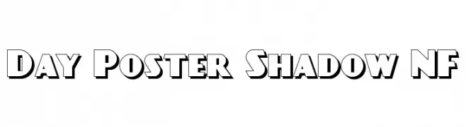
( Fonts by Nick Curtis - www.nicksfonts.com )
A bold, three-dimensional font with a vintage shadow effect.
![Day Poster Shadow NF font caratteri gratis]() Scaricare 779 Downloads@WebFont
Scaricare 779 Downloads@WebFont -
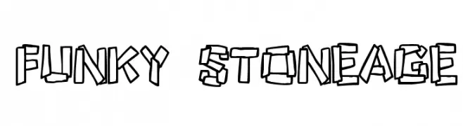
( Fonts by Jacob Fisher - www.pizzadude.dk )
A playful, rugged font with a hand-carved, stone-like appearance.
![Funky Stoneage font caratteri gratis]() Scaricare 779 Downloads@WebFont
Scaricare 779 Downloads@WebFont -
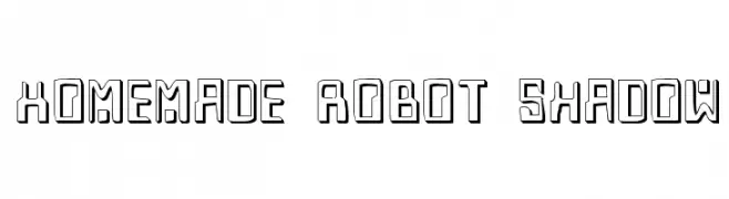
( Fonts by Daniel Zadorozny - www.iconian.com )
A bold, futuristic font with a shadow effect and geometric design.
![Homemade Robot Shadow font caratteri gratis]() Scaricare 779 Downloads@WebFont
Scaricare 779 Downloads@WebFont -
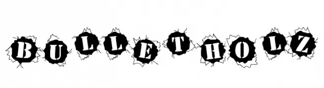
( Fonts by Paul Reid - tracertong.co.uk )
A bold, bullet hole-themed font with high contrast and dramatic impact.
![BulletHolz font caratteri gratis]() Scaricare 779 Downloads
Scaricare 779 Downloads -
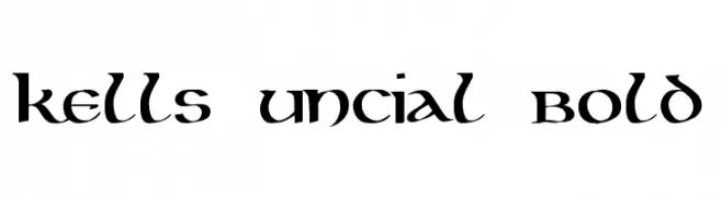
( Fonts by Digital Graphics Labs - www.digitalgraphiclabs.com )
A bold, uncial-style font with medieval influences and dynamic character shapes.
![Kells Uncial Bold font caratteri gratis]() Scaricare 779 Downloads@WebFont
Scaricare 779 Downloads@WebFont -
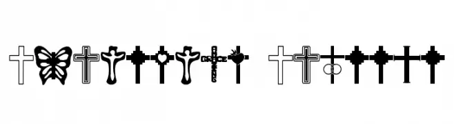
( Fonts by uatype.faithweb.com - UnAuthorized Type )
A decorative symbol font with diverse Christian cross designs.
![Christian Crosses font caratteri gratis]() Scaricare 779 Downloads@WebFont
Scaricare 779 Downloads@WebFont -
( Fonts by www.matchfonts.com - Michel Bujardet )
A festive, candy cane-themed decorative font with bold, striped characters.
![Candy Cane [Unregistered] font caratteri gratis]() Scaricare 779 Downloads@WebFont
Scaricare 779 Downloads@WebFont -
( Collection of Korean web fonts - Personal-use only. For commercial use please contact owner. )
A playful and casual handwritten font with smooth, rounded letterforms.
![GodoM font caratteri gratis]() Scaricare 778 Downloads@WebFont
Scaricare 778 Downloads@WebFont -
( Fonts by Andi Moz )
A playful and elegant script font with flowing cursive letters and decorative swirls.
![Sendday font caratteri gratis]() Scaricare 778 Downloads@WebFont
Scaricare 778 Downloads@WebFont -
( Fonts by GreyWolf Webworks - www.greywolfwebworks.com - Personal-use only. For commercial use please contact owner. )
A bold, vintage-style serif font with high contrast and dramatic serifs.
![Pointedly Mad font caratteri gratis]() Scaricare 778 Downloads@WebFont
Scaricare 778 Downloads@WebFont -
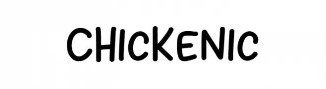
( Fonts by Khurasan )
A playful, handwritten font with rounded edges and a casual, friendly style.
![Chickenic font caratteri gratis]() Scaricare 778 Downloads@WebFont
Scaricare 778 Downloads@WebFont -
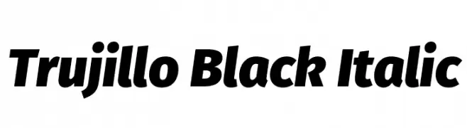
( Fonts by Fira Sans original fonts by bBox Type GmbH, Carrois Corporate GbR, & Edenspiekermann AG / Changes by Cristiano Sobral - Personal-use only. For commercial use please contact owner. )
A bold, italic font with strong strokes and dynamic style.
![Trujillo Black Italic font caratteri gratis]() Scaricare 778 Downloads@WebFont
Scaricare 778 Downloads@WebFont -
( Copyright (c) 2015 Ek Type (www.ektype.in) )
A playful, rounded font with smooth curves and a modern feel.
![Baloo Tamma 2 Regular font caratteri gratis]() Scaricare 778 Downloads@WebFont
Scaricare 778 Downloads@WebFont


![Candy Cane [Unregistered] font caratteri gratis](https://d144mzi0q5mijx.cloudfront.net/img/C/A/Candy-Cane-Unregistered.webp)


Quali sono i font più popolari adesso?
Poppins, Roboto, Montserrat, Open Sans e Lato sono molto usati per le forme pulite e l'ampia applicabilità — dall'identità di marca alle landing page e ai poster.
Quali font si usano spesso nei loghi?
Le sans serif geometriche (es. Poppins, famiglie in stile Gotham) sono scelte comuni per un branding pulito e scalabile. Per un tocco personale restano valide script e stili manoscritti. Abbina un display deciso per i titoli a un corpo testo neutro per riconoscibilità ed equilibrio.
Ogni quanto si aggiorna la lista?
Con regolarità, in base ai download e all'attività reale. Torna spesso per scoprire in anticipo le nuove preferite.
💡 Consiglio: aggiungi ai preferiti — le tendenze cambiano in fretta e i font top di oggi possono ispirare il rebranding di domani.