Benvenuto nelle Font Più Popolari — dove popolarità e qualità si incontrano. Qui trovi i font più scaricati e usati dell'anno. Se cerchi scelte sicure per logo, web o social, inizia da qui.
Ogni font top si distingue per equilibrio, leggibilità e versatilità. Troverai sans serif moderne, script eleganti, serif vintage e display minimalisti.
-
 Scaricare 771 Downloads@WebFont
 -
Caratteri di danny91194. For commercial use please contact the owner.
( nnnn )
A decorative, symbolic font with alchemical and mystical motifs.
![Alchemist Symbols font caratteri gratis]() Scaricare 771 Downloads@WebFont
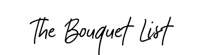
Scaricare 771 Downloads@WebFont -
![The Bouquet List font caratteri gratis]() Scaricare 771 Downloads@WebFont
Scaricare 771 Downloads@WebFont -
( Fonts by www.chequered.ink - Chequered Ink - Personal-use only. For commercial use please contact owner. )
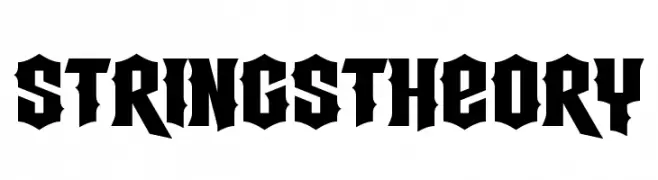
A bold, gothic-inspired font with sharp, angular edges and high contrast.
![Strings Theory font caratteri gratis]() Scaricare 771 Downloads@WebFont
Scaricare 771 Downloads@WebFont -
( Fonts by Agathe M.Joyce - www.foundmyfont.com - Personal-use only. For commercial use please contact owner. )
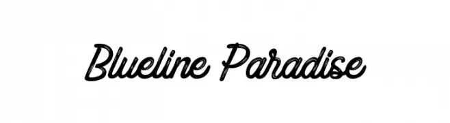
A dynamic and flowing script font with elegant, slightly slanted letterforms.
![Blueline Paradise font caratteri gratis]() Scaricare 771 Downloads@WebFont
Scaricare 771 Downloads@WebFont -
Caratteri di NicholasJudy456. For commercial use please contact the owner.
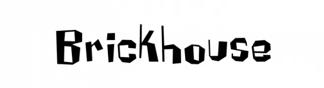
![Brickhouse font caratteri gratis]() Scaricare 771 Downloads@WebFont
Scaricare 771 Downloads@WebFont -
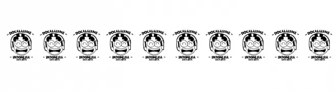
( Fonts by Docallisme HAS - Ryal - docallisme.blogspot.com - Personal-use only. For commercial use please contact owner. )
Playful, rounded sans-serif with a bold, cartoonish style.
![THE-MINION font caratteri gratis]() Scaricare 771 Downloads@WebFont
Scaricare 771 Downloads@WebFont -
![Elis font caratteri gratis]() Scaricare 771 Downloads@WebFont
Scaricare 771 Downloads@WebFont -
![Dessin123 font caratteri gratis]() Scaricare 771 Downloads@WebFont
Scaricare 771 Downloads@WebFont -
![BLUE CHUCKS font caratteri gratis]() Scaricare 771 Downloads@WebFont
Scaricare 771 Downloads@WebFont -
![Antique Font by Marta van Eck CU font caratteri gratis]() Scaricare 771 Downloads@WebFont
Scaricare 771 Downloads@WebFont -
( Fonts by Maelle.K - Thomas Boucherie )
A decorative script font with elegant curves and artistic flair.
![RoyaChicken font caratteri gratis]() Scaricare 771 Downloads@WebFont
Scaricare 771 Downloads@WebFont -
( Fonts by Vanessa Bays - bythebutterfly.com )
A playful, casual handwritten font with smooth, rounded edges.
![expressions of the soul font caratteri gratis]() Scaricare 771 Downloads@WebFont
Scaricare 771 Downloads@WebFont -
( Fonts by Castcraft Software - opti.netii.net - check the website before use )
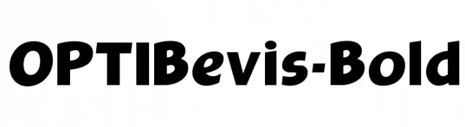
A bold, impactful font with strong, thick strokes and a slight curvature for added softness.
![OPTIBevis-Bold font caratteri gratis]() Scaricare 771 Downloads@WebFont
Scaricare 771 Downloads@WebFont -
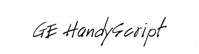
![GE HandyScript font caratteri gratis]() Scaricare 771 Downloads@WebFont
Scaricare 771 Downloads@WebFont -
( Fonts by Jonathan Harris - www.tattoowoo.com )
A bold, fluid script font with elegant, connected strokes and high contrast.
![Good Day font caratteri gratis]() Scaricare 771 Downloads@WebFont
Scaricare 771 Downloads@WebFont -
![Maya font caratteri gratis]() Scaricare 771 Downloads@WebFont
Scaricare 771 Downloads@WebFont -
( Fonts by Paul Reid - tracertong.co.uk )
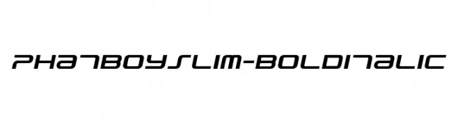
A bold, italicized font with a modern, geometric style.
![PhatBoySlim-BoldItalic font caratteri gratis]() Scaricare 771 Downloads@WebFont
Scaricare 771 Downloads@WebFont -
( Fonts by Nick Curtis - www.nicksfonts.com )
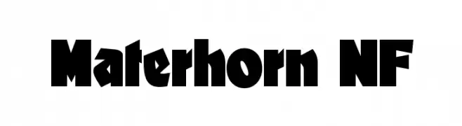
A bold, dynamic font with thick strokes and a strong visual impact.
![Materhorn NF font caratteri gratis]() Scaricare 771 Downloads@WebFont
Scaricare 771 Downloads@WebFont -
( Fonts by Astigmatic One Eye Typographic Institute - Brian J. Bonislawsky - astigmatic.com )
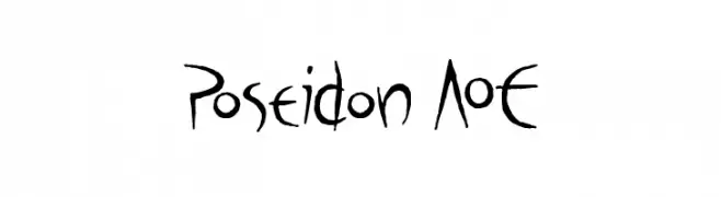
A hand-drawn, artistic font with elongated strokes and whimsical character shapes.
![Poseidon AOE font caratteri gratis]() Scaricare 771 Downloads@WebFont
Scaricare 771 Downloads@WebFont -
( Fonts by Nick Curtis - www.nicksfonts.com )
A bold, angular serif font with a modern edge.
![Not Mary Kate NF font caratteri gratis]() Scaricare 771 Downloads@WebFont
Scaricare 771 Downloads@WebFont -
( Fonts by www.stimuleyefonts.com )
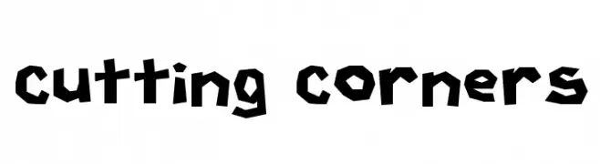
A bold, angular font with sharp, irregular edges for a modern, dynamic look.
![Cutting Corners font caratteri gratis]() Scaricare 771 Downloads@WebFont
Scaricare 771 Downloads@WebFont -
( Fonts by Galdino Otten Fonts - www.galdinootten.com - Personal-use only. For commercial use please contact owner. )
A bold, distressed font with an eroded, vintage texture.
![Fine Eroded font caratteri gratis]() Scaricare 770 Downloads@WebFont
Scaricare 770 Downloads@WebFont -
( Fonts by Gesine Todt )
A modern sans-serif font with geometric and elegant curves.
![Snippet font caratteri gratis]() Scaricare 770 Downloads@WebFont
Scaricare 770 Downloads@WebFont -
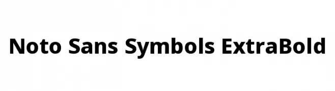
( Noto is a trademark of Google Inc. Noto fonts are open source. All Noto fonts are published under the SIL Open Font License, Version 1.1 )
A robust, extra bold sans-serif typeface with a modern and professional look.
![Noto Sans Symbols ExtraBold font caratteri gratis]() Scaricare 770 Downloads@WebFont
Scaricare 770 Downloads@WebFont -
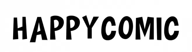
![HAPPY COMIC font caratteri gratis]() Scaricare 770 Downloads@WebFont
Scaricare 770 Downloads@WebFont -
( imagex - www.imagex-fonts.com )
A bold, halftone-patterned font with a vintage, retro feel.
![Halftoned Backup font caratteri gratis]() Scaricare 770 Downloads@WebFont
Scaricare 770 Downloads@WebFont -
( Sahirul Iman - creativemarket.com/nami_studio )
A bold, geometric font with angular, blocky letterforms.
![Dagestan font caratteri gratis]() Scaricare 770 Downloads@WebFont
Scaricare 770 Downloads@WebFont -
( Måns Grebäck - www.mansgreback.com )
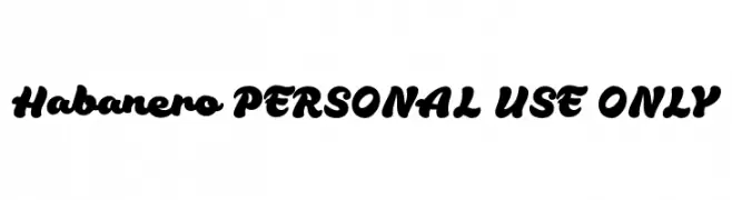
A bold, flowing script font with connected characters and dynamic style.
![Habanero PERSONAL USE ONLY font caratteri gratis]() Scaricare 770 Downloads@WebFont
Scaricare 770 Downloads@WebFont -
( Emtheen Studio - Muhammad Dimas - instagram.com/dimsngrho )
A playful, handwritten font with flowing, slightly irregular letterforms.
![Menulist Beauty font caratteri gratis]() Scaricare 770 Downloads@WebFont
Scaricare 770 Downloads@WebFont -
Caratteri di joorgemoron. For commercial use please contact the owner.
( Free for personal use. )
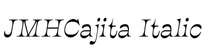
An elegant italic serif font with dynamic curves and sharp serifs.
![JMHCajita-Italic font caratteri gratis]() Scaricare 770 Downloads@WebFont
Scaricare 770 Downloads@WebFont -
( Fonts by Daniel Zadorozny - www.iconian.com )
A bold, semi-italic font with a modern, angular design.
![Eurofighter Semi-Italic font caratteri gratis]() Scaricare 770 Downloads@WebFont
Scaricare 770 Downloads@WebFont -
( Fonts by Daniel Zadorozny - www.iconian.com - Free for personal use )
A bold, angular font with a futuristic and strong design.
![Modi Thorson Regular font caratteri gratis]() Scaricare 770 Downloads@WebFont
Scaricare 770 Downloads@WebFont -
![Neovix Basic Bold font caratteri gratis]() Scaricare 770 Downloads@WebFont
Scaricare 770 Downloads@WebFont -
( Fonts by Andrew McCluskey - nalgames.com )
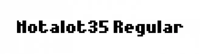
A bold, pixelated font with a retro digital aesthetic.
![Notalot35 Regular font caratteri gratis]() Scaricare 770 Downloads@WebFont
Scaricare 770 Downloads@WebFont


Quali sono i font più popolari adesso?
Poppins, Roboto, Montserrat, Open Sans e Lato sono molto usati per le forme pulite e l'ampia applicabilità — dall'identità di marca alle landing page e ai poster.
Quali font si usano spesso nei loghi?
Le sans serif geometriche (es. Poppins, famiglie in stile Gotham) sono scelte comuni per un branding pulito e scalabile. Per un tocco personale restano valide script e stili manoscritti. Abbina un display deciso per i titoli a un corpo testo neutro per riconoscibilità ed equilibrio.
Ogni quanto si aggiorna la lista?
Con regolarità, in base ai download e all'attività reale. Torna spesso per scoprire in anticipo le nuove preferite.
💡 Consiglio: aggiungi ai preferiti — le tendenze cambiano in fretta e i font top di oggi possono ispirare il rebranding di domani.