Benvenuto nelle Font Più Popolari — dove popolarità e qualità si incontrano. Qui trovi i font più scaricati e usati dell'anno. Se cerchi scelte sicure per logo, web o social, inizia da qui.
Ogni font top si distingue per equilibrio, leggibilità e versatilità. Troverai sans serif moderne, script eleganti, serif vintage e display minimalisti.
-
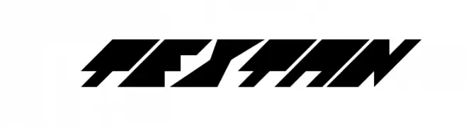
( Fonts by Apostrophic Lab )
A bold, angular font with a futuristic and dynamic design.
 Scaricare 168 Downloads@WebFont
 -
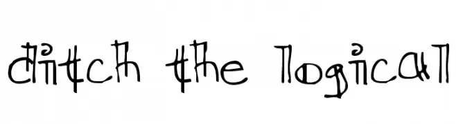
( Fonts by Kreative Korporation - www.kreativekorp.com )
A playful, whimsical handwritten font with irregular, quirky letterforms.
![Ditch the Logical font caratteri gratis]() Scaricare 168 Downloads@WebFont
Scaricare 168 Downloads@WebFont -
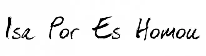
( Fonts by Roland Huse - rolandhuse.com )
A bold, expressive handwritten font with dynamic brush strokes.
![Isa Por Es Homou font caratteri gratis]() Scaricare 168 Downloads@WebFont
Scaricare 168 Downloads@WebFont -
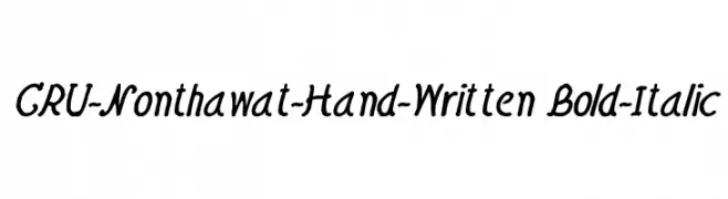
![CRU-Nonthawat-Hand-Written Bold-Italic font caratteri gratis]() Scaricare 168 Downloads@WebFont
Scaricare 168 Downloads@WebFont -
![Gad Thin Normal font caratteri gratis]() Scaricare 168 Downloads
Scaricare 168 Downloads -
-
( Fonts by IBM )
A modern, semi-bold, italic sans-serif font with a clean and geometric design.
![IBM Plex Sans SemiBold Italic font caratteri gratis]() Scaricare 168 Downloads@WebFont
Scaricare 168 Downloads@WebFont -
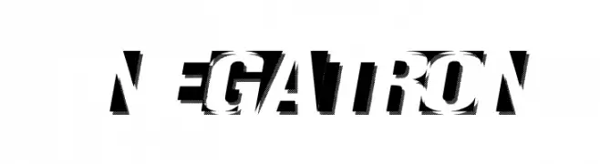
( Fonts by Kirk Shelton - www.kirkshelton.com )
A bold, glitch-effect font with a futuristic and dynamic style.
![Negatron font caratteri gratis]() Scaricare 168 Downloads@WebFont
Scaricare 168 Downloads@WebFont -
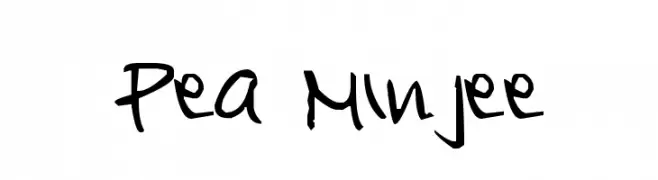
( Free for a personal use. For a commercial use please visit www.kevinandamanda.com )
A playful, handwritten font with fluid and dynamic strokes.
![Pea Minjee font caratteri gratis]() Scaricare 168 Downloads@WebFont
Scaricare 168 Downloads@WebFont -
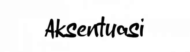
( Fonts by wepfont - Wahyu Eka Prasetya - Personal-use only. For commercial use please contact owner. )
A bold, expressive handwritten font with dynamic strokes.
![Aksentuasi font caratteri gratis]() Scaricare 168 Downloads@WebFont
Scaricare 168 Downloads@WebFont -
( Fonts by Renato Forster - forster.im - Personal-use only. For commercial use please contact owner. )
A modern, geometric font with thin, consistent strokes and subtle curves.
![NoType font caratteri gratis]() Scaricare 168 Downloads@WebFont
Scaricare 168 Downloads@WebFont


Quali sono i font più popolari adesso?
Poppins, Roboto, Montserrat, Open Sans e Lato sono molto usati per le forme pulite e l'ampia applicabilità — dall'identità di marca alle landing page e ai poster.
Quali font si usano spesso nei loghi?
Le sans serif geometriche (es. Poppins, famiglie in stile Gotham) sono scelte comuni per un branding pulito e scalabile. Per un tocco personale restano valide script e stili manoscritti. Abbina un display deciso per i titoli a un corpo testo neutro per riconoscibilità ed equilibrio.
Ogni quanto si aggiorna la lista?
Con regolarità, in base ai download e all'attività reale. Torna spesso per scoprire in anticipo le nuove preferite.
💡 Consiglio: aggiungi ai preferiti — le tendenze cambiano in fretta e i font top di oggi possono ispirare il rebranding di domani.