Benvenuto nelle Font Più Popolari — dove popolarità e qualità si incontrano. Qui trovi i font più scaricati e usati dell'anno. Se cerchi scelte sicure per logo, web o social, inizia da qui.
Ogni font top si distingue per equilibrio, leggibilità e versatilità. Troverai sans serif moderne, script eleganti, serif vintage e display minimalisti.
-
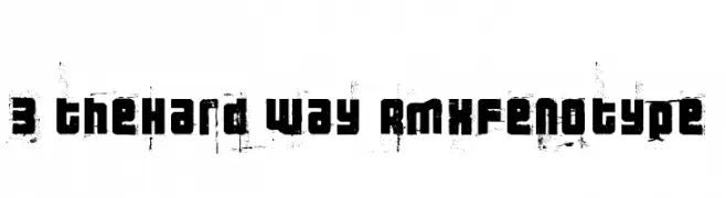
( Fonts by Emil Bertell - www.fenotype.com )
A bold, distressed font with a gritty, urban aesthetic.
 Scaricare 746 Downloads@WebFont
 -
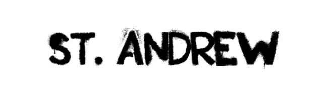
( Fonts by Andrew Hart - dirt2.com )
A bold, hand-painted font with a rough, textured appearance.
![St. Andrew font caratteri gratis]() Scaricare 746 Downloads@WebFont
Scaricare 746 Downloads@WebFont -
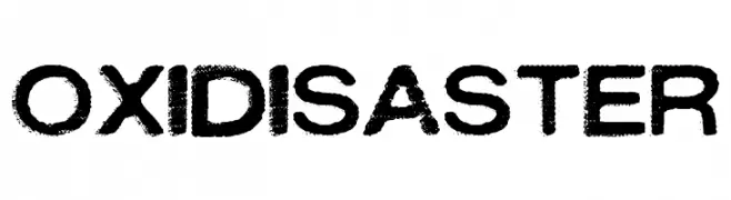
( Fonts by billyargel.blogspot.com - Billy Argel )
A bold, distressed font with a rugged, vintage appearance.
![OXIDISASTER font caratteri gratis]() Scaricare 746 Downloads@WebFont
Scaricare 746 Downloads@WebFont -
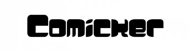
![Comicker font caratteri gratis]() Scaricare 746 Downloads@WebFont
Scaricare 746 Downloads@WebFont -
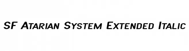
( Fonts by ShyFonts )
A bold, extended sans-serif font with an italic slant for a modern and dynamic appearance.
![SF Atarian System Extended Italic font caratteri gratis]() Scaricare 746 Downloads@WebFont
Scaricare 746 Downloads@WebFont -
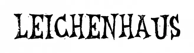
( Fonts by Tony O`Farrell )
A bold, distressed gothic-style font with a dramatic and textured appearance.
![Leichenhaus font caratteri gratis]() Scaricare 746 Downloads@WebFont
Scaricare 746 Downloads@WebFont -
![LBC Cool font caratteri gratis]() Scaricare 746 Downloads@WebFont
Scaricare 746 Downloads@WebFont -
![Braeside Outline font caratteri gratis]() Scaricare 746 Downloads@WebFont
Scaricare 746 Downloads@WebFont -
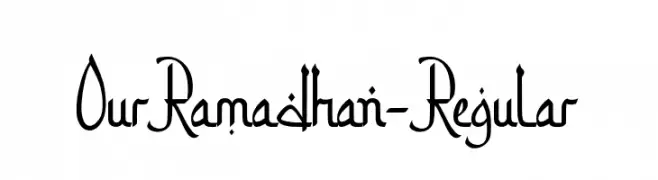
( Fonts by 50Fox Studio - www.50fox.com - Personal-use only. For commercial use please contact owner. )
An elegant script font with flowing lines and sophisticated flourishes.
![OurRamadhan-Regular font caratteri gratis]() Scaricare 745 Downloads@WebFont
Scaricare 745 Downloads@WebFont -
( Fonts by Khurasan )
A playful, bold font with a hand-drawn, whimsical style.
![Pamit font caratteri gratis]() Scaricare 745 Downloads@WebFont
Scaricare 745 Downloads@WebFont -
( Fonts by Khurasan )
A playful, hand-drawn font with rounded edges and a whimsical style.
![Baby Pilot font caratteri gratis]() Scaricare 745 Downloads@WebFont
Scaricare 745 Downloads@WebFont -
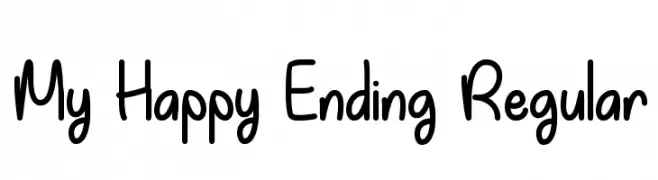
![My Happy Ending Regular font caratteri gratis]() Scaricare 745 Downloads@WebFont
Scaricare 745 Downloads@WebFont -
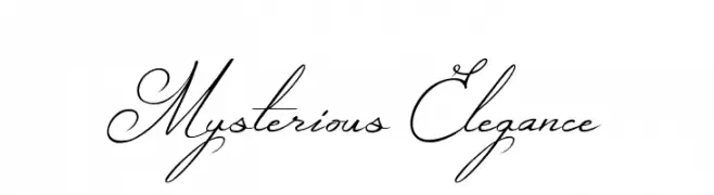
![Mysterious Elegance font caratteri gratis]() Scaricare 745 Downloads@WebFont
Scaricare 745 Downloads@WebFont -
( Copyright 2016 The Archivo Project Authors (omnibus.type@gmail.com) )
A modern, semi-bold, italic sans-serif font with clean lines and low contrast.
![Archivo SemiBold Italic font caratteri gratis]() Scaricare 745 Downloads@WebFont
Scaricare 745 Downloads@WebFont -
( Fonts by a Neale Davidson - www.pixelsagas.com. Personal-use only. For commercial use please contact owner. )
A bold, italicized font with a futuristic and dynamic style.
![Cyberfall Italic font caratteri gratis]() Scaricare 745 Downloads@WebFont
Scaricare 745 Downloads@WebFont -
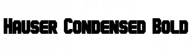
( Fonts by a Neale Davidson - www.pixelsagas.com. Personal-use only. For commercial use please contact owner. )
A bold, condensed font with a geometric and powerful style.
![Hauser Condensed Bold font caratteri gratis]() Scaricare 745 Downloads@WebFont
Scaricare 745 Downloads@WebFont -
![SimpleWriting font caratteri gratis]() Scaricare 745 Downloads@WebFont
Scaricare 745 Downloads@WebFont -
( Fonts by Castcraft Software - opti.netii.net - check the website before use )
A modern, geometric font with consistent stroke width and clean lines.
![OPTIDesign-Medium font caratteri gratis]() Scaricare 745 Downloads@WebFont
Scaricare 745 Downloads@WebFont -
( Fonts by weknow - Wino S Kadir )
A modern, geometric font with bold, structured characters.
![Modern Building font caratteri gratis]() Scaricare 745 Downloads@WebFont
Scaricare 745 Downloads@WebFont -
( Fonts by weknow - Wino S Kadir )
A bold, rounded font with a playful and retro vibe.
![Hotel Motel font caratteri gratis]() Scaricare 745 Downloads@WebFont
Scaricare 745 Downloads@WebFont -
![Apparatus SIL Italic font caratteri gratis]() Scaricare 745 Downloads@WebFont
Scaricare 745 Downloads@WebFont -
![ToolBox font caratteri gratis]() Scaricare 745 Downloads@WebFont
Scaricare 745 Downloads@WebFont -
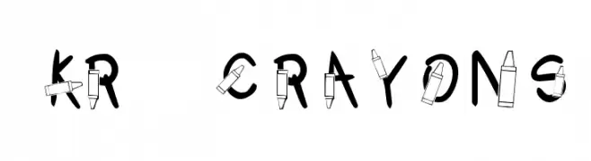
( Fonts by Kat`s Fun Fonts - Personal-use only. For commercial use please contact owner. )
A playful font with letters integrated into crayon illustrations, perfect for creative projects.
![KR Crayons font caratteri gratis]() Scaricare 745 Downloads@WebFont
Scaricare 745 Downloads@WebFont -
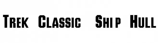
![Trek Classic Ship Hull font caratteri gratis]() Scaricare 745 Downloads@WebFont
Scaricare 745 Downloads@WebFont -
![Tiësto Font Regular font caratteri gratis]() Scaricare 745 Downloads@WebFont
Scaricare 745 Downloads@WebFont -
![AndyHand font caratteri gratis]() Scaricare 745 Downloads@WebFont
Scaricare 745 Downloads@WebFont -
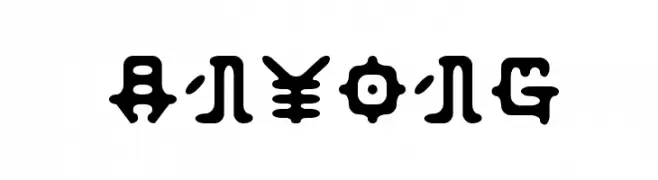
![Anyong font caratteri gratis]() Scaricare 745 Downloads@WebFont
Scaricare 745 Downloads@WebFont -
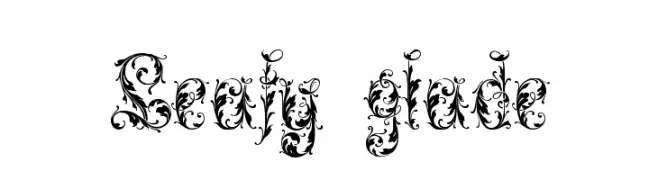
![Leafy glade font caratteri gratis]() Scaricare 745 Downloads@WebFont
Scaricare 745 Downloads@WebFont -
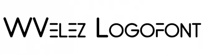
( Fonts by www.waltervelezart.com )
A modern, geometric font with rounded edges and consistent stroke width.
![WVelez Logofont font caratteri gratis]() Scaricare 745 Downloads@WebFont
Scaricare 745 Downloads@WebFont -
( Paul Lloyd Fonts )
A classic serif font with elegant strokes and a traditional aesthetic.
![Lewisham font caratteri gratis]() Scaricare 745 Downloads@WebFont
Scaricare 745 Downloads@WebFont -
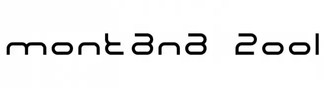
![Montana 2001 font caratteri gratis]() Scaricare 745 Downloads@WebFont
Scaricare 745 Downloads@WebFont -
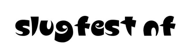
( Fonts by Nick Curtis - www.nicksfonts.com )
A bold, playful font with rounded, chunky characters and a whimsical style.
![Slugfest NF font caratteri gratis]() Scaricare 745 Downloads@WebFont
Scaricare 745 Downloads@WebFont -
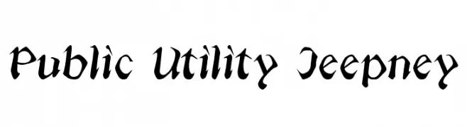
( Fonts by Annie de la Vega )
A dynamic script font with elegant curves and medium contrast.
![Public Utility Jeepney font caratteri gratis]() Scaricare 745 Downloads@WebFont
Scaricare 745 Downloads@WebFont -
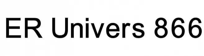
![ER Univers 866 font caratteri gratis]() Scaricare 745 Downloads
Scaricare 745 Downloads -
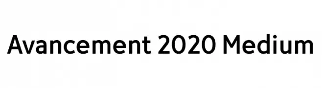
( Fonts by LyonsType - Daniel Lyons - Personal-use only. For commercial use please contact owner. )
A modern, clean sans-serif font with geometric letterforms.
![Avancement 2020 Medium font caratteri gratis]() Scaricare 744 Downloads@WebFont
Scaricare 744 Downloads@WebFont


Quali sono i font più popolari adesso?
Poppins, Roboto, Montserrat, Open Sans e Lato sono molto usati per le forme pulite e l'ampia applicabilità — dall'identità di marca alle landing page e ai poster.
Quali font si usano spesso nei loghi?
Le sans serif geometriche (es. Poppins, famiglie in stile Gotham) sono scelte comuni per un branding pulito e scalabile. Per un tocco personale restano valide script e stili manoscritti. Abbina un display deciso per i titoli a un corpo testo neutro per riconoscibilità ed equilibrio.
Ogni quanto si aggiorna la lista?
Con regolarità, in base ai download e all'attività reale. Torna spesso per scoprire in anticipo le nuove preferite.
💡 Consiglio: aggiungi ai preferiti — le tendenze cambiano in fretta e i font top di oggi possono ispirare il rebranding di domani.