Benvenuto nelle Font Più Popolari — dove popolarità e qualità si incontrano. Qui trovi i font più scaricati e usati dell'anno. Se cerchi scelte sicure per logo, web o social, inizia da qui.
Ogni font top si distingue per equilibrio, leggibilità e versatilità. Troverai sans serif moderne, script eleganti, serif vintage e display minimalisti.
-
( Character )
A tall, narrow font with a modern and sleek design.
 Scaricare 164 Downloads@WebFont
 -
![Grafoman. font caratteri gratis]() Scaricare 164 Downloads
Scaricare 164 Downloads -
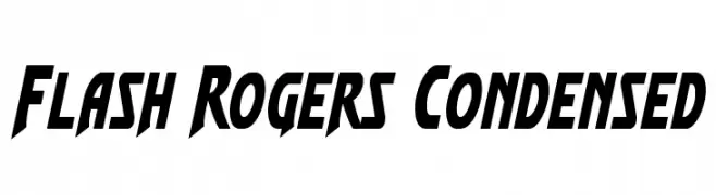
( Iconian Fonts - Daniel Zadorozny - www.iconian.com )
A bold, angular, and condensed font with a futuristic flair.
![Flash Rogers Condensed font caratteri gratis]() Scaricare 164 Downloads@WebFont
Scaricare 164 Downloads@WebFont -
![wireplayItalic font caratteri gratis]() Scaricare 164 Downloads@WebFont
Scaricare 164 Downloads@WebFont -
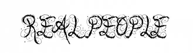
( Font by Jonathan Harris - www.tattoowoo.com )
An ornate, decorative script font with elaborate swirls and flourishes.
![Real People font caratteri gratis]() Scaricare 164 Downloads@WebFont
Scaricare 164 Downloads@WebFont -
-
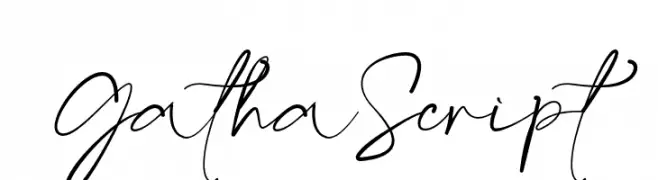
( Fonts by Khaiuns - Personal-use only. For commercial use please contact owner. )
A sophisticated and elegant script font with fluid, cursive strokes.
![GathaScript font caratteri gratis]() Scaricare 164 Downloads@WebFont
Scaricare 164 Downloads@WebFont -
( Fonts by dcoxy )
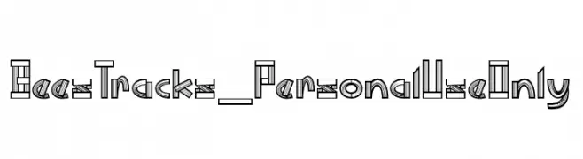
A bold, multi-line decorative font with a geometric and architectural style.
![Bees Tracks_PersonalUseOnly font caratteri gratis]() Scaricare 164 Downloads@WebFont
Scaricare 164 Downloads@WebFont -
( Fonts by Jadatype )
A bold, playful font with thick, rounded strokes and a whimsical style.
![Smoedy font caratteri gratis]() Scaricare 164 Downloads@WebFont
Scaricare 164 Downloads@WebFont -
( Fonts by Situjuh Nazara - 7ntypes.com - Personal-use only. For commercial use please contact owner. )
A bold, playful font with rounded edges and medium contrast, perfect for creative projects.
![KLAPJO font caratteri gratis]() Scaricare 164 Downloads@WebFont
Scaricare 164 Downloads@WebFont -
( Fonts by Manfred Klein - manfred-klein.ina-mar.com )
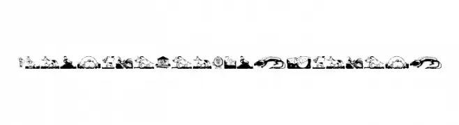
Cartoon animal illustrations form each character for a playful, child-friendly look.
![ChildrenAnimalsFriends font caratteri gratis]() Scaricare 164 Downloads@WebFont
Scaricare 164 Downloads@WebFont


Quali sono i font più popolari adesso?
Poppins, Roboto, Montserrat, Open Sans e Lato sono molto usati per le forme pulite e l'ampia applicabilità — dall'identità di marca alle landing page e ai poster.
Quali font si usano spesso nei loghi?
Le sans serif geometriche (es. Poppins, famiglie in stile Gotham) sono scelte comuni per un branding pulito e scalabile. Per un tocco personale restano valide script e stili manoscritti. Abbina un display deciso per i titoli a un corpo testo neutro per riconoscibilità ed equilibrio.
Ogni quanto si aggiorna la lista?
Con regolarità, in base ai download e all'attività reale. Torna spesso per scoprire in anticipo le nuove preferite.
💡 Consiglio: aggiungi ai preferiti — le tendenze cambiano in fretta e i font top di oggi possono ispirare il rebranding di domani.