Benvenuto nelle Font Più Popolari — dove popolarità e qualità si incontrano. Qui trovi i font più scaricati e usati dell'anno. Se cerchi scelte sicure per logo, web o social, inizia da qui.
Ogni font top si distingue per equilibrio, leggibilità e versatilità. Troverai sans serif moderne, script eleganti, serif vintage e display minimalisti.
-
( Fonts by Peax Webdesign - www.peax-webdesign.com. Personal-use only. For commercial use please contact owner. )
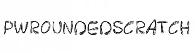
A playful, hand-drawn font with rounded edges and a scratchy texture.
 Scaricare 163 Downloads@WebFont
 -
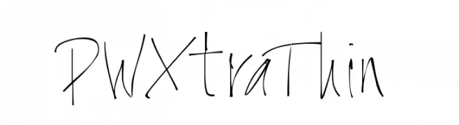
![PWXtraThin font caratteri gratis]() Scaricare 163 Downloads@WebFont
Scaricare 163 Downloads@WebFont -
( Free for personal use - www.pressgang-studios.com )
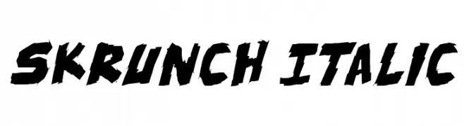
A bold, italic font with sharp angles and a dynamic, edgy style.
![skrunch Italic font caratteri gratis]() Scaricare 163 Downloads@WebFont
Scaricare 163 Downloads@WebFont -
( Copyright 2013 The Alegreya Sans Project Authors (https://github.com/huertatipografica/Alegreya-Sans) )
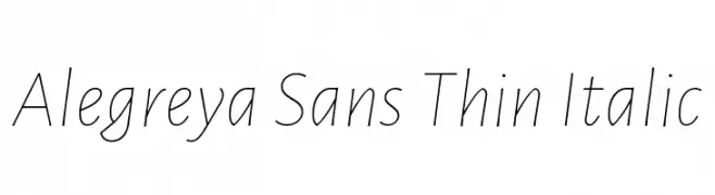
A sleek, modern, and thin italic font with elegant, fluid lines.
![Alegreya Sans Thin Italic font caratteri gratis]() Scaricare 163 Downloads@WebFont
Scaricare 163 Downloads@WebFont -
( Fonts by Maelle.K - Thomas Boucherie )
Decorative dingbat font with speech bubbles, banners, and ornate dividers.
![It Was A Good Day font caratteri gratis]() Scaricare 163 Downloads@WebFont
Scaricare 163 Downloads@WebFont -
-
![Jetta Tech Condensed font caratteri gratis]() Scaricare 163 Downloads@WebFont
Scaricare 163 Downloads@WebFont -
( Fonts by CannotIntoSpaceFonts - KineticPlasma Fonts - Personal-use only. For commercial use please contact owner. )
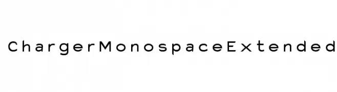
A modern, extended monospace font with clean lines and uniform spacing.
![Charger Monospace Extended font caratteri gratis]() Scaricare 163 Downloads@WebFont
Scaricare 163 Downloads@WebFont -
![Isotopic Normal font caratteri gratis]() Scaricare 163 Downloads@WebFont
Scaricare 163 Downloads@WebFont -
( Fonts by Daniel Zadorozny - www.iconian.com )
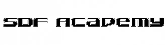
A bold, futuristic font with geometric outlines and sharp angles.
![SDF Academy font caratteri gratis]() Scaricare 163 Downloads@WebFont
Scaricare 163 Downloads@WebFont -
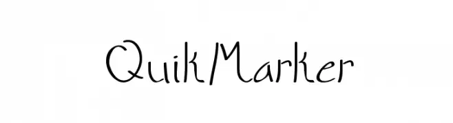
![QuikMarker font caratteri gratis]() Scaricare 163 Downloads@WebFont
Scaricare 163 Downloads@WebFont
Quali sono i font più popolari adesso?
Poppins, Roboto, Montserrat, Open Sans e Lato sono molto usati per le forme pulite e l'ampia applicabilità — dall'identità di marca alle landing page e ai poster.
Quali font si usano spesso nei loghi?
Le sans serif geometriche (es. Poppins, famiglie in stile Gotham) sono scelte comuni per un branding pulito e scalabile. Per un tocco personale restano valide script e stili manoscritti. Abbina un display deciso per i titoli a un corpo testo neutro per riconoscibilità ed equilibrio.
Ogni quanto si aggiorna la lista?
Con regolarità, in base ai download e all'attività reale. Torna spesso per scoprire in anticipo le nuove preferite.
💡 Consiglio: aggiungi ai preferiti — le tendenze cambiano in fretta e i font top di oggi possono ispirare il rebranding di domani.