Benvenuto nelle Font Più Popolari — dove popolarità e qualità si incontrano. Qui trovi i font più scaricati e usati dell'anno. Se cerchi scelte sicure per logo, web o social, inizia da qui.
Ogni font top si distingue per equilibrio, leggibilità e versatilità. Troverai sans serif moderne, script eleganti, serif vintage e display minimalisti.
-
 Scaricare 730 Downloads
 -
( Font by Sven Stuber - www.superlooper.de )
A futuristic, geometric font with clean lines and unique cutouts.
![supersonic font caratteri gratis]() Scaricare 730 Downloads@WebFont
Scaricare 730 Downloads@WebFont -
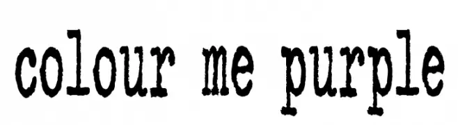
( Fonts by Kimberly Geswein - kimberlygeswein.com )
A distressed, vintage typewriter-style font with a textured, handcrafted appearance.
![colour me purple font caratteri gratis]() Scaricare 730 Downloads@WebFont
Scaricare 730 Downloads@WebFont -
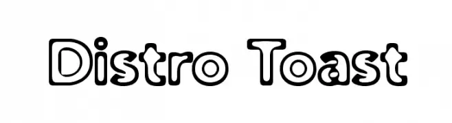
( Fonts by Apostrophic Lab )
A bold, playful outline font with rounded, uniform characters.
![Distro Toast font caratteri gratis]() Scaricare 730 Downloads@WebFont
Scaricare 730 Downloads@WebFont -
![Soda font caratteri gratis]() Scaricare 730 Downloads@WebFont
Scaricare 730 Downloads@WebFont -
( THESE ARE SHAREWARE FONTS ! NOT FREEWARE ! PLEASE VISIT www.fuelfonts.com )
A bold, modern font with rounded, condensed characters and a playful style.
![Rollergirls font caratteri gratis]() Scaricare 730 Downloads@WebFont
Scaricare 730 Downloads@WebFont -
( Fonts by Divide By Zero! - fonts.tom7.com )
An abstract, sketch-like font with overlapping strokes and a hand-drawn effect.
![Secret Labs font caratteri gratis]() Scaricare 730 Downloads@WebFont
Scaricare 730 Downloads@WebFont -
![Sayso Chic font caratteri gratis]() Scaricare 730 Downloads@WebFont
Scaricare 730 Downloads@WebFont -
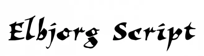
![Elbjorg Script font caratteri gratis]() Scaricare 730 Downloads@WebFont
Scaricare 730 Downloads@WebFont -
( Fonts by a Claude Pelletier . Personal-use only. For commercial use please contact owner. )
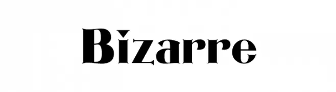
A bold, high-contrast font with sharp serifs and elegant flourishes.
![Bizarre font caratteri gratis]() Scaricare 730 Downloads@WebFont
Scaricare 730 Downloads@WebFont -
( Fonts by mlkwsn - www.mlkwsn.com - Personal-use only. For commercial use please contact owner. )
A bold, rugged font with a hand-carved, stone-like appearance.
![Rocky Stone font caratteri gratis]() Scaricare 729 Downloads@WebFont
Scaricare 729 Downloads@WebFont -
( Fonts by Daniel Zadorozny - www.iconian.com - Personal-use only. For commercial use please contact owner. )
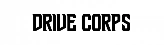
A bold, geometric font with strong, angular lines and a modern aesthetic.
![Drive Corps font caratteri gratis]() Scaricare 729 Downloads@WebFont
Scaricare 729 Downloads@WebFont -
( Fonts by Clement Nicolle - www.stereo-type.fr - Personal-use only. For commercial use please contact owner. )
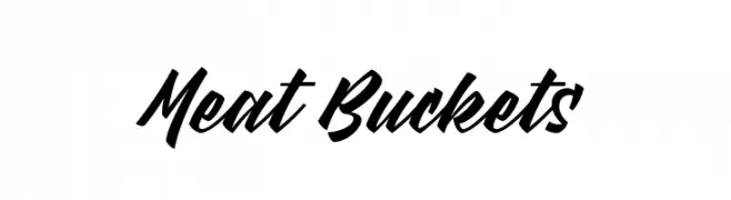
A bold, dynamic script font with fluid, connected strokes.
![Meat Buckets font caratteri gratis]() Scaricare 729 Downloads@WebFont
Scaricare 729 Downloads@WebFont -
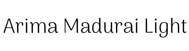
( Copyright 2015 The Arima Project Authors (info@ndiscovered.com) )
A clean, modern font with rounded edges and balanced proportions.
![Arima Madurai Light font caratteri gratis]() Scaricare 729 Downloads@WebFont
Scaricare 729 Downloads@WebFont -
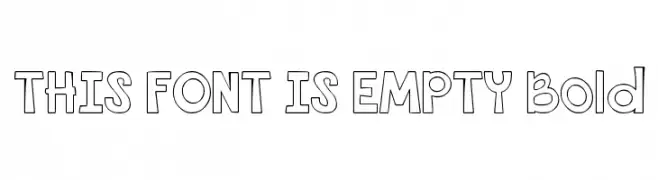
![THIS FONT IS EMPTY Bold font caratteri gratis]() Scaricare 729 Downloads@WebFont
Scaricare 729 Downloads@WebFont -
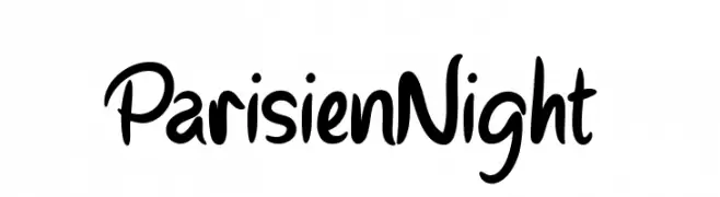
![Parisien Night font caratteri gratis]() Scaricare 729 Downloads@WebFont
Scaricare 729 Downloads@WebFont -
![Bodega Script font caratteri gratis]() Scaricare 729 Downloads
Scaricare 729 Downloads -
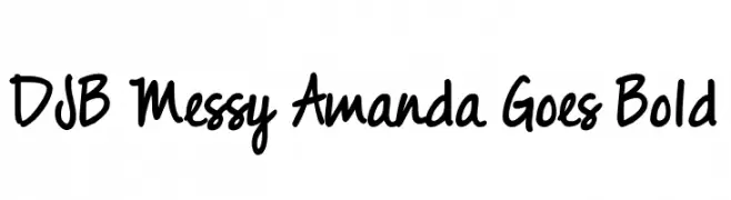
( Fonts by Darcy Baldwin {fontography} )
A bold, playful handwritten font with a casual and dynamic style.
![DJB Messy Amanda Goes Bold font caratteri gratis]() Scaricare 729 Downloads@WebFont
Scaricare 729 Downloads@WebFont -
( Fonts by a Neale Davidson - www.pixelsagas.com. Personal-use only. For commercial use please contact owner. )
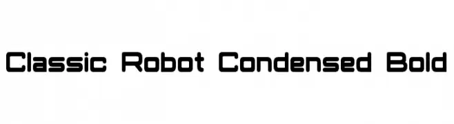
A bold, condensed font with a futuristic, robotic style.
![Classic Robot Condensed Bold font caratteri gratis]() Scaricare 729 Downloads@WebFont
Scaricare 729 Downloads@WebFont -
( Font by Jonathan Harris - www.tattoowoo.com )
A dynamic, expressive script font with a hand-drawn, brush-like appearance.
![Praying Angel font caratteri gratis]() Scaricare 729 Downloads@WebFont
Scaricare 729 Downloads@WebFont -
![SF-Bobbi2 font caratteri gratis]() Scaricare 729 Downloads@WebFont
Scaricare 729 Downloads@WebFont -
![Z-Most Devil font caratteri gratis]() Scaricare 729 Downloads@WebFont
Scaricare 729 Downloads@WebFont -
( Fonts by Heather T. - oohlalaartsy.blogspot.com )
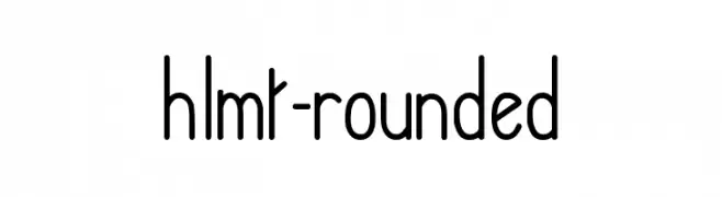
A modern, rounded font with a clean and approachable design.
![hlmt-rounded font caratteri gratis]() Scaricare 729 Downloads@WebFont
Scaricare 729 Downloads@WebFont -
( Fonts by Pol Udomwittayanukul - webnaipol.atspace.com )
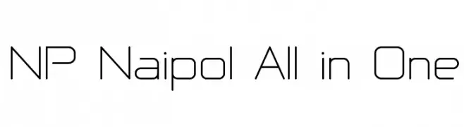
A modern, geometric font with clean lines and a minimalist style.
![NP Naipol All in One font caratteri gratis]() Scaricare 729 Downloads@WebFont
Scaricare 729 Downloads@WebFont -
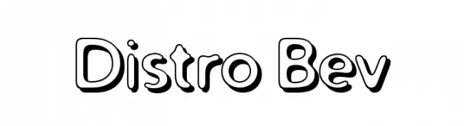
( Fonts by Apostrophic Lab )
A playful, bold font with a 3D effect and rounded characters.
![Distro Bev font caratteri gratis]() Scaricare 729 Downloads@WebFont
Scaricare 729 Downloads@WebFont -
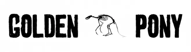
( Fonts by Ward Zwart - wardzwart.blogspot.com - free for personal use only! )
A bold, distressed font with a vintage, handcrafted look.
![golden 0 pony font caratteri gratis]() Scaricare 729 Downloads@WebFont
Scaricare 729 Downloads@WebFont -
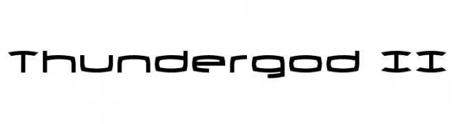
( Fonts by Daniel Zadorozny - www.iconian.com )
A futuristic, angular font with geometric shapes and consistent stroke thickness.
![Thundergod II font caratteri gratis]() Scaricare 729 Downloads@WebFont
Scaricare 729 Downloads@WebFont -
![Shower font caratteri gratis]() Scaricare 729 Downloads@WebFont
Scaricare 729 Downloads@WebFont -
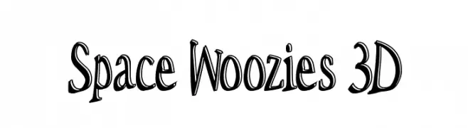
( Fonts by Omega Font Labs )
A bold, playful 3D font with a dynamic and whimsical style.
![Space Woozies 3D font caratteri gratis]() Scaricare 729 Downloads@WebFont
Scaricare 729 Downloads@WebFont -
( Fonts by Daniel Zadorozny - www.iconian.com - Free for personal use )
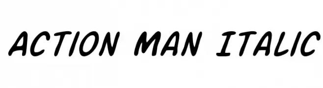
A bold, italicized handwritten font with a dynamic and energetic style.
![Action Man Italic font caratteri gratis]() Scaricare 729 Downloads@WebFont
Scaricare 729 Downloads@WebFont -
![Lower-EastSide Regular font caratteri gratis]() Scaricare 729 Downloads@WebFont
Scaricare 729 Downloads@WebFont -
( Fonts by Khurasan )
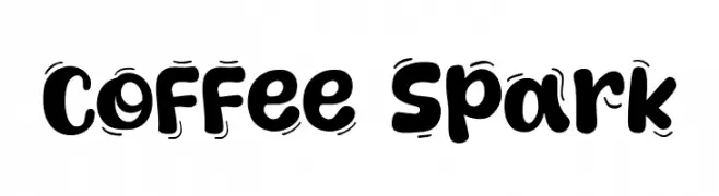
A bold, wavy, and playful font with a hand-drawn feel.
![Coffee Spark font caratteri gratis]() Scaricare 728 Downloads@WebFont
Scaricare 728 Downloads@WebFont -
( Fonts by Zac Freeland - zacfreeland.com - Personal-use only. For commercial use please contact owner. )
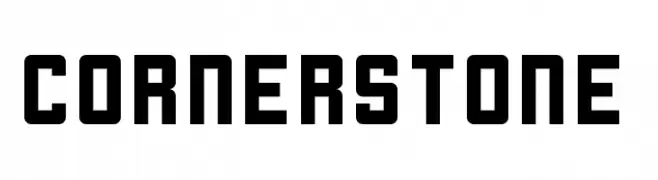
A bold, geometric font with a modern and industrial aesthetic.
![Cornerstone font caratteri gratis]() Scaricare 728 Downloads@WebFont
Scaricare 728 Downloads@WebFont -
( Fonts by Adobe )
A modern, clean sans-serif font with excellent readability.
![Source Sans Pro font caratteri gratis]() Scaricare 728 Downloads@WebFont
Scaricare 728 Downloads@WebFont -
( Fonts by Carolina Trebol )
A bold, modern sans-serif font with geometric precision.
![Marvel Bold font caratteri gratis]() Scaricare 728 Downloads@WebFont
Scaricare 728 Downloads@WebFont


Quali sono i font più popolari adesso?
Poppins, Roboto, Montserrat, Open Sans e Lato sono molto usati per le forme pulite e l'ampia applicabilità — dall'identità di marca alle landing page e ai poster.
Quali font si usano spesso nei loghi?
Le sans serif geometriche (es. Poppins, famiglie in stile Gotham) sono scelte comuni per un branding pulito e scalabile. Per un tocco personale restano valide script e stili manoscritti. Abbina un display deciso per i titoli a un corpo testo neutro per riconoscibilità ed equilibrio.
Ogni quanto si aggiorna la lista?
Con regolarità, in base ai download e all'attività reale. Torna spesso per scoprire in anticipo le nuove preferite.
💡 Consiglio: aggiungi ai preferiti — le tendenze cambiano in fretta e i font top di oggi possono ispirare il rebranding di domani.