Benvenuto nelle Font Più Popolari — dove popolarità e qualità si incontrano. Qui trovi i font più scaricati e usati dell'anno. Se cerchi scelte sicure per logo, web o social, inizia da qui.
Ogni font top si distingue per equilibrio, leggibilità e versatilità. Troverai sans serif moderne, script eleganti, serif vintage e display minimalisti.
-
( Fonts by Katatrad Team, changes by Cristiano Sobral - Personal-use only. For commercial use please contact owner. )
A modern, bold sans-serif font with excellent readability and versatility.
 Scaricare 727 Downloads@WebFont
 -
( Fonts by Windestrian- https://creativemarket.com/windestrian - Personal-use only. For commercial use please contact owner. )
A dynamic and expressive handwritten font with fluid cursive strokes.
![Sehaty font caratteri gratis]() Scaricare 727 Downloads@WebFont
Scaricare 727 Downloads@WebFont -
( Fonts by Hanoded )
A playful, bold, hand-drawn font with a whimsical and organic style.
![Cookie Crumble DEMO Regular font caratteri gratis]() Scaricare 727 Downloads@WebFont
Scaricare 727 Downloads@WebFont -
( Fonts by Catharsis - Personal-use only. For commercial use please contact owner. )
A classic serif font with elegant strokes and a refined, modern appearance.
![Cormorant Semi font caratteri gratis]() Scaricare 727 Downloads@WebFont
Scaricare 727 Downloads@WebFont -
( Fonts by Pravdin - Personal-use only. For commercial use please contact owner. )
A modern, geometric sans-serif font with clean lines and balanced proportions.
![NEXTART-Regular font caratteri gratis]() Scaricare 727 Downloads@WebFont
Scaricare 727 Downloads@WebFont -
( Sronstudio - Yusron Billah )
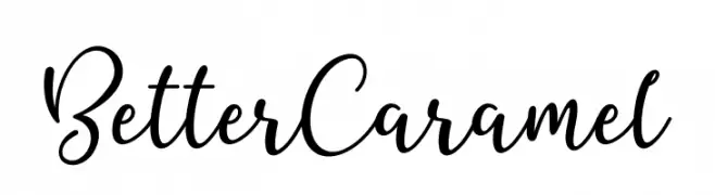
A flowing cursive font with elegant, connected strokes.
![Better Caramel font caratteri gratis]() Scaricare 727 Downloads@WebFont
Scaricare 727 Downloads@WebFont -
( Copyright 2017 The Spectral Project Authors (http://github.com/productiontype/spectral) )
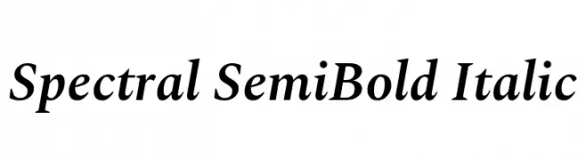
A semi-bold italic serif font with a refined and elegant style.
![Spectral SemiBold Italic font caratteri gratis]() Scaricare 727 Downloads@WebFont
Scaricare 727 Downloads@WebFont -
( Fonts by Maelle.K - Thomas Boucherie )
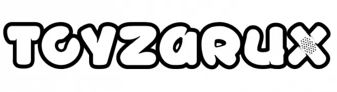
A playful, bold font with rounded, bubble-like characters ideal for fun and whimsical designs.
![TOYZARUX font caratteri gratis]() Scaricare 727 Downloads@WebFont
Scaricare 727 Downloads@WebFont -
( Copyright (c) 2010-2012, Vernon Adams (vern@newtypography.co.uk), with Reserved Font Name Nobile. )
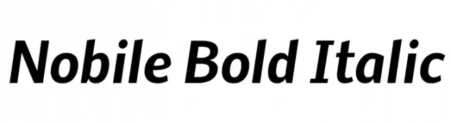
A modern, bold, and italicized font with a clean and dynamic style.
![Nobile Bold Italic font caratteri gratis]() Scaricare 727 Downloads@WebFont
Scaricare 727 Downloads@WebFont -
( Free for a personal use. For a commercial use please visit www.kevinandamanda.com )
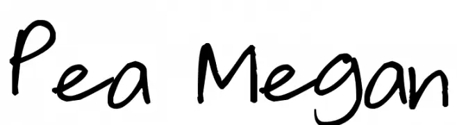
A playful, handwritten font with a casual and dynamic style.
![Pea Megan font caratteri gratis]() Scaricare 727 Downloads@WebFont
Scaricare 727 Downloads@WebFont -
( Free for a personal use. For a commercial use please visit www.kevinandamanda.com )
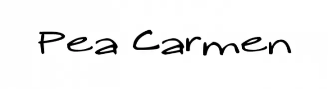
A playful, casual handwritten font with a dynamic and lively appearance.
![Pea Carmen font caratteri gratis]() Scaricare 727 Downloads@WebFont
Scaricare 727 Downloads@WebFont -
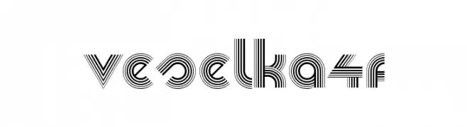
![Veselka4F font caratteri gratis]() Scaricare 727 Downloads@WebFont
Scaricare 727 Downloads@WebFont -
( Fonts by www.gust.org.pl )
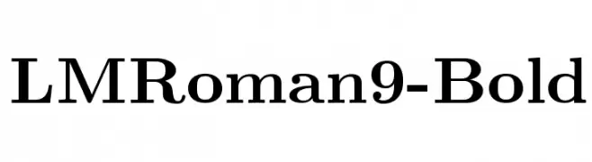
A bold, classic serif font with high contrast and strong readability.
![LMRoman9-Bold font caratteri gratis]() Scaricare 727 Downloads@WebFont
Scaricare 727 Downloads@WebFont -
( Fonts by Gerhard Helzel www.fraktur.biz )
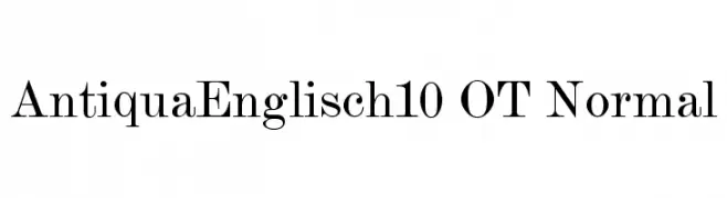
A classic serif font with elegant strokes and a refined, traditional appearance.
![AntiquaEnglisch10 OT Normal font caratteri gratis]() Scaricare 727 Downloads@WebFont
Scaricare 727 Downloads@WebFont -
( Fonts by Graham Meade - GemFonts )
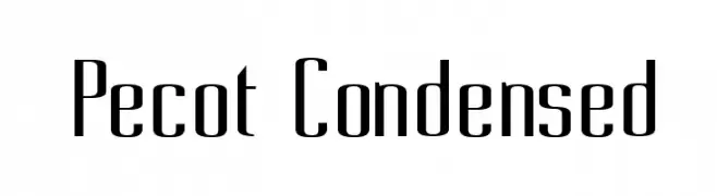
A modern, condensed font with sleek, elongated characters.
![Pecot Condensed font caratteri gratis]() Scaricare 727 Downloads@WebFont
Scaricare 727 Downloads@WebFont -
![OHNO font caratteri gratis]() Scaricare 727 Downloads@WebFont
Scaricare 727 Downloads@WebFont -
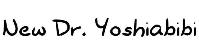
![New Dr. Yoshiabibi font caratteri gratis]() Scaricare 727 Downloads@WebFont
Scaricare 727 Downloads@WebFont -
( Fonts by Fernando Carvente - serifdechocolate.wordpress.com )
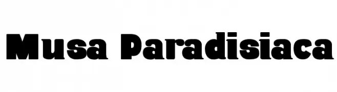
A bold, impactful font with thick strokes and a modern-retro style.
![Musa Paradisiaca font caratteri gratis]() Scaricare 727 Downloads@WebFont
Scaricare 727 Downloads@WebFont -
( Fonts by Daniel Zadorozny - www.iconian.com - Free for personal use )
Bold, italicized font with a shadow effect and geometric structure.
![Nolo Contendre Shadow Italic font caratteri gratis]() Scaricare 727 Downloads@WebFont
Scaricare 727 Downloads@WebFont -
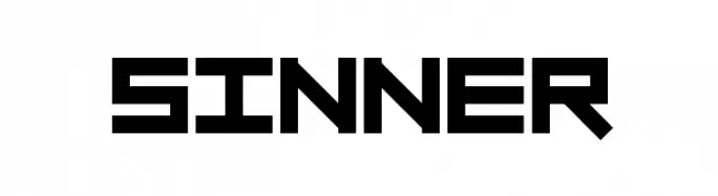
![sinner font caratteri gratis]() Scaricare 727 Downloads@WebFont
Scaricare 727 Downloads@WebFont -
( Fonts by Rodrigo German - RASDESIGN )
A bold, geometric font with a futuristic and angular design.
![TECNO font caratteri gratis]() Scaricare 727 Downloads@WebFont
Scaricare 727 Downloads@WebFont -
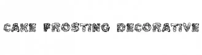
![Cake Frosting Decorative font caratteri gratis]() Scaricare 727 Downloads@WebFont
Scaricare 727 Downloads@WebFont -
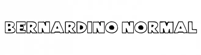
![Bernardino Normal font caratteri gratis]() Scaricare 727 Downloads@WebFont
Scaricare 727 Downloads@WebFont -
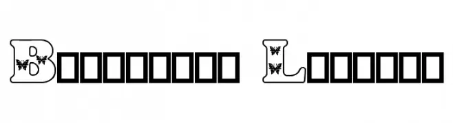
![Butterfly Letters font caratteri gratis]() Scaricare 727 Downloads@WebFont
Scaricare 727 Downloads@WebFont -
( Fonts by Graham Meade - GemFonts )
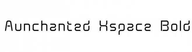
A futuristic, geometric sans-serif font with rounded edges and a modern aesthetic.
![Aunchanted Xspace Bold font caratteri gratis]() Scaricare 727 Downloads@WebFont
Scaricare 727 Downloads@WebFont -
( Fonts by Jacob Fisher - www.pizzadude.dk )
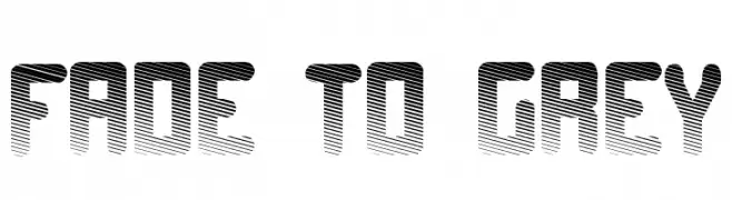
A bold, geometric font with a gradient effect and modern style.
![Fade to grey font caratteri gratis]() Scaricare 727 Downloads@WebFont
Scaricare 727 Downloads@WebFont -
( Fonts by Apostrophic Lab )
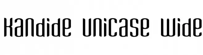
A modern, geometric unicase font with wide spacing and smooth, rounded strokes.
![Kandide Unicase Wide font caratteri gratis]() Scaricare 727 Downloads@WebFont
Scaricare 727 Downloads@WebFont -
( Fonts by Ameerazan Studio - Personal-use only. For commercial use please contact owner. )
An elegant script font with flowing, ornate cursive letters.
![Beauty font caratteri gratis]() Scaricare 726 Downloads@WebFont
Scaricare 726 Downloads@WebFont -
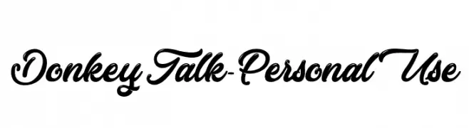
( Fonts by Typhoon Type - Suthi Srisopha - www.typhoontype.net - Personal-use only. For commercial use please contact owner. )
A playful and whimsical script font with elegant loops and swirls.
![Donkey Talk - Personal Use font caratteri gratis]() Scaricare 726 Downloads@WebFont
Scaricare 726 Downloads@WebFont -
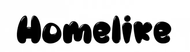
( Fonts by Daddi Daryawan )
A playful, bold font with rounded, bubble-like characters.
![Homelike font caratteri gratis]() Scaricare 726 Downloads@WebFont
Scaricare 726 Downloads@WebFont -
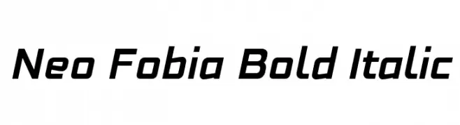
![Neo Fobia Bold Italic font caratteri gratis]() Scaricare 726 Downloads@WebFont
Scaricare 726 Downloads@WebFont -
( Fonts by monocotype - Personal-use only. For commercial use please contact owner. )
A bold, modern sans-serif font with clean geometric shapes.
![Cottage Sans font caratteri gratis]() Scaricare 726 Downloads@WebFont
Scaricare 726 Downloads@WebFont -
( 04 - www.04.jp.org )
A bold, geometric font with sharp angles and a modern, edgy style.
![carrot font caratteri gratis]() Scaricare 726 Downloads@WebFont
Scaricare 726 Downloads@WebFont -
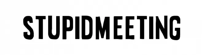
( Sharkshock - Dennis Ludlow - www.sharkshock.net )
A bold, condensed font with strong, impactful uppercase letters.
![Stupid Meeting font caratteri gratis]() Scaricare 726 Downloads@WebFont
Scaricare 726 Downloads@WebFont -
( Fonts by Iconian Fonts )
A futuristic, bold, and italicized font with sharp angles.
![Cyberdyne Super-Italic font caratteri gratis]() Scaricare 726 Downloads@WebFont
Scaricare 726 Downloads@WebFont


Quali sono i font più popolari adesso?
Poppins, Roboto, Montserrat, Open Sans e Lato sono molto usati per le forme pulite e l'ampia applicabilità — dall'identità di marca alle landing page e ai poster.
Quali font si usano spesso nei loghi?
Le sans serif geometriche (es. Poppins, famiglie in stile Gotham) sono scelte comuni per un branding pulito e scalabile. Per un tocco personale restano valide script e stili manoscritti. Abbina un display deciso per i titoli a un corpo testo neutro per riconoscibilità ed equilibrio.
Ogni quanto si aggiorna la lista?
Con regolarità, in base ai download e all'attività reale. Torna spesso per scoprire in anticipo le nuove preferite.
💡 Consiglio: aggiungi ai preferiti — le tendenze cambiano in fretta e i font top di oggi possono ispirare il rebranding di domani.