Benvenuto nelle Font Più Popolari — dove popolarità e qualità si incontrano. Qui trovi i font più scaricati e usati dell'anno. Se cerchi scelte sicure per logo, web o social, inizia da qui.
Ogni font top si distingue per equilibrio, leggibilità e versatilità. Troverai sans serif moderne, script eleganti, serif vintage e display minimalisti.
-
( Fonts by Darrell Flood )
A bold, playful handwritten font with a dynamic, brush-like style.
 Scaricare 164 Downloads@WebFont
 -
![KG Laughter Lines font caratteri gratis]() Scaricare 164 Downloads@WebFont
Scaricare 164 Downloads@WebFont -
( Fonts by Iconian Fonts )
A bold, rounded, and slightly italicized font with a futuristic style.
![1st Enterprises Leftalic font caratteri gratis]() Scaricare 164 Downloads@WebFont
Scaricare 164 Downloads@WebFont -
( Fonts by Almarkhatype - Abdul Malik Wisnu - Personal-use only. For commercial use please contact owner. )
A modern serif font with elegant, bold characters and sharp serifs.
![Sangira font caratteri gratis]() Scaricare 164 Downloads@WebFont
Scaricare 164 Downloads@WebFont -
( Fonts by a Neale Davidson - www.pixelsagas.com. Personal-use only. For commercial use please contact owner. )
A futuristic, italic font with sharp angles and a mechanical style.
![Mech Tech Italic font caratteri gratis]() Scaricare 164 Downloads@WebFont
Scaricare 164 Downloads@WebFont -
-
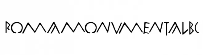
( Fonts by Manfred Klein. Free for private and charity use. Free for commercial with donation to organizations )
A bold, angular font with a geometric and artistic style.
![RomaMonumentalBC font caratteri gratis]() Scaricare 164 Downloads@WebFont
Scaricare 164 Downloads@WebFont -
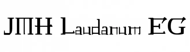
Caratteri di joorgemoron. For commercial use please contact the owner.
( free for personal use only )
A decorative serif font with a medieval and geometric style.
![JMH Laudanum EG font caratteri gratis]() Scaricare 164 Downloads@WebFont
Scaricare 164 Downloads@WebFont -
( Fonts by Daniel Zadorozny - www.iconian.com )
A bold, angular font with a dynamic slant and geometric design.
![Empire Crown Rotalic font caratteri gratis]() Scaricare 164 Downloads@WebFont
Scaricare 164 Downloads@WebFont -
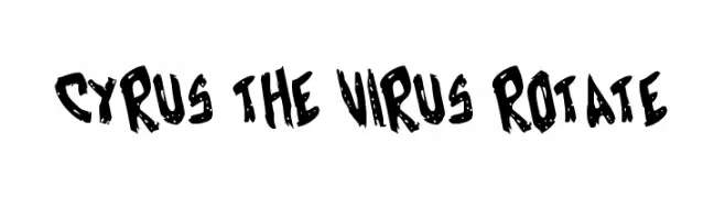
( Fonts by Daniel Zadorozny - www.iconian.com - Free for personal use )
A bold, edgy font with jagged, distressed strokes and a rebellious vibe.
![Cyrus the Virus Rotate font caratteri gratis]() Scaricare 164 Downloads@WebFont
Scaricare 164 Downloads@WebFont -
( Fonts by Khurasan )
A bold, playful font with rounded edges and a chunky appearance.
![Howdy Duck font caratteri gratis]() Scaricare 164 Downloads@WebFont
Scaricare 164 Downloads@WebFont


Quali sono i font più popolari adesso?
Poppins, Roboto, Montserrat, Open Sans e Lato sono molto usati per le forme pulite e l'ampia applicabilità — dall'identità di marca alle landing page e ai poster.
Quali font si usano spesso nei loghi?
Le sans serif geometriche (es. Poppins, famiglie in stile Gotham) sono scelte comuni per un branding pulito e scalabile. Per un tocco personale restano valide script e stili manoscritti. Abbina un display deciso per i titoli a un corpo testo neutro per riconoscibilità ed equilibrio.
Ogni quanto si aggiorna la lista?
Con regolarità, in base ai download e all'attività reale. Torna spesso per scoprire in anticipo le nuove preferite.
💡 Consiglio: aggiungi ai preferiti — le tendenze cambiano in fretta e i font top di oggi possono ispirare il rebranding di domani.