Benvenuto nelle Font Più Popolari — dove popolarità e qualità si incontrano. Qui trovi i font più scaricati e usati dell'anno. Se cerchi scelte sicure per logo, web o social, inizia da qui.
Ogni font top si distingue per equilibrio, leggibilità e versatilità. Troverai sans serif moderne, script eleganti, serif vintage e display minimalisti.
-
( Fonts by LyonsType - Daniel Lyons - Personal-use only. For commercial use please contact owner. )
A modern serif font with clean lines and balanced proportions.
 Scaricare 722 Downloads@WebFont
 -
( Fonts by Almarkhatype )
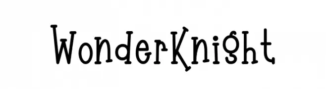
A playful, hand-drawn font with a whimsical and friendly style.
![Wonder Knight font caratteri gratis]() Scaricare 722 Downloads@WebFont
Scaricare 722 Downloads@WebFont -
( Fonts by S. John Ross - Cumberland Fontworks - fonts.cumberlandgames.com - Personal-use only. For commercial use please contact owner. )
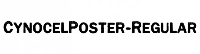
A bold, textured font with a vintage, rugged style.
![CynocelPoster-Regular font caratteri gratis]() Scaricare 722 Downloads@WebFont
Scaricare 722 Downloads@WebFont -
( Noto is a trademark of Google Inc. Noto fonts are open source. All Noto fonts are published under the SIL Open Font License, Version 1.1 )
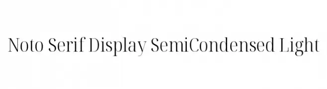
A refined serif font with semi-condensed, light letterforms and moderate contrast.
![Noto Serif Display SemiCondensed Light font caratteri gratis]() Scaricare 722 Downloads@WebFont
Scaricare 722 Downloads@WebFont -
( Copyright (c) 2015 by Rosetta Type Foundry s.r.o. (info@rosettatype.com). )
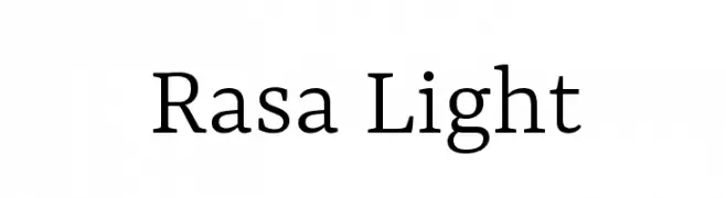
A modern serif font with elegant lines and balanced proportions.
![Rasa Light font caratteri gratis]() Scaricare 722 Downloads@WebFont
Scaricare 722 Downloads@WebFont -
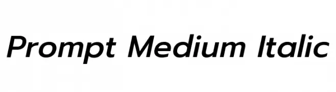
( Copyright (c) 2015, Cadson Demak (info@cadsondemak.com) )
A modern, medium-weight italic sans-serif font with clean lines and balanced proportions.
![Prompt Medium Italic font caratteri gratis]() Scaricare 722 Downloads@WebFont
Scaricare 722 Downloads@WebFont -
( Fonts by UpandIt )
A playful, handwritten font with tall, narrow letters and rounded edges.
![Azurite font caratteri gratis]() Scaricare 722 Downloads@WebFont
Scaricare 722 Downloads@WebFont -
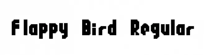
![Flappy Bird Regular font caratteri gratis]() Scaricare 722 Downloads@WebFont
Scaricare 722 Downloads@WebFont -
( Fonts by Wino S Kadir - weknow - www.revolge.com/shop/weknow/ - Personal-use only. For commercial use please contact owner. )
A modern, outline font with a neon light effect, perfect for futuristic designs.
![NEON GLOW font caratteri gratis]() Scaricare 722 Downloads@WebFont
Scaricare 722 Downloads@WebFont -
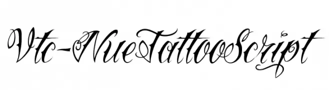
( Fonts by Vigilante Typeface Corporation Larry Yerkes. Personal-use only. For commercial use please contact owner. )
An ornate script font with flowing, interconnected letterforms and decorative flourishes.
![Vtc-NueTattooScript font caratteri gratis]() Scaricare 722 Downloads@WebFont
Scaricare 722 Downloads@WebFont -
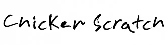
( Fonts by www.fontpanda.com. Personal-use only. For commercial use please contact owner. )
A casual, handwritten font with uneven, dynamic strokes.
![Chicken Scratch font caratteri gratis]() Scaricare 722 Downloads@WebFont
Scaricare 722 Downloads@WebFont -
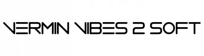
( Fonts by Andrew McCluskey - nalgames.com )
A modern, geometric font with rounded edges and consistent stroke widths.
![Vermin Vibes 2 Soft font caratteri gratis]() Scaricare 722 Downloads@WebFont
Scaricare 722 Downloads@WebFont -
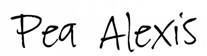
( Free for a personal use. For a commercial use please visit www.kevinandamanda.com )
A playful, casual handwritten font with dynamic strokes.
![Pea Alexis font caratteri gratis]() Scaricare 722 Downloads@WebFont
Scaricare 722 Downloads@WebFont -
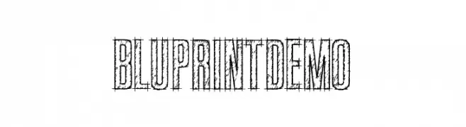
( Fonts by Kevin Christopher - www.kcfonts.com )
A sketch-like, blueprint-inspired font with a hand-drawn, textured appearance.
![BluprintDEMO font caratteri gratis]() Scaricare 722 Downloads@WebFont
Scaricare 722 Downloads@WebFont -
( Fonts by Adult Ramblings - Anastacia E. Zittel - Personal-use only. For commercial use please contact owner. )
A decorative font with festive and celebratory icons.
![AEZ celebrate font caratteri gratis]() Scaricare 722 Downloads@WebFont
Scaricare 722 Downloads@WebFont -
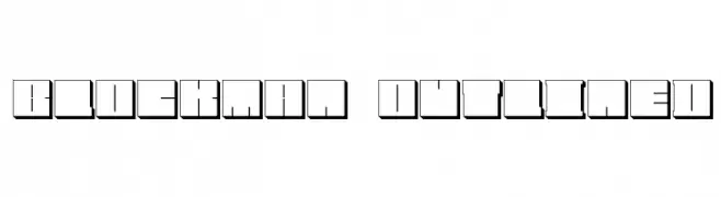
![Blockman-outlined font caratteri gratis]() Scaricare 722 Downloads@WebFont
Scaricare 722 Downloads@WebFont -
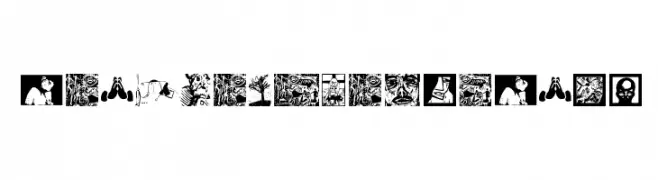
( Fonts by Manfred Klein. Free for private and charity use. Free for commercial with donation to organizations )
An artistic, image-based decorative font with linocut illustration style.
![BlacKlinoleumBats font caratteri gratis]() Scaricare 722 Downloads@WebFont
Scaricare 722 Downloads@WebFont -
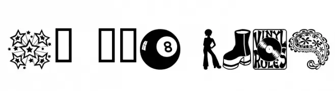
( Fonts by Blue Vinyl - Jess Latham - www.bvfonts.com )
A 1970s-themed decorative dingbat font with iconic retro illustrations.
![My 70s Ding font caratteri gratis]() Scaricare 722 Downloads@WebFont
Scaricare 722 Downloads@WebFont -
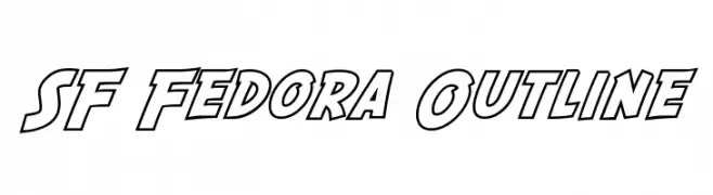
( Fonts by ShyFonts )
A bold, outlined font with a dynamic and impactful style.
![SF Fedora Outline font caratteri gratis]() Scaricare 722 Downloads@WebFont
Scaricare 722 Downloads@WebFont -
( Fonts by Daniel Zadorozny - www.iconian.com - Free for personal use )
A bold, futuristic font with angular, geometric letterforms.
![Native Alien Extended font caratteri gratis]() Scaricare 722 Downloads
Scaricare 722 Downloads -
![Jedi Symbol font caratteri gratis]() Scaricare 722 Downloads@WebFont
Scaricare 722 Downloads@WebFont -
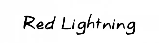
![Red Lightning font caratteri gratis]() Scaricare 722 Downloads@WebFont
Scaricare 722 Downloads@WebFont -
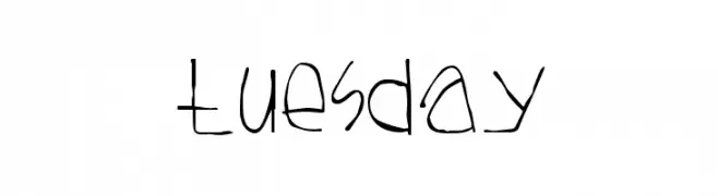
( Fonts by Divide By Zero! - fonts.tom7.com )
A playful, hand-drawn font with a whimsical, irregular style.
![Tuesday font caratteri gratis]() Scaricare 722 Downloads@WebFont
Scaricare 722 Downloads@WebFont -
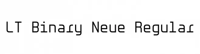
( Fonts by LyonsType )
A modern, geometric font with uniform stroke widths and a monospaced appearance.
![LT Binary Neue Regular font caratteri gratis]() Scaricare 721 Downloads@WebFont
Scaricare 721 Downloads@WebFont -
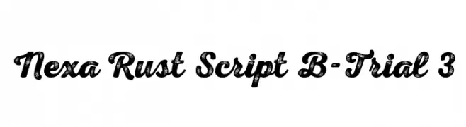
( Fonts by Fontfabric - Svetoslav Simov - Personal-use only. For commercial use please contact owner. )
A bold, textured script font with a vintage, handcrafted style.
![Nexa Rust Script B-Trial 3 font caratteri gratis]() Scaricare 721 Downloads@WebFont
Scaricare 721 Downloads@WebFont -
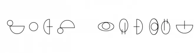
( Fonts by Perspectype Studio )
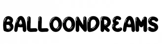
A playful, balloon-like font with rounded, glossy characters.
![BALLOON DREAMS font caratteri gratis]() Scaricare 721 Downloads@WebFont
Scaricare 721 Downloads@WebFont -
Caratteri di Kowulz. For commercial use please contact the owner.
( Kowulz Regular )
A clean, modern font with geometric shapes and uniform line thickness.
![boxicons font caratteri gratis]() Scaricare 721 Downloads@WebFont
Scaricare 721 Downloads@WebFont -
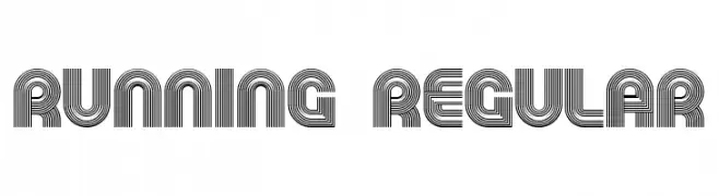
( Fonts by Vladimir Nikolic - https://www.creativefabrica.com/product/educated-deers/ref/144265/ - Personal-use only. For commercial use please contact owner. )
A decorative font with multi-line, geometric characters for a bold, modern look.
![Running Regular font caratteri gratis]() Scaricare 721 Downloads@WebFont
Scaricare 721 Downloads@WebFont -
( Noto is a trademark of Google Inc. Noto fonts are open source. All Noto fonts are published under the SIL Open Font License, Version 1.1 )
A bold, modern sans-serif font with clean lines and excellent readability.
![Noto Sans Devanagari Bold font caratteri gratis]() Scaricare 721 Downloads@WebFont
Scaricare 721 Downloads@WebFont -
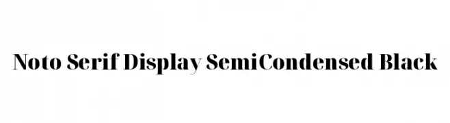
( Noto is a trademark of Google Inc. Noto fonts are open source. All Noto fonts are published under the SIL Open Font License, Version 1.1 )
A bold, semi-condensed serif font with high contrast and elegant serifs.
![Noto Serif Display SemiCondensed Black font caratteri gratis]() Scaricare 721 Downloads@WebFont
Scaricare 721 Downloads@WebFont -
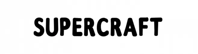
( Fonts by Eko Samp )
A bold, rounded font with a playful and approachable style.
![Supercraft font caratteri gratis]() Scaricare 721 Downloads@WebFont
Scaricare 721 Downloads@WebFont -
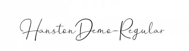
( Fonts by Weape Design - Personal-use only. For commercial use please contact owner. )
An elegant and flowing script font with graceful, fluid letterforms.
![HanstonDemo-Regular font caratteri gratis]() Scaricare 721 Downloads@WebFont
Scaricare 721 Downloads@WebFont -
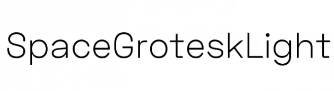
( Fonts by Florian Karsten - Personal-use only. For commercial use please contact owner. )
A modern, geometric sans-serif font with clean lines and excellent readability.
![Space Grotesk Light font caratteri gratis]() Scaricare 721 Downloads@WebFont
Scaricare 721 Downloads@WebFont -
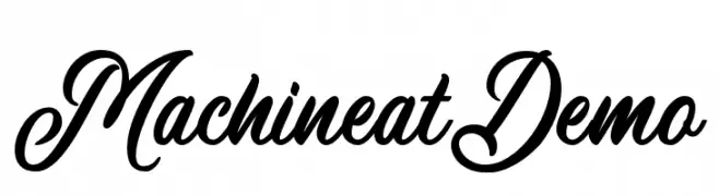
( Wacaksara Co - www.wacaksara.co )
An elegant and flowing script font with classic cursive letterforms.
![MachineatDemo font caratteri gratis]() Scaricare 721 Downloads@WebFont
Scaricare 721 Downloads@WebFont -
( Typodermic Fonts - Ray Larabie - www.typodermicfonts.com/ )
A bold, modern sans-serif font with geometric letterforms and consistent stroke widths.
![MesmerizeSeRg-Bold font caratteri gratis]() Scaricare 721 Downloads@WebFont
Scaricare 721 Downloads@WebFont


Quali sono i font più popolari adesso?
Poppins, Roboto, Montserrat, Open Sans e Lato sono molto usati per le forme pulite e l'ampia applicabilità — dall'identità di marca alle landing page e ai poster.
Quali font si usano spesso nei loghi?
Le sans serif geometriche (es. Poppins, famiglie in stile Gotham) sono scelte comuni per un branding pulito e scalabile. Per un tocco personale restano valide script e stili manoscritti. Abbina un display deciso per i titoli a un corpo testo neutro per riconoscibilità ed equilibrio.
Ogni quanto si aggiorna la lista?
Con regolarità, in base ai download e all'attività reale. Torna spesso per scoprire in anticipo le nuove preferite.
💡 Consiglio: aggiungi ai preferiti — le tendenze cambiano in fretta e i font top di oggi possono ispirare il rebranding di domani.