Benvenuto nelle Font Più Popolari — dove popolarità e qualità si incontrano. Qui trovi i font più scaricati e usati dell'anno. Se cerchi scelte sicure per logo, web o social, inizia da qui.
Ogni font top si distingue per equilibrio, leggibilità e versatilità. Troverai sans serif moderne, script eleganti, serif vintage e display minimalisti.
-
( Fonts by Toto )
A bold, wide serif font with dramatic, angular serifs and high contrast.
 Scaricare 724 Downloads@WebFont
 -
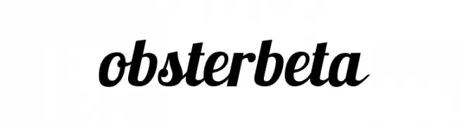
( Fonts by www.impallari.com )
A bold, flowing script font with a modern and elegant style.
![Lobsterbeta13 font caratteri gratis]() Scaricare 724 Downloads@WebFont
Scaricare 724 Downloads@WebFont -
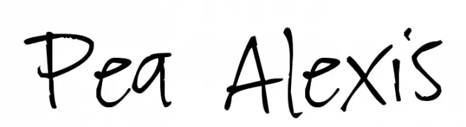
( Free for a personal use. For a commercial use please visit www.kevinandamanda.com )
A playful, casual handwritten font with dynamic strokes.
![Pea Alexis font caratteri gratis]() Scaricare 724 Downloads@WebFont
Scaricare 724 Downloads@WebFont -
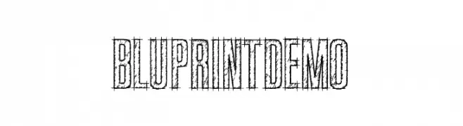
( Fonts by Kevin Christopher - www.kcfonts.com )
A sketch-like, blueprint-inspired font with a hand-drawn, textured appearance.
![BluprintDEMO font caratteri gratis]() Scaricare 724 Downloads@WebFont
Scaricare 724 Downloads@WebFont -
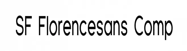
![SF Florencesans Comp font caratteri gratis]() Scaricare 724 Downloads@WebFont
Scaricare 724 Downloads@WebFont -
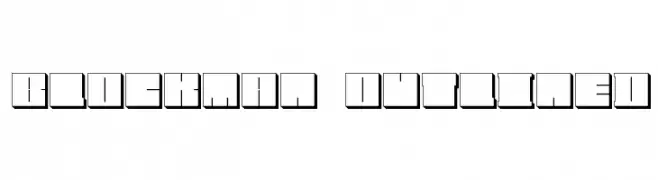
![Blockman-outlined font caratteri gratis]() Scaricare 724 Downloads@WebFont
Scaricare 724 Downloads@WebFont -
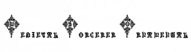
![Medieval Sorcerer Ornamental font caratteri gratis]() Scaricare 724 Downloads@WebFont
Scaricare 724 Downloads@WebFont -
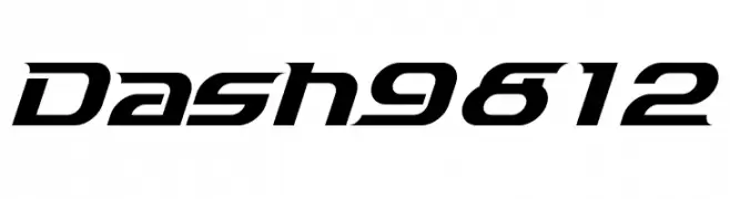
![Dash9812 font caratteri gratis]() Scaricare 724 Downloads@WebFont
Scaricare 724 Downloads@WebFont -
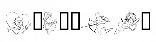
( Fonts by Kat`s Fun Fonts - Personal-use only. For commercial use please contact owner. )
A decorative collection of cupid-themed illustrations with playful and romantic motifs.
![KR Cupids font caratteri gratis]() Scaricare 724 Downloads@WebFont
Scaricare 724 Downloads@WebFont -
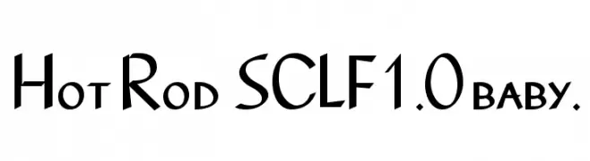
![Hot Rod SCLF1.0 baby. font caratteri gratis]() Scaricare 724 Downloads@WebFont
Scaricare 724 Downloads@WebFont -
( Fonts by Divide By Zero! - fonts.tom7.com )
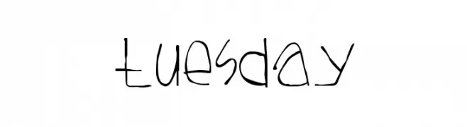
A playful, hand-drawn font with a whimsical, irregular style.
![Tuesday font caratteri gratis]() Scaricare 724 Downloads@WebFont
Scaricare 724 Downloads@WebFont -
( Fonts by Wahyu Eka Prasetya - wepfont.com - Personal-use only. For commercial use please contact owner. )
A bold, textured handwritten font with a dynamic and playful style.
![Gerak font caratteri gratis]() Scaricare 723 Downloads@WebFont
Scaricare 723 Downloads@WebFont -
( Fonts by Letterayu )
Hand-drawn botanical illustrations with a whimsical and delicate style.
![Botana font caratteri gratis]() Scaricare 723 Downloads@WebFont
Scaricare 723 Downloads@WebFont -
( Fonts by Mike Abbink, Paul van der Laan, Pieter van Rosmalen - Personal-use only. For commercial use please contact owner. )
A clean, modern sans-serif font with uniform stroke widths and excellent readability.
![Aneliza font caratteri gratis]() Scaricare 723 Downloads@WebFont
Scaricare 723 Downloads@WebFont -
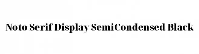
( Noto is a trademark of Google Inc. Noto fonts are open source. All Noto fonts are published under the SIL Open Font License, Version 1.1 )
A bold, semi-condensed serif font with high contrast and elegant serifs.
![Noto Serif Display SemiCondensed Black font caratteri gratis]() Scaricare 723 Downloads@WebFont
Scaricare 723 Downloads@WebFont -
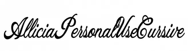
![Allicia Personal Use Cursive font caratteri gratis]() Scaricare 723 Downloads@WebFont
Scaricare 723 Downloads@WebFont -
( Pathero Studio - www.patherostudio.com )
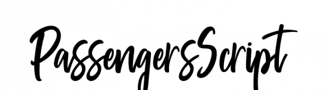
A bold, dynamic script font with flowing, interconnected strokes.
![PassengersScript font caratteri gratis]() Scaricare 723 Downloads@WebFont
Scaricare 723 Downloads@WebFont -
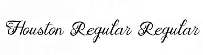
![Houston Regular Regular font caratteri gratis]() Scaricare 723 Downloads@WebFont
Scaricare 723 Downloads@WebFont -
( Fonts by character - Personal-use only. For commercial use please contact owner. )
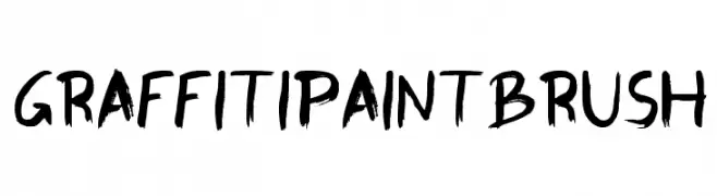
A bold, brush-style font with a graffiti-inspired, energetic look.
![GraffitiPaintBrush font caratteri gratis]() Scaricare 723 Downloads@WebFont
Scaricare 723 Downloads@WebFont -
( Copyright (c) 2015 by Rosetta Type Foundry s.r.o. (info@rosettatype.com). )
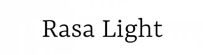
A modern serif font with elegant lines and balanced proportions.
![Rasa Light font caratteri gratis]() Scaricare 723 Downloads@WebFont
Scaricare 723 Downloads@WebFont -
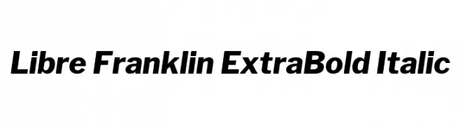
( Copyright (c) 2015, Impallari Type (www.impallari.com) )
A bold, italic sans-serif font with a modern and dynamic style.
![Libre Franklin ExtraBold Italic font caratteri gratis]() Scaricare 723 Downloads@WebFont
Scaricare 723 Downloads@WebFont -
( Fonts by UpandIt )
A playful, handwritten font with tall, narrow letters and rounded edges.
![Azurite font caratteri gratis]() Scaricare 723 Downloads@WebFont
Scaricare 723 Downloads@WebFont -
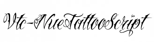
( Fonts by Vigilante Typeface Corporation Larry Yerkes. Personal-use only. For commercial use please contact owner. )
An ornate script font with flowing, interconnected letterforms and decorative flourishes.
![Vtc-NueTattooScript font caratteri gratis]() Scaricare 723 Downloads@WebFont
Scaricare 723 Downloads@WebFont -
![TYPONOME font caratteri gratis]() Scaricare 723 Downloads@WebFont
Scaricare 723 Downloads@WebFont -
( Fonts by Adult Ramblings - Anastacia E. Zittel - Personal-use only. For commercial use please contact owner. )
A decorative font with festive and celebratory icons.
![AEZ celebrate font caratteri gratis]() Scaricare 723 Downloads@WebFont
Scaricare 723 Downloads@WebFont -
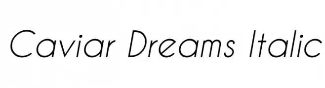
( Fonts by Lauren Thompson - www.nymfont.com )
A sleek, modern italic font with clean lines and balanced proportions.
![Caviar Dreams Italic font caratteri gratis]() Scaricare 723 Downloads@WebFont
Scaricare 723 Downloads@WebFont -
( Fonts by Blue Vinyl - Jess Latham - www.bvfonts.com )
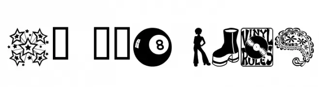
A 1970s-themed decorative dingbat font with iconic retro illustrations.
![My 70s Ding font caratteri gratis]() Scaricare 723 Downloads@WebFont
Scaricare 723 Downloads@WebFont -
( Fonts by ShyFonts )
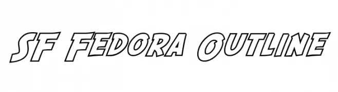
A bold, outlined font with a dynamic and impactful style.
![SF Fedora Outline font caratteri gratis]() Scaricare 723 Downloads@WebFont
Scaricare 723 Downloads@WebFont -
( Fonts by Daniel Zadorozny - www.iconian.com - Free for personal use )
A bold, futuristic font with angular, geometric letterforms.
![Native Alien Extended font caratteri gratis]() Scaricare 723 Downloads
Scaricare 723 Downloads -
( Fonts by www.4yeo.com )
Bold sans-serif font with decorative circular frames and dotted borders.
![4YEO OUT font caratteri gratis]() Scaricare 723 Downloads@WebFont
Scaricare 723 Downloads@WebFont -
( Fonts by www.varian.net )
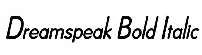
A bold, italicized font with a modern and dynamic style.
![Dreamspeak Bold Italic font caratteri gratis]() Scaricare 723 Downloads@WebFont
Scaricare 723 Downloads@WebFont -
![Jedi Symbol font caratteri gratis]() Scaricare 723 Downloads@WebFont
Scaricare 723 Downloads@WebFont -
![Manta font caratteri gratis]() Scaricare 723 Downloads@WebFont
Scaricare 723 Downloads@WebFont -
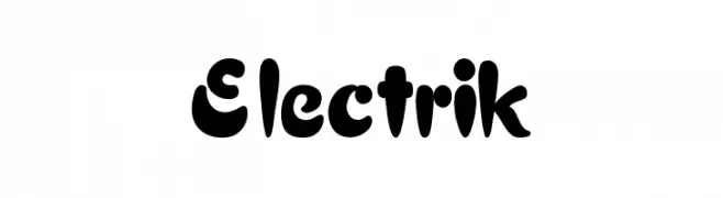
( Fonts by Alan Carr )
A bold, playful font with thick, rounded strokes and a whimsical style.
![Electrik font caratteri gratis]() Scaricare 723 Downloads
Scaricare 723 Downloads -
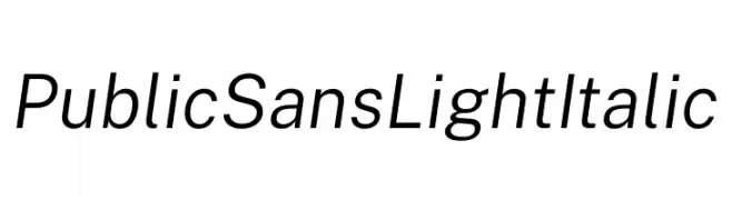
( Fonts by U.S. Web Design System )
A modern, light, italic sans-serif font with balanced spacing and clean lines.
![Public Sans Light Italic font caratteri gratis]() Scaricare 722 Downloads@WebFont
Scaricare 722 Downloads@WebFont


Quali sono i font più popolari adesso?
Poppins, Roboto, Montserrat, Open Sans e Lato sono molto usati per le forme pulite e l'ampia applicabilità — dall'identità di marca alle landing page e ai poster.
Quali font si usano spesso nei loghi?
Le sans serif geometriche (es. Poppins, famiglie in stile Gotham) sono scelte comuni per un branding pulito e scalabile. Per un tocco personale restano valide script e stili manoscritti. Abbina un display deciso per i titoli a un corpo testo neutro per riconoscibilità ed equilibrio.
Ogni quanto si aggiorna la lista?
Con regolarità, in base ai download e all'attività reale. Torna spesso per scoprire in anticipo le nuove preferite.
💡 Consiglio: aggiungi ai preferiti — le tendenze cambiano in fretta e i font top di oggi possono ispirare il rebranding di domani.