Benvenuto nelle Font Più Popolari — dove popolarità e qualità si incontrano. Qui trovi i font più scaricati e usati dell'anno. Se cerchi scelte sicure per logo, web o social, inizia da qui.
Ogni font top si distingue per equilibrio, leggibilità e versatilità. Troverai sans serif moderne, script eleganti, serif vintage e display minimalisti.
-
 Scaricare 159 Downloads@WebFont
 -
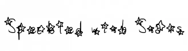
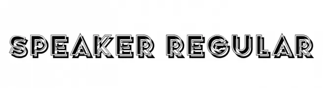
( Fonts by Vladimir Nikolic )
A bold, decorative font with geometric outlines and strong contrast.
![Speaker Regular font caratteri gratis]() Scaricare 159 Downloads@WebFont
Scaricare 159 Downloads@WebFont -
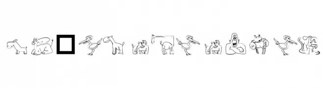
( Fonts by Font Environment - fontenvironment.com )
Playful animal illustrations form each character in a decorative, hand-drawn style.
![FE-Ubiquitous font caratteri gratis]() Scaricare 159 Downloads@WebFont
Scaricare 159 Downloads@WebFont -
( Fonts by Hanzel Space - Personal-use only. For commercial use please contact owner. )
A fluid, cursive script font with a natural handwritten style.
![Renitta font caratteri gratis]() Scaricare 159 Downloads@WebFont
Scaricare 159 Downloads@WebFont -
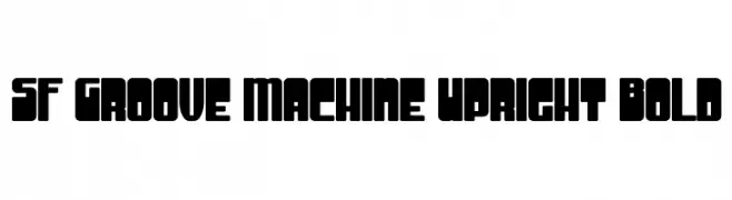
( Fonts by ShyFonts )
A bold, geometric font with blocky, modern characters.
![SF Groove Machine Upright Bold font caratteri gratis]() Scaricare 159 Downloads@WebFont
Scaricare 159 Downloads@WebFont -
-
( Fonts by Levi Szekeres - www.loremipsum.ro. Personal-use only. For commercial use please contact owner. )
A modern, italicized font with rounded, smooth characters and consistent stroke width.
![Ruler Italic font caratteri gratis]() Scaricare 159 Downloads@WebFont
Scaricare 159 Downloads@WebFont -
( Fonts by dustBUST - Andreas Nylin )
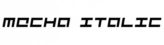
A futuristic, angular italic font with bold weight and expanded width.
![Mecha Italic font caratteri gratis]() Scaricare 159 Downloads@WebFont
Scaricare 159 Downloads@WebFont -
( Fonts by Typographer Mediengestaltung - Personal-use only. For commercial use please contact owner. )
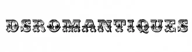
An ornate, decorative font with intricate detailing and a vintage flair.
![DS Romantiques font caratteri gratis]() Scaricare 159 Downloads@WebFont
Scaricare 159 Downloads@WebFont -
( Fonts by Daniel Zadorozny - www.iconian.com )
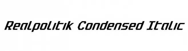
A modern, condensed italic font with bold, angular characters.
![Realpolitik Condensed Italic font caratteri gratis]() Scaricare 159 Downloads@WebFont
Scaricare 159 Downloads@WebFont -
( Jen Jones - www.jenjonesfonts.com )
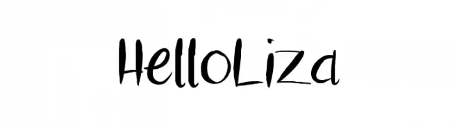
A playful, hand-drawn font with dynamic strokes and a whimsical feel.
![HelloLiza font caratteri gratis]() Scaricare 159 Downloads@WebFont
Scaricare 159 Downloads@WebFont


Quali sono i font più popolari adesso?
Poppins, Roboto, Montserrat, Open Sans e Lato sono molto usati per le forme pulite e l'ampia applicabilità — dall'identità di marca alle landing page e ai poster.
Quali font si usano spesso nei loghi?
Le sans serif geometriche (es. Poppins, famiglie in stile Gotham) sono scelte comuni per un branding pulito e scalabile. Per un tocco personale restano valide script e stili manoscritti. Abbina un display deciso per i titoli a un corpo testo neutro per riconoscibilità ed equilibrio.
Ogni quanto si aggiorna la lista?
Con regolarità, in base ai download e all'attività reale. Torna spesso per scoprire in anticipo le nuove preferite.
💡 Consiglio: aggiungi ai preferiti — le tendenze cambiano in fretta e i font top di oggi possono ispirare il rebranding di domani.