Benvenuto nelle Font Più Popolari — dove popolarità e qualità si incontrano. Qui trovi i font più scaricati e usati dell'anno. Se cerchi scelte sicure per logo, web o social, inizia da qui.
Ogni font top si distingue per equilibrio, leggibilità e versatilità. Troverai sans serif moderne, script eleganti, serif vintage e display minimalisti.
-
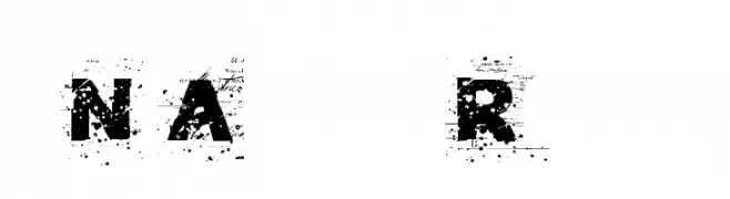
( Fonts by Rob Dobi - Toxic Type - www.dobi.nu )
A distressed, grunge-style font with a textured, weathered appearance.
 Scaricare 709 Downloads@WebFont
 -
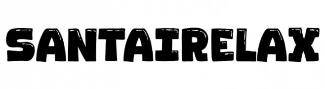
( Fonts by Khurasan )
A bold, playful font with a distressed texture and rounded characters.
![Santai Relax font caratteri gratis]() Scaricare 708 Downloads@WebFont
Scaricare 708 Downloads@WebFont -
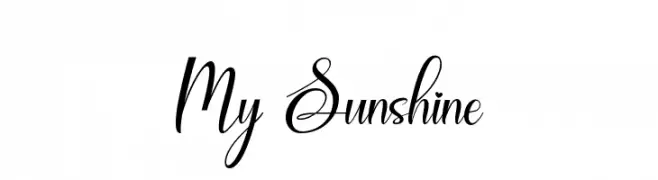
( Fonts by Naharstd - Nanda Hardiansyah - Personal-use only. For commercial use please contact owner. )
An elegant script font with flowing, cursive characters and graceful swashes.
![My Sunshine font caratteri gratis]() Scaricare 708 Downloads@WebFont
Scaricare 708 Downloads@WebFont -
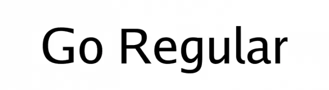
( Fonts by Kris Holmes and Charles Bigelow - Personal-use only. For commercial use please contact owner. )
A modern sans-serif font with clean, geometric letterforms.
![Go Regular font caratteri gratis]() Scaricare 708 Downloads@WebFont
Scaricare 708 Downloads@WebFont -
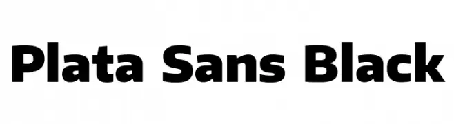
( Fonts by Pablo Impallari, Andres Torresi, & Cristiano Sobral - Personal-use only. For commercial use please contact owner. )
A bold, modern sans-serif font with strong geometric shapes.
![Plata Sans Black font caratteri gratis]() Scaricare 708 Downloads@WebFont
Scaricare 708 Downloads@WebFont -
( Weape Design - creativemarket.com/weape?u=weape )
A dynamic and expressive script font with fluid, cursive letterforms.
![Milea Demo Regular font caratteri gratis]() Scaricare 708 Downloads@WebFont
Scaricare 708 Downloads@WebFont -
( Fonts by Luke Owens - Personal-use only. For commercial use please contact owner. )
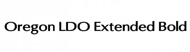
A bold, extended font with a modern and clean design, perfect for impactful headlines and branding.
![Oregon LDO Extended Bold font caratteri gratis]() Scaricare 708 Downloads@WebFont
Scaricare 708 Downloads@WebFont -
Caratteri di spideraysfonts. For commercial use please contact the owner.
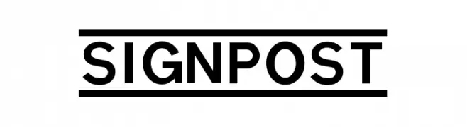
( SIGNPOST )
A bold, geometric font with strong, uniform strokes and modern appeal.
![SIGNPOST font caratteri gratis]() Scaricare 708 Downloads@WebFont
Scaricare 708 Downloads@WebFont -
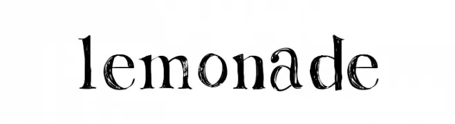
( Fonts by Rachel Adams - www.rlaurendesign.com - Personal-use only. For commercial use please contact owner. )
A distressed, textured font with a hand-drawn, artistic style.
![Lemonade font caratteri gratis]() Scaricare 708 Downloads@WebFont
Scaricare 708 Downloads@WebFont -
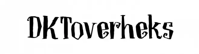
( Fonts by Hanoded )
A whimsical, Halloween-themed font with jagged, hand-drawn characters.
![DKToverheks font caratteri gratis]() Scaricare 708 Downloads@WebFont
Scaricare 708 Downloads@WebFont -
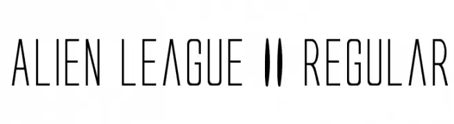
( Fonts by Daniel Zadorozny - www.iconian.com )
A futuristic, narrow font with a sleek and modern design.
![Alien League II Regular font caratteri gratis]() Scaricare 708 Downloads@WebFont
Scaricare 708 Downloads@WebFont -
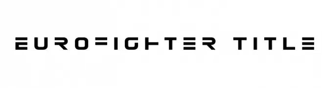
( Fonts by Daniel Zadorozny - www.iconian.com )
A bold, geometric font with a futuristic and technical aesthetic.
![Eurofighter Title font caratteri gratis]() Scaricare 708 Downloads@WebFont
Scaricare 708 Downloads@WebFont -
( Fonts by Daniel Zadorozny - www.iconian.com - Free for personal use )
A bold, italicized font with a futuristic and dynamic style.
![Quark Storm Bold Italic font caratteri gratis]() Scaricare 708 Downloads@WebFont
Scaricare 708 Downloads@WebFont -
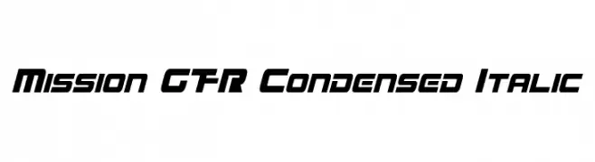
( Fonts by a Neale Davidson - www.pixelsagas.com. Personal-use only. For commercial use please contact owner. )
A bold, condensed, and italicized font with a modern, futuristic style.
![Mission GT-R Condensed Italic font caratteri gratis]() Scaricare 708 Downloads@WebFont
Scaricare 708 Downloads@WebFont -
![curved font caratteri gratis]() Scaricare 708 Downloads@WebFont
Scaricare 708 Downloads@WebFont -
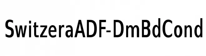
( Fonts by Arkandis Digital Foundry )
A bold, condensed sans-serif font with a modern and clean design.
![SwitzeraADF-DmBdCond font caratteri gratis]() Scaricare 708 Downloads@WebFont
Scaricare 708 Downloads@WebFont -
![NoAutority Regular font caratteri gratis]() Scaricare 708 Downloads@WebFont
Scaricare 708 Downloads@WebFont -
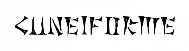
Caratteri di JuanCasco. For commercial use please contact the owner.
( Fonts by Juan Casco - www.juancasco.net )
A bold, ancient-inspired font with sharp, angular characters.
![Cuneiforme font caratteri gratis]() Scaricare 708 Downloads@WebFont
Scaricare 708 Downloads@WebFont -
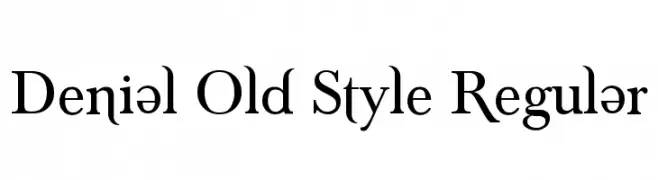
( SDFonts. http://www.angelfire.com/scifi2/sdfonts/index.html )
A classic serif font with elegant lines and a traditional, sophisticated appearance.
![Denial Old Style Regular font caratteri gratis]() Scaricare 708 Downloads@WebFont
Scaricare 708 Downloads@WebFont -
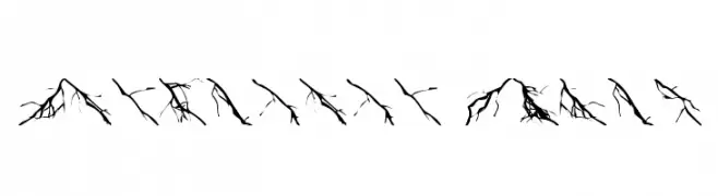
Caratteri di foopy. For commercial use please contact the owner.
![Lightning Bolts font caratteri gratis]() Scaricare 708 Downloads@WebFont
Scaricare 708 Downloads@WebFont -
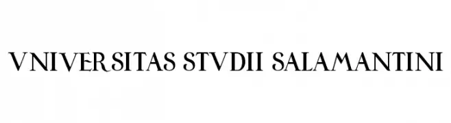
![Universitas Studii Salamantini font caratteri gratis]() Scaricare 708 Downloads@WebFont
Scaricare 708 Downloads@WebFont -
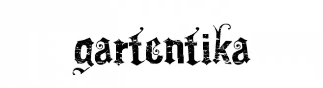
![Gartentika font caratteri gratis]() Scaricare 708 Downloads@WebFont
Scaricare 708 Downloads@WebFont -
![Half Project Logo font caratteri gratis]() Scaricare 708 Downloads@WebFont
Scaricare 708 Downloads@WebFont -
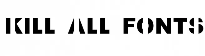
![Kill All Fonts font caratteri gratis]() Scaricare 708 Downloads@WebFont
Scaricare 708 Downloads@WebFont -
( Fonts by billyargel.blogspot.com - Billy Argel )
A bold, distressed font with a rugged, grunge aesthetic.
![PANHEAD font caratteri gratis]() Scaricare 708 Downloads@WebFont
Scaricare 708 Downloads@WebFont -
( Fonts by bridgeco.jp )
A geometric font with circular and linear elements, offering a modern and structured look.
![Gear font caratteri gratis]() Scaricare 708 Downloads@WebFont
Scaricare 708 Downloads@WebFont -
( Fonts by Manfred Klein - manfred-klein.ina-mar.com )
A playful and dynamic font with bold strokes and whimsical character designs.
![Jonas-Normal font caratteri gratis]() Scaricare 708 Downloads@WebFont
Scaricare 708 Downloads@WebFont -
( Fonts by www.fenotype.com )
A bold, geometric font with a three-dimensional effect and tight spacing.
![FT ScandinavianTitan Black font caratteri gratis]() Scaricare 708 Downloads@WebFont
Scaricare 708 Downloads@WebFont -
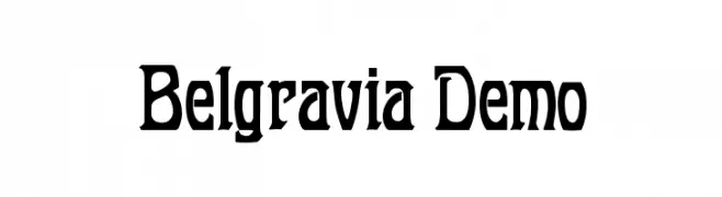
![Belgravia Demo font caratteri gratis]() Scaricare 708 Downloads@WebFont
Scaricare 708 Downloads@WebFont -
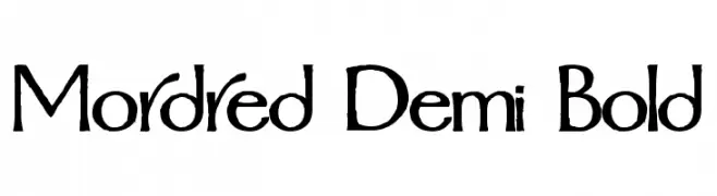
![Mordred Demi Bold font caratteri gratis]() Scaricare 708 Downloads
Scaricare 708 Downloads -
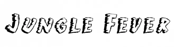
![Jungle Fever font caratteri gratis]() Scaricare 708 Downloads@WebFont
Scaricare 708 Downloads@WebFont -
( Fonts by www.blambot.com )
A playful, hand-drawn font with elongated, irregular letterforms.
![Belizarius font caratteri gratis]() Scaricare 708 Downloads@WebFont
Scaricare 708 Downloads@WebFont -
( Fonts by Apostrophic Lab )
A bold, slanted font with tight spacing and a modern, energetic style.
![FightThis font caratteri gratis]() Scaricare 708 Downloads@WebFont
Scaricare 708 Downloads@WebFont -
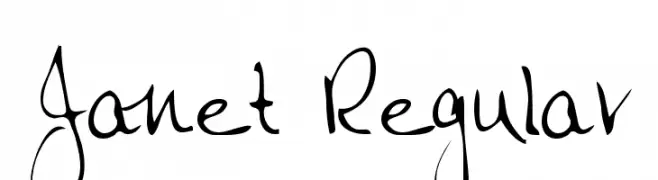
( Fonts by Altsys Metamorphosis )
A lively handwritten font with expressive, fluid strokes and playful elegance.
![Janet Regular font caratteri gratis]() Scaricare 708 Downloads@WebFont
Scaricare 708 Downloads@WebFont -
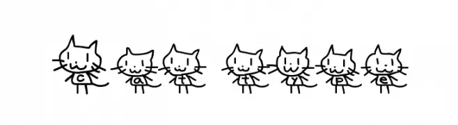
![Cat type font caratteri gratis]() Scaricare 708 Downloads@WebFont
Scaricare 708 Downloads@WebFont


Quali sono i font più popolari adesso?
Poppins, Roboto, Montserrat, Open Sans e Lato sono molto usati per le forme pulite e l'ampia applicabilità — dall'identità di marca alle landing page e ai poster.
Quali font si usano spesso nei loghi?
Le sans serif geometriche (es. Poppins, famiglie in stile Gotham) sono scelte comuni per un branding pulito e scalabile. Per un tocco personale restano valide script e stili manoscritti. Abbina un display deciso per i titoli a un corpo testo neutro per riconoscibilità ed equilibrio.
Ogni quanto si aggiorna la lista?
Con regolarità, in base ai download e all'attività reale. Torna spesso per scoprire in anticipo le nuove preferite.
💡 Consiglio: aggiungi ai preferiti — le tendenze cambiano in fretta e i font top di oggi possono ispirare il rebranding di domani.