Benvenuto nelle Font Più Popolari — dove popolarità e qualità si incontrano. Qui trovi i font più scaricati e usati dell'anno. Se cerchi scelte sicure per logo, web o social, inizia da qui.
Ogni font top si distingue per equilibrio, leggibilità e versatilità. Troverai sans serif moderne, script eleganti, serif vintage e display minimalisti.
-
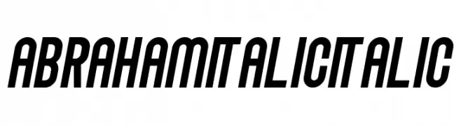
( Sabrtype - creativemarket.com/Sabrtype )
A bold, italicized font with a condensed and dynamic style.
 Scaricare 706 Downloads@WebFont
 -
( 7NTypes - Situjuh Nazara - 7ntypes.com )
A playful, flowing script font with a handwritten feel.
![Mergic font caratteri gratis]() Scaricare 706 Downloads@WebFont
Scaricare 706 Downloads@WebFont -
![Premier Sans font caratteri gratis]() Scaricare 706 Downloads@WebFont
Scaricare 706 Downloads@WebFont -
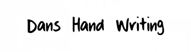
( Fonts by Daniel Agostino )
A casual, playful handwritten font with smooth, rounded strokes.
![Dans Hand Writing font caratteri gratis]() Scaricare 706 Downloads@WebFont
Scaricare 706 Downloads@WebFont -
( Fonts by Nirmal Biswas - www.be.net/nirmalbiswas/ - Usage demands USD 25 or more via PayPal to nirmalbiswas@gmail.com )
A bold, geometric font with blocky, angular letterforms.
![Meek Regular font caratteri gratis]() Scaricare 706 Downloads@WebFont
Scaricare 706 Downloads@WebFont -
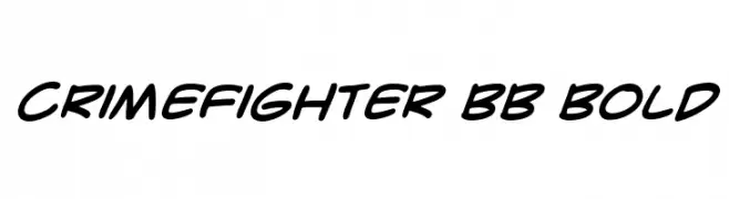
( Fonts by www.blambot.com )
A bold, dynamic script font with fluid, connected letterforms.
![CrimeFighter BB Bold font caratteri gratis]() Scaricare 706 Downloads@WebFont
Scaricare 706 Downloads@WebFont -
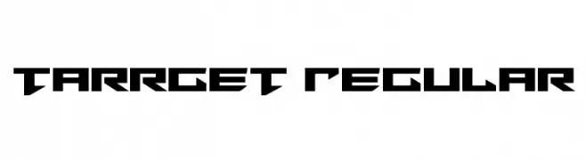
( Fonts by Daniel Zadorozny - www.iconian.com - Free for personal use )
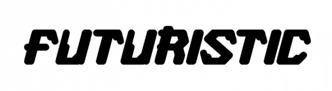
A bold, angular, and futuristic font with sharp geometric shapes.
![Tarrget Regular font caratteri gratis]() Scaricare 706 Downloads@WebFont
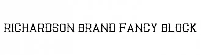
Scaricare 706 Downloads@WebFont -
![Richardson Brand Fancy Block font caratteri gratis]() Scaricare 706 Downloads@WebFont
Scaricare 706 Downloads@WebFont -
( Fonts by Fernando Haro - defharo.com )
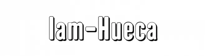
A bold, outlined font with a modern, three-dimensional appearance.
![Iam-Hueca font caratteri gratis]() Scaricare 706 Downloads@WebFont
Scaricare 706 Downloads@WebFont -
( Fonts by Daniel Zadorozny - www.iconian.com )
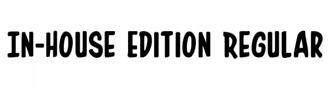
A playful, bold font with rounded edges and a friendly appearance.
![In-House Edition Regular font caratteri gratis]() Scaricare 706 Downloads@WebFont
Scaricare 706 Downloads@WebFont -
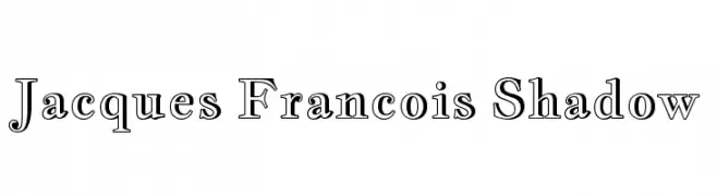
( Copyright (c) 2011, Cyreal (www.cyreal.org), with Reserved Font Name 'Jacques Francois' )
A classic serif font with a shadow effect for added depth.
![Jacques Francois Shadow font caratteri gratis]() Scaricare 706 Downloads@WebFont
Scaricare 706 Downloads@WebFont -
![FUTURISTIC font caratteri gratis]() Scaricare 706 Downloads@WebFont
Scaricare 706 Downloads@WebFont -
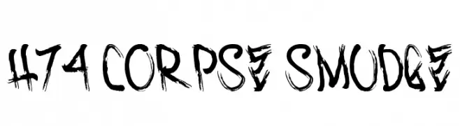
( Fonts by www.legacyofdefeat.com )
A bold, distressed font with a grunge aesthetic and textured, brush-like strokes.
![H74 Corpse Smudge font caratteri gratis]() Scaricare 706 Downloads@WebFont
Scaricare 706 Downloads@WebFont -
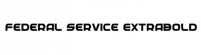
( Fonts by Daniel Zadorozny - www.iconian.com - Free for personal use )
A bold, geometric typeface with a modern and professional appearance.
![Federal Service ExtraBold font caratteri gratis]() Scaricare 706 Downloads@WebFont
Scaricare 706 Downloads@WebFont -
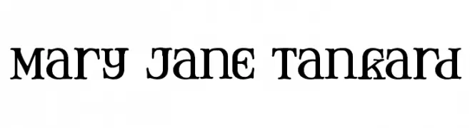
( Fonts by Apostrophic Lab )
A decorative font combining classic elegance with modern flair, featuring bold, artistic characters.
![Mary Jane Tankard font caratteri gratis]() Scaricare 706 Downloads@WebFont
Scaricare 706 Downloads@WebFont -
( Fonts by Dieter Steffmann )
A bold, decorative font with a shadow effect and sharp serifs.
![Devinne Swash Shadow font caratteri gratis]() Scaricare 706 Downloads@WebFont
Scaricare 706 Downloads@WebFont -
![SHAKAGRAPHICS 06 font caratteri gratis]() Scaricare 706 Downloads@WebFont
Scaricare 706 Downloads@WebFont -
( Fonts by Daniel Gauthier )
A bold, jagged font with an energetic and dynamic appearance.
![Weird font caratteri gratis]() Scaricare 706 Downloads@WebFont
Scaricare 706 Downloads@WebFont -
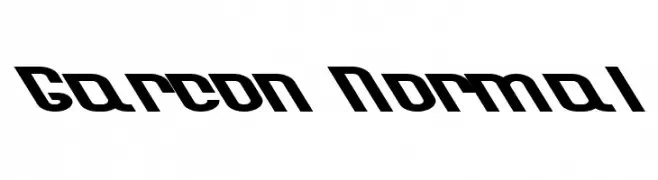
![Garcon Normal font caratteri gratis]() Scaricare 706 Downloads@WebFont
Scaricare 706 Downloads@WebFont -
( Fonts by BLKBK Fonts - www.blkbk.shop - Personal-use only. For commercial use please contact owner. Commerciali Caratteri )
A bold, brush-style script font with dynamic, hand-painted strokes.
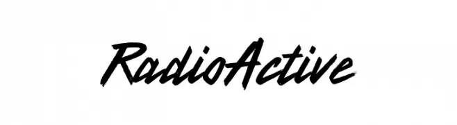
![Radio Active font caratteri gratis]() Scaricare 705 Downloads
Scaricare 705 Downloads -
( Fonts by Billy Argel Fonts - www.billyargel.com - Personal-use only. For commercial use please contact owner. )
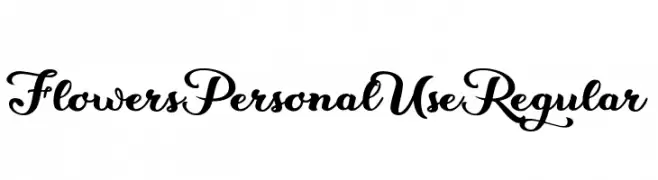
An elegant, flowing script font with ornate, decorative letterforms.
![Flowers Personal Use Regular font caratteri gratis]() Scaricare 705 Downloads@WebFont
Scaricare 705 Downloads@WebFont -
( Fonts by Cumberland Fontworks - S. John Ross - Personal-use only. For commercial use please contact owner. )
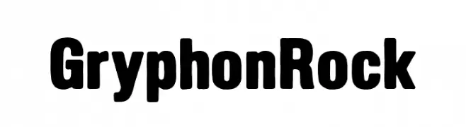
A bold, impactful font with thick, uniform strokes and rounded edges.
![GryphonRock font caratteri gratis]() Scaricare 705 Downloads@WebFont
Scaricare 705 Downloads@WebFont -
( Fonts by Syaf Rizal - www.creativefabrica.com/ref/53/ - Personal-use only. For commercial use please contact owner. )
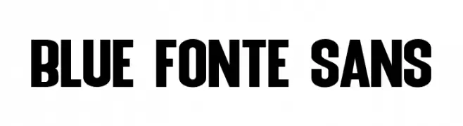
A bold, modern typeface with thick strokes and a strong presence.
![Blue Fonte Sans font caratteri gratis]() Scaricare 705 Downloads@WebFont
Scaricare 705 Downloads@WebFont -
( Fonts by Julieta Ulanovsky (font) & Cristiano Sobral (main changes) - Personal-use only. For commercial use please contact owner. )
A bold, italic font with a modern and dynamic style.
![Argentum Novus ExtraBold Italic font caratteri gratis]() Scaricare 705 Downloads@WebFont
Scaricare 705 Downloads@WebFont -
( Fonts by Kurnia Setyadi )
A playful, bold handwritten font with a whimsical and friendly style.
![Hoollidday font caratteri gratis]() Scaricare 705 Downloads@WebFont
Scaricare 705 Downloads@WebFont -
( Fonts by Monotype Design Team - Personal-use only. For commercial use please contact owner. )
A clean, modern sans-serif font with a condensed style.
![Avrile Sans Condensed font caratteri gratis]() Scaricare 705 Downloads@WebFont
Scaricare 705 Downloads@WebFont -
( Fonts by www.chequered.ink - Chequered Ink - Personal-use only. For commercial use please contact owner. )
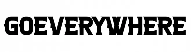
A bold, geometric font with strong, angular strokes.
![Go Everywhere font caratteri gratis]() Scaricare 705 Downloads@WebFont
Scaricare 705 Downloads@WebFont -
![December Pastel - Personal Use font caratteri gratis]() Scaricare 705 Downloads@WebFont
Scaricare 705 Downloads@WebFont -
![Inter-Bureau Bold font caratteri gratis]() Scaricare 705 Downloads@WebFont
Scaricare 705 Downloads@WebFont -
![Moonbase Delta Italic font caratteri gratis]() Scaricare 705 Downloads@WebFont
Scaricare 705 Downloads@WebFont -
( Zetafonts - www.zetafonts.com )
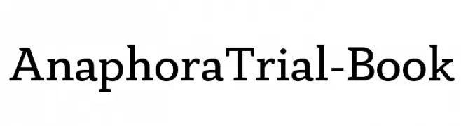
A classic serif font with a balanced and elegant appearance.
![AnaphoraTrial-Book font caratteri gratis]() Scaricare 705 Downloads@WebFont
Scaricare 705 Downloads@WebFont -
( Fonts by David Sum - www.davidsumdesign.com - Personal-use only. For commercial use please contact owner. )
A modern, geometric font with bold, uniform strokes and squared edges.
![Borg font caratteri gratis]() Scaricare 705 Downloads@WebFont
Scaricare 705 Downloads@WebFont -
( fontever.com )
A playful, casual handwritten font with uneven strokes and a whimsical style.
![handkerchief font caratteri gratis]() Scaricare 705 Downloads@WebFont
Scaricare 705 Downloads@WebFont -
( Fonts by Kristina Klaffke )
A playful, modern handwritten font with tall, narrow uppercase letters.
![BEARHUGSBYRATTICSASSIN-Regular font caratteri gratis]() Scaricare 705 Downloads@WebFont
Scaricare 705 Downloads@WebFont -
( Copyright (c) 2014, Indian Type Foundry (info@indiantypefoundry.com). )
A clean, modern sans-serif font with semi-light weight and slightly condensed characters.
![Khand-SemiLight font caratteri gratis]() Scaricare 705 Downloads@WebFont
Scaricare 705 Downloads@WebFont


Quali sono i font più popolari adesso?
Poppins, Roboto, Montserrat, Open Sans e Lato sono molto usati per le forme pulite e l'ampia applicabilità — dall'identità di marca alle landing page e ai poster.
Quali font si usano spesso nei loghi?
Le sans serif geometriche (es. Poppins, famiglie in stile Gotham) sono scelte comuni per un branding pulito e scalabile. Per un tocco personale restano valide script e stili manoscritti. Abbina un display deciso per i titoli a un corpo testo neutro per riconoscibilità ed equilibrio.
Ogni quanto si aggiorna la lista?
Con regolarità, in base ai download e all'attività reale. Torna spesso per scoprire in anticipo le nuove preferite.
💡 Consiglio: aggiungi ai preferiti — le tendenze cambiano in fretta e i font top di oggi possono ispirare il rebranding di domani.