Benvenuto nelle Font Più Popolari — dove popolarità e qualità si incontrano. Qui trovi i font più scaricati e usati dell'anno. Se cerchi scelte sicure per logo, web o social, inizia da qui.
Ogni font top si distingue per equilibrio, leggibilità e versatilità. Troverai sans serif moderne, script eleganti, serif vintage e display minimalisti.
-
( Fonts by Kotak Kuning Studio - kotakkuning.com - Personal-use only. For commercial use please contact owner. )
A bold, expressive script font with a playful and energetic style.
 Scaricare 701 Downloads@WebFont
 -
( Fonts by www.chequered.ink - Chequered Ink - Personal-use only. For commercial use please contact owner. )
A bold, geometric font with a futuristic and modern design.
![Amuse-Bouche font caratteri gratis]() Scaricare 701 Downloads@WebFont
Scaricare 701 Downloads@WebFont -
( Fonts by Nur Solikh )
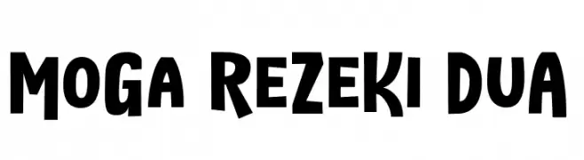
A bold, playful font with dynamic characters and a strong presence.
![MoGa ReZeKi DuA font caratteri gratis]() Scaricare 701 Downloads@WebFont
Scaricare 701 Downloads@WebFont -
( Fonts by Typesgal - Personal-use only. For commercial use please contact owner. )
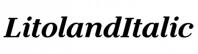
An elegant italic font with smooth curves and a classic style.
![Litoland Italic font caratteri gratis]() Scaricare 701 Downloads@WebFont
Scaricare 701 Downloads@WebFont -
( Michael D. Adams - www.triskele.com/roadgeek-fonts/ )
A modern, geometric sans-serif font with uniform strokes and high readability.
![Roadgeek 2005 Series D font caratteri gratis]() Scaricare 701 Downloads@WebFont
Scaricare 701 Downloads@WebFont -
( imagex - www.imagex-fonts.com )
A bold, expressive handwritten font with dynamic brush strokes and high contrast.
![Advert font caratteri gratis]() Scaricare 701 Downloads@WebFont
Scaricare 701 Downloads@WebFont -
( Matthieu Lonton )
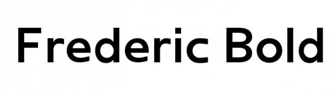
A bold, modern typeface with clean lines and strong presence.
![Frederic Bold font caratteri gratis]() Scaricare 701 Downloads@WebFont
Scaricare 701 Downloads@WebFont -
( Fonts by CannotIntoSpaceFonts - KineticPlasma Fonts - Personal-use only. For commercial use please contact owner. )
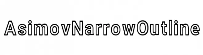
A modern, narrow outline font with a sleek and futuristic design.
![Asimov Narrow Outline font caratteri gratis]() Scaricare 701 Downloads@WebFont
Scaricare 701 Downloads@WebFont -
![Affectionately Yours font caratteri gratis]() Scaricare 701 Downloads@WebFont
Scaricare 701 Downloads@WebFont -
( Fonts by a Neale Davidson - www.pixelsagas.com. Personal-use only. For commercial use please contact owner. )
A bold, italicized font with sharp angles and a dynamic, modern style.
![Blitzwing Bold Italic font caratteri gratis]() Scaricare 701 Downloads@WebFont
Scaricare 701 Downloads@WebFont -
( Fonts by a Situjuh Nazara - c7n1.wordpress.com. Personal-use only. For commercial use please contact owner. )
A bold, geometric font with a cracked texture overlay, perfect for striking headlines.
![HEADSOME & modif Cut1 font caratteri gratis]() Scaricare 701 Downloads@WebFont
Scaricare 701 Downloads@WebFont -
( Fonts by Socialh. Personal-use only. For commercial use please contact owner. )
A bold, rounded font with a playful and friendly style.
![Cool Bold font caratteri gratis]() Scaricare 701 Downloads@WebFont
Scaricare 701 Downloads@WebFont -
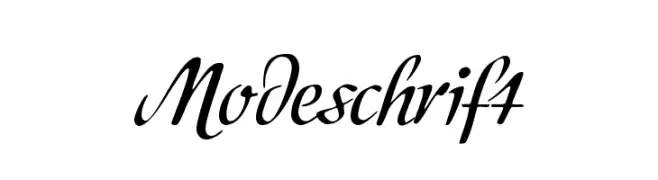
( Fonts by www.peter-wiegel.de. Personal-use only. For commercial use please contact owner. )
A cursive, elegant font with a sophisticated handwritten style.
![Modeschrift font caratteri gratis]() Scaricare 701 Downloads@WebFont
Scaricare 701 Downloads@WebFont -
( Fonts by junkohanhero )
A bold, distressed font with a vintage, rugged style.
![Endrophenomeua font caratteri gratis]() Scaricare 701 Downloads@WebFont
Scaricare 701 Downloads@WebFont -
( Fonts by Castcraft Software - opti.netii.net - check the website before use )
An elegant script font with flowing, cursive letterforms and intricate flourishes.
![OPTIAjax font caratteri gratis]() Scaricare 701 Downloads@WebFont
Scaricare 701 Downloads@WebFont -
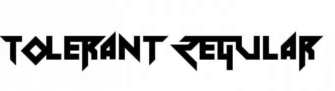
( Fonts by Andrew McCluskey - nalgames.com. Personal-use only. For commercial use please contact owner. )
A bold, geometric font with sharp angles and a futuristic look.
![Tolerant Regular font caratteri gratis]() Scaricare 701 Downloads@WebFont
Scaricare 701 Downloads@WebFont -
( Fonts by a Neale Davidson - www.pixelsagas.com. Personal-use only. For commercial use please contact owner. )
A bold, geometric font with high contrast and unique character shapes.
![Suchet Bold font caratteri gratis]() Scaricare 701 Downloads@WebFont
Scaricare 701 Downloads@WebFont -
![FoglihtenNo04 font caratteri gratis]() Scaricare 701 Downloads@WebFont
Scaricare 701 Downloads@WebFont -
( Fonts by Hideki Katayama - com4t-fff.seesaa.net )
A bold, modern font with geometric influences and strong visual impact.
![OLDNEW Axis font caratteri gratis]() Scaricare 701 Downloads@WebFont
Scaricare 701 Downloads@WebFont -
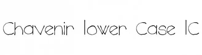
( Fonts by Mans Greback - www.mawns.com )
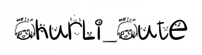
A playful, hand-drawn font with thin, elongated characters and a whimsical style.
![Chavenir Lower Case LC font caratteri gratis]() Scaricare 701 Downloads@WebFont
Scaricare 701 Downloads@WebFont -
![Churli_Cute font caratteri gratis]() Scaricare 701 Downloads@WebFont
Scaricare 701 Downloads@WebFont -
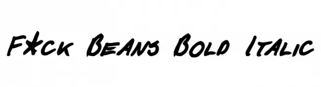
( Fonts by Michael Tension - www.TensionType.com )
A bold, italicized handwritten font with dynamic and expressive strokes.
![F*ck Beans Bold Italic font caratteri gratis]() Scaricare 701 Downloads@WebFont
Scaricare 701 Downloads@WebFont -
( Fonts by www.philing.net )
A casual, handwritten font with a fluid and dynamic style.
![Philing font caratteri gratis]() Scaricare 701 Downloads@WebFont
Scaricare 701 Downloads@WebFont -
( Fonts by Dieter Steffmann )
A bold, ornate font with medieval script influences and intricate detailing.
![Alte Schwabacher OSF DemiBold font caratteri gratis]() Scaricare 701 Downloads@WebFont
Scaricare 701 Downloads@WebFont -
![WishMF font caratteri gratis]() Scaricare 701 Downloads@WebFont
Scaricare 701 Downloads@WebFont -
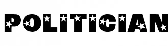
![Politician font caratteri gratis]() Scaricare 701 Downloads@WebFont
Scaricare 701 Downloads@WebFont -
![Vampire Revised Edition font caratteri gratis]() Scaricare 701 Downloads@WebFont
Scaricare 701 Downloads@WebFont -
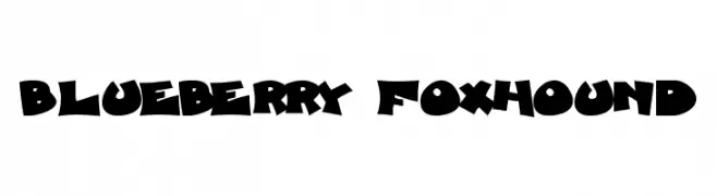
![Blueberry Foxhound font caratteri gratis]() Scaricare 701 Downloads
Scaricare 701 Downloads -
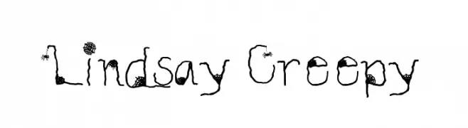
![Lindsay Creepy font caratteri gratis]() Scaricare 701 Downloads@WebFont
Scaricare 701 Downloads@WebFont -
( Fonts by Levi Halmos )
A bold, vintage-style font with thick serifs and unique cut-out shapes.
![Helldorado font caratteri gratis]() Scaricare 701 Downloads@WebFont
Scaricare 701 Downloads@WebFont -
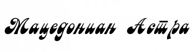
![Macedonian Astra font caratteri gratis]() Scaricare 701 Downloads@WebFont
Scaricare 701 Downloads@WebFont -
( Fonts by Graham Meade - GemFonts )
A bold, textured font with a hand-drawn, artistic style.
![Oil On The Water font caratteri gratis]() Scaricare 701 Downloads@WebFont
Scaricare 701 Downloads@WebFont -
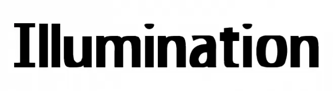
![Illumination font caratteri gratis]() Scaricare 701 Downloads@WebFont
Scaricare 701 Downloads@WebFont -
( Fonts by www.waltervelezart.com )
A bold, electrifying font with sharp, jagged edges and dynamic style.
![Zeus font caratteri gratis]() Scaricare 701 Downloads@WebFont
Scaricare 701 Downloads@WebFont -
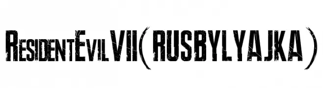
( Fonts by FONTS BY LYAJKA - Personal-use only. For commercial use please contact owner. )
A bold, distressed font with a grunge aesthetic, perfect for dramatic designs.
![Resident Evil 7(RUS BY LYAJKA) font caratteri gratis]() Scaricare 700 Downloads@WebFont
Scaricare 700 Downloads@WebFont


Quali sono i font più popolari adesso?
Poppins, Roboto, Montserrat, Open Sans e Lato sono molto usati per le forme pulite e l'ampia applicabilità — dall'identità di marca alle landing page e ai poster.
Quali font si usano spesso nei loghi?
Le sans serif geometriche (es. Poppins, famiglie in stile Gotham) sono scelte comuni per un branding pulito e scalabile. Per un tocco personale restano valide script e stili manoscritti. Abbina un display deciso per i titoli a un corpo testo neutro per riconoscibilità ed equilibrio.
Ogni quanto si aggiorna la lista?
Con regolarità, in base ai download e all'attività reale. Torna spesso per scoprire in anticipo le nuove preferite.
💡 Consiglio: aggiungi ai preferiti — le tendenze cambiano in fretta e i font top di oggi possono ispirare il rebranding di domani.