Benvenuto nelle Font Più Popolari — dove popolarità e qualità si incontrano. Qui trovi i font più scaricati e usati dell'anno. Se cerchi scelte sicure per logo, web o social, inizia da qui.
Ogni font top si distingue per equilibrio, leggibilità e versatilità. Troverai sans serif moderne, script eleganti, serif vintage e display minimalisti.
-
( Fonts by Miffies - mfs.jp.org - Personal-use only. For commercial use please contact owner. )
A bold, geometric font with a modern and futuristic style.
 Scaricare 153 Downloads@WebFont
 -
( Lyric Type - www.deviantart.com/westralinc )
A bold, geometric font with a futuristic and edgy design.
![YG Rounded Bold font caratteri gratis]() Scaricare 153 Downloads@WebFont
Scaricare 153 Downloads@WebFont -
![Cheesy Enchilada Regular font caratteri gratis]() Scaricare 153 Downloads@WebFont
Scaricare 153 Downloads@WebFont -
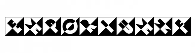
( Iconian Fonts - Daniel Zadorozny - www.iconian.com )
A bold, angular font with a futuristic and dynamic style.
![Flash Rogers Straight font caratteri gratis]() Scaricare 153 Downloads@WebFont
Scaricare 153 Downloads@WebFont -
( Fonts by JoannaVu - https://ioannaladopoulou.design - Personal-use only. For commercial use please contact owner. )
A futuristic, angular font with bold geometric shapes and sharp edges.
![thepriest font caratteri gratis]() Scaricare 153 Downloads@WebFont
Scaricare 153 Downloads@WebFont -
-
( Fonts by Daniel Zadorozny - www.iconian.com )
A bold, distressed font with a rugged, weathered appearance.
![Body Swipers Rotated font caratteri gratis]() Scaricare 153 Downloads@WebFont
Scaricare 153 Downloads@WebFont -
( Fonts by Southype )
A bold, three-dimensional font with a retro-modern style.
![Panda Power St font caratteri gratis]() Scaricare 153 Downloads@WebFont
Scaricare 153 Downloads@WebFont -
( Fonts by Divide By Zero! - fonts.tom7.com )
A playful, hand-drawn font with quirky letterforms and smiley face characters.
![Cosine Katie font caratteri gratis]() Scaricare 153 Downloads@WebFont
Scaricare 153 Downloads@WebFont -
( Fonts by Nick Curtis - www.nicksfonts.com )
A bold, geometric, and decorative font with angular shapes and high contrast.
![EmporiumNF font caratteri gratis]() Scaricare 153 Downloads@WebFont
Scaricare 153 Downloads@WebFont -
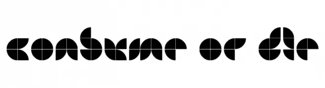
( Fonts by PaulW - paulw.deviantart.com )
A bold, geometric font with circular, grid-based characters.
![Consume or Die font caratteri gratis]() Scaricare 153 Downloads@WebFont
Scaricare 153 Downloads@WebFont
Quali sono i font più popolari adesso?
Poppins, Roboto, Montserrat, Open Sans e Lato sono molto usati per le forme pulite e l'ampia applicabilità — dall'identità di marca alle landing page e ai poster.
Quali font si usano spesso nei loghi?
Le sans serif geometriche (es. Poppins, famiglie in stile Gotham) sono scelte comuni per un branding pulito e scalabile. Per un tocco personale restano valide script e stili manoscritti. Abbina un display deciso per i titoli a un corpo testo neutro per riconoscibilità ed equilibrio.
Ogni quanto si aggiorna la lista?
Con regolarità, in base ai download e all'attività reale. Torna spesso per scoprire in anticipo le nuove preferite.
💡 Consiglio: aggiungi ai preferiti — le tendenze cambiano in fretta e i font top di oggi possono ispirare il rebranding di domani.