Benvenuto nelle Font Più Popolari — dove popolarità e qualità si incontrano. Qui trovi i font più scaricati e usati dell'anno. Se cerchi scelte sicure per logo, web o social, inizia da qui.
Ogni font top si distingue per equilibrio, leggibilità e versatilità. Troverai sans serif moderne, script eleganti, serif vintage e display minimalisti.
-
 Scaricare 153 Downloads@WebFont
 -
( Free for a personal use. For a commercial use please visit www.kevinandamanda.com )
A bold, playful handwritten font with a casual and friendly style.
![Pea Marcie font caratteri gratis]() Scaricare 153 Downloads@WebFont
Scaricare 153 Downloads@WebFont -
( Fonts by Apostrophic Lab )
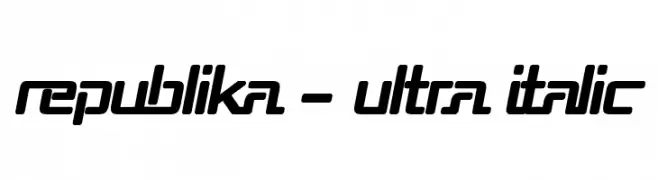
A bold, italicized font with a futuristic and dynamic style.
![Republika - Ultra Italic font caratteri gratis]() Scaricare 153 Downloads@WebFont
Scaricare 153 Downloads@WebFont -
( Fonts by Disaster Fonts )
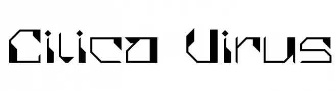
A futuristic, angular font with a bold and geometric design.
![Cilica Virus font caratteri gratis]() Scaricare 153 Downloads@WebFont
Scaricare 153 Downloads@WebFont -
( Fonts by Fizzetica DepokAsiana TypeFoundry - fizzeticatypefoundry.tumblr.com )
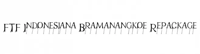
An elegant, decorative font with artistic flourishes and a modern flair.
![FTF Indonesiana Bramanangkoe Repackage font caratteri gratis]() Scaricare 153 Downloads@WebFont
Scaricare 153 Downloads@WebFont -
-
( Fonts by Iconian Fonts )
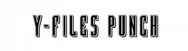
A bold, outlined geometric font with a vintage yet modern appeal.
![Y-Files Punch font caratteri gratis]() Scaricare 153 Downloads@WebFont
Scaricare 153 Downloads@WebFont -
( Fonts by Miffies - mfs.jp.org - Personal-use only. For commercial use please contact owner. )
A bold, pixelated font with a retro, arcade-inspired design.
![M38_GORILLA font caratteri gratis]() Scaricare 153 Downloads@WebFont
Scaricare 153 Downloads@WebFont -
( Fonts by ingoFonts. http://www.ingofonts.de )
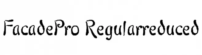
An artistic, hand-drawn font with whimsical curves and decorative elements.
![FacadePro-Regularreduced font caratteri gratis]() Scaricare 153 Downloads@WebFont
Scaricare 153 Downloads@WebFont -
( Fonts by Daniel Zadorozny - www.iconian.com )
A bold, italicized, and distressed decorative font with a riddled appearance.
![King Commando Riddled Italic font caratteri gratis]() Scaricare 153 Downloads@WebFont
Scaricare 153 Downloads@WebFont -
( Fonts by Andi Moz )
A playful, handwritten font with rounded, consistent strokes and good readability.
![Welcome December font caratteri gratis]() Scaricare 153 Downloads@WebFont
Scaricare 153 Downloads@WebFont


Quali sono i font più popolari adesso?
Poppins, Roboto, Montserrat, Open Sans e Lato sono molto usati per le forme pulite e l'ampia applicabilità — dall'identità di marca alle landing page e ai poster.
Quali font si usano spesso nei loghi?
Le sans serif geometriche (es. Poppins, famiglie in stile Gotham) sono scelte comuni per un branding pulito e scalabile. Per un tocco personale restano valide script e stili manoscritti. Abbina un display deciso per i titoli a un corpo testo neutro per riconoscibilità ed equilibrio.
Ogni quanto si aggiorna la lista?
Con regolarità, in base ai download e all'attività reale. Torna spesso per scoprire in anticipo le nuove preferite.
💡 Consiglio: aggiungi ai preferiti — le tendenze cambiano in fretta e i font top di oggi possono ispirare il rebranding di domani.