Benvenuto nelle Font Più Popolari — dove popolarità e qualità si incontrano. Qui trovi i font più scaricati e usati dell'anno. Se cerchi scelte sicure per logo, web o social, inizia da qui.
Ogni font top si distingue per equilibrio, leggibilità e versatilità. Troverai sans serif moderne, script eleganti, serif vintage e display minimalisti.
-
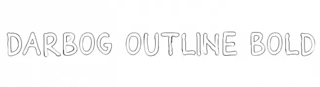
( Fonts by Darko Bogdanov )
A playful, bold outline font with a whimsical and engaging style.
 Scaricare 151 Downloads@WebFont
 -
( Fonts by Iconian Fonts )
A bold, condensed, and italic font with a dynamic, geometric style.
![Domino Jack Condensed Italic Condensed Italic font caratteri gratis]() Scaricare 151 Downloads@WebFont
Scaricare 151 Downloads@WebFont -
( Fonts by www.chequered.ink - Chequered Ink - Personal-use only. For commercial use please contact owner. )
A bold, dynamic font with sharp, angular edges and a playful style.
![Shiny Eyes font caratteri gratis]() Scaricare 151 Downloads@WebFont
Scaricare 151 Downloads@WebFont -
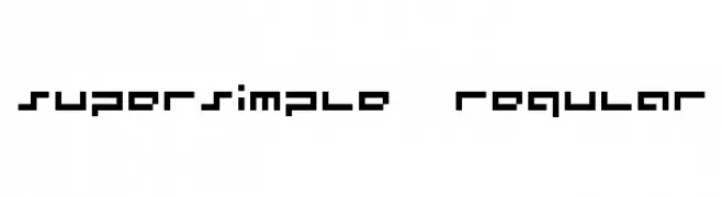
( Font by Sven Stuber - www.superlooper.de )
A pixelated, geometric font inspired by retro digital displays.
![supersimple regular font caratteri gratis]() Scaricare 151 Downloads@WebFont
Scaricare 151 Downloads@WebFont -
![Taper font caratteri gratis]() Scaricare 151 Downloads@WebFont
Scaricare 151 Downloads@WebFont -
-
( گالری فانت فارسی پژوهش آريانا - only compatible with Farsi and Arabic )
A bold, high-contrast font with elegant curves and a dramatic style.
![Yaas Bold font caratteri gratis]() Scaricare 151 Downloads@WebFont
Scaricare 151 Downloads@WebFont -
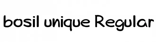
( Fonts by Manuel Ramos - www.infinitismo.com - Personal-use only. For commercial use please contact owner. )
A bold, geometric font with artistic flair and unique character shapes.
![Artistica font caratteri gratis]() Scaricare 151 Downloads@WebFont
Scaricare 151 Downloads@WebFont -
![bosil unique Regular font caratteri gratis]() Scaricare 151 Downloads@WebFont
Scaricare 151 Downloads@WebFont -
( Fonts by www.studiotypo.com - Personal-use only. For commercial use please contact owner. )
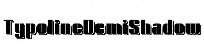
A bold, shadowed font with a strong, three-dimensional appearance.
![Typoline Demi Shadow font caratteri gratis]() Scaricare 151 Downloads@WebFont
Scaricare 151 Downloads@WebFont -
( Fonts by Apostrophic Lab )
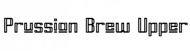
A bold, geometric font with an industrial and modern aesthetic.
![Prussian Brew Upper font caratteri gratis]() Scaricare 151 Downloads@WebFont
Scaricare 151 Downloads@WebFont


Quali sono i font più popolari adesso?
Poppins, Roboto, Montserrat, Open Sans e Lato sono molto usati per le forme pulite e l'ampia applicabilità — dall'identità di marca alle landing page e ai poster.
Quali font si usano spesso nei loghi?
Le sans serif geometriche (es. Poppins, famiglie in stile Gotham) sono scelte comuni per un branding pulito e scalabile. Per un tocco personale restano valide script e stili manoscritti. Abbina un display deciso per i titoli a un corpo testo neutro per riconoscibilità ed equilibrio.
Ogni quanto si aggiorna la lista?
Con regolarità, in base ai download e all'attività reale. Torna spesso per scoprire in anticipo le nuove preferite.
💡 Consiglio: aggiungi ai preferiti — le tendenze cambiano in fretta e i font top di oggi possono ispirare il rebranding di domani.