Benvenuto nelle Font Più Popolari — dove popolarità e qualità si incontrano. Qui trovi i font più scaricati e usati dell'anno. Se cerchi scelte sicure per logo, web o social, inizia da qui.
Ogni font top si distingue per equilibrio, leggibilità e versatilità. Troverai sans serif moderne, script eleganti, serif vintage e display minimalisti.
-
( Fonts by Dan P. Lyons - Personal-use only. For commercial use please contact owner. )
A bold, geometric unicase font with a modern and uniform appearance.
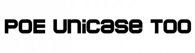 Scaricare 692 Downloads@WebFont
 -
( Fonts by www.graphicartsunit.com - Personal-use only. For commercial use please contact owner. )
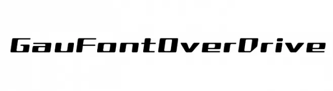
A bold, futuristic font with dynamic, slanted characters.
![GauFontOverDrive font caratteri gratis]() Scaricare 692 Downloads@WebFont
Scaricare 692 Downloads@WebFont -
( Fonts by JOEBOB graphics )
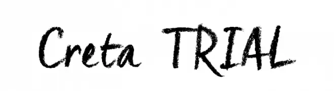
A bold, textured brush-style font with a hand-painted look.
![Creta_TRIAL font caratteri gratis]() Scaricare 692 Downloads@WebFont
Scaricare 692 Downloads@WebFont -
( Fonts by Greg Medina - www.dcoxy.com - Personal-use only. For commercial use please contact owner. )
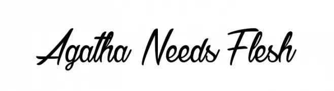
A dynamic, flowing script font with elegant, cursive letterforms.
![Agatha Needs Flesh font caratteri gratis]() Scaricare 692 Downloads@WebFont
Scaricare 692 Downloads@WebFont -
( Fonts by Levi Szekeres - www.loremipsum.ro. Personal-use only. For commercial use please contact owner. )
A bold, pixelated font with a retro digital aesthetic.
![pxlxxl font caratteri gratis]() Scaricare 692 Downloads@WebFont
Scaricare 692 Downloads@WebFont -
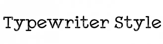
( Fonts by a Galdino Otten - galdinootten.com . Personal-use only. For commercial use please contact owner. )
A vintage, monospaced font with a distressed, typewriter-style appearance.
![Typewriter Style font caratteri gratis]() Scaricare 692 Downloads@WebFont
Scaricare 692 Downloads@WebFont -
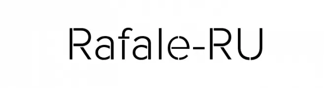
( Fonts by a www.fontfabric.com. Personal-use only. For commercial use please contact owner. )
A modern, geometric sans-serif font with clean lines and uniform strokes.
![Rafale-RU font caratteri gratis]() Scaricare 692 Downloads@WebFont
Scaricare 692 Downloads@WebFont -
( Fonts by Jonathan Harris - www.tattoowoo.com )
A bold, brush-style font with dynamic, expressive strokes.
![Sticky Things font caratteri gratis]() Scaricare 692 Downloads@WebFont
Scaricare 692 Downloads@WebFont -
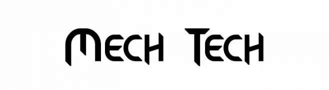
( Fonts by a Neale Davidson - www.pixelsagas.com. Personal-use only. For commercial use please contact owner. )
A bold, futuristic font with geometric shapes and sharp angles.
![Mech Tech font caratteri gratis]() Scaricare 692 Downloads@WebFont
Scaricare 692 Downloads@WebFont -
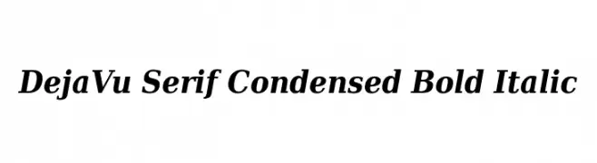
![DejaVu Serif Condensed Bold Italic font caratteri gratis]() Scaricare 692 Downloads@WebFont
Scaricare 692 Downloads@WebFont -
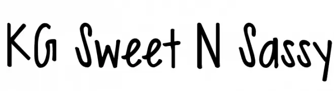
( Fonts by www.kimberlygeswein.com - Kimberly Geswein )
A playful, handwritten font with a casual and friendly appearance.
![KG Sweet N Sassy font caratteri gratis]() Scaricare 692 Downloads@WebFont
Scaricare 692 Downloads@WebFont -
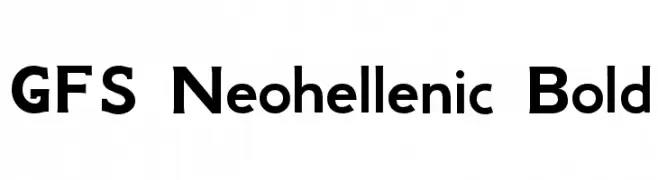
( Copyright (c) 2007, Greek Font Society (www.greekfontsociety.org | gfs@greekfontsociety.org) )
A bold, modern typeface with geometric shapes and consistent stroke width.
![GFS Neohellenic Bold font caratteri gratis]() Scaricare 692 Downloads@WebFont
Scaricare 692 Downloads@WebFont -
![ESRI Crime Analysis font caratteri gratis]() Scaricare 692 Downloads@WebFont
Scaricare 692 Downloads@WebFont -
![Machine Tool Handscript font caratteri gratis]() Scaricare 692 Downloads@WebFont
Scaricare 692 Downloads@WebFont -
( Fonts by Steve Ferrera )
An ornate, decorative font with elaborate serifs and swashes.
![Pieces of Eight Alt font caratteri gratis]() Scaricare 692 Downloads@WebFont
Scaricare 692 Downloads@WebFont -
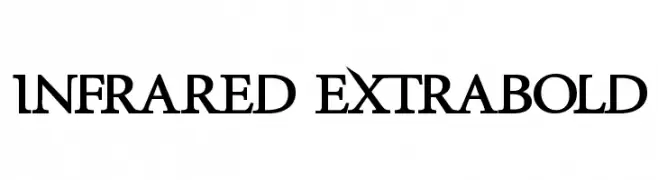
( Fonts by Zdenek Gromnica - www.futuremillennium.com )
A bold, high-contrast serif font with sharp serifs and a modern classic style.
![InfraRed ExtraBold font caratteri gratis]() Scaricare 692 Downloads@WebFont
Scaricare 692 Downloads@WebFont -
( Fonts by Daniel Zadorozny - www.iconian.com - Free for personal use )
A playful, bold font with rounded, cartoon-like characters.
![Toon Town Industrial Exp font caratteri gratis]() Scaricare 692 Downloads@WebFont
Scaricare 692 Downloads@WebFont -
![Floral Garnish font caratteri gratis]() Scaricare 692 Downloads@WebFont
Scaricare 692 Downloads@WebFont -
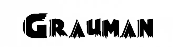
( Fonts by DeNada Industries )
A bold, edgy font with sharp, jagged edges and a distressed style.
![Grauman font caratteri gratis]() Scaricare 692 Downloads@WebFont
Scaricare 692 Downloads@WebFont -
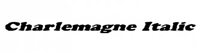
( Fonts by Daniel Zadorozny - www.iconian.com )
A bold, italicized font with strong serifs and dynamic character shapes.
![Charlemagne Italic font caratteri gratis]() Scaricare 692 Downloads@WebFont
Scaricare 692 Downloads@WebFont -
( Fonts by GreyWolf Webworks - www.greywolfwebworks.com - Personal-use only. For commercial use please contact owner. )
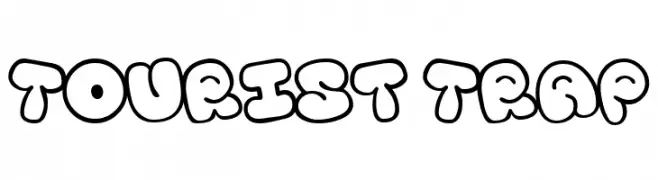
A playful, bubble-like font with bold, rounded characters.
![Tourist Trap font caratteri gratis]() Scaricare 691 Downloads@WebFont
Scaricare 691 Downloads@WebFont -
( Fonts by Galdino Otten Fonts - www.galdinootten.com - Personal-use only. For commercial use please contact owner. )
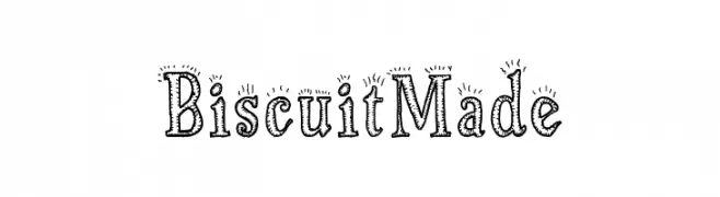
A playful, hand-drawn font with decorative, dotted outlines.
![Biscuit Made font caratteri gratis]() Scaricare 691 Downloads@WebFont
Scaricare 691 Downloads@WebFont -
( Fonts by Cat.B - Agathe M.Joyce - Personal-use only. For commercial use please contact owner. )
An elegant and flowing script font with artistic flourishes.
![Awake the Beauty font caratteri gratis]() Scaricare 691 Downloads@WebFont
Scaricare 691 Downloads@WebFont -
( Fonts by Khurasan )
A playful, bold font with rounded, bubbly characters.
![Chilet font caratteri gratis]() Scaricare 691 Downloads@WebFont
Scaricare 691 Downloads@WebFont -
( Fonts by Khurasan )
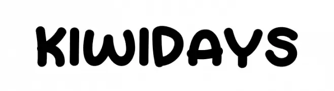
A playful, bold font with rounded strokes and a friendly appearance.
![Kiwi Days font caratteri gratis]() Scaricare 691 Downloads@WebFont
Scaricare 691 Downloads@WebFont -
( Fonts by Walter Velez )
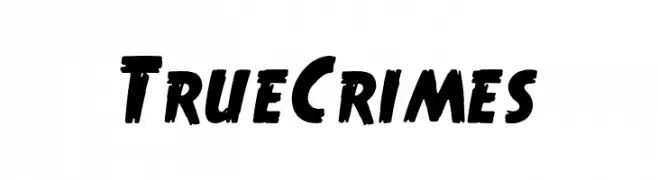
A bold, hand-painted style font with thick strokes and dynamic energy.
![True Crimes font caratteri gratis]() Scaricare 691 Downloads@WebFont
Scaricare 691 Downloads@WebFont -
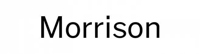
( Fonts by Pablo Impallari, Rodrigo Fuenzalida (Modified by Dan O. Williams) - Personal-use only. For commercial use please contact owner. )
A modern, clean sans-serif font with balanced spacing and consistent stroke width.
![Morrison font caratteri gratis]() Scaricare 691 Downloads@WebFont
Scaricare 691 Downloads@WebFont -
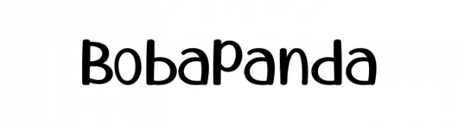
( Fonts by 7NTypes )
A playful, rounded font with smooth curves and a friendly, whimsical style.
![Boba Panda font caratteri gratis]() Scaricare 691 Downloads@WebFont
Scaricare 691 Downloads@WebFont -
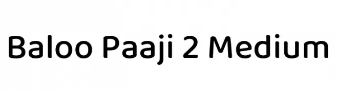
( Copyright (c) 2015 Ek Type (www.ektype.in) )
A playful, rounded font with smooth curves and a friendly appearance.
![Baloo Paaji 2 Medium font caratteri gratis]() Scaricare 691 Downloads@WebFont
Scaricare 691 Downloads@WebFont -
( Fonts by Rantau Type - rantaustudio.com - Personal-use only. For commercial use please contact owner. )
A dynamic and fluid handwritten font with elegant, flowing strokes.
![Northrow font caratteri gratis]() Scaricare 691 Downloads@WebFont
Scaricare 691 Downloads@WebFont -
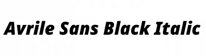
( Fonts by Cristiano Sobral - Personal-use only. For commercial use please contact owner. )
A bold, italic sans-serif font with a modern and dynamic style.
![Avrile Sans Black Italic font caratteri gratis]() Scaricare 691 Downloads@WebFont
Scaricare 691 Downloads@WebFont -
( Rafael Branco - www.ararazu.com )
A classic blackletter font with bold, ornate letterforms and high contrast.
![Albion font caratteri gratis]() Scaricare 691 Downloads@WebFont
Scaricare 691 Downloads@WebFont -
( Fonts by Krunoslav Sokic - model850.deviantart.com - Personal-use only. For commercial use please contact owner. )
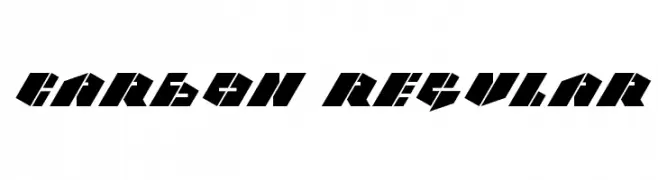
A bold, angular font with a futuristic and geometric design.
![CARBON Regular font caratteri gratis]() Scaricare 691 Downloads@WebFont
Scaricare 691 Downloads@WebFont -
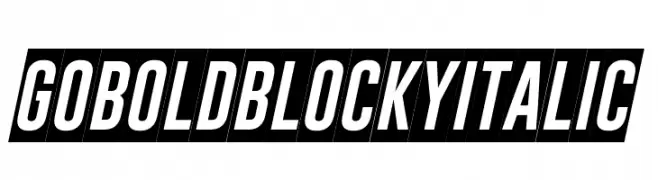
( Fonts by Situjuh Nazara - 7ntypes.com - Personal-use only. For commercial use please contact owner. )
Bold, blocky, and italic with high contrast strokes.
![Gobold Blocky Italic font caratteri gratis]() Scaricare 691 Downloads@WebFont
Scaricare 691 Downloads@WebFont -
( Fonts by Fran Fernandez - Personal-use only. For commercial use please contact owner. )
A bold, brush-style font with dynamic, hand-painted strokes.
![Squad Font font caratteri gratis]() Scaricare 691 Downloads@WebFont
Scaricare 691 Downloads@WebFont


Quali sono i font più popolari adesso?
Poppins, Roboto, Montserrat, Open Sans e Lato sono molto usati per le forme pulite e l'ampia applicabilità — dall'identità di marca alle landing page e ai poster.
Quali font si usano spesso nei loghi?
Le sans serif geometriche (es. Poppins, famiglie in stile Gotham) sono scelte comuni per un branding pulito e scalabile. Per un tocco personale restano valide script e stili manoscritti. Abbina un display deciso per i titoli a un corpo testo neutro per riconoscibilità ed equilibrio.
Ogni quanto si aggiorna la lista?
Con regolarità, in base ai download e all'attività reale. Torna spesso per scoprire in anticipo le nuove preferite.
💡 Consiglio: aggiungi ai preferiti — le tendenze cambiano in fretta e i font top di oggi possono ispirare il rebranding di domani.