Benvenuto nelle Font Più Popolari — dove popolarità e qualità si incontrano. Qui trovi i font più scaricati e usati dell'anno. Se cerchi scelte sicure per logo, web o social, inizia da qui.
Ogni font top si distingue per equilibrio, leggibilità e versatilità. Troverai sans serif moderne, script eleganti, serif vintage e display minimalisti.
-
( Rafael Branco - www.ararazu.com )
A bold, dramatic font with sharp, angular strokes and a dynamic style.
 Scaricare 151 Downloads@WebFont
 -
( Fonts by Alex Squack - http://twitter.com/NoGoodToMe )
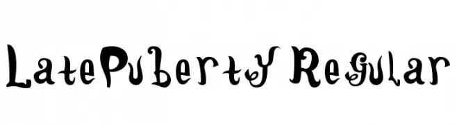
A whimsical, playful font with curly serifs and a hand-drawn feel.
![LatePuberty-Regular font caratteri gratis]() Scaricare 151 Downloads@WebFont
Scaricare 151 Downloads@WebFont -
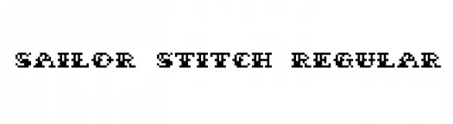
![Sailor Stitch Regular font caratteri gratis]() Scaricare 151 Downloads@WebFont
Scaricare 151 Downloads@WebFont -
( Fonts by Ariq Sya - marsnev.com )
Invalid font image.
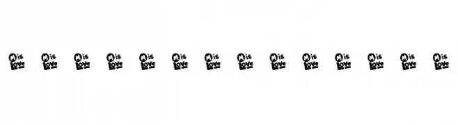
![Font-untuk-Ibu font caratteri gratis]() Scaricare 151 Downloads@WebFont
Scaricare 151 Downloads@WebFont -
( Malre - David Masson Alalire - www.facebook.com/Community-Search-146103155534356/ )
A bold, classic serif font with strong, elegant strokes.
![Absortile-Bold font caratteri gratis]() Scaricare 151 Downloads@WebFont
Scaricare 151 Downloads@WebFont -
-
( Fonts by Shaped Fonts - Philip Trautmann - Personal-use only. For commercial use please contact owner. )
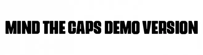
A bold, impactful typeface with a strong, geometric style.
![Mind The Caps DEMO VERSION font caratteri gratis]() Scaricare 151 Downloads@WebFont
Scaricare 151 Downloads@WebFont -
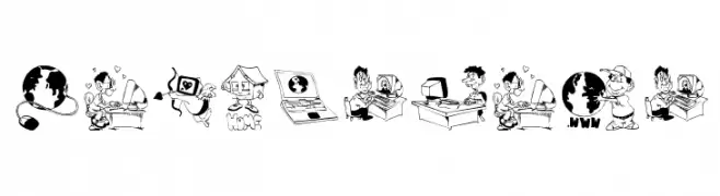
( Fonts by Manfred Klein - manfred-klein.ina-mar.com )
Cartoon illustrations of web-related activities.
![Webmasters font caratteri gratis]() Scaricare 151 Downloads@WebFont
Scaricare 151 Downloads@WebFont -
( Fonts by backpacker.gr )
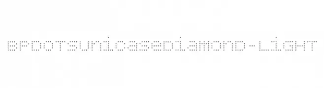
A modern, dotted font with a unicase effect and geometric design.
![BPdotsUnicaseDiamond-Light font caratteri gratis]() Scaricare 151 Downloads@WebFont
Scaricare 151 Downloads@WebFont -
( Fonts by Klaus Johansen - www.listemageren.dK )
Illustrative font with WWI-themed line art for each character.
![WW1 B font caratteri gratis]() Scaricare 151 Downloads@WebFont
Scaricare 151 Downloads@WebFont -
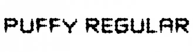
![Puffy Regular font caratteri gratis]() Scaricare 151 Downloads@WebFont
Scaricare 151 Downloads@WebFont


Quali sono i font più popolari adesso?
Poppins, Roboto, Montserrat, Open Sans e Lato sono molto usati per le forme pulite e l'ampia applicabilità — dall'identità di marca alle landing page e ai poster.
Quali font si usano spesso nei loghi?
Le sans serif geometriche (es. Poppins, famiglie in stile Gotham) sono scelte comuni per un branding pulito e scalabile. Per un tocco personale restano valide script e stili manoscritti. Abbina un display deciso per i titoli a un corpo testo neutro per riconoscibilità ed equilibrio.
Ogni quanto si aggiorna la lista?
Con regolarità, in base ai download e all'attività reale. Torna spesso per scoprire in anticipo le nuove preferite.
💡 Consiglio: aggiungi ai preferiti — le tendenze cambiano in fretta e i font top di oggi possono ispirare il rebranding di domani.