Benvenuto nelle Font Più Popolari — dove popolarità e qualità si incontrano. Qui trovi i font più scaricati e usati dell'anno. Se cerchi scelte sicure per logo, web o social, inizia da qui.
Ogni font top si distingue per equilibrio, leggibilità e versatilità. Troverai sans serif moderne, script eleganti, serif vintage e display minimalisti.
-
( Fonts by Jacob Fisher - www.pizzadude.dk )
A bold, rounded font with playful, heart-shaped details.
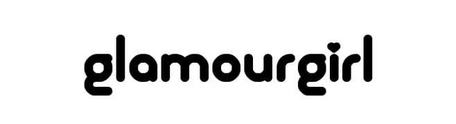 Scaricare 683 Downloads@WebFont
 -
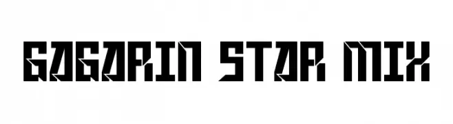
( Fonts by Levi Halmos )
A bold, geometric font with sharp angles and a futuristic style.
![Gagarin Star Mix font caratteri gratis]() Scaricare 683 Downloads@WebFont
Scaricare 683 Downloads@WebFont -
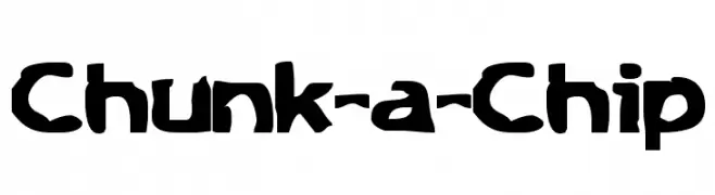
( Fonts by www.stimuleyefonts.com )
A bold, playful font with a chunky, hand-drawn style.
![Chunk-a-Chip font caratteri gratis]() Scaricare 683 Downloads@WebFont
Scaricare 683 Downloads@WebFont -
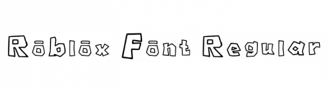
( Fonts by philipwesoloski )
A playful, bold, and cartoonish font with thick outlines and irregular shapes.
![Roblox Font Regular font caratteri gratis]() Scaricare 682 Downloads@WebFont
Scaricare 682 Downloads@WebFont -
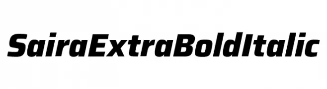
( Fonts by Omnibus Type )
A bold, italic font with a modern and dynamic style.
![Saira ExtraBold Italic font caratteri gratis]() Scaricare 682 Downloads@WebFont
Scaricare 682 Downloads@WebFont -
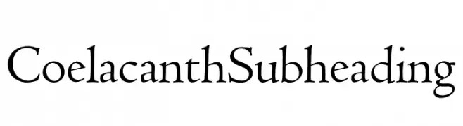
( Personal-use only. For commercial use please contact owner. )
A classic serif font with elegant, sharp serifs and a traditional yet modern appeal.
![Coelacanth Subheading font caratteri gratis]() Scaricare 682 Downloads@WebFont
Scaricare 682 Downloads@WebFont -
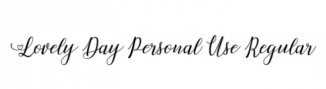
( Billy Argel - billyargel.com/ )
An elegant and flowing script font with decorative swashes and heart accents.
![Lovely Day Personal Use Regular font caratteri gratis]() Scaricare 682 Downloads@WebFont
Scaricare 682 Downloads@WebFont -
( Måns Grebäck - www.mansgreback.com )
An elegant, flowing script font with a sophisticated cursive design.
![Ebbing PERSONAL USE ONLY font caratteri gratis]() Scaricare 682 Downloads@WebFont
Scaricare 682 Downloads@WebFont -
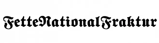
( Fonts by www.peter-wiegel.de - Personal-use only. For commercial use please contact owner. )
A bold, blackletter font with intricate, gothic-style letterforms.
![FetteNationalFraktur font caratteri gratis]() Scaricare 682 Downloads@WebFont
Scaricare 682 Downloads@WebFont -
( Fonts by Daniel Zadorozny - www.iconian.com - Free for personal use )
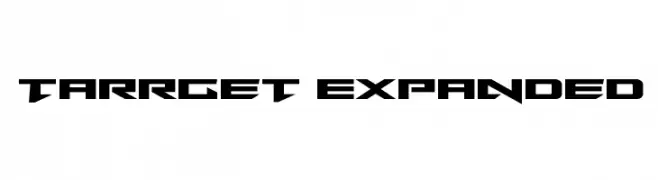
A bold, futuristic font with sharp, angular edges and a geometric style.
![Tarrget Expanded font caratteri gratis]() Scaricare 682 Downloads@WebFont
Scaricare 682 Downloads@WebFont -
( Fonts by The League of Moveable Type - theleagueofmoveabletype.com )
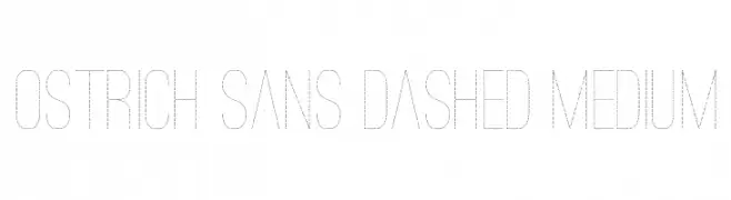
A modern, dashed font with a minimalist and innovative style.
![Ostrich Sans Dashed Medium font caratteri gratis]() Scaricare 682 Downloads@WebFont
Scaricare 682 Downloads@WebFont -
( Fonts by Mans Greback - www.mawns.com )
A distressed, bold sans-serif font with a rugged, vintage appearance.
![Europe Underground Worn font caratteri gratis]() Scaricare 682 Downloads@WebFont
Scaricare 682 Downloads@WebFont -
( Free for a personal use. For a commercial use please visit www.kevinandamanda.com )
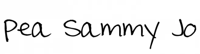
A playful, casual handwritten font with irregular, slanted strokes.
![Pea Sammy Jo font caratteri gratis]() Scaricare 682 Downloads@WebFont
Scaricare 682 Downloads@WebFont -
( Fonts by Fernando Carvente - serifdechocolate.wordpress.com )
A modern sans-serif font with a slightly condensed style and medium contrast.
![Spatha Sans font caratteri gratis]() Scaricare 682 Downloads@WebFont
Scaricare 682 Downloads@WebFont -
( Fonts by Manfred Klein. Free for private and charity use. Free for commercial with donation to organizations )
A bold, blackletter-inspired font with ornate and dramatic letterforms.
![ElephantaBlack font caratteri gratis]() Scaricare 682 Downloads@WebFont
Scaricare 682 Downloads@WebFont -
( Fonts by David Rakowski )
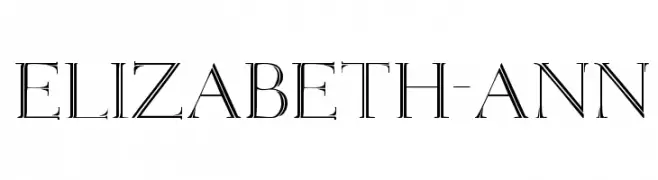
An elegant serif font with high contrast and classic refinement.
![Elizabeth-ANN font caratteri gratis]() Scaricare 682 Downloads@WebFont
Scaricare 682 Downloads@WebFont -
( Fonts by www.abecedarienne.com )
A playful, hand-drawn font with a lively and informal style.
![Splurge font caratteri gratis]() Scaricare 682 Downloads@WebFont
Scaricare 682 Downloads@WebFont -
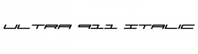
( Fonts by Daniel Zadorozny - www.iconian.com )
A sleek, italicized font with a futuristic and dynamic design.
![Ultra 911 Italic font caratteri gratis]() Scaricare 682 Downloads@WebFont
Scaricare 682 Downloads@WebFont -
![BIN Bold font caratteri gratis]() Scaricare 682 Downloads@WebFont
Scaricare 682 Downloads@WebFont -
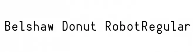
![Belshaw Donut RobotRegular font caratteri gratis]() Scaricare 682 Downloads@WebFont
Scaricare 682 Downloads@WebFont -
( Fonts by Fabrika De Typos - Marcio Hirosse - fabrikadetypos.blogspot.com )
A bold, grungy font with a distressed, brush-painted appearance.
![ABUSO font caratteri gratis]() Scaricare 682 Downloads@WebFont
Scaricare 682 Downloads@WebFont -
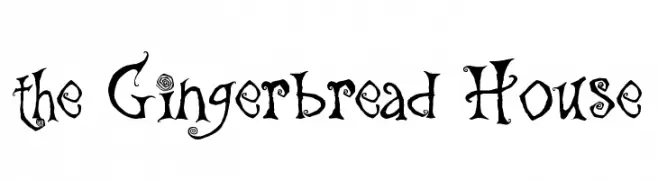
( Fonts by Christopher Hansen )
A whimsical, decorative font with swirling embellishments and a fairy-tale style.
![the Gingerbread House font caratteri gratis]() Scaricare 682 Downloads@WebFont
Scaricare 682 Downloads@WebFont -
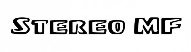
( Fonts by Rick Mueller )
A bold, playful font with a three-dimensional effect and rounded edges.
![Stereo MF font caratteri gratis]() Scaricare 682 Downloads@WebFont
Scaricare 682 Downloads@WebFont -
( Fonts by www.aenigmafonts.com )
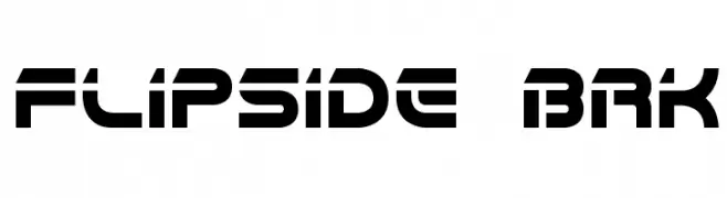
A bold, futuristic font with geometric and stencil-like characteristics.
![Flipside BRK font caratteri gratis]() Scaricare 682 Downloads@WebFont
Scaricare 682 Downloads@WebFont -
![Batman and Company font caratteri gratis]() Scaricare 682 Downloads@WebFont
Scaricare 682 Downloads@WebFont -
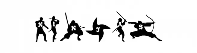
( Fonts by Daniel Zadorozny - www.iconian.com )
A dynamic, ninja-themed decorative font with action-packed silhouettes.
![Ninjas font caratteri gratis]() Scaricare 682 Downloads
Scaricare 682 Downloads -
( Fonts by www.varian.net )
A bold, dynamic brush script font with expressive strokes and lively movement.
![Yes:Union font caratteri gratis]() Scaricare 682 Downloads@WebFont
Scaricare 682 Downloads@WebFont -
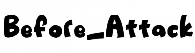
![Before_Attack font caratteri gratis]() Scaricare 682 Downloads@WebFont
Scaricare 682 Downloads@WebFont -
( Fonts by Nick Curtis - www.nicksfonts.com )
A vibrant and eclectic font with unique, decorative characters.
![Pastiche font caratteri gratis]() Scaricare 682 Downloads
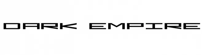
Scaricare 682 Downloads -
![Dark Empire font caratteri gratis]() Scaricare 682 Downloads@WebFont
Scaricare 682 Downloads@WebFont -
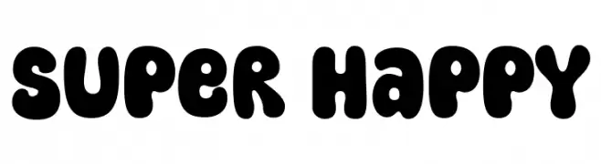
( Fonts by fsuarez913 )
A playful, bold font with rounded, bubbly characters perfect for fun and creative projects.
![Super Happy font caratteri gratis]() Scaricare 681 Downloads@WebFont
Scaricare 681 Downloads@WebFont -
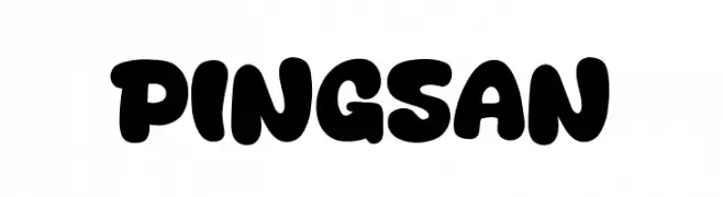
( Fonts by Khurasan )
A bold, rounded font with a playful and whimsical style.
![Pingsan font caratteri gratis]() Scaricare 681 Downloads@WebFont
Scaricare 681 Downloads@WebFont -
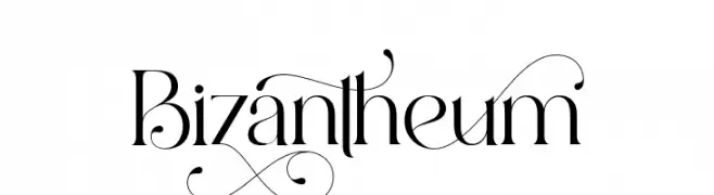
( Fonts by Aluyeah Studio - Personal-use only. For commercial use please contact owner. )
An elegant, high-contrast serif font with decorative swashes and refined curves.
![Bizantheum font caratteri gratis]() Scaricare 681 Downloads@WebFont
Scaricare 681 Downloads@WebFont -
( Fonts by Toko Laris Djaja )
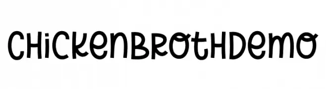
A playful, hand-drawn style font with rounded edges and consistent stroke width.
![Chicken Broth Demo font caratteri gratis]() Scaricare 681 Downloads@WebFont
Scaricare 681 Downloads@WebFont -
Caratteri di AQEELABLUEBELL. For commercial use please contact the owner.
( Amilya )
A decorative and whimsical script font with elegant swirls and flourishes.
![Amilya font caratteri gratis]() Scaricare 681 Downloads@WebFont
Scaricare 681 Downloads@WebFont


Quali sono i font più popolari adesso?
Poppins, Roboto, Montserrat, Open Sans e Lato sono molto usati per le forme pulite e l'ampia applicabilità — dall'identità di marca alle landing page e ai poster.
Quali font si usano spesso nei loghi?
Le sans serif geometriche (es. Poppins, famiglie in stile Gotham) sono scelte comuni per un branding pulito e scalabile. Per un tocco personale restano valide script e stili manoscritti. Abbina un display deciso per i titoli a un corpo testo neutro per riconoscibilità ed equilibrio.
Ogni quanto si aggiorna la lista?
Con regolarità, in base ai download e all'attività reale. Torna spesso per scoprire in anticipo le nuove preferite.
💡 Consiglio: aggiungi ai preferiti — le tendenze cambiano in fretta e i font top di oggi possono ispirare il rebranding di domani.