Benvenuto nelle Font Più Popolari — dove popolarità e qualità si incontrano. Qui trovi i font più scaricati e usati dell'anno. Se cerchi scelte sicure per logo, web o social, inizia da qui.
Ogni font top si distingue per equilibrio, leggibilità e versatilità. Troverai sans serif moderne, script eleganti, serif vintage e display minimalisti.
-
( Fonts by a Max Infeld - XEROGRAPHER FONTS - xerographer.blogspot.com . Personal-use only. For commercial use please contact owner. )
An expressive, hand-drawn font with dynamic and fluid strokes.
 Scaricare 151 Downloads@WebFont
 -
( Fonts by Edric Studio - Personal-use only. For commercial use please contact owner. )
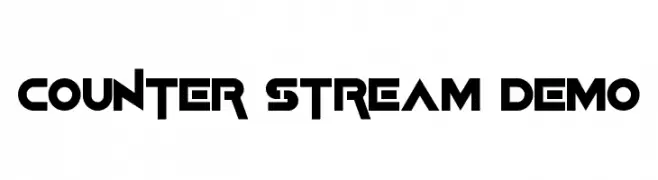
A bold, geometric font with a futuristic and modern aesthetic.
![Counter Stream Demo font caratteri gratis]() Scaricare 151 Downloads@WebFont
Scaricare 151 Downloads@WebFont -
( Fonts by hey_you_font )
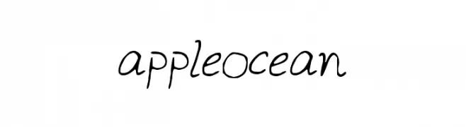
A casual, handwritten font with a smooth and flowing style.
![appleocean font caratteri gratis]() Scaricare 151 Downloads@WebFont
Scaricare 151 Downloads@WebFont -
![fickle font caratteri gratis]() Scaricare 151 Downloads@WebFont
Scaricare 151 Downloads@WebFont -
( Fonts by www.typodermicfonts.com - Ray Larabie )
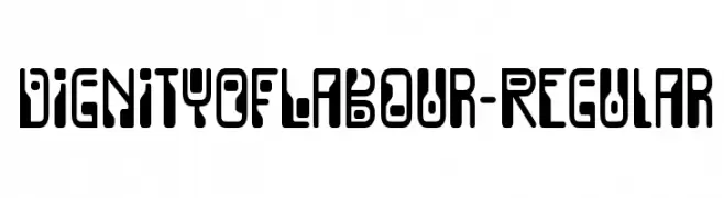
A bold, modern font with an industrial and futuristic aesthetic.
![DignityOfLabour-Regular font caratteri gratis]() Scaricare 151 Downloads@WebFont
Scaricare 151 Downloads@WebFont -
-
( Fonts by Kat`s Fun Fonts - Personal-use only. For commercial use please contact owner. )
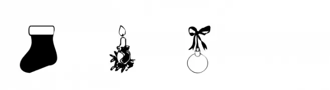
A decorative font with Christmas-themed illustrations replacing standard characters.
![KR Christmas Jewels 2005 2 font caratteri gratis]() Scaricare 151 Downloads@WebFont
Scaricare 151 Downloads@WebFont -
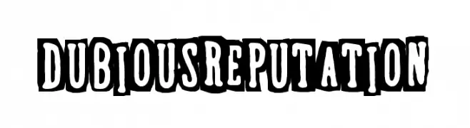
( Woodcutter - woodcutter Manero - www.woodcutter.es )
A bold, playful font with a vintage, three-dimensional style.
![Dubious Reputation font caratteri gratis]() Scaricare 151 Downloads@WebFont
Scaricare 151 Downloads@WebFont -
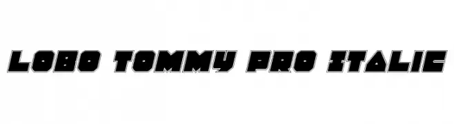
( Fonts by Daniel Zadorozny - www.iconian.com - Free for personal use )
A bold, geometric italic font with a strong, modern presence.
![Lobo Tommy Pro Italic font caratteri gratis]() Scaricare 151 Downloads@WebFont
Scaricare 151 Downloads@WebFont -
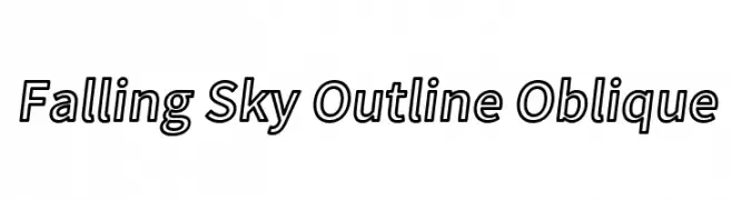
![Falling Sky Outline Oblique font caratteri gratis]() Scaricare 151 Downloads@WebFont
Scaricare 151 Downloads@WebFont -
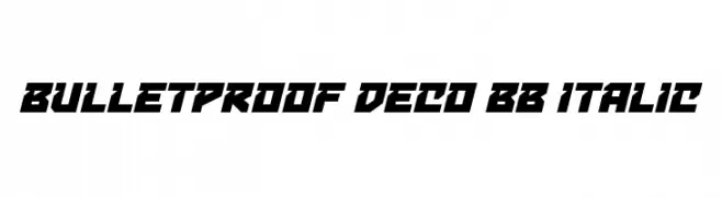
( Fonts by www.blambot.com )
A bold, angular, and italicized font with a futuristic and geometric design.
![Bulletproof Deco BB Italic font caratteri gratis]() Scaricare 151 Downloads@WebFont
Scaricare 151 Downloads@WebFont

Quali sono i font più popolari adesso?
Poppins, Roboto, Montserrat, Open Sans e Lato sono molto usati per le forme pulite e l'ampia applicabilità — dall'identità di marca alle landing page e ai poster.
Quali font si usano spesso nei loghi?
Le sans serif geometriche (es. Poppins, famiglie in stile Gotham) sono scelte comuni per un branding pulito e scalabile. Per un tocco personale restano valide script e stili manoscritti. Abbina un display deciso per i titoli a un corpo testo neutro per riconoscibilità ed equilibrio.
Ogni quanto si aggiorna la lista?
Con regolarità, in base ai download e all'attività reale. Torna spesso per scoprire in anticipo le nuove preferite.
💡 Consiglio: aggiungi ai preferiti — le tendenze cambiano in fretta e i font top di oggi possono ispirare il rebranding di domani.