Benvenuto nelle Font Più Popolari — dove popolarità e qualità si incontrano. Qui trovi i font più scaricati e usati dell'anno. Se cerchi scelte sicure per logo, web o social, inizia da qui.
Ogni font top si distingue per equilibrio, leggibilità e versatilità. Troverai sans serif moderne, script eleganti, serif vintage e display minimalisti.
-
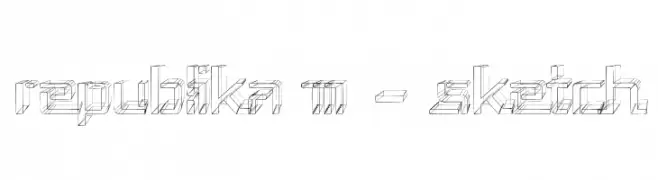
( Fonts by Apostrophic Lab )
A three-dimensional sketch font with a geometric, architectural style.
 Scaricare 148 Downloads@WebFont
 -
( Fonts by Misti`s Fonts - mistifonts.com - Personal-use only. For commercial use please contact owner. )
A playful, rounded font with smooth lines and consistent stroke width.
![Mf Candy font caratteri gratis]() Scaricare 148 Downloads@WebFont
Scaricare 148 Downloads@WebFont -
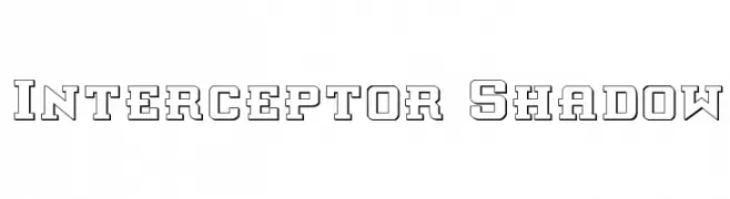
( Fonts by Daniel Zadorozny - www.iconian.com )
A bold, outlined font with a shadow effect, ideal for vintage-inspired designs.
![Interceptor Shadow font caratteri gratis]() Scaricare 148 Downloads@WebFont
Scaricare 148 Downloads@WebFont -
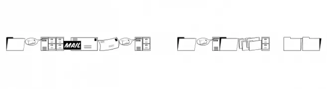
( Fonts by Jeff Levine. FREEWARE )
An iconographic set depicting mail and office-related items.
![Messages & Memos JL font caratteri gratis]() Scaricare 148 Downloads@WebFont
Scaricare 148 Downloads@WebFont -
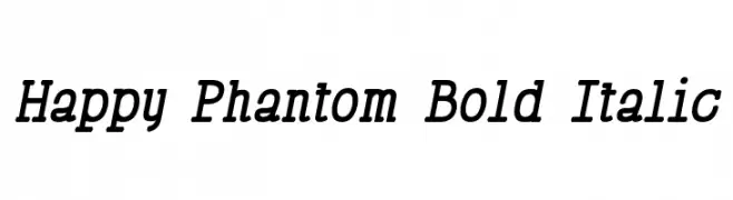
( Fonts by Lauren Thompson - www.nymfont.com )
A bold, italic serif font with dynamic, forward-leaning characters.
![Happy Phantom Bold Italic font caratteri gratis]() Scaricare 148 Downloads@WebFont
Scaricare 148 Downloads@WebFont -
-
( Gaël Chrétien )
A bold, modern font with geometric lines and a strong presence.
![Comdie font caratteri gratis]() Scaricare 148 Downloads@WebFont
Scaricare 148 Downloads@WebFont -
( Fonts by a Max Infeld - XEROGRAPHER FONTS - xerographer.blogspot.com . Personal-use only. For commercial use please contact owner. )
A bold, camouflage-patterned font ideal for adventurous and rugged designs.
![CamoWear font caratteri gratis]() Scaricare 148 Downloads@WebFont
Scaricare 148 Downloads@WebFont -
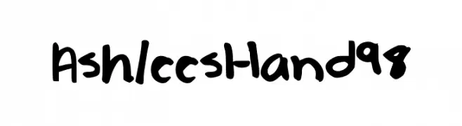
![AshleesHand98 font caratteri gratis]() Scaricare 148 Downloads@WebFont
Scaricare 148 Downloads@WebFont -
![Retardo font caratteri gratis]() Scaricare 148 Downloads@WebFont
Scaricare 148 Downloads@WebFont -
![lpflowers font caratteri gratis]() Scaricare 147 Downloads@WebFont
Scaricare 147 Downloads@WebFont


Quali sono i font più popolari adesso?
Poppins, Roboto, Montserrat, Open Sans e Lato sono molto usati per le forme pulite e l'ampia applicabilità — dall'identità di marca alle landing page e ai poster.
Quali font si usano spesso nei loghi?
Le sans serif geometriche (es. Poppins, famiglie in stile Gotham) sono scelte comuni per un branding pulito e scalabile. Per un tocco personale restano valide script e stili manoscritti. Abbina un display deciso per i titoli a un corpo testo neutro per riconoscibilità ed equilibrio.
Ogni quanto si aggiorna la lista?
Con regolarità, in base ai download e all'attività reale. Torna spesso per scoprire in anticipo le nuove preferite.
💡 Consiglio: aggiungi ai preferiti — le tendenze cambiano in fretta e i font top di oggi possono ispirare il rebranding di domani.