Benvenuto nelle Font Più Popolari — dove popolarità e qualità si incontrano. Qui trovi i font più scaricati e usati dell'anno. Se cerchi scelte sicure per logo, web o social, inizia da qui.
Ogni font top si distingue per equilibrio, leggibilità e versatilità. Troverai sans serif moderne, script eleganti, serif vintage e display minimalisti.
-
( Fonts by Almarkhatype - Abdul Malik Wisnu - Personal-use only. For commercial use please contact owner. )
A bold, expressive script font with fluid, cursive letterforms.
 Scaricare 676 Downloads@WebFont
 -
( Fonts by Letterayu )
A bold, decorative font with star-shaped cutouts in each character.
![StarBold font caratteri gratis]() Scaricare 676 Downloads@WebFont
Scaricare 676 Downloads@WebFont -
( Fonts by sronstudio )
A playful, bold handwritten font with a whimsical and friendly style.
![Pumpkin Story font caratteri gratis]() Scaricare 676 Downloads@WebFont
Scaricare 676 Downloads@WebFont -
( Fonts by studiostilt - Personal-use only. For commercial use please contact owner. )
A bold, distressed font with a rugged, vintage style.
![Stilt-Regular font caratteri gratis]() Scaricare 676 Downloads@WebFont
Scaricare 676 Downloads@WebFont -
![YumaroRough font caratteri gratis]() Scaricare 676 Downloads@WebFont
Scaricare 676 Downloads@WebFont -
( revo farisky - stripline co )
A bold, flowing script font with elegant curves and dynamic style.
![hadfield font caratteri gratis]() Scaricare 676 Downloads@WebFont
Scaricare 676 Downloads@WebFont -
( dcoxy - Greg Medina - www.dcoxy.com/ )
A bold, vintage script font with a brush-like texture and decorative style.
![Barber Street_PersonalUseOnly font caratteri gratis]() Scaricare 676 Downloads@WebFont
Scaricare 676 Downloads@WebFont -
( Amar Lettering - creativemarket.com/Amarlettering )
An elegant script font with fluid, cursive strokes and sophisticated design.
![Challista font caratteri gratis]() Scaricare 676 Downloads@WebFont
Scaricare 676 Downloads@WebFont -
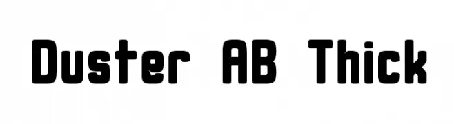
( Alex Banks - www.alex-banks.com )
A bold, rounded font with a modern and playful style.
![Duster AB Thick font caratteri gratis]() Scaricare 676 Downloads@WebFont
Scaricare 676 Downloads@WebFont -
( Fonts by Hanoded )
A bold, hand-drawn font with a playful, marker-like appearance.
![DK Darker Marker Regular font caratteri gratis]() Scaricare 676 Downloads@WebFont
Scaricare 676 Downloads@WebFont -
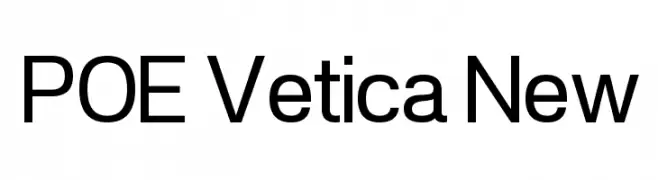
( Fonts by Dan P. Lyons - Personal-use only. For commercial use please contact owner. )
A modern sans-serif font with geometric shapes and uniform strokes.
![POE Vetica New font caratteri gratis]() Scaricare 676 Downloads@WebFont
Scaricare 676 Downloads@WebFont -
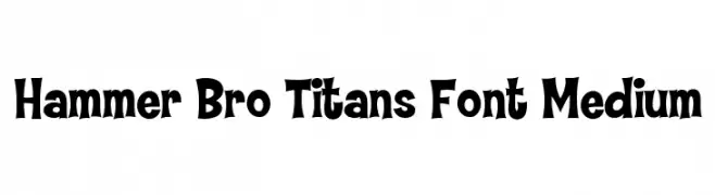
Caratteri di HammerBro101. For commercial use please contact the owner.
![Hammer Bro Titans Font Medium font caratteri gratis]() Scaricare 676 Downloads@WebFont
Scaricare 676 Downloads@WebFont -
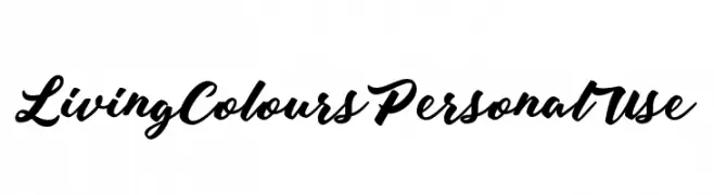
( Fonts by Billy Argel - www.billyargel.com - Personal-use only. For commercial use please contact owner. )
A bold, expressive script font with elegant, flowing letterforms.
![Living Colours Personal Use font caratteri gratis]() Scaricare 676 Downloads@WebFont
Scaricare 676 Downloads@WebFont -
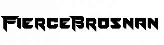
( Fonts by www.chequered.ink - Chequered Ink - Personal-use only. For commercial use please contact owner. )
A bold, angular font with a futuristic and aggressive design.
![Fierce Brosnan font caratteri gratis]() Scaricare 676 Downloads@WebFont
Scaricare 676 Downloads@WebFont -
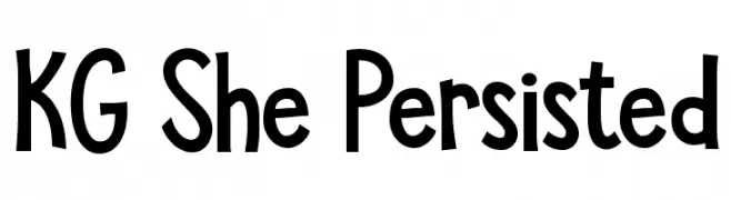
![KG She Persisted font caratteri gratis]() Scaricare 676 Downloads@WebFont
Scaricare 676 Downloads@WebFont -
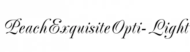
( Fonts by Castcraft Software - OPTI Fonts Archive - opti.netii.net - Personal-use only. For commercial use please contact owner. )
An elegant script font with graceful curves and delicate strokes.
![PeachExquisiteOpti-Light font caratteri gratis]() Scaricare 676 Downloads@WebFont
Scaricare 676 Downloads@WebFont -
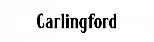
![Carlingford font caratteri gratis]() Scaricare 676 Downloads@WebFont
Scaricare 676 Downloads@WebFont -
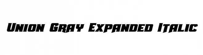
( Fonts by Daniel Zadorozny - www.iconian.com - Free for personal use )
A bold, expanded, and italic font with a dynamic and modern style.
![Union Gray Expanded Italic font caratteri gratis]() Scaricare 676 Downloads@WebFont
Scaricare 676 Downloads@WebFont -
( Fonts by Colonel Sanders )
A dot matrix font with a retro digital aesthetic.
![LCD AT&T Phone font caratteri gratis]() Scaricare 676 Downloads@WebFont
Scaricare 676 Downloads@WebFont -
( Fonts by www.junkohanhero.com - Personal-use only. For commercial use please contact owner. )
A bold, hand-drawn font with an expressive and artistic style.
![Edge font caratteri gratis]() Scaricare 676 Downloads@WebFont
Scaricare 676 Downloads@WebFont -
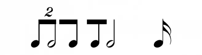
( Fonts by www.hindson.com.au )
Decorative font mimicking musical rhythms and notation symbols.
![Rhythms font caratteri gratis]() Scaricare 676 Downloads@WebFont
Scaricare 676 Downloads@WebFont -
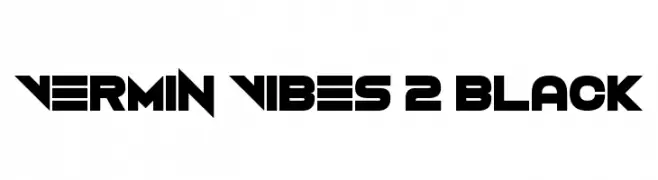
( Fonts by Andrew McCluskey - nalgames.com )
A bold, geometric font with a futuristic and edgy style.
![Vermin Vibes 2 Black font caratteri gratis]() Scaricare 676 Downloads@WebFont
Scaricare 676 Downloads@WebFont -
![Kalhor font caratteri gratis]() Scaricare 676 Downloads@WebFont
Scaricare 676 Downloads@WebFont -
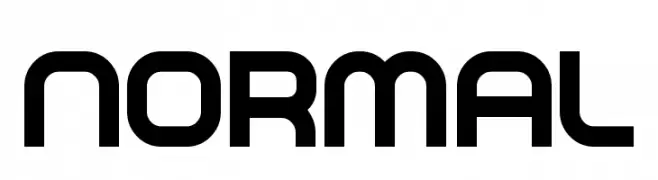
( Fonts by billyargel.blogspot.com - Billy Argel )
A bold, modern geometric font with a sleek and professional appearance.
![NORMAL font caratteri gratis]() Scaricare 676 Downloads@WebFont
Scaricare 676 Downloads@WebFont -
![Lizard font caratteri gratis]() Scaricare 676 Downloads@WebFont
Scaricare 676 Downloads@WebFont -
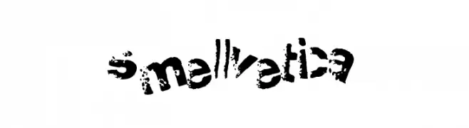
![Smellvetica font caratteri gratis]() Scaricare 676 Downloads@WebFont
Scaricare 676 Downloads@WebFont -
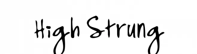
![High Strung font caratteri gratis]() Scaricare 676 Downloads@WebFont
Scaricare 676 Downloads@WebFont -
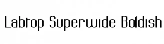
( Fonts by Graham Meade - GemFonts )
A bold, superwide font with a modern and uniform design.
![Labtop Superwide Boldish font caratteri gratis]() Scaricare 676 Downloads@WebFont
Scaricare 676 Downloads@WebFont -
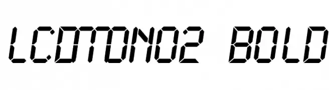
![LCDMono2 Bold font caratteri gratis]() Scaricare 676 Downloads@WebFont
Scaricare 676 Downloads@WebFont -
![Mister Pixel 16 pt - Old Style Figure font caratteri gratis]() Scaricare 676 Downloads@WebFont
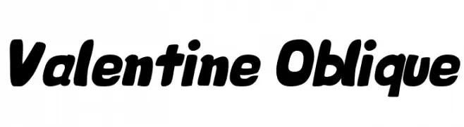
Scaricare 676 Downloads@WebFont -
![Valentine Oblique font caratteri gratis]() Scaricare 676 Downloads@WebFont
Scaricare 676 Downloads@WebFont -
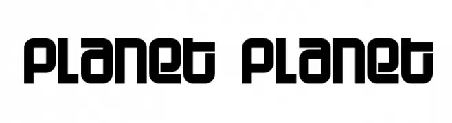
( Fonts by www.fontalicious.com )
A bold, geometric font with a modern, futuristic style.
![Planet Planet font caratteri gratis]() Scaricare 676 Downloads@WebFont
Scaricare 676 Downloads@WebFont -
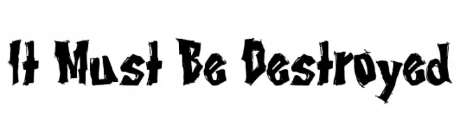
( Fonts by Tony O`Farrell )
A bold, jagged, and aggressive font with a distressed, rebellious style.
![It Must Be Destroyed font caratteri gratis]() Scaricare 676 Downloads@WebFont
Scaricare 676 Downloads@WebFont -
( Fonts by Graham Meade - GemFonts )
A bold, distressed font with jagged edges and a torn appearance.
![Tear font caratteri gratis]() Scaricare 676 Downloads@WebFont
Scaricare 676 Downloads@WebFont -
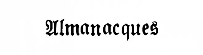
![Almanacques font caratteri gratis]() Scaricare 676 Downloads@WebFont
Scaricare 676 Downloads@WebFont


Quali sono i font più popolari adesso?
Poppins, Roboto, Montserrat, Open Sans e Lato sono molto usati per le forme pulite e l'ampia applicabilità — dall'identità di marca alle landing page e ai poster.
Quali font si usano spesso nei loghi?
Le sans serif geometriche (es. Poppins, famiglie in stile Gotham) sono scelte comuni per un branding pulito e scalabile. Per un tocco personale restano valide script e stili manoscritti. Abbina un display deciso per i titoli a un corpo testo neutro per riconoscibilità ed equilibrio.
Ogni quanto si aggiorna la lista?
Con regolarità, in base ai download e all'attività reale. Torna spesso per scoprire in anticipo le nuove preferite.
💡 Consiglio: aggiungi ai preferiti — le tendenze cambiano in fretta e i font top di oggi possono ispirare il rebranding di domani.