Benvenuto nelle Font Più Popolari — dove popolarità e qualità si incontrano. Qui trovi i font più scaricati e usati dell'anno. Se cerchi scelte sicure per logo, web o social, inizia da qui.
Ogni font top si distingue per equilibrio, leggibilità e versatilità. Troverai sans serif moderne, script eleganti, serif vintage e display minimalisti.
-
 Scaricare 6631 Downloads
 -
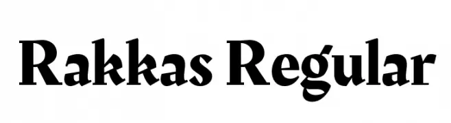
( Copyright 2016 Zeynep Akay )
A bold, dynamic serif font with high contrast and a modern twist.
![Rakkas Regular font caratteri gratis]() Scaricare 6630 Downloads@WebFont
Scaricare 6630 Downloads@WebFont -
![Beo font caratteri gratis]() Scaricare 6625 Downloads@WebFont
Scaricare 6625 Downloads@WebFont -
![LetterGothic font caratteri gratis]() Scaricare 6625 Downloads
Scaricare 6625 Downloads -
( Fonts by Jayde Garrow )
Bold, angular, and dynamic font with a sporty, modern feel.
![NHL font caratteri gratis]() Scaricare 6624 Downloads@WebFont
Scaricare 6624 Downloads@WebFont -
( Fonts by Luke Owens - Personal-use only. For commercial use please contact owner. )
A bold, modern sans-serif font with geometric shapes and clean lines.
![Waukegan LDO Bold font caratteri gratis]() Scaricare 6622 Downloads@WebFont
Scaricare 6622 Downloads@WebFont -
![Azbuka font caratteri gratis]() Scaricare 6620 Downloads@WebFont
Scaricare 6620 Downloads@WebFont -
( Copyright (c) 2015 Dan Reynolds. )
A bold, strong font with thick strokes and a commanding presence.
![Biryani Heavy font caratteri gratis]() Scaricare 6619 Downloads@WebFont
Scaricare 6619 Downloads@WebFont -
![Aubrey font caratteri gratis]() Scaricare 6618 Downloads@WebFont
Scaricare 6618 Downloads@WebFont -
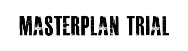
( Fonts by billyargel.blogspot.com - Billy Argel )
A bold, distressed font with a rugged, vintage appearance.
![MASTERPLAN TRIAL font caratteri gratis]() Scaricare 6617 Downloads@WebFont
Scaricare 6617 Downloads@WebFont -
![ETH Black font caratteri gratis]() Scaricare 6617 Downloads@WebFont
Scaricare 6617 Downloads@WebFont -
![Quicksand Dash Regular font caratteri gratis]() Scaricare 6614 Downloads@WebFont
Scaricare 6614 Downloads@WebFont -
( Fonts by David Shetterly- Personal-use only. For commercial use please contact owner. )
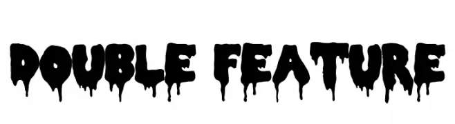
A bold, dripping font ideal for horror or Halloween themes.
![Double Feature font caratteri gratis]() Scaricare 6612 Downloads@WebFont
Scaricare 6612 Downloads@WebFont -
![NHL Tampa Bay font caratteri gratis]() Scaricare 6609 Downloads@WebFont
Scaricare 6609 Downloads@WebFont -
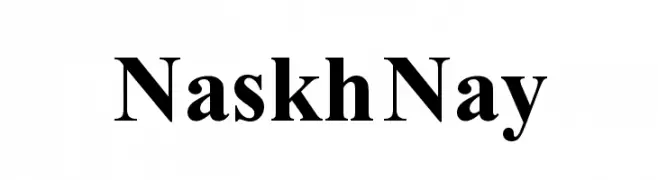
( گالری فانت فارسی پژوهش آريانا - only compatible with Farsi and Arabic )
A classic serif font with bold strokes and high contrast, ideal for formal uses.
![Naskh Nay font caratteri gratis]() Scaricare 6600 Downloads@WebFont
Scaricare 6600 Downloads@WebFont -
![Ghostbusters font caratteri gratis]() Scaricare 6596 Downloads@WebFont
Scaricare 6596 Downloads@WebFont -
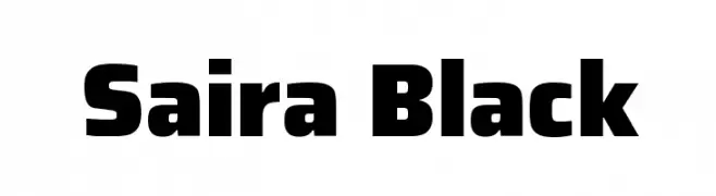
( Copyright 2016 The Saira Project Authors (omnibus.type@gmail.com), with reserved font name "Saira". )
A bold, modern font with strong geometric shapes and uniform strokes.
![Saira Black font caratteri gratis]() Scaricare 6595 Downloads@WebFont
Scaricare 6595 Downloads@WebFont -
![flatline font caratteri gratis]() Scaricare 6595 Downloads@WebFont
Scaricare 6595 Downloads@WebFont -
![3t font caratteri gratis]() Scaricare 6593 Downloads@WebFont
Scaricare 6593 Downloads@WebFont -
( Copyright 2015 The Black Han Sans Authors )
A bold, modern sans-serif font with strong geometric shapes.
![Black Han Sans Regular font caratteri gratis]() Scaricare 6587 Downloads@WebFont
Scaricare 6587 Downloads@WebFont -
![AMRITA font caratteri gratis]() Scaricare 6586 Downloads@WebFont
Scaricare 6586 Downloads@WebFont -
![DejaVu Sans Bold font caratteri gratis]() Scaricare 6584 Downloads@WebFont
Scaricare 6584 Downloads@WebFont -
( Copyright 2015 The El Messiri Project Authors. )
A bold, modern font with elegant strokes and strong character presence.
![El Messiri Bold font caratteri gratis]() Scaricare 6582 Downloads@WebFont
Scaricare 6582 Downloads@WebFont -
( Fonts by Daniel Midgley )
A dynamic, expressive handwritten font with fluid strokes and a casual appearance.
![Daniel Bold font caratteri gratis]() Scaricare 6581 Downloads@WebFont
Scaricare 6581 Downloads@WebFont -
![Speed font caratteri gratis]() Scaricare 6578 Downloads@WebFont
Scaricare 6578 Downloads@WebFont -
![Swatch it font caratteri gratis]() Scaricare 6575 Downloads@WebFont
Scaricare 6575 Downloads@WebFont -
![A.D. MONO font caratteri gratis]() Scaricare 6574 Downloads@WebFont
Scaricare 6574 Downloads@WebFont -
( Fonts by Jayde Garrow - GarrowGlitch - http://jaydegarrow.wix.com/jaydefonts. Personal-use only. For commercial use please contact owner. )
A bold, slanted font with a fragmented, energetic style.
![PaybAck font caratteri gratis]() Scaricare 6571 Downloads@WebFont
Scaricare 6571 Downloads@WebFont -
![NBA Suns font caratteri gratis]() Scaricare 6569 Downloads@WebFont
Scaricare 6569 Downloads@WebFont -
( Copyright (c) 2014-2015 Wei Huang (wweeiihhuuaanngg@gmail.com) )
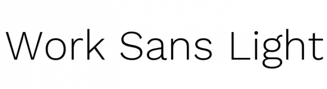
A clean, modern sans-serif font with a light weight and excellent legibility.
![Work Sans Light font caratteri gratis]() Scaricare 6568 Downloads@WebFont
Scaricare 6568 Downloads@WebFont -
( Fonts by Google - Personal-use only. For commercial use please contact owner. )
A clean, modern sans-serif font with a condensed width and uniform stroke width.
![Noto Sans Condensed font caratteri gratis]() Scaricare 6566 Downloads@WebFont
Scaricare 6566 Downloads@WebFont -
( Copyright (c) 2011, Joe Prince, Admix Designs (http://www.admixdesigns.com/) )
A modern sans-serif font with rounded edges and balanced proportions.
![Varela font caratteri gratis]() Scaricare 6564 Downloads@WebFont
Scaricare 6564 Downloads@WebFont -
( Copyright (c) 2014 Pooja Saxena (www.poojasaxena.in) )
A bold, modern sans-serif font with clean lines and strong readability.
![Cambay Bold font caratteri gratis]() Scaricare 6563 Downloads@WebFont
Scaricare 6563 Downloads@WebFont -
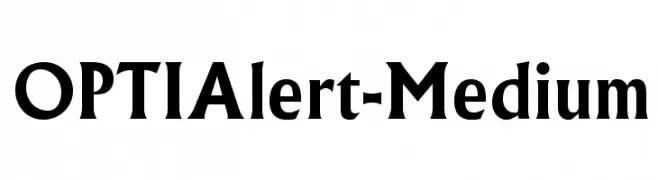
( Fonts by Castcraft Software - opti.netii.net - check the website before use )
A bold, assertive serif font with thick strokes and slightly condensed letterforms.
![OPTIAlert-Medium font caratteri gratis]() Scaricare 6563 Downloads@WebFont
Scaricare 6563 Downloads@WebFont -
![Bone Regular font caratteri gratis]() Scaricare 6563 Downloads@WebFont
Scaricare 6563 Downloads@WebFont


Quali sono i font più popolari adesso?
Poppins, Roboto, Montserrat, Open Sans e Lato sono molto usati per le forme pulite e l'ampia applicabilità — dall'identità di marca alle landing page e ai poster.
Quali font si usano spesso nei loghi?
Le sans serif geometriche (es. Poppins, famiglie in stile Gotham) sono scelte comuni per un branding pulito e scalabile. Per un tocco personale restano valide script e stili manoscritti. Abbina un display deciso per i titoli a un corpo testo neutro per riconoscibilità ed equilibrio.
Ogni quanto si aggiorna la lista?
Con regolarità, in base ai download e all'attività reale. Torna spesso per scoprire in anticipo le nuove preferite.
💡 Consiglio: aggiungi ai preferiti — le tendenze cambiano in fretta e i font top di oggi possono ispirare il rebranding di domani.