Benvenuto nelle Font Più Popolari — dove popolarità e qualità si incontrano. Qui trovi i font più scaricati e usati dell'anno. Se cerchi scelte sicure per logo, web o social, inizia da qui.
Ogni font top si distingue per equilibrio, leggibilità e versatilità. Troverai sans serif moderne, script eleganti, serif vintage e display minimalisti.
-
( Fonts by Rvst )
A playful, bold font with rounded characters and wide spacing.
 Scaricare 673 Downloads@WebFont
 -
( Fonts by Syaf Rizal - Khurasan - Personal-use only. For commercial use please contact owner. )
A bold, expressive handwritten font with dynamic strokes and a brush-like texture.
![Fonters font caratteri gratis]() Scaricare 673 Downloads@WebFont
Scaricare 673 Downloads@WebFont -
( Fonts by Alex Slobzheninov - Personal-use only. For commercial use please contact owner. )
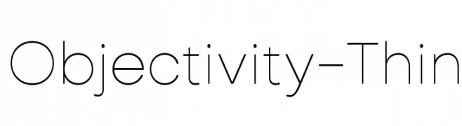
A thin, modern sans-serif font with a clean and minimalist design.
![Objectivity-Thin font caratteri gratis]() Scaricare 673 Downloads@WebFont
Scaricare 673 Downloads@WebFont -
( Solidtype - bit.ly/2OxZn2V )
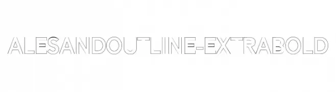
A bold, outlined font with a modern, geometric style.
![AlesandOutline-ExtraBold font caratteri gratis]() Scaricare 673 Downloads@WebFont
Scaricare 673 Downloads@WebFont -
( Fonts by Dan P. Lyons - Personal-use only. For commercial use please contact owner. )
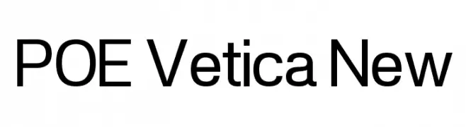
A modern sans-serif font with geometric shapes and uniform strokes.
![POE Vetica New font caratteri gratis]() Scaricare 673 Downloads@WebFont
Scaricare 673 Downloads@WebFont -
( Fonts by Billy Argel - www.billyargel.com - Personal-use only. For commercial use please contact owner. )
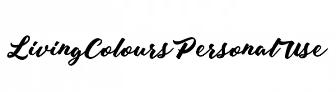
A bold, expressive script font with elegant, flowing letterforms.
![Living Colours Personal Use font caratteri gratis]() Scaricare 673 Downloads@WebFont
Scaricare 673 Downloads@WebFont -
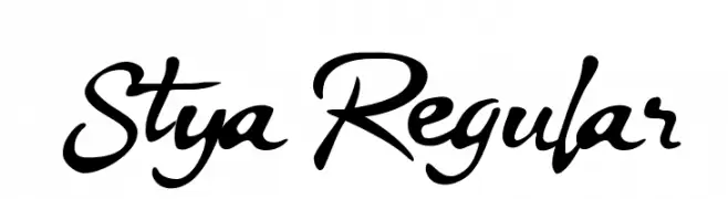
( Fonts by Khoe Roni )
A dynamic cursive font with fluid strokes and lively rhythm.
![Stya Regular font caratteri gratis]() Scaricare 673 Downloads@WebFont
Scaricare 673 Downloads@WebFont -
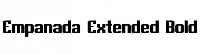
( Fonts by a Neale Davidson - www.pixelsagas.com. Personal-use only. For commercial use please contact owner. )
A bold, extended, and geometric font with a modern style.
![Empanada Extended Bold font caratteri gratis]() Scaricare 673 Downloads@WebFont
Scaricare 673 Downloads@WebFont -
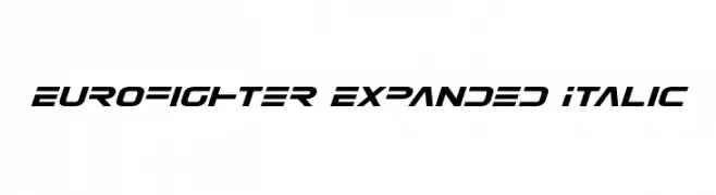
( Fonts by Daniel Zadorozny - www.iconian.com )
A modern, italicized, and expanded font with a bold, angular design.
![Eurofighter Expanded Italic font caratteri gratis]() Scaricare 673 Downloads@WebFont
Scaricare 673 Downloads@WebFont -
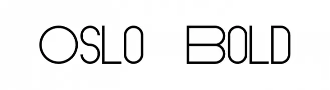
( Fonts by antoniorodriguesjr.com )
A modern, geometric font with a sleek and sophisticated design.
![Oslo Bold font caratteri gratis]() Scaricare 673 Downloads@WebFont
Scaricare 673 Downloads@WebFont -
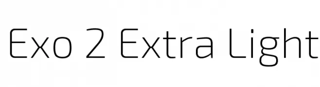
( Copyright (c) 2013, Natanael Gama (www.ndiscovered.com . info(at)ndiscovered.com), with Reserved Font Name 'Exo' )
A sleek, modern geometric sans-serif font with clean lines and uniform stroke width.
![Exo 2 Extra Light font caratteri gratis]() Scaricare 673 Downloads@WebFont
Scaricare 673 Downloads@WebFont -
( Fonts by Typodermic Fonts )
A bold, monospaced font with a clean and uniform appearance.
![NK57MonospaceCdRg-Bold font caratteri gratis]() Scaricare 673 Downloads@WebFont
Scaricare 673 Downloads@WebFont -
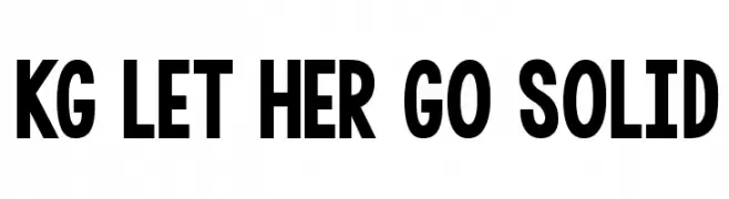
( Fonts by www.kimberlygeswein.com - Kimberly Geswein )
A bold, modern font with thick, uniform strokes and a geometric influence.
![KG LET HER GO SOLID font caratteri gratis]() Scaricare 673 Downloads@WebFont
Scaricare 673 Downloads@WebFont -
![aWavakii font caratteri gratis]() Scaricare 673 Downloads@WebFont
Scaricare 673 Downloads@WebFont -
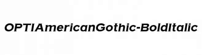
( Fonts by Castcraft Software - opti.netii.net - check the website before use )
A bold, italicized font with a dynamic and uniform appearance.
![OPTIAmericanGothic-BoldItalic font caratteri gratis]() Scaricare 673 Downloads@WebFont
Scaricare 673 Downloads@WebFont -
( Fonts by Roland Huse - rolandhuse.com )
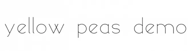
A modern, minimalist font with thin, geometric strokes and a clean aesthetic.
![yellow peas demo font caratteri gratis]() Scaricare 673 Downloads@WebFont
Scaricare 673 Downloads@WebFont -
( Fonts by Style-7 - www.styleseven.com - Personal-use only. For commercial use please contact owner. )
A pixelated, digital font inspired by classic LCD displays, perfect for tech-themed projects.
![Advanced Pixel LCD-7 font caratteri gratis]() Scaricare 673 Downloads@WebFont
Scaricare 673 Downloads@WebFont -
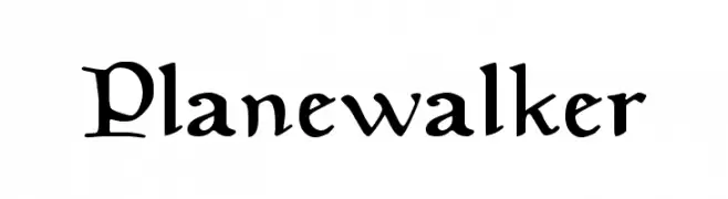
( Fonts by a Neale Davidson - www.pixelsagas.com. Personal-use only. For commercial use please contact owner. )
A medieval-inspired serif font with bold strokes and intricate detailing.
![Planewalker font caratteri gratis]() Scaricare 673 Downloads@WebFont
Scaricare 673 Downloads@WebFont -
![Lizard font caratteri gratis]() Scaricare 673 Downloads@WebFont
Scaricare 673 Downloads@WebFont -
![THE PRINCE font caratteri gratis]() Scaricare 673 Downloads@WebFont
Scaricare 673 Downloads@WebFont -
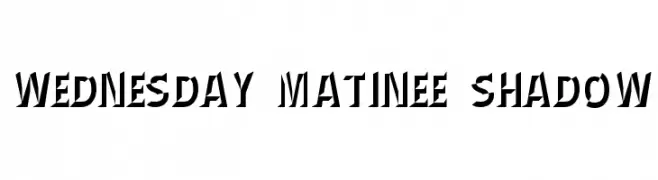
![Wednesday Matinee Shadow font caratteri gratis]() Scaricare 673 Downloads@WebFont
Scaricare 673 Downloads@WebFont -
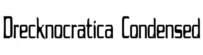
![Drecknocratica Condensed font caratteri gratis]() Scaricare 673 Downloads@WebFont
Scaricare 673 Downloads@WebFont -
![aelfa font caratteri gratis]() Scaricare 673 Downloads@WebFont
Scaricare 673 Downloads@WebFont -
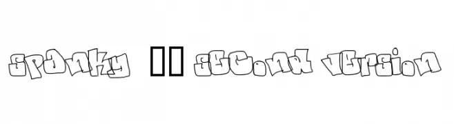
![spanky 20 second version font caratteri gratis]() Scaricare 673 Downloads@WebFont
Scaricare 673 Downloads@WebFont -
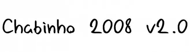
![Chabinho 2008 v2.0 font caratteri gratis]() Scaricare 673 Downloads@WebFont
Scaricare 673 Downloads@WebFont -
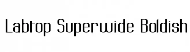
( Fonts by Graham Meade - GemFonts )
A bold, superwide font with a modern and uniform design.
![Labtop Superwide Boldish font caratteri gratis]() Scaricare 673 Downloads@WebFont
Scaricare 673 Downloads@WebFont -
( Fonts by Daniel Zadorozny - www.iconian.com )
A bold, geometric font with a futuristic and angular design.
![Kobold font caratteri gratis]() Scaricare 673 Downloads@WebFont
Scaricare 673 Downloads@WebFont -
![cube vol.2 font caratteri gratis]() Scaricare 673 Downloads@WebFont
Scaricare 673 Downloads@WebFont -
( Fonts by Nick Curtis - www.nicksfonts.com )
A bold, high-contrast font with geometric and decorative elements.
![Rialto NF font caratteri gratis]() Scaricare 673 Downloads@WebFont
Scaricare 673 Downloads@WebFont -
( Fonts by www.aenigmafonts.com )
A playful, bold font with a unique shadow effect and cartoonish style.
![Qlumpy Shadow BRK font caratteri gratis]() Scaricare 673 Downloads@WebFont
Scaricare 673 Downloads@WebFont -
![Jetson font caratteri gratis]() Scaricare 673 Downloads@WebFont
Scaricare 673 Downloads@WebFont -
( Fonts by Jeri Ingalls - littlehouse.homestead.com )
A decorative font with characters encased in sunflower-like shapes, offering a whimsical and artistic style.
![JI Sunflower font caratteri gratis]() Scaricare 673 Downloads@WebFont
Scaricare 673 Downloads@WebFont -
( Fonts by John David www.easywriter.com/fonts/ )
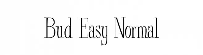
A classic serif font with tall, elegant letterforms and high contrast strokes.
![Bud Easy Normal font caratteri gratis]() Scaricare 673 Downloads@WebFont
Scaricare 673 Downloads@WebFont -
![Zippo font caratteri gratis]() Scaricare 673 Downloads@WebFont
Scaricare 673 Downloads@WebFont -
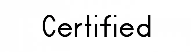
( Fonts by Dieter Schumacher )
A modern, geometric sans-serif font with uniform strokes and strong visual impact.
![Certified font caratteri gratis]() Scaricare 673 Downloads@WebFont
Scaricare 673 Downloads@WebFont


Quali sono i font più popolari adesso?
Poppins, Roboto, Montserrat, Open Sans e Lato sono molto usati per le forme pulite e l'ampia applicabilità — dall'identità di marca alle landing page e ai poster.
Quali font si usano spesso nei loghi?
Le sans serif geometriche (es. Poppins, famiglie in stile Gotham) sono scelte comuni per un branding pulito e scalabile. Per un tocco personale restano valide script e stili manoscritti. Abbina un display deciso per i titoli a un corpo testo neutro per riconoscibilità ed equilibrio.
Ogni quanto si aggiorna la lista?
Con regolarità, in base ai download e all'attività reale. Torna spesso per scoprire in anticipo le nuove preferite.
💡 Consiglio: aggiungi ai preferiti — le tendenze cambiano in fretta e i font top di oggi possono ispirare il rebranding di domani.