Benvenuto nelle Font Più Popolari — dove popolarità e qualità si incontrano. Qui trovi i font più scaricati e usati dell'anno. Se cerchi scelte sicure per logo, web o social, inizia da qui.
Ogni font top si distingue per equilibrio, leggibilità e versatilità. Troverai sans serif moderne, script eleganti, serif vintage e display minimalisti.
-
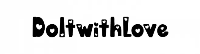
( Fonts by Situjuh Nazara - 7ntypes.com - Personal-use only. For commercial use please contact owner. )
A playful, heart-themed font with bold, rounded characters.
 Scaricare 145 Downloads@WebFont
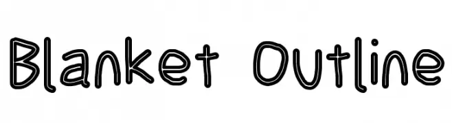
 -
![Blanket Outline font caratteri gratis]() Scaricare 145 Downloads@WebFont
Scaricare 145 Downloads@WebFont -
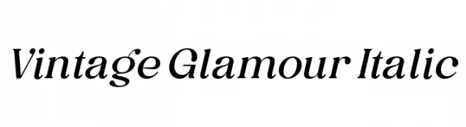
( Fonts by Ardyanatypes - Personal-use only. For commercial use please contact owner. )
An elegant italic serif font with a classic and sophisticated style.
![Vintage Glamour Italic font caratteri gratis]() Scaricare 145 Downloads@WebFont
Scaricare 145 Downloads@WebFont -
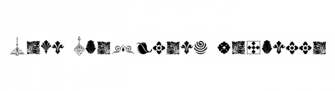
( new.myfonts.com/foundry/Intellecta_Design/?refby=paulow )
A diverse collection of ornamental and decorative dingbats.
![Soft Ornaments Fourteen font caratteri gratis]() Scaricare 145 Downloads@WebFont
Scaricare 145 Downloads@WebFont -
( Onne Hermawan )
A playful, casual handwritten font with smooth, flowing curves and expressive letterforms.
![Kalamian font caratteri gratis]() Scaricare 145 Downloads@WebFont
Scaricare 145 Downloads@WebFont -
-
( Fonts by a Max Infeld - XEROGRAPHER FONTS - xerographer.blogspot.com . Personal-use only. For commercial use please contact owner. )
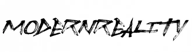
A bold, grunge-style font with rough, jagged edges and dynamic strokes.
![ModernReality font caratteri gratis]() Scaricare 145 Downloads@WebFont
Scaricare 145 Downloads@WebFont -
( Copyright (c) 2015, Impallari Type (www.impallari.com) )
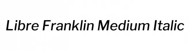
A modern, medium-weight italic sans-serif font with clean lines and balanced proportions.
![Libre Franklin Medium Italic font caratteri gratis]() Scaricare 145 Downloads@WebFont
Scaricare 145 Downloads@WebFont -
( Fonts by deFharo - Fernando Haro - Personal-use only. For commercial use please contact owner. )
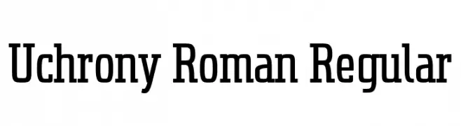
A bold slab serif font with a modern yet classic appeal.
![Uchrony Roman Regular font caratteri gratis]() Scaricare 145 Downloads@WebFont
Scaricare 145 Downloads@WebFont -
( Fonts by or from www.graffitifonts.net )
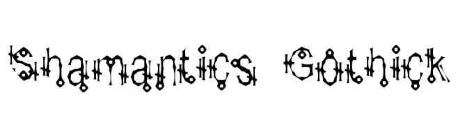
A decorative, Gothic-inspired font with intricate, angular designs.
![Shamantics Gothick font caratteri gratis]() Scaricare 145 Downloads@WebFont
Scaricare 145 Downloads@WebFont -
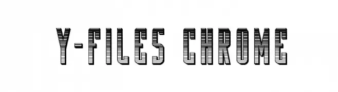
( Fonts by Iconian Fonts )
A bold, three-dimensional font with horizontal stripes and a vintage-modern aesthetic.
![Y-Files Chrome font caratteri gratis]() Scaricare 145 Downloads@WebFont
Scaricare 145 Downloads@WebFont

Quali sono i font più popolari adesso?
Poppins, Roboto, Montserrat, Open Sans e Lato sono molto usati per le forme pulite e l'ampia applicabilità — dall'identità di marca alle landing page e ai poster.
Quali font si usano spesso nei loghi?
Le sans serif geometriche (es. Poppins, famiglie in stile Gotham) sono scelte comuni per un branding pulito e scalabile. Per un tocco personale restano valide script e stili manoscritti. Abbina un display deciso per i titoli a un corpo testo neutro per riconoscibilità ed equilibrio.
Ogni quanto si aggiorna la lista?
Con regolarità, in base ai download e all'attività reale. Torna spesso per scoprire in anticipo le nuove preferite.
💡 Consiglio: aggiungi ai preferiti — le tendenze cambiano in fretta e i font top di oggi possono ispirare il rebranding di domani.