Benvenuto nelle Font Più Popolari — dove popolarità e qualità si incontrano. Qui trovi i font più scaricati e usati dell'anno. Se cerchi scelte sicure per logo, web o social, inizia da qui.
Ogni font top si distingue per equilibrio, leggibilità e versatilità. Troverai sans serif moderne, script eleganti, serif vintage e display minimalisti.
-
( Fonts by Youssef Habchi - Personal-use only. For commercial use please contact owner. )
A bold, geometric font with an industrial, futuristic style.
 Scaricare 667 Downloads@WebFont
 -
( Intellecta Design - Paulo W - new.myfonts.com/foundry/Intellecta_Design/?refby=paulow )
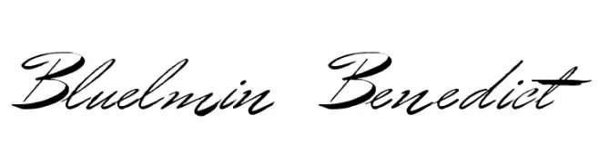
A dynamic, cursive script font with high contrast and elegant flow.
![Bluelmin Benedict font caratteri gratis]() Scaricare 667 Downloads@WebFont
Scaricare 667 Downloads@WebFont -
( Fakhrul Razi - creativemarket.com/Naqsya.Co )
A refined script font with elegant, flowing cursive letterforms.
![Wetting font caratteri gratis]() Scaricare 667 Downloads@WebFont
Scaricare 667 Downloads@WebFont -
![Youth Touch DEMO Regular font caratteri gratis]() Scaricare 667 Downloads@WebFont
Scaricare 667 Downloads@WebFont -
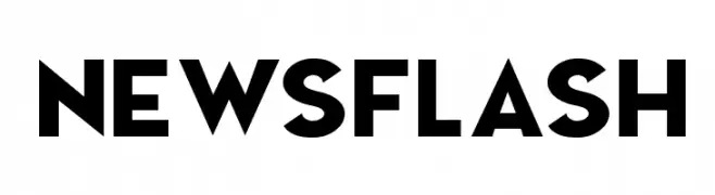
![NEWSFLASH font caratteri gratis]() Scaricare 667 Downloads@WebFont
Scaricare 667 Downloads@WebFont -
( Copyright 2018 Boutros International. (http://www.boutrosfonts.com) )
A bold, modern sans-serif font with clean lines and strong presence.
![Tajawal Black font caratteri gratis]() Scaricare 667 Downloads@WebFont
Scaricare 667 Downloads@WebFont -
( Fonts by www.studiotypo.com - Personal-use only. For commercial use please contact owner. )
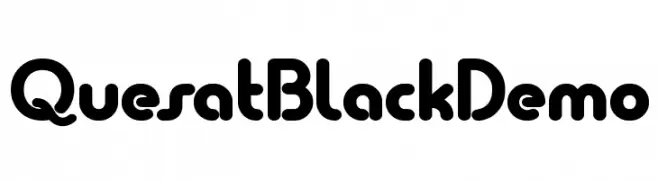
A bold, rounded font with a playful and approachable style.
![Quesat Black Demo font caratteri gratis]() Scaricare 667 Downloads@WebFont
Scaricare 667 Downloads@WebFont -
![Cobalt Alien Expanded Italic font caratteri gratis]() Scaricare 667 Downloads@WebFont
Scaricare 667 Downloads@WebFont -
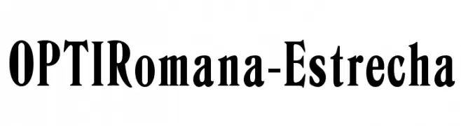
( Fonts by Castcraft Software - OPTI Fonts Archive - opti.netii.net - Personal-use only. For commercial use please contact owner. )
A bold, high-contrast serif font with elegant curves and a classic yet modern style.
![OPTIRomana-Estrecha font caratteri gratis]() Scaricare 667 Downloads@WebFont
Scaricare 667 Downloads@WebFont -
( Fonts by www.fontpanda.com. Personal-use only. For commercial use please contact owner. )
A playful, handwritten font with a casual and dynamic style.
![Marmalade Toast font caratteri gratis]() Scaricare 667 Downloads@WebFont
Scaricare 667 Downloads@WebFont -
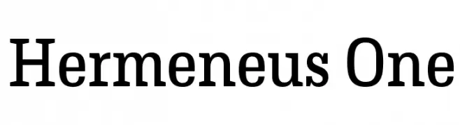
( Copyright (c) 2012, Pablo Impallari (www.impallari.com|impallari@gmail.com), Rodrigo Fuenzalida (www.rfuenzalida.com|hello@rfuenzalida.com), with Reserved Font Name Hermeneus. )
A bold serif font with a classic yet modern style, featuring strong vertical lines and subtle curves.
![Hermeneus One font caratteri gratis]() Scaricare 667 Downloads@WebFont
Scaricare 667 Downloads@WebFont -
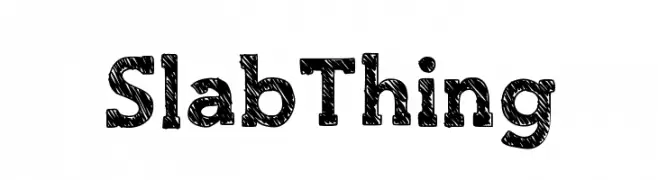
( Fonts by Luedecke Design Font Co. - ldfonts.weebly.com )
A bold, textured slab serif font with a hand-drawn, sketchy appearance.
![SlabThing font caratteri gratis]() Scaricare 667 Downloads@WebFont
Scaricare 667 Downloads@WebFont -
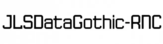
![JLSDataGothic-RNC font caratteri gratis]() Scaricare 667 Downloads@WebFont
Scaricare 667 Downloads@WebFont -
( Fonts by Mans Greback - www.mawns.com )
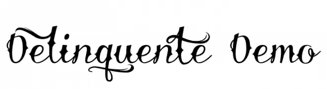
An ornate script font with elaborate swashes and decorative elements.
![Delinquente Demo font caratteri gratis]() Scaricare 667 Downloads@WebFont
Scaricare 667 Downloads@WebFont -
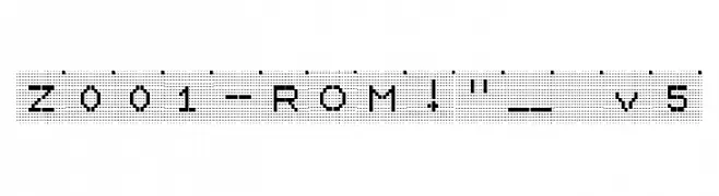
![Z001-ROM!]() Scaricare 667 Downloads@WebFont
Scaricare 667 Downloads@WebFont -
![ESRI Weather font caratteri gratis]() Scaricare 667 Downloads@WebFont
Scaricare 667 Downloads@WebFont -
( Frogii`s Fonts )
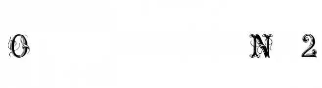
An ornate and decorative font with intricate swirls and embellishments.
![OrnamentalNo2 font caratteri gratis]() Scaricare 667 Downloads@WebFont
Scaricare 667 Downloads@WebFont -
( Fonts by Manfred Klein. Free for private and charity use. Free for commercial with donation to organizations )
A classic serif font with a modern touch, offering elegance and readability.
![BaumWell font caratteri gratis]() Scaricare 667 Downloads@WebFont
Scaricare 667 Downloads@WebFont -
( Fonts by Daniel Gauthier )
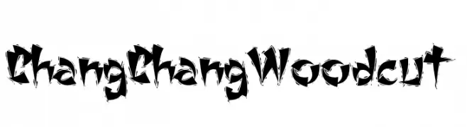
A bold, jagged font with a woodcut-inspired, energetic style.
![ChangChangWoodcut font caratteri gratis]() Scaricare 667 Downloads@WebFont
Scaricare 667 Downloads@WebFont -
( Fonts by Steve Deffeyes - www.deffeyes.com )
A casual, handwritten font with a slight slant and smooth, rounded characters.
![Marker SD Italic font caratteri gratis]() Scaricare 667 Downloads@WebFont
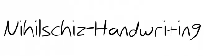
Scaricare 667 Downloads@WebFont -
![Nihilschiz-Handwriting font caratteri gratis]() Scaricare 667 Downloads@WebFont
Scaricare 667 Downloads@WebFont -
( Fonts by Nick Curtis - www.nicksfonts.com )
A bold, modern font with a geometric and futuristic style.
![SnappyService font caratteri gratis]() Scaricare 667 Downloads
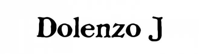
Scaricare 667 Downloads -
![Dolenzo J font caratteri gratis]() Scaricare 667 Downloads@WebFont
Scaricare 667 Downloads@WebFont -
![LOAD font caratteri gratis]() Scaricare 667 Downloads@WebFont
Scaricare 667 Downloads@WebFont -
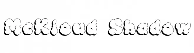
( Fonts by Apostrophic Lab )
A playful, cloud-like font with a shadow effect, perfect for creative designs.
![McKloud Shadow font caratteri gratis]() Scaricare 667 Downloads@WebFont
Scaricare 667 Downloads@WebFont -
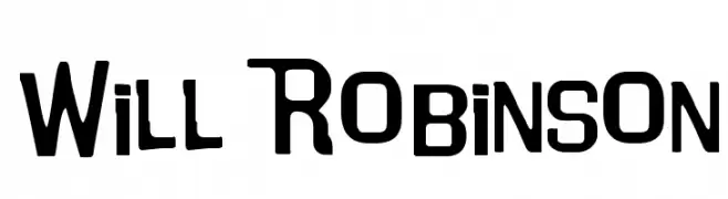
( Fonts by DeNada Industries - Mike Allard )
A bold, geometric font with a modern and slightly condensed style.
![Will Robinson font caratteri gratis]() Scaricare 667 Downloads@WebFont
Scaricare 667 Downloads@WebFont -
( Fonts by Nick Curtis - www.nicksfonts.com )
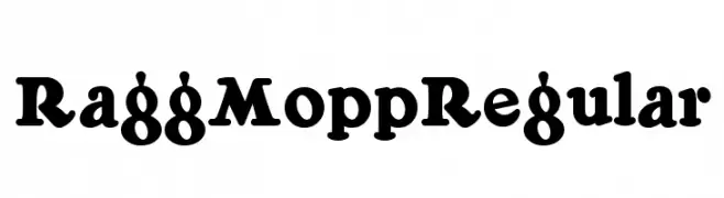
A bold, playful font with a retro flair and rounded characters.
![RaggMoppRegular font caratteri gratis]() Scaricare 667 Downloads@WebFont
Scaricare 667 Downloads@WebFont -
( Fonts by Iconian Fonts - Daniel Zadorozny )
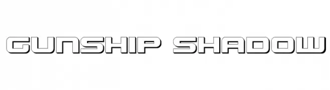
A bold, futuristic outline font with geometric and angular characters.
![Gunship Shadow font caratteri gratis]() Scaricare 667 Downloads@WebFont
Scaricare 667 Downloads@WebFont -
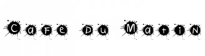
![Cafe du Matin font caratteri gratis]() Scaricare 667 Downloads@WebFont
Scaricare 667 Downloads@WebFont -
( Fonts by Khurasan )
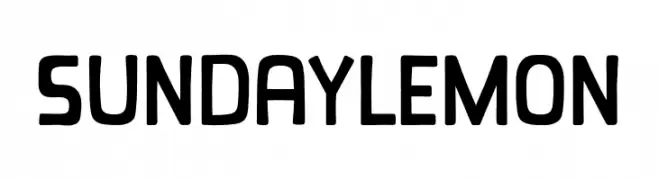
A playful, rounded font with bold, consistent strokes and a friendly appearance.
![Sunday Lemon font caratteri gratis]() Scaricare 666 Downloads@WebFont
Scaricare 666 Downloads@WebFont -
( Fonts by Rainzel Lazaro - Personal-use only. For commercial use please contact owner. )
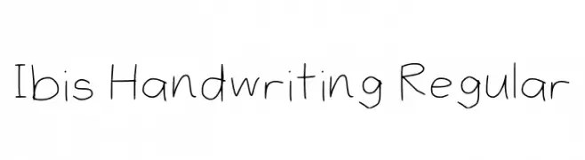
A casual, handwritten font with a natural and personal touch.
![Ibis Handwriting Regular font caratteri gratis]() Scaricare 666 Downloads@WebFont
Scaricare 666 Downloads@WebFont -
( Fonts by Jérémie Gauthier - Personal-use only. For commercial use please contact owner. )
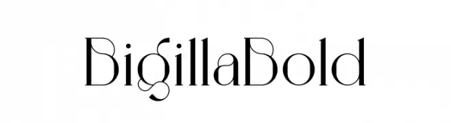
A high-contrast, elegant font with unique curves and angles.
![Bigilla Bold font caratteri gratis]() Scaricare 666 Downloads@WebFont
Scaricare 666 Downloads@WebFont -
( Fonts by Attype Studio )
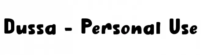
A bold, playful font with rounded edges and a whimsical style.
![Dussa - Personal Use font caratteri gratis]() Scaricare 666 Downloads@WebFont
Scaricare 666 Downloads@WebFont -
( Fonts by Vladimir Nikolic - www.creativefabrica.com/designer/vladimirnikolic/ - Personal-use only. For commercial use please contact owner. )
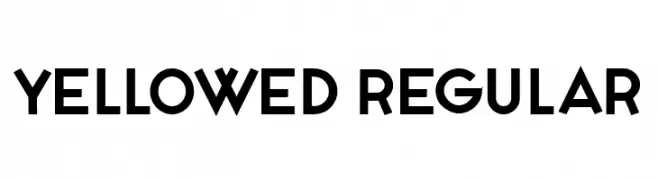
A bold, geometric sans-serif font with a modern and minimalistic design.
![Yellowed Regular font caratteri gratis]() Scaricare 666 Downloads@WebFont
Scaricare 666 Downloads@WebFont -
( Fonts by Khurasan )
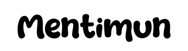
A playful, bold font with rounded, bubbly characters ideal for creative projects.
![Mentimun font caratteri gratis]() Scaricare 666 Downloads@WebFont
Scaricare 666 Downloads@WebFont


Quali sono i font più popolari adesso?
Poppins, Roboto, Montserrat, Open Sans e Lato sono molto usati per le forme pulite e l'ampia applicabilità — dall'identità di marca alle landing page e ai poster.
Quali font si usano spesso nei loghi?
Le sans serif geometriche (es. Poppins, famiglie in stile Gotham) sono scelte comuni per un branding pulito e scalabile. Per un tocco personale restano valide script e stili manoscritti. Abbina un display deciso per i titoli a un corpo testo neutro per riconoscibilità ed equilibrio.
Ogni quanto si aggiorna la lista?
Con regolarità, in base ai download e all'attività reale. Torna spesso per scoprire in anticipo le nuove preferite.
💡 Consiglio: aggiungi ai preferiti — le tendenze cambiano in fretta e i font top di oggi possono ispirare il rebranding di domani.