Benvenuto nelle Font Più Popolari — dove popolarità e qualità si incontrano. Qui trovi i font più scaricati e usati dell'anno. Se cerchi scelte sicure per logo, web o social, inizia da qui.
Ogni font top si distingue per equilibrio, leggibilità e versatilità. Troverai sans serif moderne, script eleganti, serif vintage e display minimalisti.
-
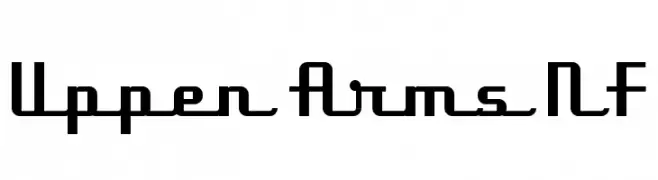
( Fonts by Nick Curtis - www.nicksfonts.com )
A geometric, angular font with a modern and vintage blend, featuring bold and structured letterforms.
 Scaricare 657 Downloads@WebFont
 -
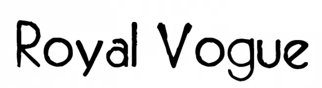
( Fonts by site.xavier.edu/polt/typewriters/ - Richard Polt )
A hand-drawn, artistic font with a bold, textured appearance.
![Royal Vogue font caratteri gratis]() Scaricare 657 Downloads@WebFont
Scaricare 657 Downloads@WebFont -
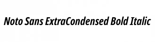
( Fonts by Google - Personal-use only. For commercial use please contact owner. )
A modern, extra-condensed, bold italic typeface with a sleek and professional appearance.
![Noto Sans ExtraCondensed Bold Italic font caratteri gratis]() Scaricare 657 Downloads@WebFont
Scaricare 657 Downloads@WebFont -
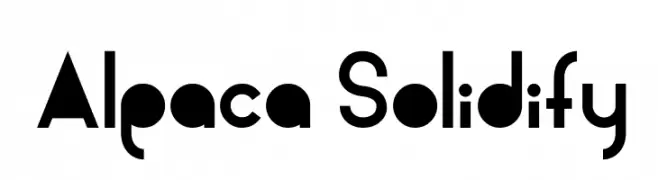
( Fonts by a Andrew Hart Dirt2.com - SickCapital. Personal-use only. For commercial use please contact owner. )
A bold, geometric font with a modern and clean style.
![Alpaca Solidify font caratteri gratis]() Scaricare 657 Downloads@WebFont
Scaricare 657 Downloads@WebFont -
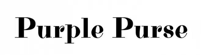
( Copyright (c) 2012 by Brian J. Bonislawsky DBA Astigmatic (AOETI) )
A bold, high-contrast serif font with elegant and dramatic strokes.
![Purple Purse font caratteri gratis]() Scaricare 657 Downloads@WebFont
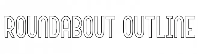
Scaricare 657 Downloads@WebFont -
![Roundabout Outline font caratteri gratis]() Scaricare 657 Downloads@WebFont
Scaricare 657 Downloads@WebFont -
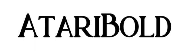
( Peter Olexa - www.dealjumbo.com )
A bold serif font with strong vertical lines and slightly curved serifs.
![Atari Bold font caratteri gratis]() Scaricare 657 Downloads@WebFont
Scaricare 657 Downloads@WebFont -
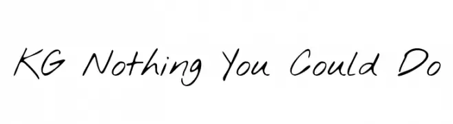
( Fonts by www.kimberlygeswein.com - Kimberly Geswein )
A casual, handwritten font with fluid and natural strokes.
![KG Nothing You Could Do font caratteri gratis]() Scaricare 657 Downloads@WebFont
Scaricare 657 Downloads@WebFont -
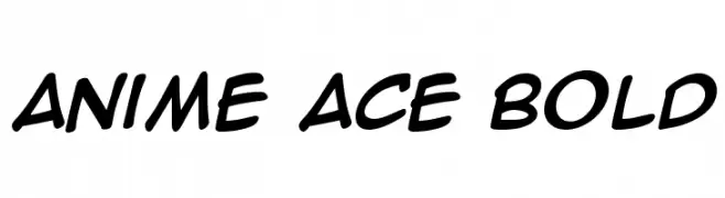
( Blambot - www.blambot.com )
A bold, playful font with rounded, italicized letterforms.
![Anime Ace Bold font caratteri gratis]() Scaricare 657 Downloads@WebFont
Scaricare 657 Downloads@WebFont -
( Font by Eric Wirjanata. All of my font are donation based. You can support by buying something from here. http://society6.com/EricWirjanata )
A playful, bold, hand-drawn font with a cartoon-like style.
![Chocolate_Muffin font caratteri gratis]() Scaricare 657 Downloads@WebFont
Scaricare 657 Downloads@WebFont -
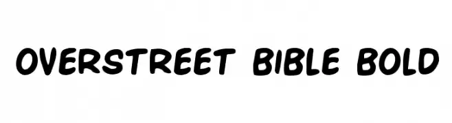
( Fonts by Daniel Zadorozny - www.iconian.com )
A bold, playful font with rounded edges and a strong presence.
![Overstreet Bible Bold font caratteri gratis]() Scaricare 657 Downloads@WebFont
Scaricare 657 Downloads@WebFont -
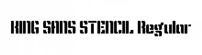
![KING SANS STENCIL Regular font caratteri gratis]() Scaricare 657 Downloads@WebFont
Scaricare 657 Downloads@WebFont -
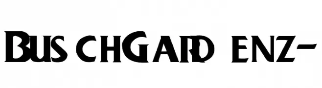
![BuschGardenz- font caratteri gratis]() Scaricare 657 Downloads@WebFont
Scaricare 657 Downloads@WebFont -
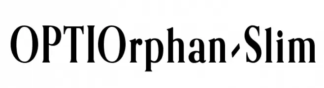
( Fonts by Castcraft Software - OPTI Fonts Archive - opti.netii.net - Personal-use only. For commercial use please contact owner. )
A classic serif font with elegant, elongated letterforms and refined details.
![OPTIOrphan-Slim font caratteri gratis]() Scaricare 657 Downloads@WebFont
Scaricare 657 Downloads@WebFont -
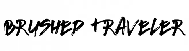
( Fonts by Leonard Posavec - leosupply.co - Personal-use only. For commercial use please contact owner. )
A bold, brush-style font with dynamic and expressive strokes.
![Brushed Traveler font caratteri gratis]() Scaricare 657 Downloads@WebFont
Scaricare 657 Downloads@WebFont -
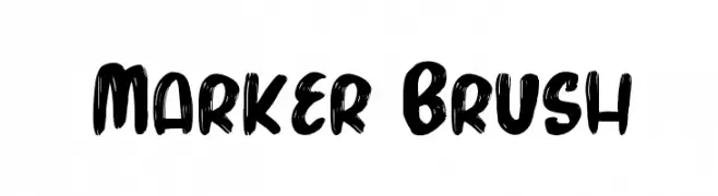
![Marker Brush font caratteri gratis]() Scaricare 657 Downloads@WebFont
Scaricare 657 Downloads@WebFont -
![meryjane font caratteri gratis]() Scaricare 657 Downloads@WebFont
Scaricare 657 Downloads@WebFont -
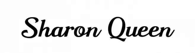
( Fonts by Fenny Wiryani - Personal-use only. For commercial use please contact owner. )
A classic script font with elegant, flowing curves and a sophisticated appearance.
![Sharon Queen font caratteri gratis]() Scaricare 657 Downloads@WebFont
Scaricare 657 Downloads@WebFont -
( Fonts by 7NTypes )
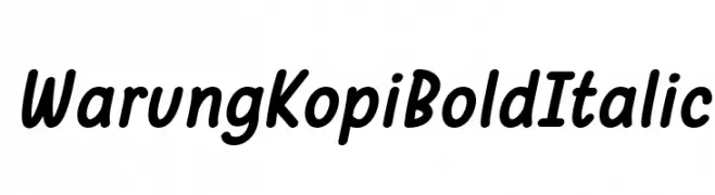
A bold, italic, handwritten-style font with a casual and friendly appearance.
![Warung Kopi Bold Italic font caratteri gratis]() Scaricare 657 Downloads@WebFont
Scaricare 657 Downloads@WebFont -
( Fonts by Calligraphy Fonts )
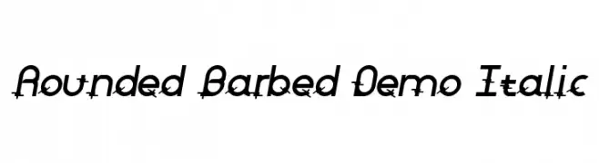
A modern italic font with rounded and barbed accents, offering a dynamic and edgy style.
![Rounded Barbed Demo Italic font caratteri gratis]() Scaricare 657 Downloads@WebFont
Scaricare 657 Downloads@WebFont -
( Fonts by Castcraft Software - opti.netii.net - check the website before use )
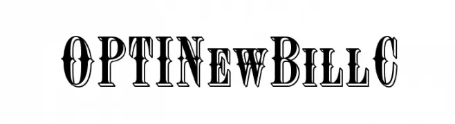
A bold, decorative font with a vintage, three-dimensional style.
![OPTINewBillC font caratteri gratis]() Scaricare 657 Downloads@WebFont
Scaricare 657 Downloads@WebFont -
( Fonts by Lena Hesse {manolena} )
A bold, playful font with a hand-drawn, whimsical style.
![MLmonstrolino-Regular font caratteri gratis]() Scaricare 657 Downloads@WebFont
Scaricare 657 Downloads@WebFont -
![VDS Bold font caratteri gratis]() Scaricare 657 Downloads@WebFont
Scaricare 657 Downloads@WebFont -
( Fonts by Vanessa Bays - bythebutterfly.com )
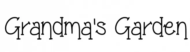
A whimsical, hand-drawn font with playful, nostalgic charm.
![Grandma's Garden font caratteri gratis]() Scaricare 657 Downloads@WebFont
Scaricare 657 Downloads@WebFont -
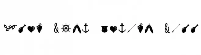
( Fonts by a www.fontfabric.com. Personal-use only. For commercial use please contact owner. )
A rustic, hand-drawn collection of decorative elements and icons.
![Nexa Rust Extras Free font caratteri gratis]() Scaricare 657 Downloads@WebFont
Scaricare 657 Downloads@WebFont -
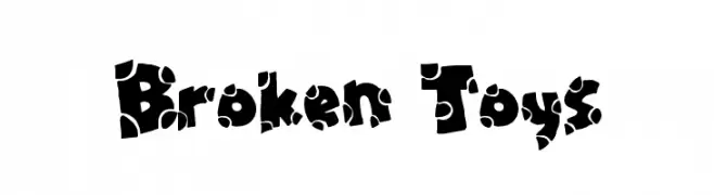
( Fonts by Jacob Fisher - www.pizzadude.dk )
A playful, fragmented font with bold, irregular shapes and contrasting patterns.
![Broken Toys font caratteri gratis]() Scaricare 657 Downloads@WebFont
Scaricare 657 Downloads@WebFont -
( 7NTypes - Situjuh Nazara - 7ntypes.com )
A graceful script font with flowing, connected strokes and elegant curves.
![Togetha font caratteri gratis]() Scaricare 657 Downloads@WebFont
Scaricare 657 Downloads@WebFont -
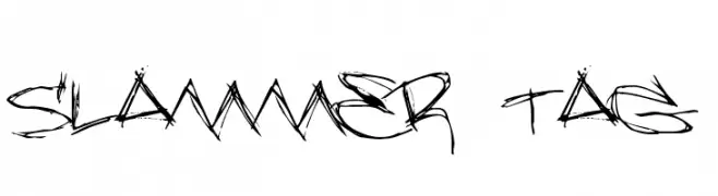
( Fonts by Jacob Fisher - www.pizzadude.dk )
A graffiti-inspired font with bold, jagged strokes and an urban, edgy style.
![Slammer tag font caratteri gratis]() Scaricare 657 Downloads@WebFont
Scaricare 657 Downloads@WebFont -
( Fonts by Apostrophic Lab )
A bold, italicized font with elongated, condensed letterforms and a modern feel.
![Labtop Bold Italic font caratteri gratis]() Scaricare 657 Downloads@WebFont
Scaricare 657 Downloads@WebFont -
![P22 Euros font caratteri gratis]() Scaricare 657 Downloads@WebFont
Scaricare 657 Downloads@WebFont -
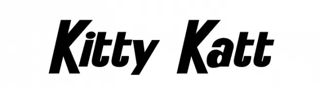
![Kitty Katt font caratteri gratis]() Scaricare 657 Downloads@WebFont
Scaricare 657 Downloads@WebFont -
Caratteri di Designnny90. For commercial use please contact the owner.
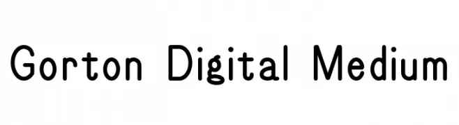
( A revival of a 20th century interwar typeface. In the early- to mid-20th century, the George Gorton Machine Company made engraving machines (among other machines). )
A modern sans-serif font with rounded edges and excellent readability.
![Gorton Digital Medium font caratteri gratis]() Scaricare 657 Downloads@WebFont
Scaricare 657 Downloads@WebFont -
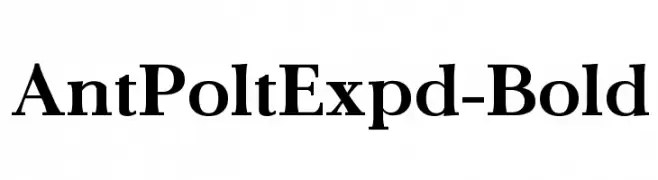
![AntPoltExpd-Bold font caratteri gratis]() Scaricare 657 Downloads@WebFont
Scaricare 657 Downloads@WebFont -
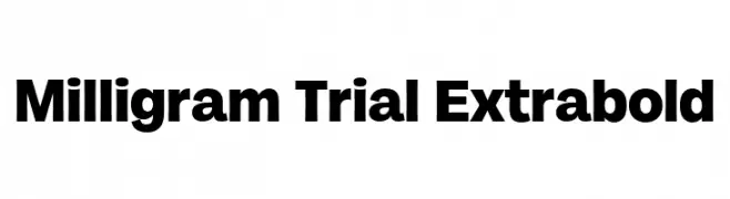
( Fonts by Zetafonts - Personal-use only. For commercial use please contact owner. )
A bold, modern sans-serif font with strong, thick strokes.
![Milligram Trial Extrabold font caratteri gratis]() Scaricare 657 Downloads@WebFont
Scaricare 657 Downloads@WebFont -
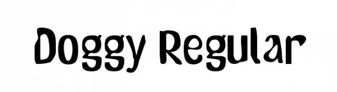
( Fonts by Altsys Metamorphosis )
A playful, bold font with a hand-drawn, whimsical style.
![Doggy Regular font caratteri gratis]() Scaricare 657 Downloads@WebFont
Scaricare 657 Downloads@WebFont


Quali sono i font più popolari adesso?
Poppins, Roboto, Montserrat, Open Sans e Lato sono molto usati per le forme pulite e l'ampia applicabilità — dall'identità di marca alle landing page e ai poster.
Quali font si usano spesso nei loghi?
Le sans serif geometriche (es. Poppins, famiglie in stile Gotham) sono scelte comuni per un branding pulito e scalabile. Per un tocco personale restano valide script e stili manoscritti. Abbina un display deciso per i titoli a un corpo testo neutro per riconoscibilità ed equilibrio.
Ogni quanto si aggiorna la lista?
Con regolarità, in base ai download e all'attività reale. Torna spesso per scoprire in anticipo le nuove preferite.
💡 Consiglio: aggiungi ai preferiti — le tendenze cambiano in fretta e i font top di oggi possono ispirare il rebranding di domani.