Benvenuto nelle Font Più Popolari — dove popolarità e qualità si incontrano. Qui trovi i font più scaricati e usati dell'anno. Se cerchi scelte sicure per logo, web o social, inizia da qui.
Ogni font top si distingue per equilibrio, leggibilità e versatilità. Troverai sans serif moderne, script eleganti, serif vintage e display minimalisti.
-
 Scaricare 647 Downloads@WebFont
 -
( Fonts by Cyril Mikhailov )
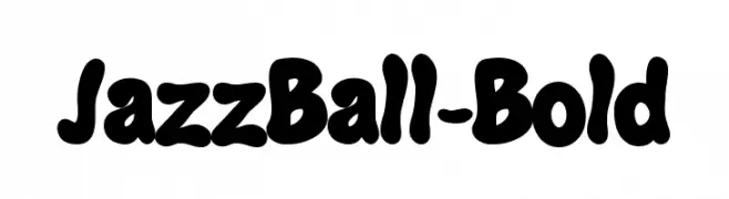
A bold, playful font with rounded, bubbly characters.
![JazzBall-Bold font caratteri gratis]() Scaricare 647 Downloads@WebFont
Scaricare 647 Downloads@WebFont -
( Fonts by Arkandis Digital Foundry )
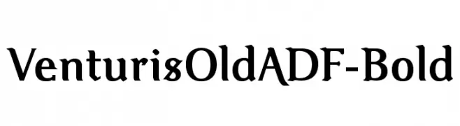
A bold, classic serif font with elegant curves and flared serifs.
![VenturisOldADF-Bold font caratteri gratis]() Scaricare 647 Downloads@WebFont
Scaricare 647 Downloads@WebFont -
( Fonts by CannotIntoSpaceFonts - KineticPlasma Fonts - Personal-use only. For commercial use please contact owner. )
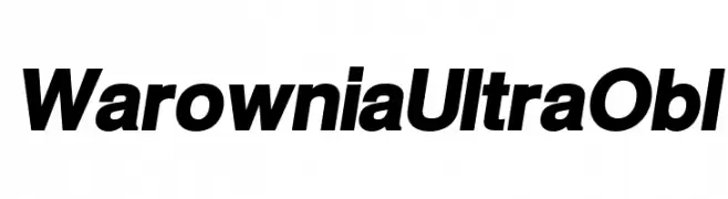
A bold, italicized font with high contrast and a modern style.
![Warownia Ultra Obl font caratteri gratis]() Scaricare 647 Downloads@WebFont
Scaricare 647 Downloads@WebFont -
( Fonts by Apostrophic Lab )
A modern, geometric sans-serif font with uniform width and clear readability.
![Florencesans Comp font caratteri gratis]() Scaricare 647 Downloads@WebFont
Scaricare 647 Downloads@WebFont -
![TrapOne-Regular font caratteri gratis]() Scaricare 647 Downloads@WebFont
Scaricare 647 Downloads@WebFont -
( Fonts by Daniel Zadorozny - www.iconian.com - Free for personal use )
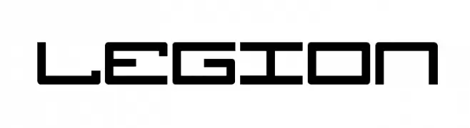
A futuristic, geometric font with angular shapes and consistent stroke width.
![Legion font caratteri gratis]() Scaricare 647 Downloads@WebFont
Scaricare 647 Downloads@WebFont -
![AlphaBizzyBee font caratteri gratis]() Scaricare 647 Downloads@WebFont
Scaricare 647 Downloads@WebFont -
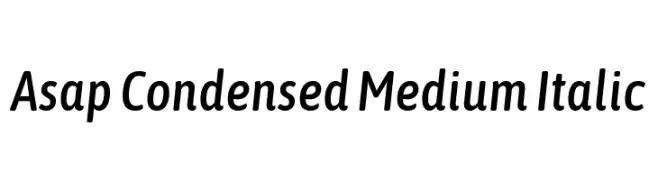
( Copyright 2016 The Asap Project Authors (omnibus.type@gmail.com), with Reserved Font Name 'Jaldi' and 'Asap'. )
A modern, condensed sans-serif font with a medium weight and italic style.
![Asap Condensed Medium Italic font caratteri gratis]() Scaricare 647 Downloads@WebFont
Scaricare 647 Downloads@WebFont -
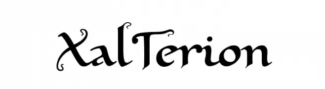
( Fonts by www.pia-frauss.de )
An elegant, decorative font with artistic flourishes and a sophisticated style.
![XalTerion font caratteri gratis]() Scaricare 647 Downloads@WebFont
Scaricare 647 Downloads@WebFont -
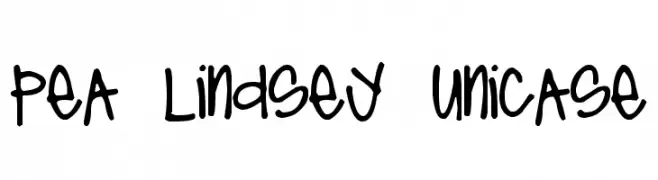
( Free for a personal use. For a commercial use please visit www.kevinandamanda.com )
A playful, handwritten font with a mix of uppercase and lowercase letters.
![Pea Lindsey Unicase font caratteri gratis]() Scaricare 647 Downloads@WebFont
Scaricare 647 Downloads@WebFont -
( Fonts by Misti's Fonts )
Playful handwritten font with rounded edges.
![Summer Goals font caratteri gratis]() Scaricare 647 Downloads@WebFont
Scaricare 647 Downloads@WebFont -
![CF Circuit Electrique Regular font caratteri gratis]() Scaricare 647 Downloads@WebFont
Scaricare 647 Downloads@WebFont -
( Free for a personal use. For a commercial use please visit www.kevinandamanda.com )
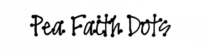
A playful, dotted handwritten font with a whimsical style.
![Pea Faith Dots font caratteri gratis]() Scaricare 647 Downloads@WebFont
Scaricare 647 Downloads@WebFont -
( Fonts by Gyom Seguin - last-soundtrack.daportfolio.com )
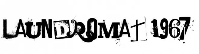
A distressed, grunge-style font with bold, irregular letterforms and a textured appearance.
![laundromat 1967 font caratteri gratis]() Scaricare 647 Downloads@WebFont
Scaricare 647 Downloads@WebFont -
( Fonts by Moonotonous )
A modern, rounded sans-serif font with smooth curves and a friendly appearance.
![Peasone font caratteri gratis]() Scaricare 647 Downloads@WebFont
Scaricare 647 Downloads@WebFont -
( Fonts by a Neale Davidson - www.pixelsagas.com. Personal-use only. For commercial use please contact owner. )
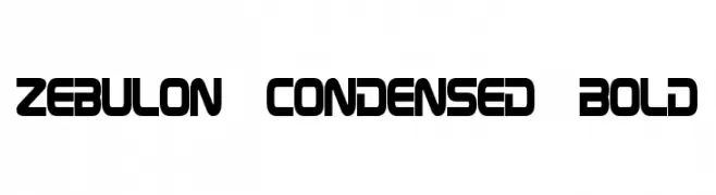
A bold, condensed font with a futuristic and industrial aesthetic.
![Zebulon Condensed Bold font caratteri gratis]() Scaricare 647 Downloads@WebFont
Scaricare 647 Downloads@WebFont -
( Fonts by Andrew Hart - dirt2.com )
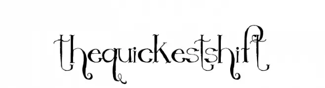
A whimsical and decorative font with elegant, flowing strokes and artistic flourishes.
![TheQuickestShift font caratteri gratis]() Scaricare 647 Downloads@WebFont
Scaricare 647 Downloads@WebFont -
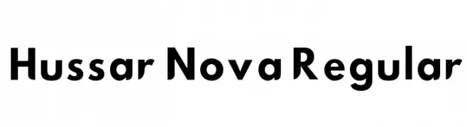
![Hussar Nova Regular font caratteri gratis]() Scaricare 647 Downloads@WebFont
Scaricare 647 Downloads@WebFont -
( Fonts by David Rakowski )
A decorative ribbon-style font with a three-dimensional effect.
![DavysRibbons font caratteri gratis]() Scaricare 647 Downloads@WebFont
Scaricare 647 Downloads@WebFont -
( Fonts by Rick Mueller )
A lively, handwritten-style font with energetic strokes and modern appeal.
![New Day Script font caratteri gratis]() Scaricare 647 Downloads@WebFont
Scaricare 647 Downloads@WebFont -
![SpookShow Undead font caratteri gratis]() Scaricare 647 Downloads@WebFont
Scaricare 647 Downloads@WebFont -
( Fonts by Zetafonts - Personal-use only. For commercial use please contact owner. )
A modern, sans-serif font with a clean and geometric design.
![Heading Now Trial 64 Regular font caratteri gratis]() Scaricare 647 Downloads@WebFont
Scaricare 647 Downloads@WebFont -
( Fonts by Leonard Posavec - leosupply.co - Personal-use only. For commercial use please contact owner. )
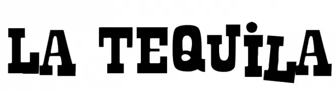
A bold slab serif font with a vintage Western style.
![La Tequila font caratteri gratis]() Scaricare 647 Downloads@WebFont
Scaricare 647 Downloads@WebFont -
( Fonts by Tobias Benjamin Kohler - www.uncia.de )
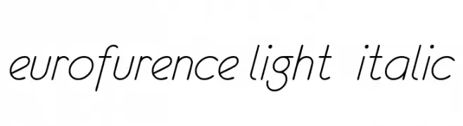
A sleek, modern, light italic font with elegant curves and minimal contrast.
![eurofurence light italic font caratteri gratis]() Scaricare 647 Downloads@WebFont
Scaricare 647 Downloads@WebFont -
( Fonts by 7NTypes )
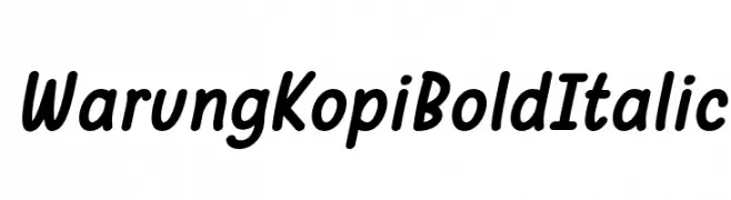
A bold, italic, handwritten-style font with a casual and friendly appearance.
![Warung Kopi Bold Italic font caratteri gratis]() Scaricare 647 Downloads@WebFont
Scaricare 647 Downloads@WebFont -
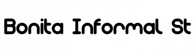
![Bonita Informal St font caratteri gratis]() Scaricare 647 Downloads@WebFont
Scaricare 647 Downloads@WebFont -
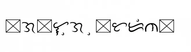
![Tagalog Doctrina 1593 font caratteri gratis]() Scaricare 647 Downloads@WebFont
Scaricare 647 Downloads@WebFont -
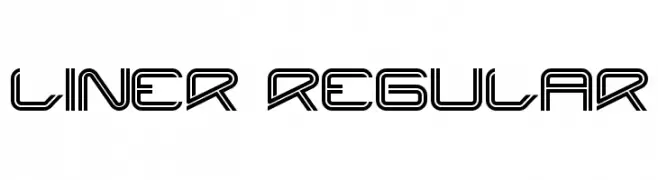
( Fonts by www.onezero.tv )
A futuristic, geometric font with a double-line structure and sharp angles.
![Liner Regular font caratteri gratis]() Scaricare 647 Downloads@WebFont
Scaricare 647 Downloads@WebFont -
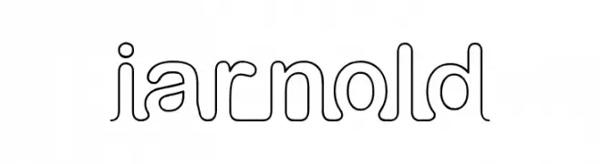
![iarnold font caratteri gratis]() Scaricare 647 Downloads@WebFont
Scaricare 647 Downloads@WebFont -
( Fonts by Milena Brandao - Personal-use only. For commercial use please contact owner. )
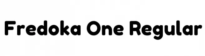
A bold, rounded font with a playful and friendly style.
![Fredoka One Regular font caratteri gratis]() Scaricare 647 Downloads@WebFont
Scaricare 647 Downloads@WebFont -
( 7NTypes - Situjuh Nazara - 7ntypes.com )
A bold, flowing script font with elegant, interconnected characters.
![Troche font caratteri gratis]() Scaricare 647 Downloads@WebFont
Scaricare 647 Downloads@WebFont -
( Fonts by Pizzadude )
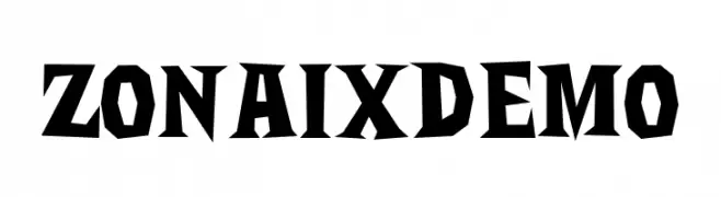
A bold, angular font with sharp edges and a geometric style.
![Zonaix DEMO font caratteri gratis]() Scaricare 647 Downloads@WebFont
Scaricare 647 Downloads@WebFont -
( Fonts by Ryan Daley )
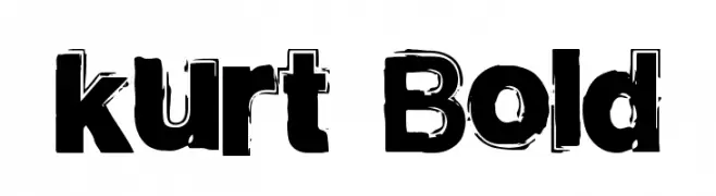
A bold, distressed font with rough, textured edges.
![kurt Bold font caratteri gratis]() Scaricare 647 Downloads@WebFont
Scaricare 647 Downloads@WebFont -
( Fonts by Manfred Klein - manfred-klein.ina-mar.com )
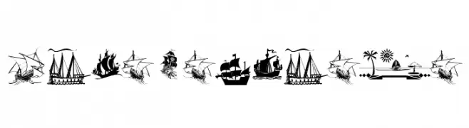
A maritime-themed decorative dingbat font with pirate ships and nautical icons.
![ArmadaPirata font caratteri gratis]() Scaricare 647 Downloads@WebFont
Scaricare 647 Downloads@WebFont


Quali sono i font più popolari adesso?
Poppins, Roboto, Montserrat, Open Sans e Lato sono molto usati per le forme pulite e l'ampia applicabilità — dall'identità di marca alle landing page e ai poster.
Quali font si usano spesso nei loghi?
Le sans serif geometriche (es. Poppins, famiglie in stile Gotham) sono scelte comuni per un branding pulito e scalabile. Per un tocco personale restano valide script e stili manoscritti. Abbina un display deciso per i titoli a un corpo testo neutro per riconoscibilità ed equilibrio.
Ogni quanto si aggiorna la lista?
Con regolarità, in base ai download e all'attività reale. Torna spesso per scoprire in anticipo le nuove preferite.
💡 Consiglio: aggiungi ai preferiti — le tendenze cambiano in fretta e i font top di oggi possono ispirare il rebranding di domani.