Benvenuto nelle Font Più Popolari — dove popolarità e qualità si incontrano. Qui trovi i font più scaricati e usati dell'anno. Se cerchi scelte sicure per logo, web o social, inizia da qui.
Ogni font top si distingue per equilibrio, leggibilità e versatilità. Troverai sans serif moderne, script eleganti, serif vintage e display minimalisti.
-
( Fonts by Situjuh Nazara - 7ntypes.com - Personal-use only. For commercial use please contact owner. )
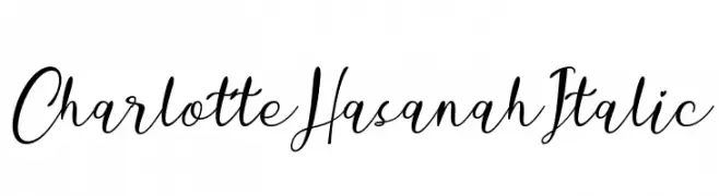
An elegant, flowing script font with a sophisticated, cursive style.
 Scaricare 136 Downloads@WebFont
 -
( Carrot Rope - typewhatyouloveandletitkillyou.tumblr.com/ )
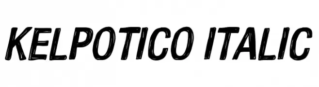
A bold, italicized font with a hand-drawn, energetic style.
![Kelpotico Italic font caratteri gratis]() Scaricare 136 Downloads@WebFont
Scaricare 136 Downloads@WebFont -
( Fonts by Edric Studio - Personal-use only. For commercial use please contact owner. )
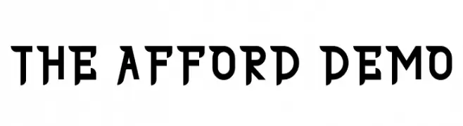
A bold, geometric font with sharp angles and a futuristic style.
![THE AFFORD DEMO font caratteri gratis]() Scaricare 136 Downloads@WebFont
Scaricare 136 Downloads@WebFont -
![LMS Poke'mon Master Outline font caratteri gratis]() Scaricare 136 Downloads@WebFont
Scaricare 136 Downloads@WebFont -
( Fonts by Apostrophic Lab )
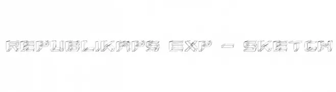
A sketch-style, 3D geometric font with a modern, artistic flair.
![Republikaps Exp - Sketch font caratteri gratis]() Scaricare 136 Downloads@WebFont
Scaricare 136 Downloads@WebFont -
-
( Fonts by Woodcutter )
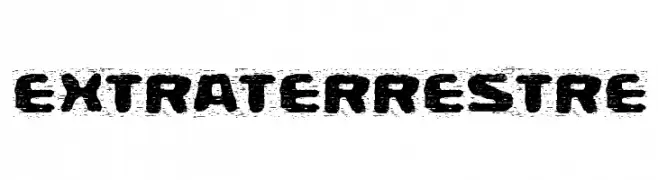
A bold, distressed font with a rugged, textured appearance.
![Extraterrestre font caratteri gratis]() Scaricare 136 Downloads@WebFont
Scaricare 136 Downloads@WebFont -
( Fonts by Daniel Zadorozny - www.iconian.com - Free for personal use )
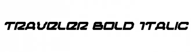
A bold, italicized font with a futuristic, angular design.
![Traveler Bold Italic font caratteri gratis]() Scaricare 136 Downloads@WebFont
Scaricare 136 Downloads@WebFont -
( Fonts by Typographer Mediengestaltung - Personal-use only. For commercial use please contact owner. )
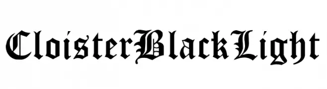
An ornate blackletter font with intricate and decorative strokes.
![Cloister Black Light font caratteri gratis]() Scaricare 136 Downloads@WebFont
Scaricare 136 Downloads@WebFont -
( Fonts by Xerographer Fonts )
A bold, geometric font with striped and solid sections for a modern, striking look.
![Wysterium font caratteri gratis]() Scaricare 136 Downloads@WebFont
Scaricare 136 Downloads@WebFont -
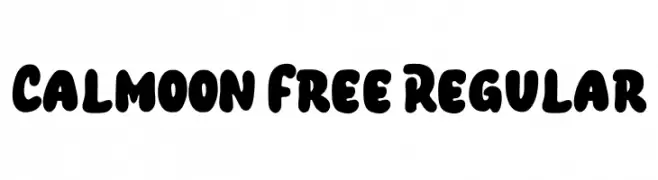
( Fonts by Maulana Creative )
A bold, playful font with rounded, bubble-like characters ideal for creative projects.
![Calmoon Free Regular font caratteri gratis]() Scaricare 136 Downloads@WebFont
Scaricare 136 Downloads@WebFont

Quali sono i font più popolari adesso?
Poppins, Roboto, Montserrat, Open Sans e Lato sono molto usati per le forme pulite e l'ampia applicabilità — dall'identità di marca alle landing page e ai poster.
Quali font si usano spesso nei loghi?
Le sans serif geometriche (es. Poppins, famiglie in stile Gotham) sono scelte comuni per un branding pulito e scalabile. Per un tocco personale restano valide script e stili manoscritti. Abbina un display deciso per i titoli a un corpo testo neutro per riconoscibilità ed equilibrio.
Ogni quanto si aggiorna la lista?
Con regolarità, in base ai download e all'attività reale. Torna spesso per scoprire in anticipo le nuove preferite.
💡 Consiglio: aggiungi ai preferiti — le tendenze cambiano in fretta e i font top di oggi possono ispirare il rebranding di domani.