Benvenuto nelle Font Più Popolari — dove popolarità e qualità si incontrano. Qui trovi i font più scaricati e usati dell'anno. Se cerchi scelte sicure per logo, web o social, inizia da qui.
Ogni font top si distingue per equilibrio, leggibilità e versatilità. Troverai sans serif moderne, script eleganti, serif vintage e display minimalisti.
-
 Scaricare 630 Downloads@WebFont
 -
( Fonts by www.blambot.com )
A bold, modern font with clean lines and a slightly condensed style.
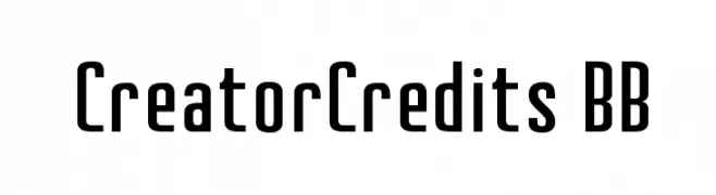
![CreatorCredits BB font caratteri gratis]() Scaricare 630 Downloads@WebFont
Scaricare 630 Downloads@WebFont -
( Fonts by zamjump - Ahmad Zamzami - Personal-use only. For commercial use please contact owner. )
A modern, elegant font with tall, narrow letterforms and subtle serifs.
![Bentalista font caratteri gratis]() Scaricare 630 Downloads@WebFont
Scaricare 630 Downloads@WebFont -
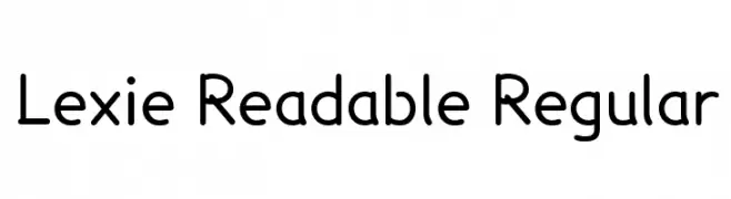
![Lexie Readable Regular font caratteri gratis]() Scaricare 630 Downloads@WebFont
Scaricare 630 Downloads@WebFont -
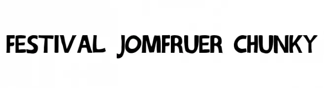
![Festival Jomfruer chunky font caratteri gratis]() Scaricare 630 Downloads@WebFont
Scaricare 630 Downloads@WebFont -
![CairoExtended Italic font caratteri gratis]() Scaricare 630 Downloads@WebFont
Scaricare 630 Downloads@WebFont -
( Copyright 2013 The Alegreya Sans Project Authors (https://github.com/huertatipografica/Alegreya-Sans) )
A sleek, modern sans-serif font with thin, elegant lines.
![Alegreya Sans Thin font caratteri gratis]() Scaricare 630 Downloads@WebFont
Scaricare 630 Downloads@WebFont -
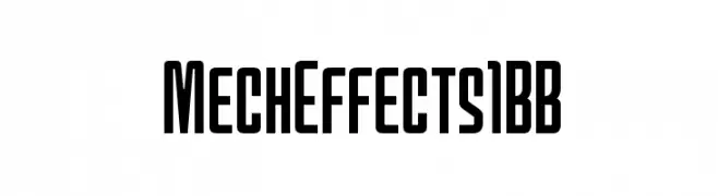
( Fonts by www.blambot.com )
A bold, modern font with a condensed, geometric style.
![MechEffects1BB font caratteri gratis]() Scaricare 630 Downloads@WebFont
Scaricare 630 Downloads@WebFont -
![Uqammaq Bold font caratteri gratis]() Scaricare 630 Downloads@WebFont
Scaricare 630 Downloads@WebFont -
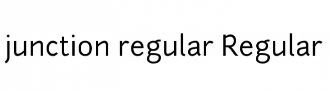
( Fonts by The League of Moveable Type - theleagueofmoveabletype.com )
A modern sans-serif font with a geometric and clean design.
![junction regular Regular font caratteri gratis]() Scaricare 630 Downloads@WebFont
Scaricare 630 Downloads@WebFont -
![Serpico font caratteri gratis]() Scaricare 630 Downloads@WebFont
Scaricare 630 Downloads@WebFont -
( Martha May Designs )
A playful, hand-drawn font with a whimsical and friendly appearance.
![Harmony font caratteri gratis]() Scaricare 630 Downloads@WebFont
Scaricare 630 Downloads@WebFont -
![Rukmini font caratteri gratis]() Scaricare 630 Downloads@WebFont
Scaricare 630 Downloads@WebFont -
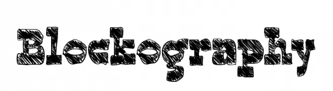
( Fonts by Mans Greback - www.mawns.com )
A bold, textured, hand-drawn font with a sketch-like appearance.
![Blockography font caratteri gratis]() Scaricare 630 Downloads@WebFont
Scaricare 630 Downloads@WebFont -
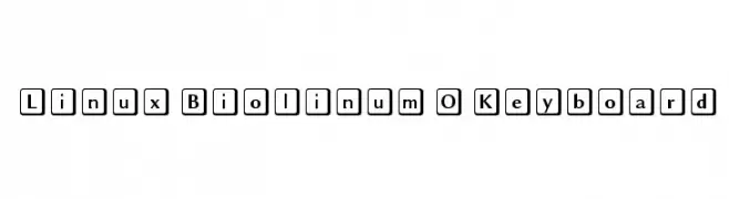
![Linux Biolinum O Keyboard font caratteri gratis]() Scaricare 630 Downloads@WebFont
Scaricare 630 Downloads@WebFont -
![USAAF_Serial_Stencil font caratteri gratis]() Scaricare 630 Downloads@WebFont
Scaricare 630 Downloads@WebFont -
( Fonts by www.someshinzz.com )
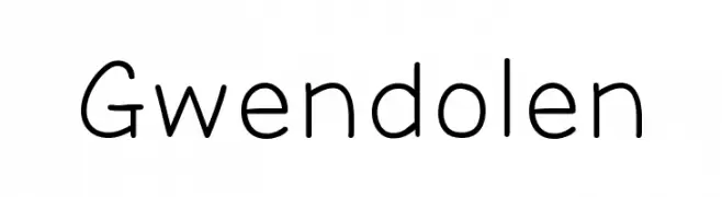
A clean, modern sans-serif font with uniform stroke width and balanced design.
![Gwendolen font caratteri gratis]() Scaricare 630 Downloads@WebFont
Scaricare 630 Downloads@WebFont -
( Copyright (c) 2012-2015, The Mozilla Foundation and Telefonica S.A. )
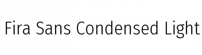
A modern, condensed sans-serif font with light weight and low contrast.
![Fira Sans Condensed Light font caratteri gratis]() Scaricare 630 Downloads@WebFont
Scaricare 630 Downloads@WebFont -
( Fonts by www.someshinzz.com )
A bold, vintage-style font with thick, blocky characters and rounded edges.
![Beeper font caratteri gratis]() Scaricare 630 Downloads@WebFont
Scaricare 630 Downloads@WebFont -
( Fonts by www.peter-wiegel.de. Personal-use only. For commercial use please contact owner. )
A bold, ornate blackletter font with medieval flair and intricate design.
![Rotunda Pommerania font caratteri gratis]() Scaricare 630 Downloads@WebFont
Scaricare 630 Downloads@WebFont -
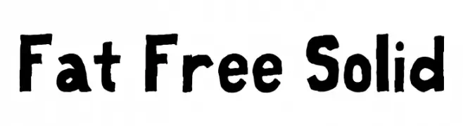
![Fat Free Solid font caratteri gratis]() Scaricare 630 Downloads@WebFont
Scaricare 630 Downloads@WebFont -
( Fonts by www.smilestudio-jp.com )
A bold, geometric font with rounded edges and a modern, approachable style.
![Daidoh Remix Round font caratteri gratis]() Scaricare 630 Downloads@WebFont
Scaricare 630 Downloads@WebFont -
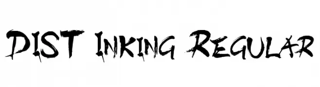
![DIST Inking Regular font caratteri gratis]() Scaricare 630 Downloads@WebFont
Scaricare 630 Downloads@WebFont -
( Fonts by ocans33 - Personal-use only. For commercial use please contact owner. )
A flowing, cursive handwritten font with an elegant and creative style.
![Broetown Signature font caratteri gratis]() Scaricare 630 Downloads@WebFont
Scaricare 630 Downloads@WebFont -
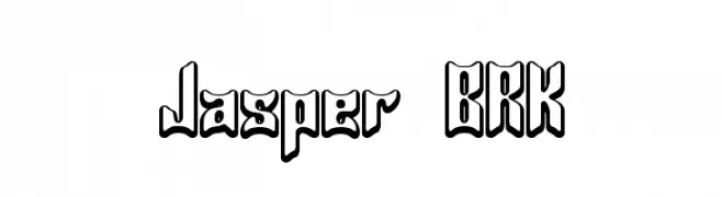
( Fonts by AEnigma - www.aenigmafonts.com )
A bold, decorative font with a three-dimensional outline effect.
![Jasper BRK font caratteri gratis]() Scaricare 630 Downloads@WebFont
Scaricare 630 Downloads@WebFont -
( Fonts by Blue Vinyl - Jess Latham - www.bvfonts.com )
A playful, handwritten font with bold, rounded characters and charming curls.
![Bumble Bee BV font caratteri gratis]() Scaricare 630 Downloads@WebFont
Scaricare 630 Downloads@WebFont -
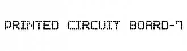
( Fonts by Style-7 - www.styleseven.com - Personal-use only. For commercial use please contact owner. )
A pixelated font with a digital, retro style.
![Printed Circuit Board-7 font caratteri gratis]() Scaricare 630 Downloads@WebFont
Scaricare 630 Downloads@WebFont -
![Maheera font caratteri gratis]() Scaricare 630 Downloads@WebFont
Scaricare 630 Downloads@WebFont -
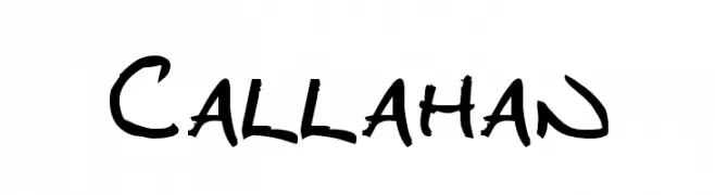
![Callahan font caratteri gratis]() Scaricare 630 Downloads@WebFont
Scaricare 630 Downloads@WebFont -
![Chalk Line Outline font caratteri gratis]() Scaricare 630 Downloads@WebFont
Scaricare 630 Downloads@WebFont -
![Vintage Regular font caratteri gratis]() Scaricare 630 Downloads@WebFont
Scaricare 630 Downloads@WebFont -
( CloutierFontes - Steve Cloutier - www.cloutierfontes.ca/ )
A vintage, typewriter-inspired serif font with bold, irregular strokes.
![CF Remington Typewriter Regular font caratteri gratis]() Scaricare 629 Downloads@WebFont
Scaricare 629 Downloads@WebFont -
![schizophrenia Queue font caratteri gratis]() Scaricare 629 Downloads@WebFont
Scaricare 629 Downloads@WebFont -
![Gameboy Gamegirl font caratteri gratis]() Scaricare 629 Downloads@WebFont
Scaricare 629 Downloads@WebFont -
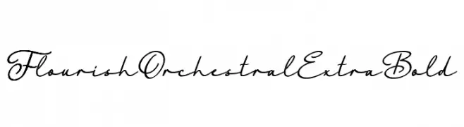
( Fonts by Octotype - www.foundmyfont.com - Personal-use only. For commercial use please contact owner. )
An elegant, extra bold script font with flowing, cursive letterforms.
![FlourishOrchestralExtraBold font caratteri gratis]() Scaricare 629 Downloads@WebFont
Scaricare 629 Downloads@WebFont


Quali sono i font più popolari adesso?
Poppins, Roboto, Montserrat, Open Sans e Lato sono molto usati per le forme pulite e l'ampia applicabilità — dall'identità di marca alle landing page e ai poster.
Quali font si usano spesso nei loghi?
Le sans serif geometriche (es. Poppins, famiglie in stile Gotham) sono scelte comuni per un branding pulito e scalabile. Per un tocco personale restano valide script e stili manoscritti. Abbina un display deciso per i titoli a un corpo testo neutro per riconoscibilità ed equilibrio.
Ogni quanto si aggiorna la lista?
Con regolarità, in base ai download e all'attività reale. Torna spesso per scoprire in anticipo le nuove preferite.
💡 Consiglio: aggiungi ai preferiti — le tendenze cambiano in fretta e i font top di oggi possono ispirare il rebranding di domani.