Benvenuto nelle Font Più Popolari — dove popolarità e qualità si incontrano. Qui trovi i font più scaricati e usati dell'anno. Se cerchi scelte sicure per logo, web o social, inizia da qui.
Ogni font top si distingue per equilibrio, leggibilità e versatilità. Troverai sans serif moderne, script eleganti, serif vintage e display minimalisti.
-
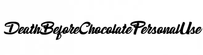
( Fonts by Billy Argel Fonts - www.billyargel.com - Personal-use only. For commercial use please contact owner. )
A bold, dynamic script font with a modern and elegant style.
 Scaricare 133 Downloads@WebFont
 -
( Fonts by Emil Bertell - www.fenotype.com )
A bold, angular, and futuristic italic font with a strong visual impact.
![cheaptype [italic] font caratteri gratis]() Scaricare 133 Downloads@WebFont
Scaricare 133 Downloads@WebFont -
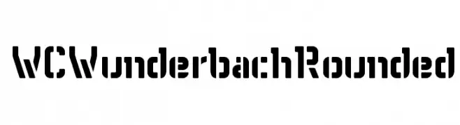
( Fonts by Christophe Feray - www.wcfonts.com )
A bold, geometric font with rounded edges and a stencil-like design.
![WCWunderbachRounded font caratteri gratis]() Scaricare 133 Downloads@WebFont
Scaricare 133 Downloads@WebFont -
( Copyright (c) 2014, Neelakash Kshetrimayum (www.neelakash.com|neelakash.k@gmail.com). )
A bold, robust font ideal for impactful and commanding designs.
![Sitara Bold font caratteri gratis]() Scaricare 133 Downloads@WebFont
Scaricare 133 Downloads@WebFont -
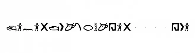
( Fonts by Kemetic 3200 BCE )
A decorative, pictorial font inspired by ancient Egyptian hieroglyphs.
![Kemetic_Alphabet_3.200_BCE font caratteri gratis]() Scaricare 133 Downloads@WebFont
Scaricare 133 Downloads@WebFont -
-
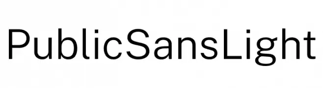
( Fonts by U.S. Web Design System )
A clean, modern sans-serif font with light weight and low contrast.
![Public Sans Light font caratteri gratis]() Scaricare 133 Downloads@WebFont
Scaricare 133 Downloads@WebFont -
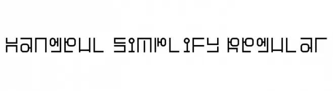
( Fonts by Adien Gunarta - fontasticindonesia.blogspot.com )
A geometric and minimalistic font with consistent stroke width and modern design.
![Hangeul Simplify Regular font caratteri gratis]() Scaricare 133 Downloads@WebFont
Scaricare 133 Downloads@WebFont -
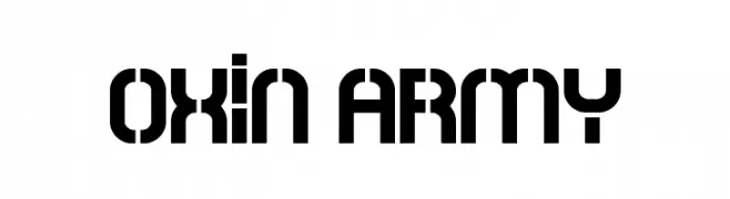
( Fonts by Carlos Daniel Matteoli - Qbotype Fonts - http://carlosmatteoli.wix.com/qbotype. Personal-use only. For commercial use please contact owner. )
A bold, geometric font with a military-inspired, stencil-like design.
![Oxin Army font caratteri gratis]() Scaricare 133 Downloads@WebFont
Scaricare 133 Downloads@WebFont -
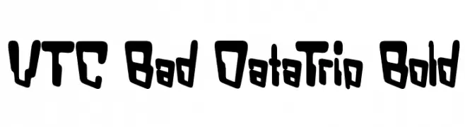
![VTC Bad DataTrip Bold font caratteri gratis]() Scaricare 133 Downloads@WebFont
Scaricare 133 Downloads@WebFont -
![Pixel Shift font caratteri gratis]() Scaricare 133 Downloads@WebFont
Scaricare 133 Downloads@WebFont
![cheaptype [italic] font caratteri gratis](https://d144mzi0q5mijx.cloudfront.net/img/C/H/cheaptype-italic.webp)
Quali sono i font più popolari adesso?
Poppins, Roboto, Montserrat, Open Sans e Lato sono molto usati per le forme pulite e l'ampia applicabilità — dall'identità di marca alle landing page e ai poster.
Quali font si usano spesso nei loghi?
Le sans serif geometriche (es. Poppins, famiglie in stile Gotham) sono scelte comuni per un branding pulito e scalabile. Per un tocco personale restano valide script e stili manoscritti. Abbina un display deciso per i titoli a un corpo testo neutro per riconoscibilità ed equilibrio.
Ogni quanto si aggiorna la lista?
Con regolarità, in base ai download e all'attività reale. Torna spesso per scoprire in anticipo le nuove preferite.
💡 Consiglio: aggiungi ai preferiti — le tendenze cambiano in fretta e i font top di oggi possono ispirare il rebranding di domani.