Benvenuto nelle Font Più Popolari — dove popolarità e qualità si incontrano. Qui trovi i font più scaricati e usati dell'anno. Se cerchi scelte sicure per logo, web o social, inizia da qui.
Ogni font top si distingue per equilibrio, leggibilità e versatilità. Troverai sans serif moderne, script eleganti, serif vintage e display minimalisti.
-
 Scaricare 130 Downloads@WebFont
 -
( Fonts by Allouse Studio - Personal-use only. For commercial use please contact owner. )
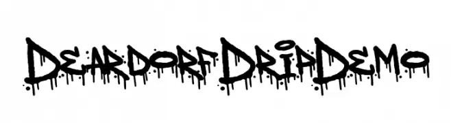
A bold, graffiti-inspired font with a distinctive dripping effect.
![Deardorf Drip Demo font caratteri gratis]() Scaricare 130 Downloads@WebFont
Scaricare 130 Downloads@WebFont -
( www.studiotypo.com )
An edgy font with barbed wire elements, offering a rugged and industrial look.
![Barbed font caratteri gratis]() Scaricare 130 Downloads@WebFont
Scaricare 130 Downloads@WebFont -
( Fonts by Vladimir Nikolic - www.creativefabrica.com/designer/vladimirnikolic/ - Personal-use only. For commercial use please contact owner. )
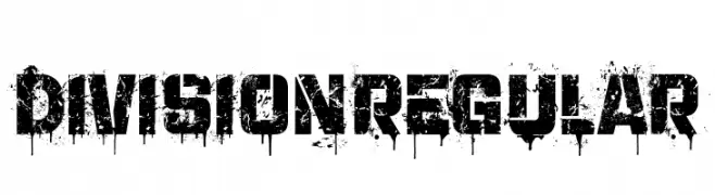
A bold, distressed font with a grunge, graffiti-inspired style.
![Division Regular font caratteri gratis]() Scaricare 130 Downloads@WebFont
Scaricare 130 Downloads@WebFont -
( Fonts by Billy Argel )
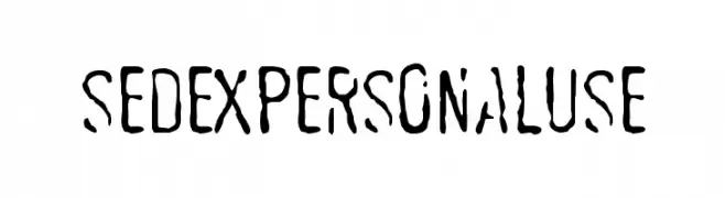
A distressed, hand-drawn font with bold, elongated characters and tight spacing.
![SEDEXPERSONALUSE font caratteri gratis]() Scaricare 130 Downloads@WebFont
Scaricare 130 Downloads@WebFont -
-
( Fonts by Syaf Rizal - Khurasan - Personal-use only. For commercial use please contact owner. )
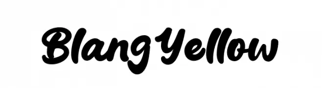
A bold, cursive font with a playful and energetic style.
![Blang Yellow font caratteri gratis]() Scaricare 130 Downloads@WebFont
Scaricare 130 Downloads@WebFont -
( Fonts by Daniel Zadorozny - www.iconian.com )
A bold, condensed, and italicized font with high contrast and angular design.
![Xiphos Condensed Italic font caratteri gratis]() Scaricare 130 Downloads@WebFont
Scaricare 130 Downloads@WebFont -
( Fonts by Manfred Klein. Free for private and charity use. Free for commercial with donation to organizations )
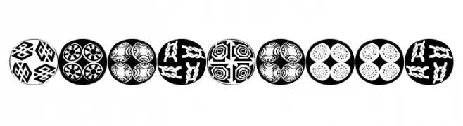
Ornamental, patterned circular display font with festive, decorative motifs.
![XmasBalls font caratteri gratis]() Scaricare 130 Downloads@WebFont
Scaricare 130 Downloads@WebFont -
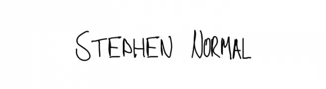
![Stephen Normal font caratteri gratis]() Scaricare 130 Downloads@WebFont
Scaricare 130 Downloads@WebFont -
( Fonts by Jonathan S. Harris )
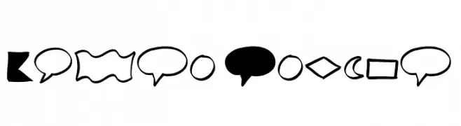
Hand-drawn, bold brush-style shapes and comic elements.
![Brush Shapes font caratteri gratis]() Scaricare 130 Downloads@WebFont
Scaricare 130 Downloads@WebFont


Quali sono i font più popolari adesso?
Poppins, Roboto, Montserrat, Open Sans e Lato sono molto usati per le forme pulite e l'ampia applicabilità — dall'identità di marca alle landing page e ai poster.
Quali font si usano spesso nei loghi?
Le sans serif geometriche (es. Poppins, famiglie in stile Gotham) sono scelte comuni per un branding pulito e scalabile. Per un tocco personale restano valide script e stili manoscritti. Abbina un display deciso per i titoli a un corpo testo neutro per riconoscibilità ed equilibrio.
Ogni quanto si aggiorna la lista?
Con regolarità, in base ai download e all'attività reale. Torna spesso per scoprire in anticipo le nuove preferite.
💡 Consiglio: aggiungi ai preferiti — le tendenze cambiano in fretta e i font top di oggi possono ispirare il rebranding di domani.