Benvenuto nelle Font Più Popolari — dove popolarità e qualità si incontrano. Qui trovi i font più scaricati e usati dell'anno. Se cerchi scelte sicure per logo, web o social, inizia da qui.
Ogni font top si distingue per equilibrio, leggibilità e versatilità. Troverai sans serif moderne, script eleganti, serif vintage e display minimalisti.
-
( Fonts by Get Studio - Hermansyah , - Personal-use only. For commercial use please contact owner. )
A bold, cursive font with a playful and energetic style.
 Scaricare 614 Downloads@WebFont
 -
( Fonts by a Neale Davidson - www.pixelsagas.com. Personal-use only. For commercial use please contact owner. )
A bold, italicized sans-serif font with a modern and dynamic style.
![Sigma Five Sans Italic font caratteri gratis]() Scaricare 614 Downloads@WebFont
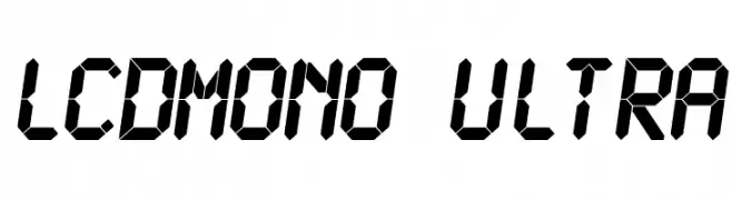
Scaricare 614 Downloads@WebFont -
![LCDMono Ultra font caratteri gratis]() Scaricare 614 Downloads@WebFont
Scaricare 614 Downloads@WebFont -
( Fonts by Johan Holmdahl - www.free-typewriter-fonts.com )
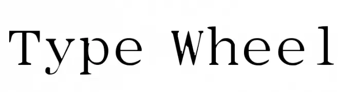
A classic serif font with elegant strokes and refined serifs.
![Type Wheel font caratteri gratis]() Scaricare 614 Downloads@WebFont
Scaricare 614 Downloads@WebFont -
( Fonts by Eli Shore Productions )
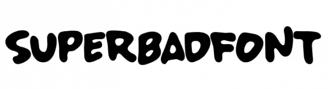
A bold, playful font with rounded strokes and a cartoonish style.
![SUPERBADFONT font caratteri gratis]() Scaricare 614 Downloads@WebFont
Scaricare 614 Downloads@WebFont -
( Fonts by Daniel Zadorozny - www.iconian.com )
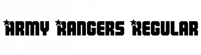
A bold, military-inspired font with star-adorned uppercase letters and geometric shapes.
![Army Rangers Regular font caratteri gratis]() Scaricare 614 Downloads@WebFont
Scaricare 614 Downloads@WebFont -
![BOSS M A font caratteri gratis]() Scaricare 614 Downloads@WebFont
Scaricare 614 Downloads@WebFont -
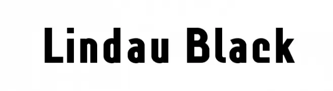
![Lindau Black font caratteri gratis]() Scaricare 614 Downloads@WebFont
Scaricare 614 Downloads@WebFont -
( Fonts by Manfred Klein. Free for private and charity use. Free for commercial with donation to organizations )
A whimsical and abstract decorative font with alien-like figures.
![ExtraTerrestrial font caratteri gratis]() Scaricare 614 Downloads@WebFont
Scaricare 614 Downloads@WebFont -
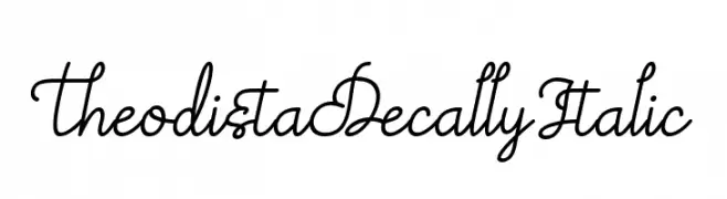
( Fonts by a Situjuh Nazara - c7n1.wordpress.com. Personal-use only. For commercial use please contact owner. )
A graceful and elegant script font with flowing, interconnected strokes.
![Theodista Decally Italic font caratteri gratis]() Scaricare 614 Downloads@WebFont
Scaricare 614 Downloads@WebFont -
( Fonts by Letterayu )
Ornamental dingbat font with mandala and floral motifs.
![Mandara Regular font caratteri gratis]() Scaricare 614 Downloads@WebFont
Scaricare 614 Downloads@WebFont -
![MaqueenSans font caratteri gratis]() Scaricare 614 Downloads@WebFont
Scaricare 614 Downloads@WebFont -
( Fonts by Peter Wiegel - www.peter-wiegel.de - Personal-use only. For commercial use please contact owner. )
A bold, blackletter-inspired font with intricate, angular letterforms.
![CATSchmalfetteThannhaeuser font caratteri gratis]() Scaricare 614 Downloads@WebFont
Scaricare 614 Downloads@WebFont -
( Paul Lloyd Fonts )
A bold, italicized font with a modern and dynamic style.
![Claritty_BoldItalic font caratteri gratis]() Scaricare 614 Downloads
Scaricare 614 Downloads -
( Henrik Johansson - mediocre.se )
A modern, geometric font with clean lines and angular shapes.
![Smash Hit font caratteri gratis]() Scaricare 614 Downloads@WebFont
Scaricare 614 Downloads@WebFont -
( Bou Fonts - Agustín Bou )
A tall, narrow, and modern font with consistent stroke width and elegant design.
![Movie Letters font caratteri gratis]() Scaricare 614 Downloads@WebFont
Scaricare 614 Downloads@WebFont -
![Linux Libertine O Bold Italic font caratteri gratis]() Scaricare 614 Downloads@WebFont
Scaricare 614 Downloads@WebFont -
( Fonts by Salt & Pepper Designs )
A bold, geometric sans-serif font with a distinctive outline style.
![Indigo Outline Font Regular font caratteri gratis]() Scaricare 614 Downloads@WebFont
Scaricare 614 Downloads@WebFont -
( Fonts by Nick Curtis - www.nicksfonts.com )
A bold, high-contrast serif font with a classic and authoritative style.
![HardlyWorthit font caratteri gratis]() Scaricare 614 Downloads@WebFont
Scaricare 614 Downloads@WebFont -
( Fonts by Paul Lloyd )
A decorative blackletter font with intricate, ornate designs and a medieval manuscript feel.
![Minster No 5 font caratteri gratis]() Scaricare 614 Downloads@WebFont
Scaricare 614 Downloads@WebFont -
![Skinny Black font caratteri gratis]() Scaricare 614 Downloads@WebFont
Scaricare 614 Downloads@WebFont -
![PENCIL SHARP font caratteri gratis]() Scaricare 614 Downloads@WebFont
Scaricare 614 Downloads@WebFont -
( Fonts by MJB Letters - Muhammad Mujibulloh - Personal-use only. For commercial use please contact owner. )
A decorative serif font with elegant swashes and modern flair.
![Atlane font caratteri gratis]() Scaricare 614 Downloads@WebFont
Scaricare 614 Downloads@WebFont -
( Fonts by Hanoded )
A playful, textured font with a crayon-like appearance.
![DK Leftover Crayon Regular font caratteri gratis]() Scaricare 614 Downloads@WebFont
Scaricare 614 Downloads@WebFont -
( Fonts by Daniel Pimley - Personal-use only. For commercial use please contact owner. )
A clean, modern sans-serif font with balanced proportions and excellent readability.
![CrusoeText-Regular font caratteri gratis]() Scaricare 614 Downloads@WebFont
Scaricare 614 Downloads@WebFont -
( Fonts by Fikry Alif - Fikryal studio - https://www.creativefabrica.com/designer/mfikryalif/ref/222304/ - Personal-use only. For commercial use please contact owner. )
A lively, handwritten font with fluid strokes and a casual feel.
![Hastage font caratteri gratis]() Scaricare 614 Downloads@WebFont
Scaricare 614 Downloads@WebFont -
( Fonts by Arkandis Digital Foundry )
A bold, modern sans-serif font with a slightly condensed width.
![SwitzeraADF-BoldCond font caratteri gratis]() Scaricare 614 Downloads@WebFont
Scaricare 614 Downloads@WebFont -
( Fonts by Mozatype )
A playful and bold font with thick, uniform strokes and rounded edges.
![Friendszone font caratteri gratis]() Scaricare 614 Downloads@WebFont
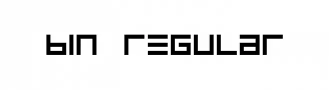
Scaricare 614 Downloads@WebFont -
![BIN Regular font caratteri gratis]() Scaricare 614 Downloads@WebFont
Scaricare 614 Downloads@WebFont -
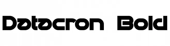
( Fonts by a Neale Davidson - www.pixelsagas.com. Personal-use only. For commercial use please contact owner. )
A bold, futuristic font with geometric shapes and clean lines.
![Datacron Bold font caratteri gratis]() Scaricare 614 Downloads@WebFont
Scaricare 614 Downloads@WebFont -
![Making Lettering Tall_demo font caratteri gratis]() Scaricare 614 Downloads@WebFont
Scaricare 614 Downloads@WebFont -
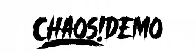
( Fonts by Knackpack Studio - www.knackpack.studio - Personal-use only. For commercial use please contact owner. )
A bold, jagged font with a chaotic and energetic style.
![_CHAOS! DEMO font caratteri gratis]() Scaricare 614 Downloads@WebFont
Scaricare 614 Downloads@WebFont -
( Fonts by Daniel Zadorozny - www.iconian.com - Free for personal use )
A bold, italic, and modern font with a dynamic, futuristic style.
![Lightsider Ultra-Italic font caratteri gratis]() Scaricare 614 Downloads@WebFont
Scaricare 614 Downloads@WebFont -
![Octapost NBP font caratteri gratis]() Scaricare 614 Downloads@WebFont
Scaricare 614 Downloads@WebFont -
( Fonts by allsuperfont.com - Personal-use only. For commercial use please contact owner. )
A bold, playful font with thick, rounded characters perfect for eye-catching designs.
![Super Chunky font caratteri gratis]() Scaricare 614 Downloads@WebFont
Scaricare 614 Downloads@WebFont


Quali sono i font più popolari adesso?
Poppins, Roboto, Montserrat, Open Sans e Lato sono molto usati per le forme pulite e l'ampia applicabilità — dall'identità di marca alle landing page e ai poster.
Quali font si usano spesso nei loghi?
Le sans serif geometriche (es. Poppins, famiglie in stile Gotham) sono scelte comuni per un branding pulito e scalabile. Per un tocco personale restano valide script e stili manoscritti. Abbina un display deciso per i titoli a un corpo testo neutro per riconoscibilità ed equilibrio.
Ogni quanto si aggiorna la lista?
Con regolarità, in base ai download e all'attività reale. Torna spesso per scoprire in anticipo le nuove preferite.
💡 Consiglio: aggiungi ai preferiti — le tendenze cambiano in fretta e i font top di oggi possono ispirare il rebranding di domani.