Benvenuto nelle Font Più Popolari — dove popolarità e qualità si incontrano. Qui trovi i font più scaricati e usati dell'anno. Se cerchi scelte sicure per logo, web o social, inizia da qui.
Ogni font top si distingue per equilibrio, leggibilità e versatilità. Troverai sans serif moderne, script eleganti, serif vintage e display minimalisti.
-
( Fonts by Eddy Goodboy )
A playful, bold font with a bubbly and whimsical design.
 Scaricare 602 Downloads@WebFont
 -
( Font by kingthingsfonts.co.uk )
An ornate and decorative font with intricate flourishes and embellishments.
![Kingthings Flourishes font caratteri gratis]() Scaricare 602 Downloads@WebFont
Scaricare 602 Downloads@WebFont -
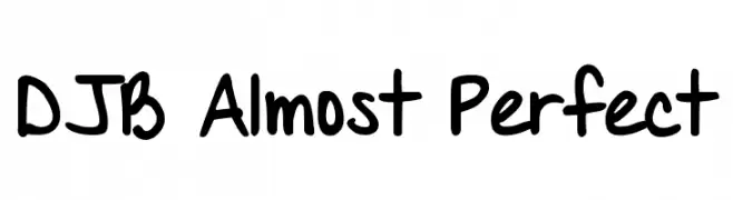
( Fonts by Darcy Baldwin - darcybaldwin.com. Free for personal use only )
A playful, handwritten font with bold strokes and a casual, whimsical style.
![DJB Almost Perfect font caratteri gratis]() Scaricare 602 Downloads@WebFont
Scaricare 602 Downloads@WebFont -
( Fonts by a Zaffar Ansari - Zansari . Personal-use only. For commercial use please contact owner. )
A bold, expressive brush-style font with a dynamic, hand-painted look.
![Gypsy Brush font caratteri gratis]() Scaricare 602 Downloads@WebFont
Scaricare 602 Downloads@WebFont -
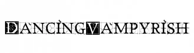
( Fonts by Manfred Klein - manfred-klein.ina-mar.com )
An intricate and decorative font with gothic influences and modern flair.
![DancingVampyrish font caratteri gratis]() Scaricare 602 Downloads@WebFont
Scaricare 602 Downloads@WebFont -
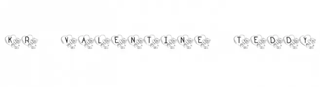
![KR Valentine Teddy font caratteri gratis]() Scaricare 602 Downloads@WebFont
Scaricare 602 Downloads@WebFont -
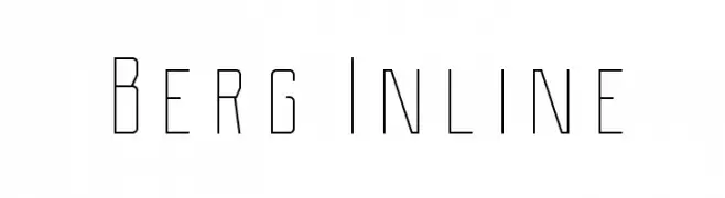
( Fonts by THE BROSNES Design Co - creativemarket.com/Brosnes - Personal-use only. For commercial use please contact owner. )
A modern, geometric font with an inline style and clean, sharp lines.
![Berg Inline font caratteri gratis]() Scaricare 602 Downloads@WebFont
Scaricare 602 Downloads@WebFont -
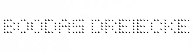
![BOODAS DREIECKE font caratteri gratis]() Scaricare 602 Downloads@WebFont
Scaricare 602 Downloads@WebFont -
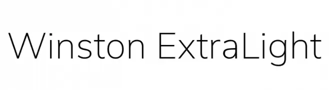
( Fonts by Original fonts by Vernon Adams / Changes by Cristiano Sobral - Personal-use only. For commercial use please contact owner. )
A clean, modern, and extra light font perfect for minimalist designs.
![Winston ExtraLight font caratteri gratis]() Scaricare 602 Downloads@WebFont
Scaricare 602 Downloads@WebFont -
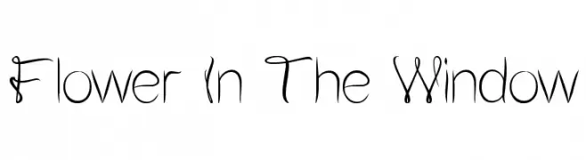
( Fonts by weknow - Wino S Kadir )
A whimsical, decorative font with floral-inspired, intertwining uppercase letters.
![Flower In The Window font caratteri gratis]() Scaricare 602 Downloads@WebFont
Scaricare 602 Downloads@WebFont -
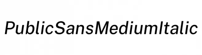
( Fonts by U.S. Web Design System )
A modern, medium-weight italic sans-serif font with clean lines and normal spacing.
![Public Sans Medium Italic font caratteri gratis]() Scaricare 602 Downloads@WebFont
Scaricare 602 Downloads@WebFont -
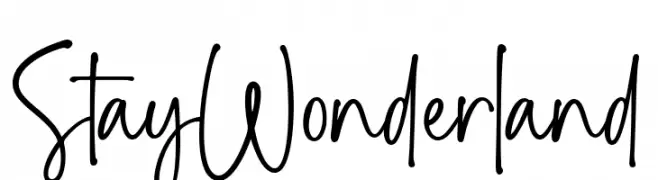
( Fonts by Ramli Setiadi - Personal-use only. For commercial use please contact owner. )
A playful, whimsical handwritten font with tall, narrow letters and irregular strokes.
![Stay Wonderland font caratteri gratis]() Scaricare 602 Downloads@WebFont
Scaricare 602 Downloads@WebFont -
![Charity font caratteri gratis]() Scaricare 602 Downloads@WebFont
Scaricare 602 Downloads@WebFont -
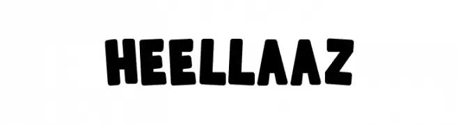
( Fonts by Almarkhatype )
A bold, rounded font with a playful and chunky style.
![Heellaaz font caratteri gratis]() Scaricare 602 Downloads@WebFont
Scaricare 602 Downloads@WebFont -
( Fonts by Andrew Hart - dirt2.com )
An edgy, grungy font with jagged, irregular strokes and a rebellious vibe.
![Electric Panda font caratteri gratis]() Scaricare 602 Downloads@WebFont
Scaricare 602 Downloads@WebFont -
![Linux Biolinum Slanted font caratteri gratis]() Scaricare 602 Downloads@WebFont
Scaricare 602 Downloads@WebFont -
![BLT font caratteri gratis]() Scaricare 602 Downloads@WebFont
Scaricare 602 Downloads@WebFont -
( Fonts by Khurasan )
A playful, rounded font with bold, uniform strokes and a whimsical style.
![Basque Smile font caratteri gratis]() Scaricare 602 Downloads@WebFont
Scaricare 602 Downloads@WebFont -
![Off-curve font caratteri gratis]() Scaricare 602 Downloads@WebFont
Scaricare 602 Downloads@WebFont -
( Fonts by www.aenigmafonts.com )
A playful, bubble-like font with thick outlines and a cartoonish style.
![Outer Sider BRK font caratteri gratis]() Scaricare 602 Downloads@WebFont
Scaricare 602 Downloads@WebFont -
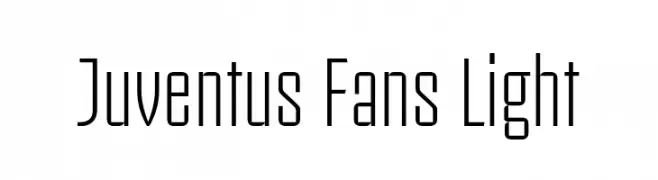
( Fonts by Alessio D`Ellena - alessiodellena.com - Personal-use only. For commercial use please contact owner. )
A sleek, modern font with elongated, narrow characters and a minimalistic design.
![Juventus Fans Light font caratteri gratis]() Scaricare 602 Downloads@WebFont
Scaricare 602 Downloads@WebFont -
( Fonts by Kong Font - Personal-use only. For commercial use please contact owner. )
A bold, angular font with a futuristic and geometric style.
![Hi Jack font caratteri gratis]() Scaricare 602 Downloads@WebFont
Scaricare 602 Downloads@WebFont -
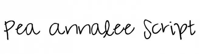
( Free for a personal use. For a commercial use please visit www.kevinandamanda.com )
A playful, casual handwritten font with smooth, connected strokes.
![Pea Annalee Script font caratteri gratis]() Scaricare 602 Downloads@WebFont
Scaricare 602 Downloads@WebFont -
( Fonts by Syaf Rizal - https://creativemarket.com/khurasan - Personal-use only. For commercial use please contact owner. )
An elegant serif font with decorative swirls and flourishes.
![Lefina font caratteri gratis]() Scaricare 602 Downloads@WebFont
Scaricare 602 Downloads@WebFont -
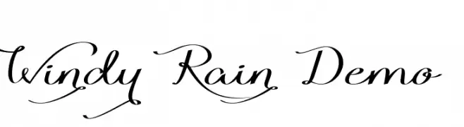
( Fonts by Roland Huse - rolandhuse.com )
An elegant script font with flowing cursive letters and decorative swashes.
![Windy Rain Demo font caratteri gratis]() Scaricare 602 Downloads@WebFont
Scaricare 602 Downloads@WebFont -
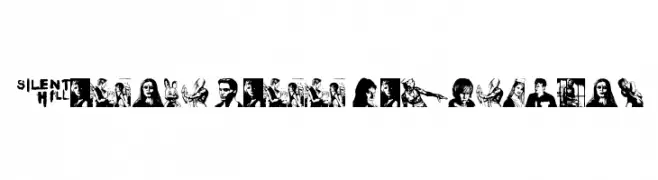
![Silent Hill Nightmares font caratteri gratis]() Scaricare 602 Downloads@WebFont
Scaricare 602 Downloads@WebFont -
![Necromantic font caratteri gratis]() Scaricare 602 Downloads@WebFont
Scaricare 602 Downloads@WebFont -
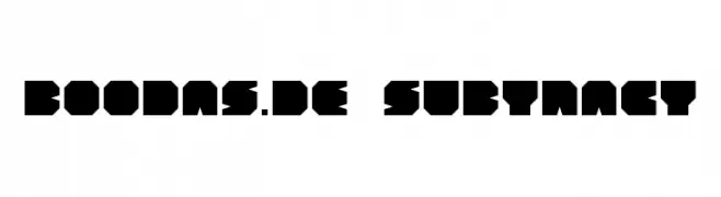
![BOODAS.DE | Subtract font caratteri gratis]() Scaricare 602 Downloads@WebFont
Scaricare 602 Downloads@WebFont -
![MechamaruKat font caratteri gratis]() Scaricare 602 Downloads@WebFont
Scaricare 602 Downloads@WebFont -
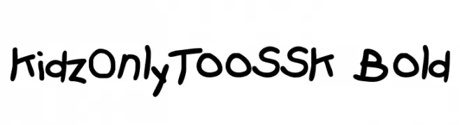
![KidzOnlyTooSSK Bold font caratteri gratis]() Scaricare 602 Downloads@WebFont
Scaricare 602 Downloads@WebFont -
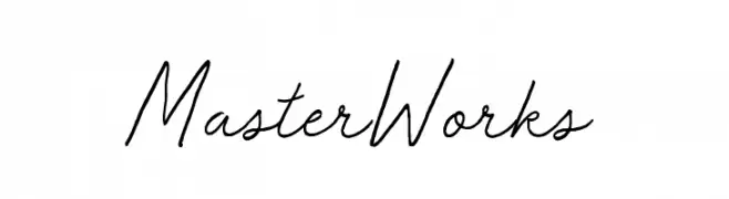
( Fonts by BLKBK - https://blkbk.ink - Personal-use only. For commercial use please contact owner. Commerciali Caratteri )
A cursive, handwritten font with a smooth and flowing style.
![Master Works font caratteri gratis]() Scaricare 602 Downloads
Scaricare 602 Downloads -
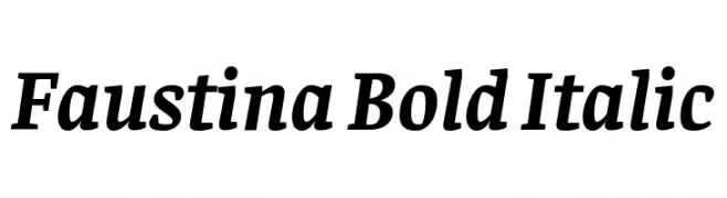
( Copyright 2016 The Faustina Project Authors (omnibus.type@gmail.com) )
A bold, italic serif font with a classic and elegant style.
![Faustina Bold Italic font caratteri gratis]() Scaricare 602 Downloads@WebFont
Scaricare 602 Downloads@WebFont -
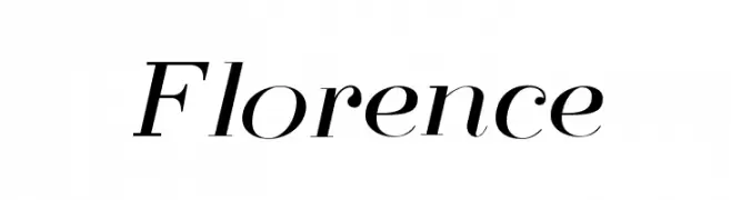
( Free for personal use )
A classic serif font with high contrast and elegant italic styling.
![Florence font caratteri gratis]() Scaricare 602 Downloads@WebFont
Scaricare 602 Downloads@WebFont -
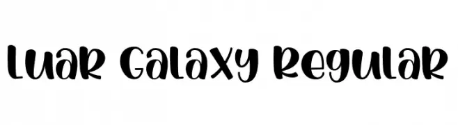
( Fonts by Gilar Studio )
A bold, playful script font with rounded characters and a modern flair.
![Luar Galaxy Regular font caratteri gratis]() Scaricare 602 Downloads@WebFont
Scaricare 602 Downloads@WebFont -
( Fonts by Kong Font - https://fontkong.com/ - Personal-use only. For commercial use please contact owner. )
A bold, playful script font with dynamic cursive letterforms.
![The Blester font caratteri gratis]() Scaricare 602 Downloads@WebFont
Scaricare 602 Downloads@WebFont


Quali sono i font più popolari adesso?
Poppins, Roboto, Montserrat, Open Sans e Lato sono molto usati per le forme pulite e l'ampia applicabilità — dall'identità di marca alle landing page e ai poster.
Quali font si usano spesso nei loghi?
Le sans serif geometriche (es. Poppins, famiglie in stile Gotham) sono scelte comuni per un branding pulito e scalabile. Per un tocco personale restano valide script e stili manoscritti. Abbina un display deciso per i titoli a un corpo testo neutro per riconoscibilità ed equilibrio.
Ogni quanto si aggiorna la lista?
Con regolarità, in base ai download e all'attività reale. Torna spesso per scoprire in anticipo le nuove preferite.
💡 Consiglio: aggiungi ai preferiti — le tendenze cambiano in fretta e i font top di oggi possono ispirare il rebranding di domani.