Benvenuto nelle Font Più Popolari — dove popolarità e qualità si incontrano. Qui trovi i font più scaricati e usati dell'anno. Se cerchi scelte sicure per logo, web o social, inizia da qui.
Ogni font top si distingue per equilibrio, leggibilità e versatilità. Troverai sans serif moderne, script eleganti, serif vintage e display minimalisti.
-
 Scaricare 599 Downloads@WebFont
 -
( Fonts by Koczman Balint - magiquefonts.gportal.hu )
A graffiti-inspired font with bold, dynamic characters and playful arrow elements.
![Urban&Slick font caratteri gratis]() Scaricare 599 Downloads@WebFont
Scaricare 599 Downloads@WebFont -
( Fonts by Gyom Seguin - last-soundtrack.daportfolio.com )
A bold, distressed font with a rugged, grunge appearance.
![Mohawk font caratteri gratis]() Scaricare 599 Downloads@WebFont
Scaricare 599 Downloads@WebFont -
![Flabby Bums handwriting font caratteri gratis]() Scaricare 599 Downloads@WebFont
Scaricare 599 Downloads@WebFont -
( Fonts by Tobias Sommer - mentalmenthol.blogspot.com )
A modern, rounded font with a sleek, condensed style.
![Capitalia Rounded Regular font caratteri gratis]() Scaricare 599 Downloads@WebFont
Scaricare 599 Downloads@WebFont -
( Free for non-commercial use. www.johnmartz.com )
A bold, hand-drawn font with a rough, edgy style.
![Meet John Henry font caratteri gratis]() Scaricare 599 Downloads@WebFont
Scaricare 599 Downloads@WebFont -
( Fonts by Galdino Otten - galdinootten.com )
A refined serif font with thin strokes and elegant serifs, offering a timeless and sophisticated look.
![Very Fine Serif font caratteri gratis]() Scaricare 599 Downloads@WebFont
Scaricare 599 Downloads@WebFont -
( Fonts by Apostrophic Lab )
A modern, geometric font with a tall, narrow design and consistent stroke width.
![Lady Ice font caratteri gratis]() Scaricare 599 Downloads@WebFont
Scaricare 599 Downloads@WebFont -
( www.itrydiy.me )
A bold, striped font with a playful and dynamic appearance.
![MixStriped font caratteri gratis]() Scaricare 599 Downloads@WebFont
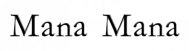
Scaricare 599 Downloads@WebFont -
![Mana Mana font caratteri gratis]() Scaricare 599 Downloads@WebFont
Scaricare 599 Downloads@WebFont -
![District Four font caratteri gratis]() Scaricare 599 Downloads@WebFont
Scaricare 599 Downloads@WebFont -
( Fonts by www.freakyfonts.de )
A retro, ASCII art-inspired display font with a digital aesthetic.
![Triad font caratteri gratis]() Scaricare 599 Downloads
Scaricare 599 Downloads -
( Isurus Labs - Derik Schneider )
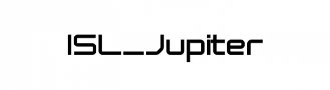
A modern, geometric font with clean lines and a structured appearance.
![ISL_Jupiter font caratteri gratis]() Scaricare 599 Downloads@WebFont
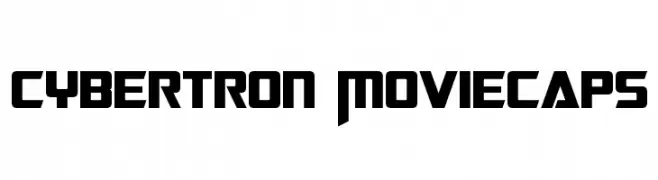
Scaricare 599 Downloads@WebFont -
![Cybertron Moviecaps font caratteri gratis]() Scaricare 599 Downloads@WebFont
Scaricare 599 Downloads@WebFont -
![Lane Posh Light font caratteri gratis]() Scaricare 599 Downloads@WebFont
Scaricare 599 Downloads@WebFont -
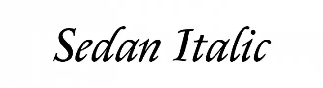
( Copyright (c) 2012, Sebastian Salazar (sebotas26@hotmail.com), with Reserved Font Name 'Sedan' )
An elegant italic typeface with smooth curves and a refined, sophisticated style.
![Sedan Italic font caratteri gratis]() Scaricare 599 Downloads@WebFont
Scaricare 599 Downloads@WebFont -
( Fonts by Khurasan )
A bold, playful font with a hand-drawn, friendly appearance.
![April Easter font caratteri gratis]() Scaricare 599 Downloads@WebFont
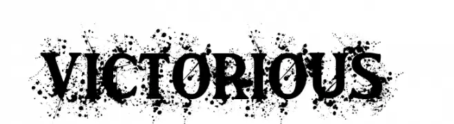
Scaricare 599 Downloads@WebFont -
![Victorious font caratteri gratis]() Scaricare 599 Downloads@WebFont
Scaricare 599 Downloads@WebFont -
( Fonts by www.stimuleyefonts.com )
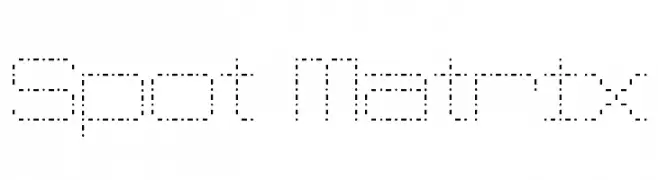
A dot matrix style font with a retro digital display aesthetic.
![Spot Matrix font caratteri gratis]() Scaricare 599 Downloads@WebFont
Scaricare 599 Downloads@WebFont -
( Fonts by Daniel Zadorozny - www.iconian.com - Free for personal use )
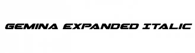
A bold, expanded, and italicized font with a modern, dynamic style.
![Gemina Expanded Italic font caratteri gratis]() Scaricare 599 Downloads@WebFont
Scaricare 599 Downloads@WebFont -
![Stifora font caratteri gratis]() Scaricare 599 Downloads@WebFont
Scaricare 599 Downloads@WebFont -
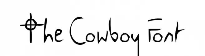
![The Cowboy Font font caratteri gratis]() Scaricare 599 Downloads@WebFont
Scaricare 599 Downloads@WebFont -
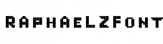
![RaphaelZfont font caratteri gratis]() Scaricare 599 Downloads
Scaricare 599 Downloads -
( Fonts by Fontfabric - Svetoslav Simov - Personal-use only. For commercial use please contact owner. )
A bold, modern font with geometric influences, perfect for impactful headlines and logos.
![Uni Neue-Trial Black font caratteri gratis]() Scaricare 599 Downloads@WebFont
Scaricare 599 Downloads@WebFont -
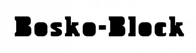
( This font is freeware. www.thenorthernblock.co.uk )
A bold, blocky font with strong, impactful characters.
![Bosko-Block font caratteri gratis]() Scaricare 599 Downloads@WebFont
Scaricare 599 Downloads@WebFont -
( Fonts by a kmzero font foundry - www.zetafonts.com. Personal-use only. For commercial use please contact owner. )
A bold, italicized sans-serif font with a dynamic and modern style.
![Amazing Grotesk Ultra Italic font caratteri gratis]() Scaricare 598 Downloads@WebFont
Scaricare 598 Downloads@WebFont -
( Fonts by Nick Curtis - www.nicksfonts.com )
A bold, classic serif font with strong strokes and elegant serifs.
![Kelmscott Roman NF Bold font caratteri gratis]() Scaricare 598 Downloads@WebFont
Scaricare 598 Downloads@WebFont -
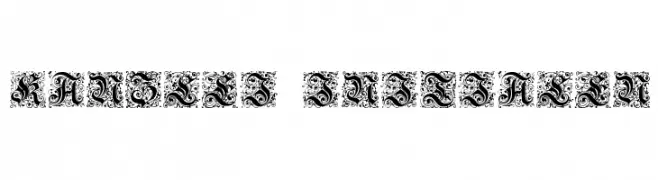
![Kanzlei-Initialen font caratteri gratis]() Scaricare 598 Downloads@WebFont
Scaricare 598 Downloads@WebFont -
( Fonts by www.houseoflime.com )
Illustrative artwork of geishas, not a font.
![Geisha font caratteri gratis]() Scaricare 598 Downloads@WebFont
Scaricare 598 Downloads@WebFont -
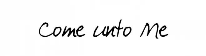
( Fonts by Kimberly Geswein - kimberlygeswein.com )
A casual, handwritten font with smooth, fluid strokes and a playful appearance.
![Come unto Me font caratteri gratis]() Scaricare 598 Downloads@WebFont
Scaricare 598 Downloads@WebFont -
( Free for personal use - www.chrisvile.com/ )
A bold, distressed font with a grunge aesthetic.
![Malevolent z font caratteri gratis]() Scaricare 598 Downloads@WebFont
Scaricare 598 Downloads@WebFont -
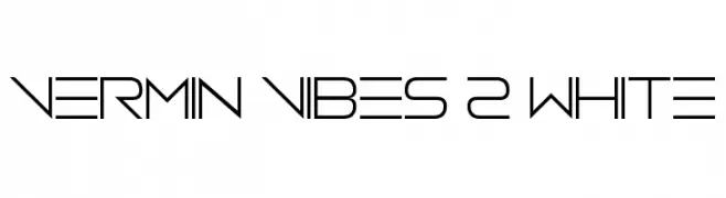
( Fonts by Andrew McCluskey - nalgames.com )
A modern, geometric font with clean lines and a futuristic aesthetic.
![Vermin Vibes 2 White font caratteri gratis]() Scaricare 598 Downloads@WebFont
Scaricare 598 Downloads@WebFont -
( Fonts by Arterfak Project )
A bold, playful font with rounded, whimsical characters.
![Bestoom-Bold font caratteri gratis]() Scaricare 598 Downloads@WebFont
Scaricare 598 Downloads@WebFont -
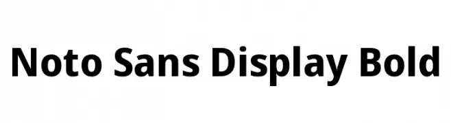
( Noto is a trademark of Google Inc. Noto fonts are open source. All Noto fonts are published under the SIL Open Font License, Version 1.1 )
A bold, modern sans-serif font with clean lines and excellent legibility.
![Noto Sans Display Bold font caratteri gratis]() Scaricare 598 Downloads@WebFont
Scaricare 598 Downloads@WebFont -
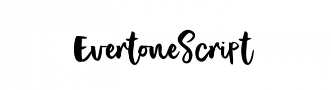
( Ferdiansyah - creativemarket.com/ijemrockart )
A bold and expressive script font with dynamic and playful letterforms.
![EvertoneScript font caratteri gratis]() Scaricare 598 Downloads@WebFont
Scaricare 598 Downloads@WebFont


Quali sono i font più popolari adesso?
Poppins, Roboto, Montserrat, Open Sans e Lato sono molto usati per le forme pulite e l'ampia applicabilità — dall'identità di marca alle landing page e ai poster.
Quali font si usano spesso nei loghi?
Le sans serif geometriche (es. Poppins, famiglie in stile Gotham) sono scelte comuni per un branding pulito e scalabile. Per un tocco personale restano valide script e stili manoscritti. Abbina un display deciso per i titoli a un corpo testo neutro per riconoscibilità ed equilibrio.
Ogni quanto si aggiorna la lista?
Con regolarità, in base ai download e all'attività reale. Torna spesso per scoprire in anticipo le nuove preferite.
💡 Consiglio: aggiungi ai preferiti — le tendenze cambiano in fretta e i font top di oggi possono ispirare il rebranding di domani.