Benvenuto nelle Font Più Popolari — dove popolarità e qualità si incontrano. Qui trovi i font più scaricati e usati dell'anno. Se cerchi scelte sicure per logo, web o social, inizia da qui.
Ogni font top si distingue per equilibrio, leggibilità e versatilità. Troverai sans serif moderne, script eleganti, serif vintage e display minimalisti.
-
 Scaricare 122 Downloads@WebFont
 -
( 123456 )
A playful, hand-drawn font with a double-line effect and casual style.
![Move It font caratteri gratis]() Scaricare 122 Downloads@WebFont
Scaricare 122 Downloads@WebFont -
( Fonts by scratchones )
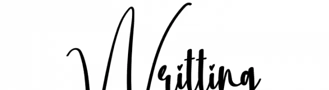
Playful handwritten script font.
![Writting font caratteri gratis]() Scaricare 122 Downloads@WebFont
Scaricare 122 Downloads@WebFont -
( Fonts by Fikry Alif - Fikryal studio - https://www.creativefabrica.com/designer/mfikryalif/ref/222304/ - Personal-use only. For commercial use please contact owner. )
A modern, elegant script font with flowing, handwritten characters.
![bridesmaid font caratteri gratis]() Scaricare 122 Downloads@WebFont
Scaricare 122 Downloads@WebFont -
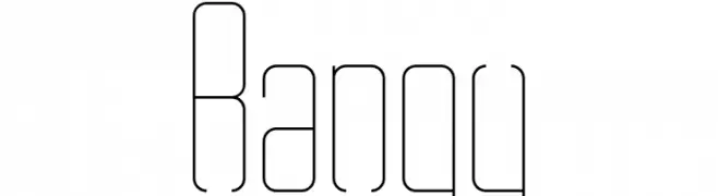
![Rangy font caratteri gratis]() Scaricare 122 Downloads@WebFont
Scaricare 122 Downloads@WebFont -
-
( Fonts by Zetafonts - Personal-use only. For commercial use please contact owner. )
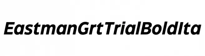
A bold, italicized font with strong strokes and a modern aesthetic.
![Eastman Grt Trial Bold Ita font caratteri gratis]() Scaricare 122 Downloads@WebFont
Scaricare 122 Downloads@WebFont -
( Fonts by MCKL )
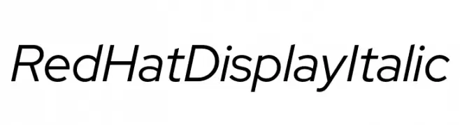
A modern, italic sans-serif font with clean lines and balanced spacing.
![Red Hat Display Italic font caratteri gratis]() Scaricare 122 Downloads@WebFont
Scaricare 122 Downloads@WebFont -
( Fonts by Peter Wiegel - www.peter-wiegel.de - Personal-use only. For commercial use please contact owner. )
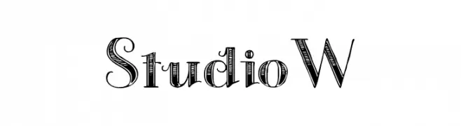
A decorative font with a blend of modern and vintage styles, featuring intricate detailing.
![StudioW font caratteri gratis]() Scaricare 122 Downloads@WebFont
Scaricare 122 Downloads@WebFont -
![Fun Astronomical Symbols font caratteri gratis]() Scaricare 122 Downloads@WebFont
Scaricare 122 Downloads@WebFont -
( Fonts by Apostrophic Lab )
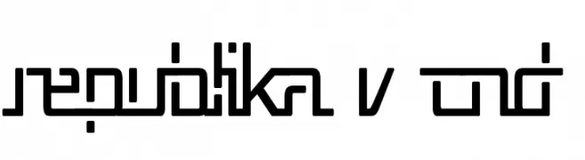
A modern, geometric font with a futuristic and precise design.
![Republika V Cnd font caratteri gratis]() Scaricare 122 Downloads@WebFont
Scaricare 122 Downloads@WebFont


Quali sono i font più popolari adesso?
Poppins, Roboto, Montserrat, Open Sans e Lato sono molto usati per le forme pulite e l'ampia applicabilità — dall'identità di marca alle landing page e ai poster.
Quali font si usano spesso nei loghi?
Le sans serif geometriche (es. Poppins, famiglie in stile Gotham) sono scelte comuni per un branding pulito e scalabile. Per un tocco personale restano valide script e stili manoscritti. Abbina un display deciso per i titoli a un corpo testo neutro per riconoscibilità ed equilibrio.
Ogni quanto si aggiorna la lista?
Con regolarità, in base ai download e all'attività reale. Torna spesso per scoprire in anticipo le nuove preferite.
💡 Consiglio: aggiungi ai preferiti — le tendenze cambiano in fretta e i font top di oggi possono ispirare il rebranding di domani.