Benvenuto nelle Font Più Popolari — dove popolarità e qualità si incontrano. Qui trovi i font più scaricati e usati dell'anno. Se cerchi scelte sicure per logo, web o social, inizia da qui.
Ogni font top si distingue per equilibrio, leggibilità e versatilità. Troverai sans serif moderne, script eleganti, serif vintage e display minimalisti.
-
( Fonts by dartcanada.tripod.com - Darren Rigby )
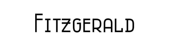
A modern, geometric sans-serif font with uniform width and clean lines.
 Scaricare 586 Downloads@WebFont
 -
( Just Font You - Ian Irwan Wismoyo - justfontyou.com/ )
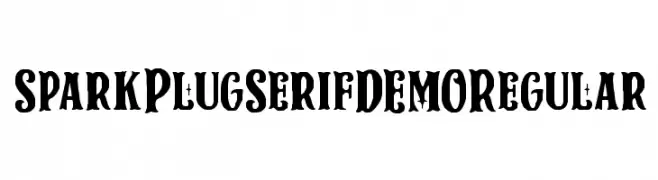
A bold, high-contrast serif font with vintage and modern elements.
![Spark Plug Serif DEMO Regular font caratteri gratis]() Scaricare 586 Downloads@WebFont
Scaricare 586 Downloads@WebFont -
( Zess Type - zesstype.com/ )
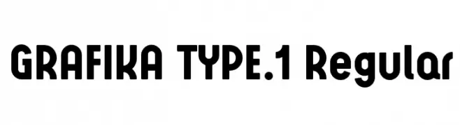
A bold, modern font with rounded edges and geometric influences.
![GRAFIKA TYPE.1 Regular font caratteri gratis]() Scaricare 586 Downloads@WebFont
Scaricare 586 Downloads@WebFont -
( Fonts by Apostrophic Lab )
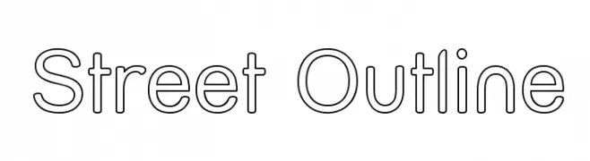
A modern, minimalist outline font with uniform stroke widths and geometric precision.
![Street Outline font caratteri gratis]() Scaricare 586 Downloads@WebFont
Scaricare 586 Downloads@WebFont -
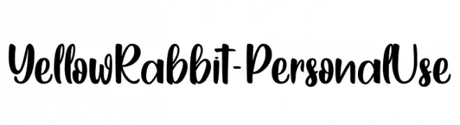
( Fonts by Typhoon Type - Suthi Srisopha - www.typhoontype.net - Personal-use only. For commercial use please contact owner. )
A playful, handwritten font with smooth, rounded edges and a friendly appearance.
![YellowRabbit-PersonalUse font caratteri gratis]() Scaricare 586 Downloads@WebFont
Scaricare 586 Downloads@WebFont -
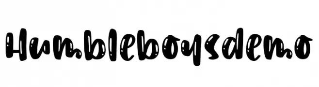
( Fonts by Abo Daniel )
A bold, playful handwritten font with whimsical dots and strokes.
![Humbleboysdemo font caratteri gratis]() Scaricare 586 Downloads@WebFont
Scaricare 586 Downloads@WebFont -
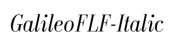
( Fonts by Casady & Greene )
An elegant serif font with a classic italic style and high contrast strokes.
![GalileoFLF-Italic font caratteri gratis]() Scaricare 586 Downloads@WebFont
Scaricare 586 Downloads@WebFont -
( Fonts by The Scriptorium - Dave Nalle )
An ornate, calligraphic font with dramatic flourishes and historical elegance.
![Alleghieri Demo font caratteri gratis]() Scaricare 586 Downloads@WebFont
Scaricare 586 Downloads@WebFont -
![UVN Con Thuy font caratteri gratis]() Scaricare 586 Downloads@WebFont
Scaricare 586 Downloads@WebFont -
![MusicalSymbols font caratteri gratis]() Scaricare 586 Downloads@WebFont
Scaricare 586 Downloads@WebFont -
( mistifonts.com/ )
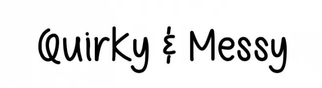
A playful, hand-drawn font with a quirky, informal style.
![Quirky & Messy font caratteri gratis]() Scaricare 586 Downloads@WebFont
Scaricare 586 Downloads@WebFont -
![Martin Vogel's Symbols font caratteri gratis]() Scaricare 586 Downloads@WebFont
Scaricare 586 Downloads@WebFont -
( Fonts by Andreas Hofeld - www.fontgrube.de )
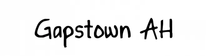
A playful, handwritten font with a casual and approachable style.
![Gapstown AH font caratteri gratis]() Scaricare 586 Downloads@WebFont
Scaricare 586 Downloads@WebFont -
( Fonts by Vanessa Bays - bythebutterfly.com )
A playful, dot-based decorative font with a modern flair.
![DotNess font caratteri gratis]() Scaricare 586 Downloads@WebFont
Scaricare 586 Downloads@WebFont -
![CrunchyFaxPhont font caratteri gratis]() Scaricare 586 Downloads@WebFont
Scaricare 586 Downloads@WebFont -
( Fonts by Utopiafonts )
A whimsical and playful font with exaggerated curves and dynamic strokes.
![Luxo font caratteri gratis]() Scaricare 586 Downloads@WebFont
Scaricare 586 Downloads@WebFont -
( Fonts by David Rakowski )
A distressed serif font with a grunge, textured appearance.
![Hartin2 Regular font caratteri gratis]() Scaricare 585 Downloads@WebFont
Scaricare 585 Downloads@WebFont -
( Fonts by Daniel Zadorozny - www.iconian.com )
A bold, condensed, and italicized font with sharp angles and dynamic energy.
![Oceanic Drift Condensed Italic font caratteri gratis]() Scaricare 585 Downloads@WebFont
Scaricare 585 Downloads@WebFont -
( Fonts by Daniel Zadorozny - www.iconian.com - Free for personal use )
A bold, condensed font with sharp, angular edges and a modern geometric style.
![21 Gun Salute Condensed font caratteri gratis]() Scaricare 585 Downloads@WebFont
Scaricare 585 Downloads@WebFont -
![Pencil Caps font caratteri gratis]() Scaricare 585 Downloads@WebFont
Scaricare 585 Downloads@WebFont -
( Fonts by Dondon Nillo )
An elegant script font with flowing, cursive strokes and intricate flourishes.
![Signarita Chloe font caratteri gratis]() Scaricare 585 Downloads@WebFont
Scaricare 585 Downloads@WebFont -
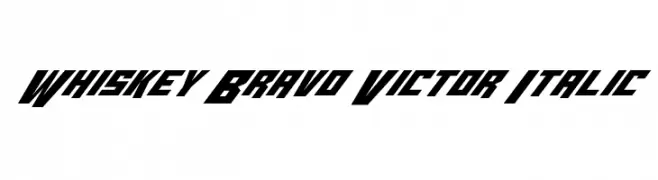
( Fonts by Daniel Zadorozny - www.iconian.com )
A bold, italic, and geometric font with a futuristic style.
![Whiskey Bravo Victor Italic font caratteri gratis]() Scaricare 585 Downloads@WebFont
Scaricare 585 Downloads@WebFont -
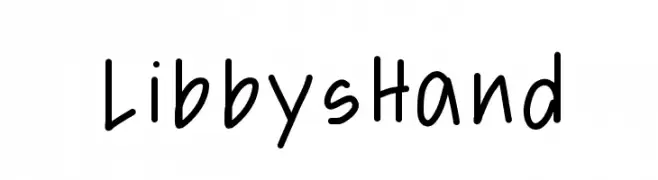
![LibbysHand font caratteri gratis]() Scaricare 585 Downloads@WebFont
Scaricare 585 Downloads@WebFont -
![Latté font caratteri gratis]() Scaricare 585 Downloads@WebFont
Scaricare 585 Downloads@WebFont -
( Fonts by Daniel Zadorozny - www.iconian.com - Free for personal use )
A bold, angular, semi-italic font with a futuristic design.
![Gemina Semi-Italic font caratteri gratis]() Scaricare 585 Downloads@WebFont
Scaricare 585 Downloads@WebFont -
( Fonts by Spork Thug Typography - Josh Wilhelm - www.lifewithouttaffy.com/taffy/blog )
A bold, brush-style font with dynamic, hand-drawn strokes.
![Donald font caratteri gratis]() Scaricare 585 Downloads@WebFont
Scaricare 585 Downloads@WebFont -
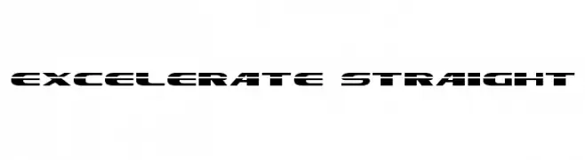
( Fonts by Daniel Zadorozny - www.iconian.com )
A bold, futuristic font with geometric and modern design elements.
![Excelerate Straight font caratteri gratis]() Scaricare 585 Downloads
Scaricare 585 Downloads -
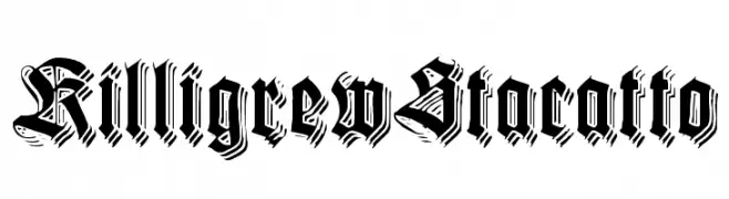
( Fonts by Paul Lloyd )
A bold, ornate Blackletter font with dramatic, angular letterforms.
![KilligrewStacatto font caratteri gratis]() Scaricare 585 Downloads@WebFont
Scaricare 585 Downloads@WebFont -
( Fonts by mcw )
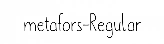
A playful handwritten font with thin, elongated strokes and irregular letterforms.
![metafors-Regular font caratteri gratis]() Scaricare 585 Downloads@WebFont
Scaricare 585 Downloads@WebFont -
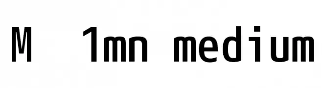
![M+ 1mn medium font caratteri gratis]() Scaricare 585 Downloads@WebFont
Scaricare 585 Downloads@WebFont -
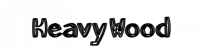
![HeavyWood font caratteri gratis]() Scaricare 585 Downloads@WebFont
Scaricare 585 Downloads@WebFont -
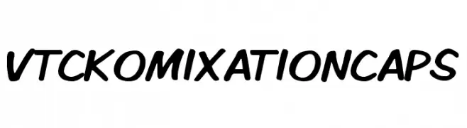
![VTCKomixationCaps font caratteri gratis]() Scaricare 585 Downloads@WebFont
Scaricare 585 Downloads@WebFont -
![VI Anh Dao Hoa font caratteri gratis]() Scaricare 585 Downloads@WebFont
Scaricare 585 Downloads@WebFont -
![Gentleman font caratteri gratis]() Scaricare 585 Downloads@WebFont
Scaricare 585 Downloads@WebFont -
( Fonts by Docallisme HAS )
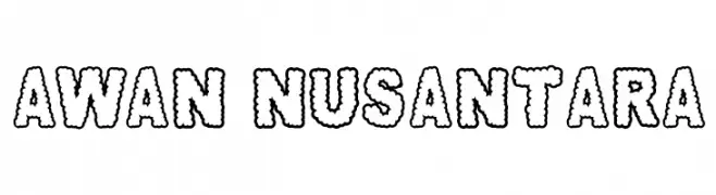
A playful, cloud-like font with bold, rounded characters.
![AWAN NUSANTARA font caratteri gratis]() Scaricare 585 Downloads@WebFont
Scaricare 585 Downloads@WebFont


Quali sono i font più popolari adesso?
Poppins, Roboto, Montserrat, Open Sans e Lato sono molto usati per le forme pulite e l'ampia applicabilità — dall'identità di marca alle landing page e ai poster.
Quali font si usano spesso nei loghi?
Le sans serif geometriche (es. Poppins, famiglie in stile Gotham) sono scelte comuni per un branding pulito e scalabile. Per un tocco personale restano valide script e stili manoscritti. Abbina un display deciso per i titoli a un corpo testo neutro per riconoscibilità ed equilibrio.
Ogni quanto si aggiorna la lista?
Con regolarità, in base ai download e all'attività reale. Torna spesso per scoprire in anticipo le nuove preferite.
💡 Consiglio: aggiungi ai preferiti — le tendenze cambiano in fretta e i font top di oggi possono ispirare il rebranding di domani.