Benvenuto nelle Font Più Popolari — dove popolarità e qualità si incontrano. Qui trovi i font più scaricati e usati dell'anno. Se cerchi scelte sicure per logo, web o social, inizia da qui.
Ogni font top si distingue per equilibrio, leggibilità e versatilità. Troverai sans serif moderne, script eleganti, serif vintage e display minimalisti.
-
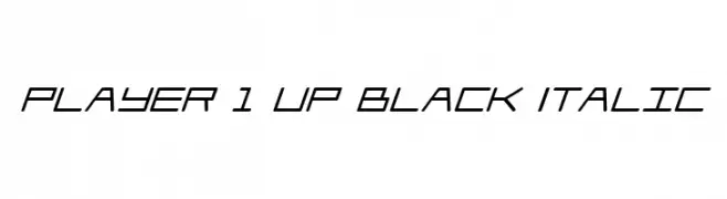
( Fonts by Daniel Zadorozny - www.iconian.com )
A futuristic, angular font with a dynamic, italicized style.
 Scaricare 119 Downloads@WebFont
 -
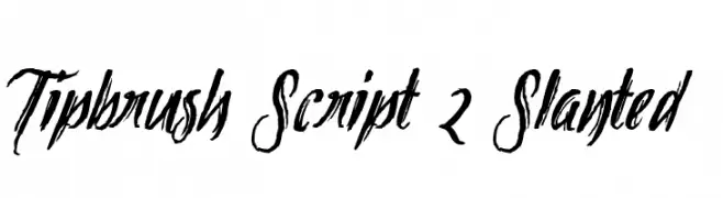
( Fonts by Mans Greback - www.mawns.com )
A dynamic brush script font with bold, slanted strokes and artistic flair.
![Tipbrush Script 2 Slanted font caratteri gratis]() Scaricare 119 Downloads@WebFont
Scaricare 119 Downloads@WebFont -
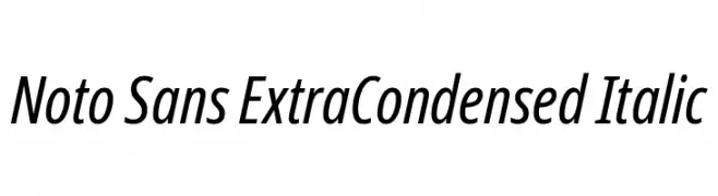
( Fonts by Google )
A sleek, modern sans-serif font with an extra condensed and italicized style.
![Noto Sans ExtraCondensed Italic font caratteri gratis]() Scaricare 119 Downloads@WebFont
Scaricare 119 Downloads@WebFont -
![Icons Social Media 9 font caratteri gratis]() Scaricare 119 Downloads@WebFont
Scaricare 119 Downloads@WebFont -
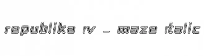
( Fonts by Apostrophic Lab )
A bold, geometric, maze-like italic font with a unique, intricate design.
![Republika IV - Maze Italic font caratteri gratis]() Scaricare 119 Downloads@WebFont
Scaricare 119 Downloads@WebFont -
-
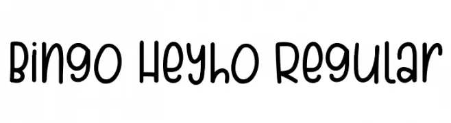
( Fonts by Bearytype )
Playful handwritten font with rounded edges.
![Bingo Heyho Regular font caratteri gratis]() Scaricare 119 Downloads@WebFont
Scaricare 119 Downloads@WebFont -
Caratteri di typotopia. For commercial use please contact the owner.
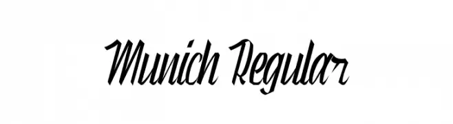
( Fonts by Typotopia - Typotopia.co - Personal Use Only, for Commercial Use, please contact us )
A bold, dynamic script font with a strong, fluid presence.
![Munich Regular font caratteri gratis]() Scaricare 119 Downloads@WebFont
Scaricare 119 Downloads@WebFont -
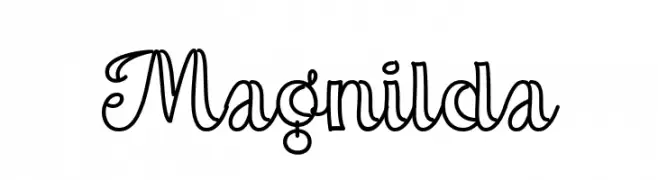
( Fonts by Misti Hammers - mistifonts.com - Personal-use only. For commercial use please contact owner. )
A playful and decorative script font with elegant, flowing lines.
![Magnilda font caratteri gratis]() Scaricare 119 Downloads@WebFont
Scaricare 119 Downloads@WebFont -
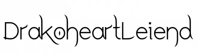
( Fonts by Yun Gonzalez - g3drakoheart-arts.deviantart.com - Personal-use only. For commercial use please contact owner. )
A modern decorative font with elegant curves and sharp angles.
![DrakoheartLeiend font caratteri gratis]() Scaricare 119 Downloads@WebFont
Scaricare 119 Downloads@WebFont -
![Quixotic font caratteri gratis]() Scaricare 119 Downloads@WebFont
Scaricare 119 Downloads@WebFont

Quali sono i font più popolari adesso?
Poppins, Roboto, Montserrat, Open Sans e Lato sono molto usati per le forme pulite e l'ampia applicabilità — dall'identità di marca alle landing page e ai poster.
Quali font si usano spesso nei loghi?
Le sans serif geometriche (es. Poppins, famiglie in stile Gotham) sono scelte comuni per un branding pulito e scalabile. Per un tocco personale restano valide script e stili manoscritti. Abbina un display deciso per i titoli a un corpo testo neutro per riconoscibilità ed equilibrio.
Ogni quanto si aggiorna la lista?
Con regolarità, in base ai download e all'attività reale. Torna spesso per scoprire in anticipo le nuove preferite.
💡 Consiglio: aggiungi ai preferiti — le tendenze cambiano in fretta e i font top di oggi possono ispirare il rebranding di domani.