Benvenuto nelle Font Più Popolari — dove popolarità e qualità si incontrano. Qui trovi i font più scaricati e usati dell'anno. Se cerchi scelte sicure per logo, web o social, inizia da qui.
Ogni font top si distingue per equilibrio, leggibilità e versatilità. Troverai sans serif moderne, script eleganti, serif vintage e display minimalisti.
-
( Fonts by Manfred Klein. Free for private and charity use. Free for commercial with donation to organizations )
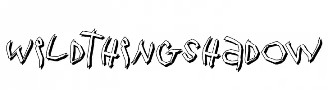
A bold, edgy font with a 3D shadow effect and angular, dynamic characters.
 Scaricare 119 Downloads@WebFont
 -
( Fonts by Daniel Zadorozny - www.iconian.com )
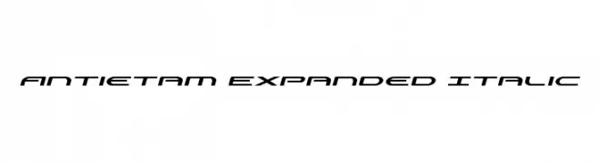
A sleek, modern, expanded italic font with a futuristic look.
![Antietam Expanded Italic font caratteri gratis]() Scaricare 119 Downloads@WebFont
Scaricare 119 Downloads@WebFont -
![SF Retroesque Shaded font caratteri gratis]() Scaricare 119 Downloads@WebFont
Scaricare 119 Downloads@WebFont -
Caratteri di fenomen75. For commercial use please contact the owner.
( free for personal use only )
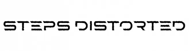
A modern, distorted font with a jagged, energetic texture.
![STEPS Distorted font caratteri gratis]() Scaricare 119 Downloads@WebFont
Scaricare 119 Downloads@WebFont -
![PiratesOne font caratteri gratis]() Scaricare 119 Downloads@WebFont
Scaricare 119 Downloads@WebFont -
-
( Fonts by Darcy Baldwin - darcybaldwin.com. Free for personal use only )
A playful, outlined font with tall, narrow characters and rounded edges.
![DJB That Font I Saw on TV font caratteri gratis]() Scaricare 119 Downloads@WebFont
Scaricare 119 Downloads@WebFont -
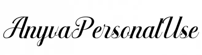
( Fonts by Din Studio - Donis Miftahudin - Personal-use only. For commercial use please contact owner. )
An elegant, flowing script font with graceful curves and a sophisticated style.
![Anyva Personal Use font caratteri gratis]() Scaricare 119 Downloads@WebFont
Scaricare 119 Downloads@WebFont -
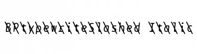
( Fonts by backpacker.gr )
A slashed, italic font with a dynamic, hand-drawn style.
![BPtypewriteSlashed Italic font caratteri gratis]() Scaricare 119 Downloads@WebFont
Scaricare 119 Downloads@WebFont -
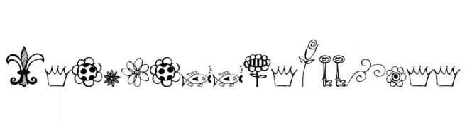
( Free for a personal use. For a commercial use please visit www.kevinandamanda.com )
A whimsical collection of hand-drawn doodles featuring flowers, paisleys, and other decorative elements.
![Pea Stacy's Doodles font caratteri gratis]() Scaricare 119 Downloads@WebFont
Scaricare 119 Downloads@WebFont -
![RUSAK font caratteri gratis]() Scaricare 119 Downloads@WebFont
Scaricare 119 Downloads@WebFont


Quali sono i font più popolari adesso?
Poppins, Roboto, Montserrat, Open Sans e Lato sono molto usati per le forme pulite e l'ampia applicabilità — dall'identità di marca alle landing page e ai poster.
Quali font si usano spesso nei loghi?
Le sans serif geometriche (es. Poppins, famiglie in stile Gotham) sono scelte comuni per un branding pulito e scalabile. Per un tocco personale restano valide script e stili manoscritti. Abbina un display deciso per i titoli a un corpo testo neutro per riconoscibilità ed equilibrio.
Ogni quanto si aggiorna la lista?
Con regolarità, in base ai download e all'attività reale. Torna spesso per scoprire in anticipo le nuove preferite.
💡 Consiglio: aggiungi ai preferiti — le tendenze cambiano in fretta e i font top di oggi possono ispirare il rebranding di domani.