Benvenuto nelle Font Più Popolari — dove popolarità e qualità si incontrano. Qui trovi i font più scaricati e usati dell'anno. Se cerchi scelte sicure per logo, web o social, inizia da qui.
Ogni font top si distingue per equilibrio, leggibilità e versatilità. Troverai sans serif moderne, script eleganti, serif vintage e display minimalisti.
-
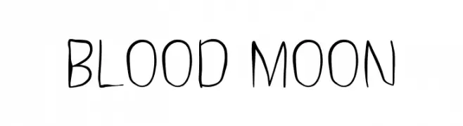
( Fonts by Alpaprana Studio )
A playful, handwritten font with tall, slender characters and an informal style.
 Scaricare 118 Downloads@WebFont
 -
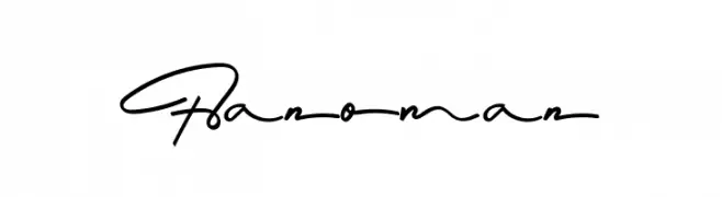
( Fonts by odi Prasetya - Personal-use only. For commercial use please contact owner. )
An elegant, cursive script font with fluid, interconnected strokes and a handwritten style.
![Hanoman font caratteri gratis]() Scaricare 118 Downloads@WebFont
Scaricare 118 Downloads@WebFont -
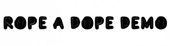
( Fonts by epiclinez )
A bold, playful font with a rope-like design and consistent stroke width.
![Rope A Dope Demo font caratteri gratis]() Scaricare 118 Downloads@WebFont
Scaricare 118 Downloads@WebFont -
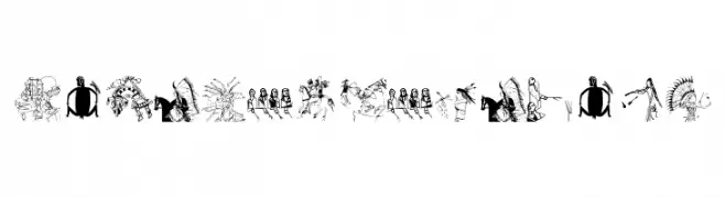
( Fonts by Manfred Klein. Free for private and charity use. Free for commercial with donation to organizations )
Illustrative display font with Native American cultural motifs.
![NativeAmericans font caratteri gratis]() Scaricare 118 Downloads@WebFont
Scaricare 118 Downloads@WebFont -
( MylesKatherine - Myles Coleman - www.myleskatherine.com/ )
A whimsical, curly font with a playful, hand-drawn style.
![Lula font caratteri gratis]() Scaricare 118 Downloads@WebFont
Scaricare 118 Downloads@WebFont -
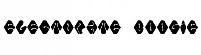
-
![Electorate Boogie font caratteri gratis]() Scaricare 118 Downloads@WebFont
Scaricare 118 Downloads@WebFont -
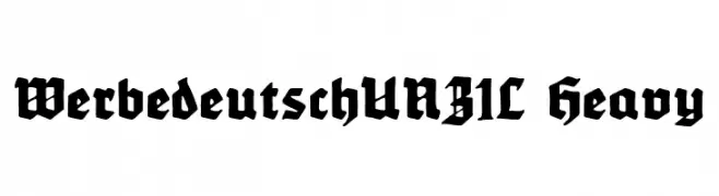
( Fonts by Peter Wiegel - www.peter-wiegel.de - Personal-use only. For commercial use please contact owner. )
A bold, blackletter font with a medieval, Gothic style.
![WerbedeutschUNZ1L Heavy font caratteri gratis]() Scaricare 118 Downloads@WebFont
Scaricare 118 Downloads@WebFont -
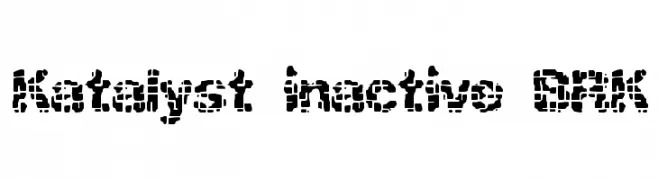
( Fonts by AEnigma - www.aenigmafonts.com )
A bold, pixelated font with a fragmented, digital aesthetic.
![Katalyst inactive BRK font caratteri gratis]() Scaricare 118 Downloads@WebFont
Scaricare 118 Downloads@WebFont -
( Fonts by or from www.graffitifonts.net )
A bold, graffiti-inspired font with dynamic and energetic strokes.
![Killanea font caratteri gratis]() Scaricare 118 Downloads@WebFont
Scaricare 118 Downloads@WebFont -
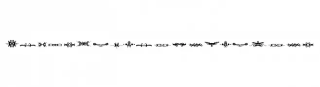
( Fonts by dcoxy )
Highly decorative ornamental glyphs for borders and embellishments.
![Bougy_PersonalUseOnly font caratteri gratis]() Scaricare 118 Downloads@WebFont
Scaricare 118 Downloads@WebFont

Quali sono i font più popolari adesso?
Poppins, Roboto, Montserrat, Open Sans e Lato sono molto usati per le forme pulite e l'ampia applicabilità — dall'identità di marca alle landing page e ai poster.
Quali font si usano spesso nei loghi?
Le sans serif geometriche (es. Poppins, famiglie in stile Gotham) sono scelte comuni per un branding pulito e scalabile. Per un tocco personale restano valide script e stili manoscritti. Abbina un display deciso per i titoli a un corpo testo neutro per riconoscibilità ed equilibrio.
Ogni quanto si aggiorna la lista?
Con regolarità, in base ai download e all'attività reale. Torna spesso per scoprire in anticipo le nuove preferite.
💡 Consiglio: aggiungi ai preferiti — le tendenze cambiano in fretta e i font top di oggi possono ispirare il rebranding di domani.