Benvenuto nelle Font Più Popolari — dove popolarità e qualità si incontrano. Qui trovi i font più scaricati e usati dell'anno. Se cerchi scelte sicure per logo, web o social, inizia da qui.
Ogni font top si distingue per equilibrio, leggibilità e versatilità. Troverai sans serif moderne, script eleganti, serif vintage e display minimalisti.
-
Caratteri di alifinart. For commercial use please contact the owner.
( Salma Alfasans )
A modern, light sans-serif font with clean lines and uniform stroke width.
 Scaricare 118 Downloads
 -
( Fonts by EyeCone - Personal-use only. For commercial use please contact owner. )
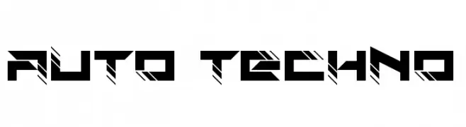
A bold, futuristic font with angular, techno-inspired design.
![Auto Techno font caratteri gratis]() Scaricare 118 Downloads@WebFont
Scaricare 118 Downloads@WebFont -
( Fonts by Apostrophic Lab )
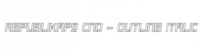
A modern, italicized outline font with a condensed and geometric style.
![Republikaps Cnd - Outline Italic font caratteri gratis]() Scaricare 118 Downloads@WebFont
Scaricare 118 Downloads@WebFont -
( Fonts by CannotIntoSpaceFonts - KineticPlasma Fonts - Personal-use only. For commercial use please contact owner. )
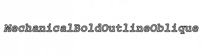
A bold, outlined, oblique font with a mechanical and industrial style.
![Mechanical Bold Outline Oblique font caratteri gratis]() Scaricare 118 Downloads@WebFont
Scaricare 118 Downloads@WebFont -
( Fonts by 212 fonts - Elizabeth - Personal-use only. For commercial use please contact owner. )
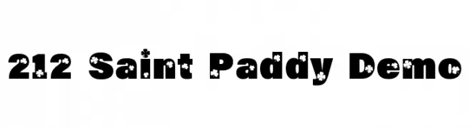
A bold, decorative font with shamrock motifs, perfect for festive themes.
![212 Saint Paddy Demo font caratteri gratis]() Scaricare 118 Downloads@WebFont
Scaricare 118 Downloads@WebFont -
-
![Little_Fox_By_the_Moonlight font caratteri gratis]() Scaricare 118 Downloads@WebFont
Scaricare 118 Downloads@WebFont -
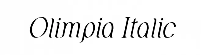
( Fonts by David Espinosa [Type Sailor] - www.facebook.com/typesailor - Personal-use only. For commercial use please contact owner. )
A refined and elegant italic serif font with smooth curves and classic style.
![Olimpia Italic font caratteri gratis]() Scaricare 118 Downloads@WebFont
Scaricare 118 Downloads@WebFont -
![gAbAcHiTA-FFP font caratteri gratis]() Scaricare 118 Downloads@WebFont
Scaricare 118 Downloads@WebFont -
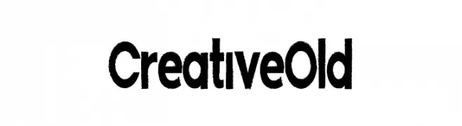
( Fonts by Lontong Lodeh )
A bold, geometric font with a modern and structured design.
![CreativeOld font caratteri gratis]() Scaricare 118 Downloads@WebFont
Scaricare 118 Downloads@WebFont -
![Love Me For A Reason font caratteri gratis]() Scaricare 118 Downloads@WebFont
Scaricare 118 Downloads@WebFont


Quali sono i font più popolari adesso?
Poppins, Roboto, Montserrat, Open Sans e Lato sono molto usati per le forme pulite e l'ampia applicabilità — dall'identità di marca alle landing page e ai poster.
Quali font si usano spesso nei loghi?
Le sans serif geometriche (es. Poppins, famiglie in stile Gotham) sono scelte comuni per un branding pulito e scalabile. Per un tocco personale restano valide script e stili manoscritti. Abbina un display deciso per i titoli a un corpo testo neutro per riconoscibilità ed equilibrio.
Ogni quanto si aggiorna la lista?
Con regolarità, in base ai download e all'attività reale. Torna spesso per scoprire in anticipo le nuove preferite.
💡 Consiglio: aggiungi ai preferiti — le tendenze cambiano in fretta e i font top di oggi possono ispirare il rebranding di domani.