Benvenuto nelle Font Più Popolari — dove popolarità e qualità si incontrano. Qui trovi i font più scaricati e usati dell'anno. Se cerchi scelte sicure per logo, web o social, inizia da qui.
Ogni font top si distingue per equilibrio, leggibilità e versatilità. Troverai sans serif moderne, script eleganti, serif vintage e display minimalisti.
-
( Fonts by perefect-schraub.jimdosite.com - Personal-use only. For commercial use please contact owner. )
A bold, playful handwritten font with thick strokes and a casual style.
 Scaricare 117 Downloads@WebFont
 -
( Font by Eric Wirjanata. All of my font are donation based. You can support by buying something from here. http://society6.com/EricWirjanata )
A playful, geometric font with a pixelated, digital style.
![Booblr by Thunderpanda font caratteri gratis]() Scaricare 117 Downloads@WebFont
Scaricare 117 Downloads@WebFont -
( Fonts by Eddy Goodboy )
A playful, hand-drawn font with quirky embellishments and a casual style.
![Friday School font caratteri gratis]() Scaricare 117 Downloads@WebFont
Scaricare 117 Downloads@WebFont -
( Fonts by Spork Thug Typography - Josh Wilhelm - www.lifewithouttaffy.com/taffy/blog )
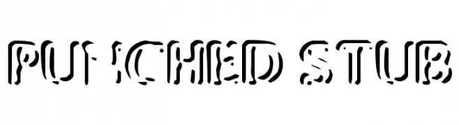
A bold, industrial stencil font with unique punched-out sections.
![Punched Stub font caratteri gratis]() Scaricare 117 Downloads@WebFont
Scaricare 117 Downloads@WebFont -
( Fonts by Daniel Gauthier )
Error: Not a valid font.
![Gauts font caratteri gratis]() Scaricare 117 Downloads@WebFont
Scaricare 117 Downloads@WebFont -
-
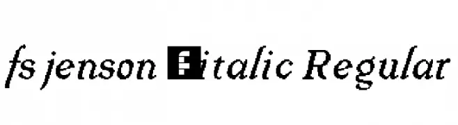
![fs jenson 1 italic Regular font caratteri gratis]() Scaricare 117 Downloads@WebFont
Scaricare 117 Downloads@WebFont -
( Darrell Flood )
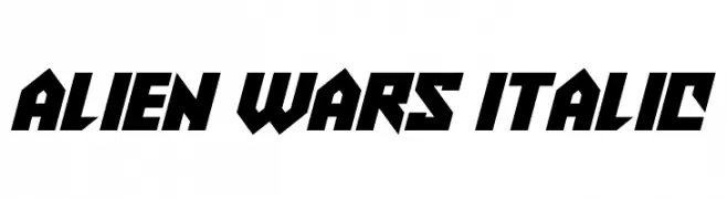
A bold, futuristic italic font with sharp angles and tight spacing.
![Alien Wars Italic font caratteri gratis]() Scaricare 117 Downloads@WebFont
Scaricare 117 Downloads@WebFont -
( fontsme )
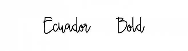
A playful, handwritten font with smooth, flowing lines and a casual style.
![Ecuador Bold font caratteri gratis]() Scaricare 117 Downloads@WebFont
Scaricare 117 Downloads@WebFont -
Caratteri di joorgemoron. For commercial use please contact the owner.
( Free for personal use )
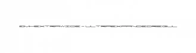
A futuristic, ultra-expanded font with geometric and sleek design.
![JMHExtraWide-UltraexpandedRegul font caratteri gratis]() Scaricare 117 Downloads@WebFont
Scaricare 117 Downloads@WebFont -
( Fonts by madeDeduk )
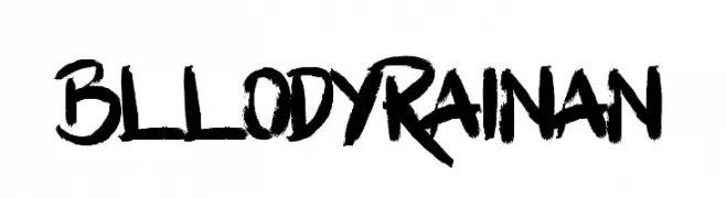
A bold, brush-style font with dynamic, hand-painted strokes.
![BllodyRainan font caratteri gratis]() Scaricare 117 Downloads@WebFont
Scaricare 117 Downloads@WebFont


Quali sono i font più popolari adesso?
Poppins, Roboto, Montserrat, Open Sans e Lato sono molto usati per le forme pulite e l'ampia applicabilità — dall'identità di marca alle landing page e ai poster.
Quali font si usano spesso nei loghi?
Le sans serif geometriche (es. Poppins, famiglie in stile Gotham) sono scelte comuni per un branding pulito e scalabile. Per un tocco personale restano valide script e stili manoscritti. Abbina un display deciso per i titoli a un corpo testo neutro per riconoscibilità ed equilibrio.
Ogni quanto si aggiorna la lista?
Con regolarità, in base ai download e all'attività reale. Torna spesso per scoprire in anticipo le nuove preferite.
💡 Consiglio: aggiungi ai preferiti — le tendenze cambiano in fretta e i font top di oggi possono ispirare il rebranding di domani.